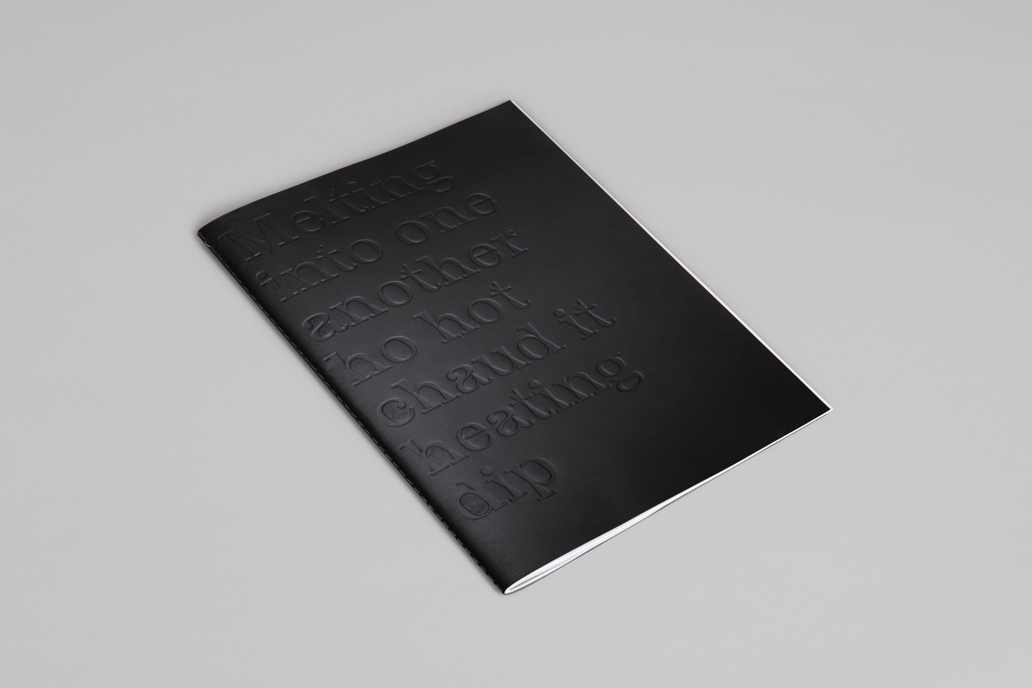
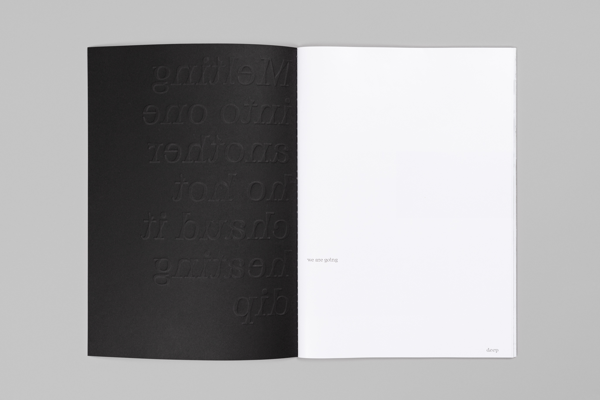
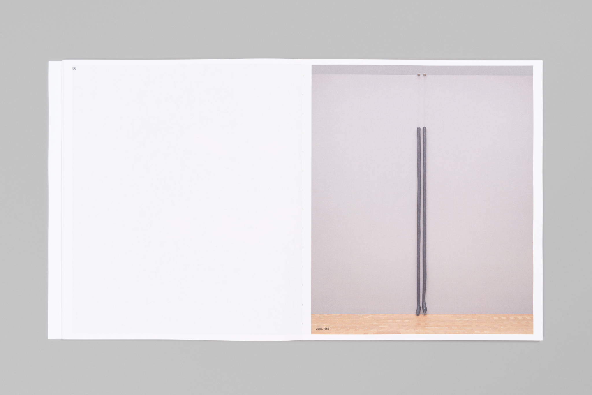
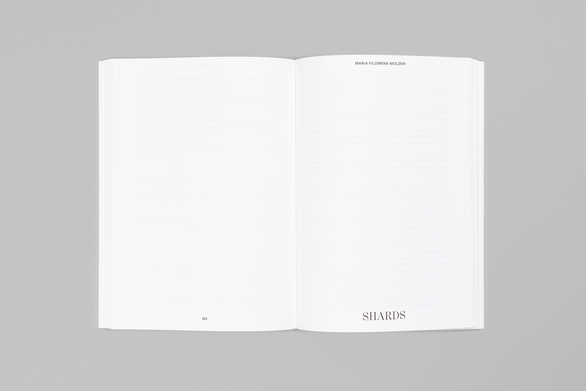
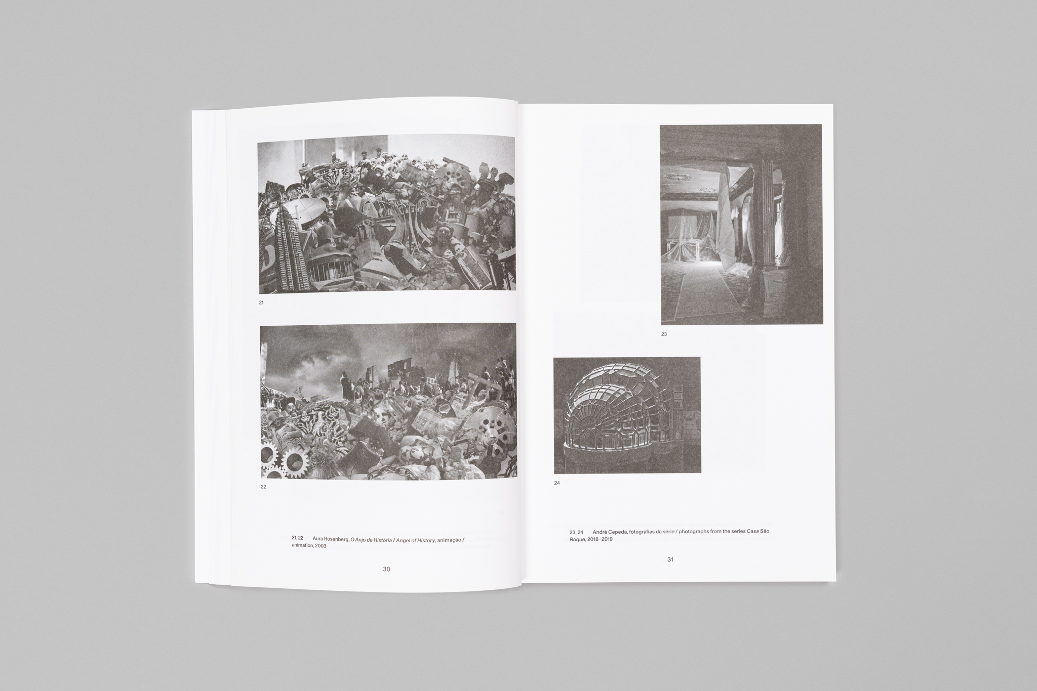
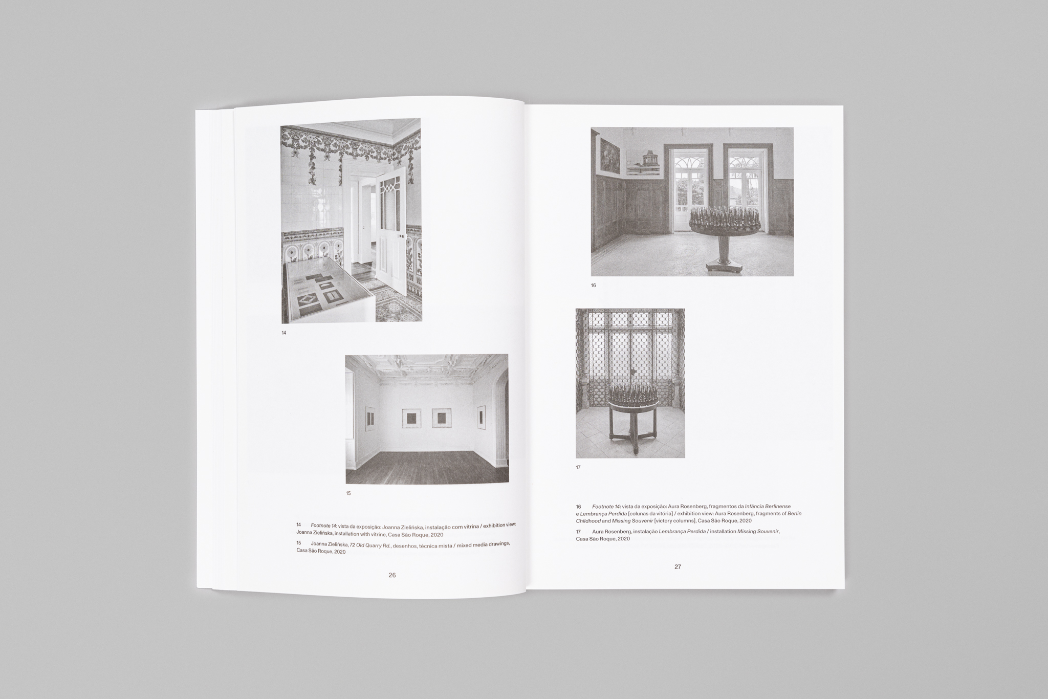
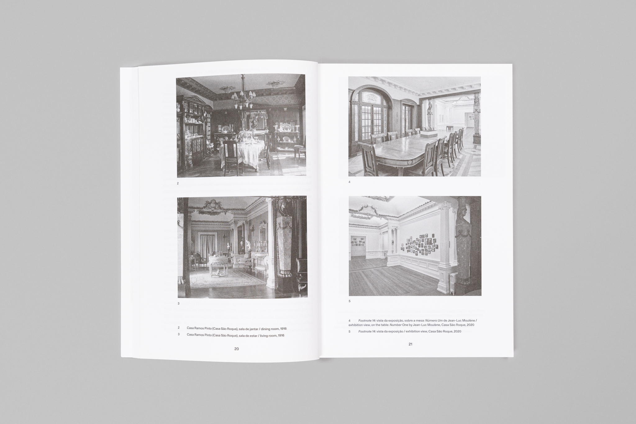
Melting into one another ho hot chad it heating dip
2021
205 × 305 mm printed in squid ink
Client: Kunsthalle Lissabon
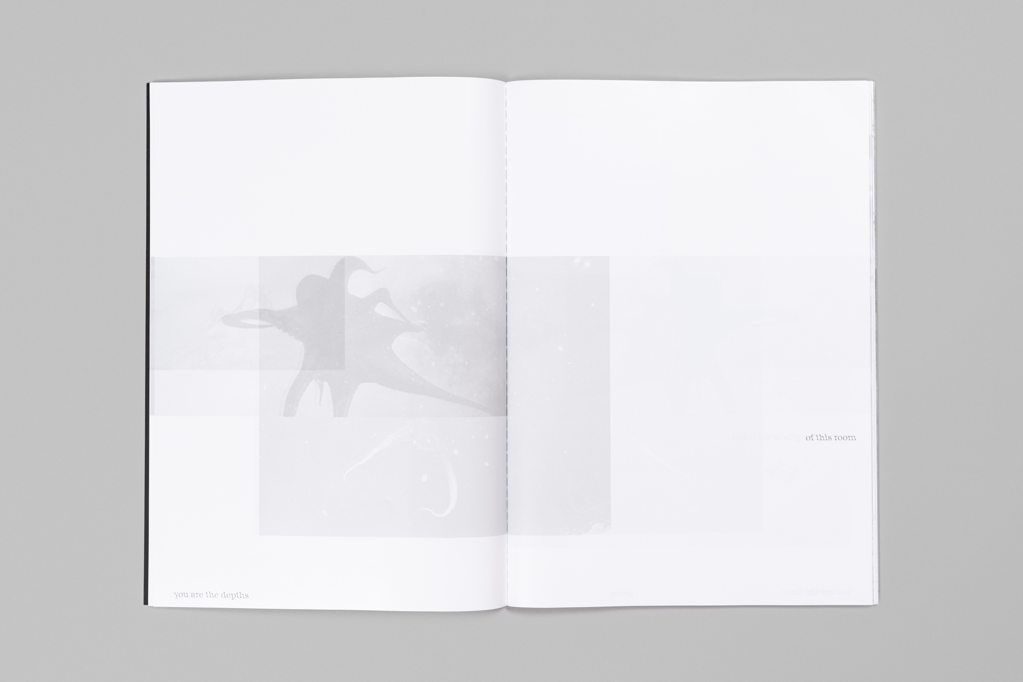
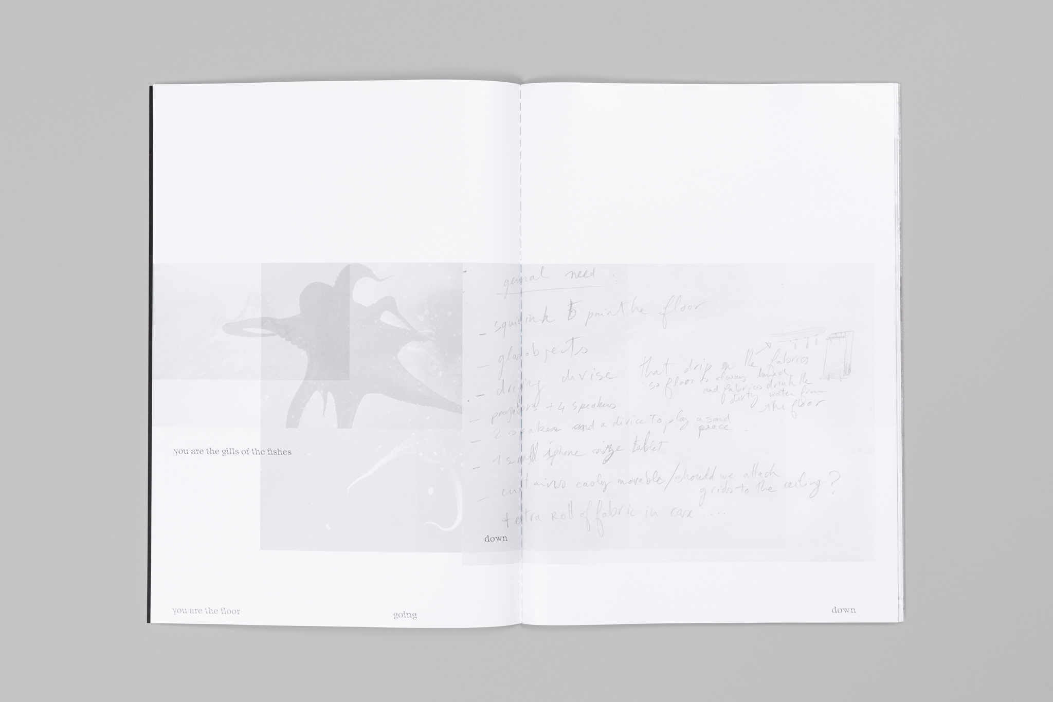
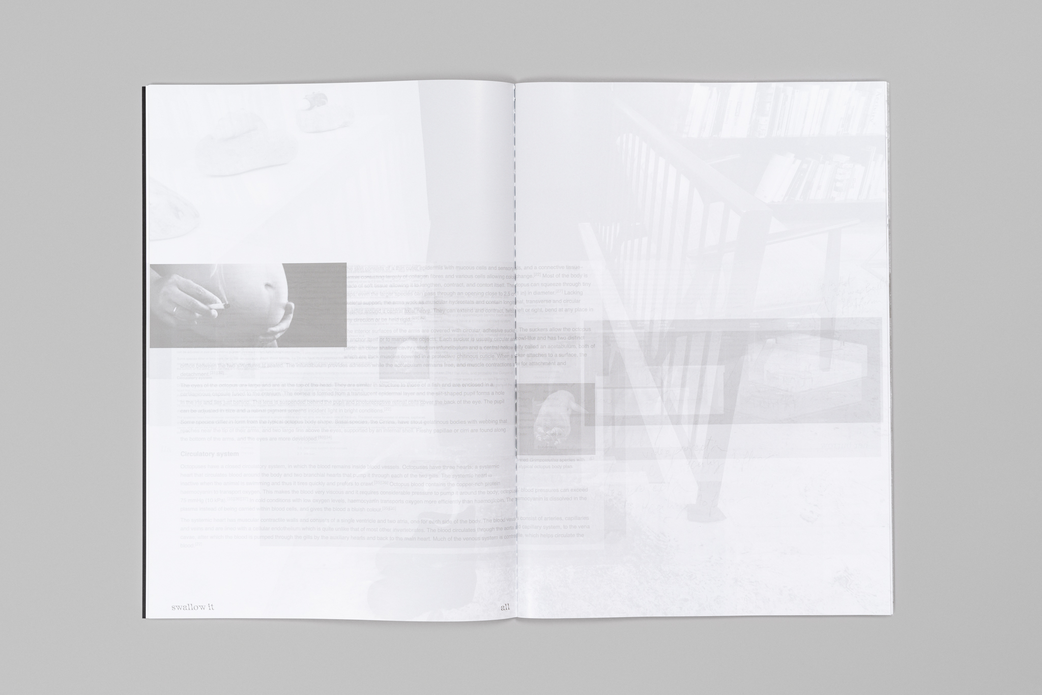
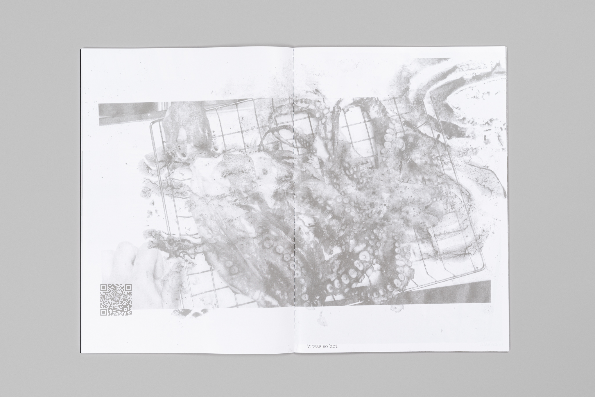
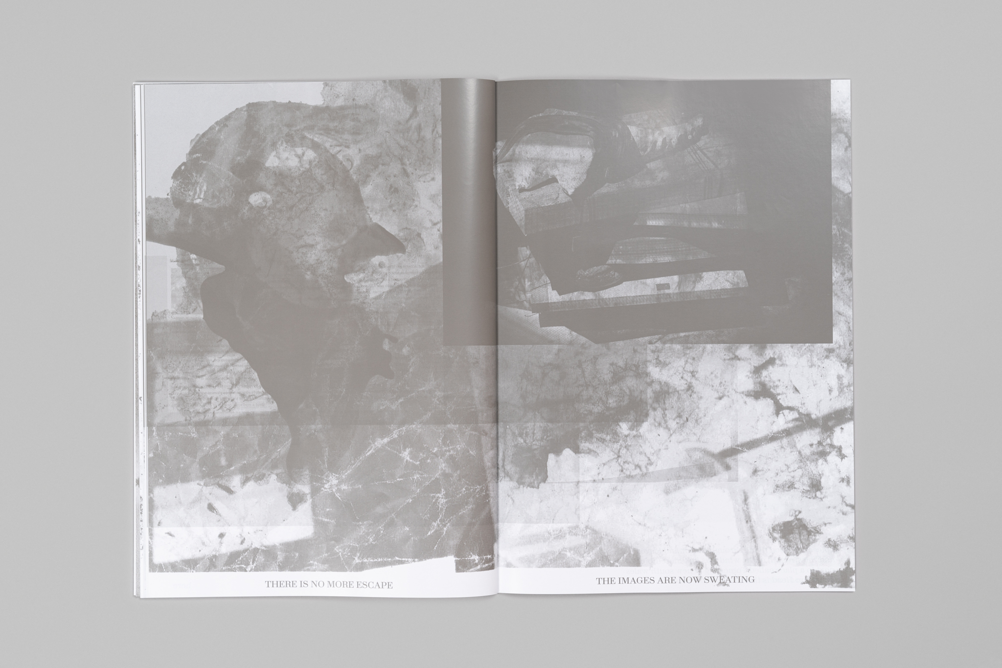
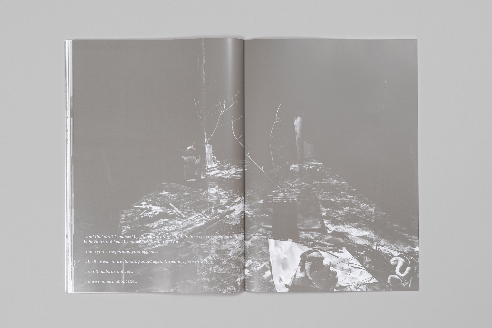
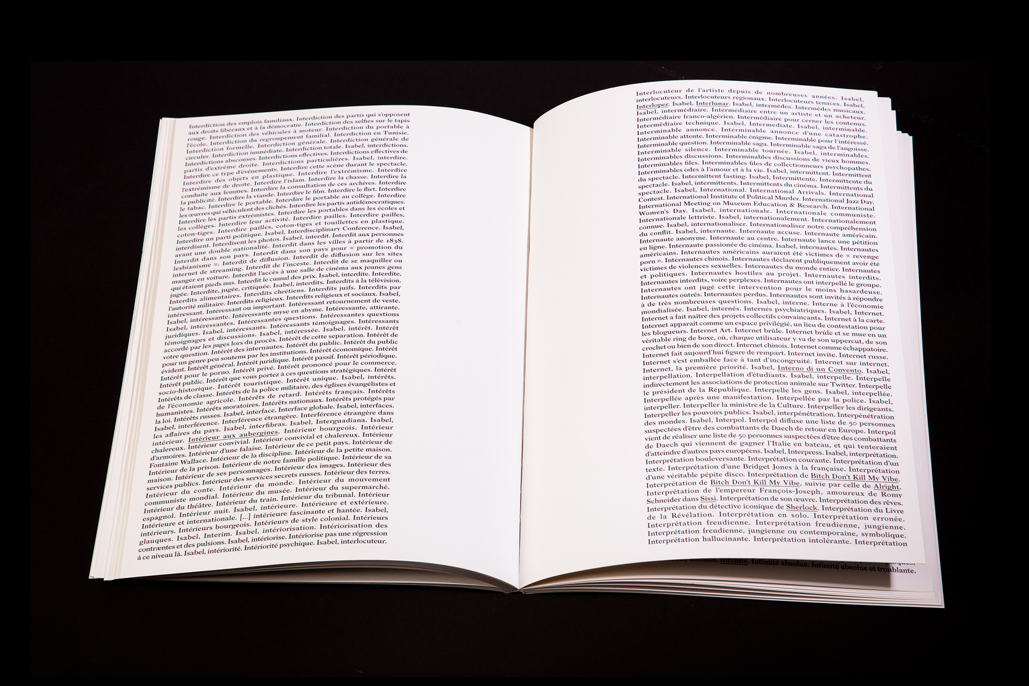
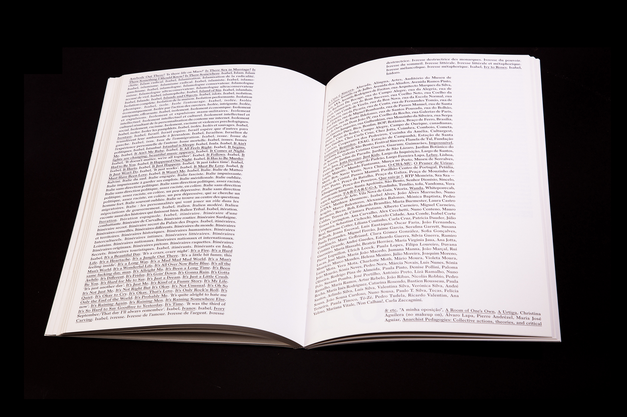
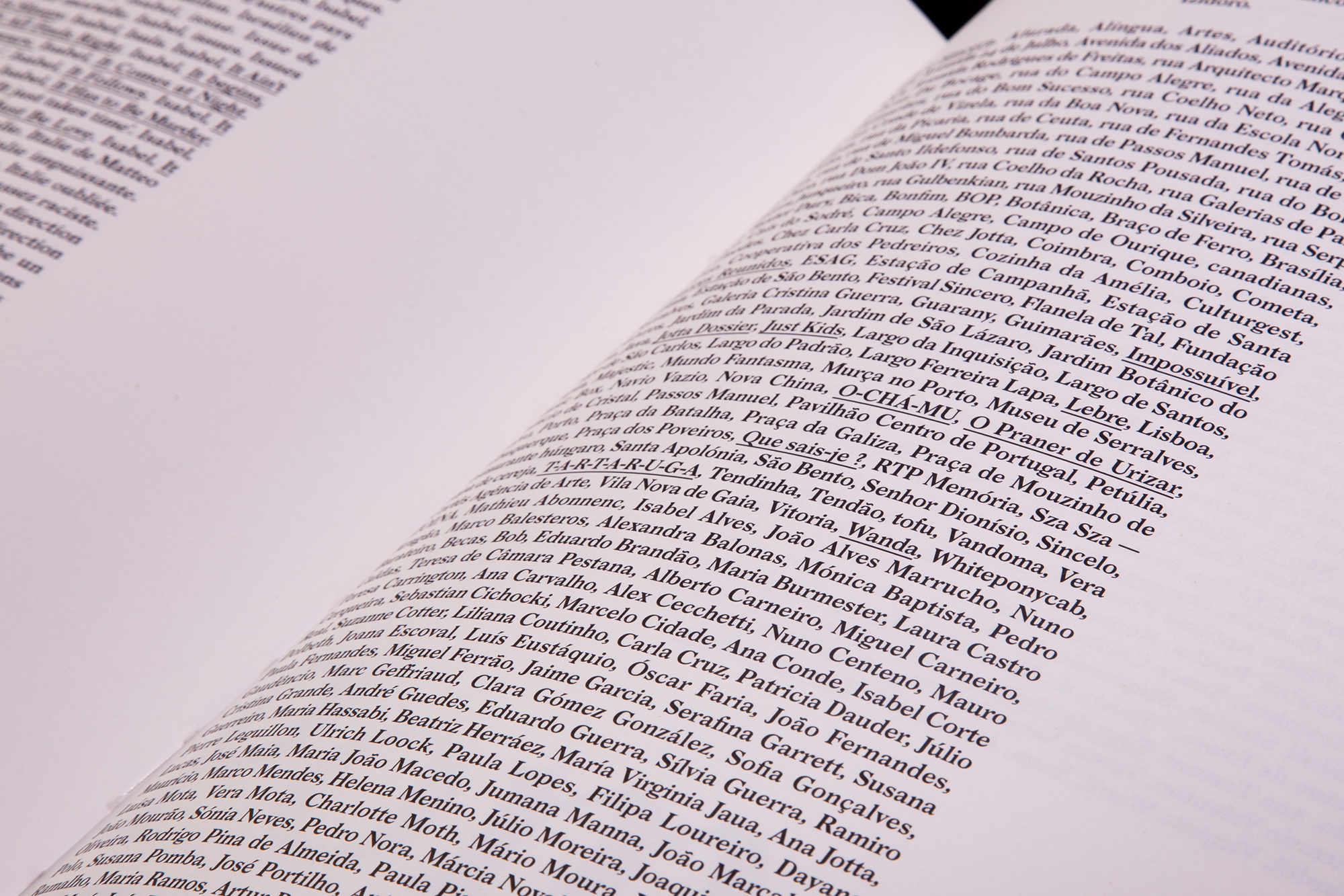
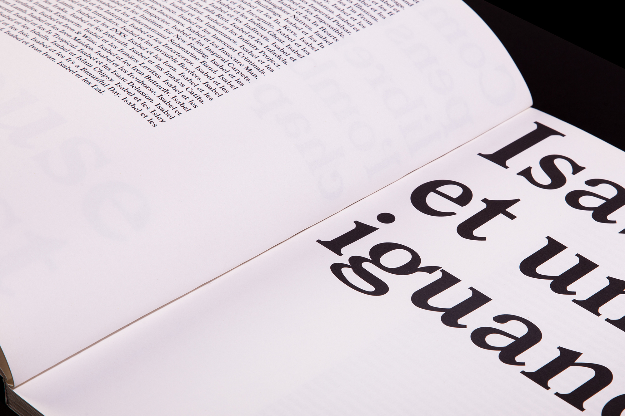
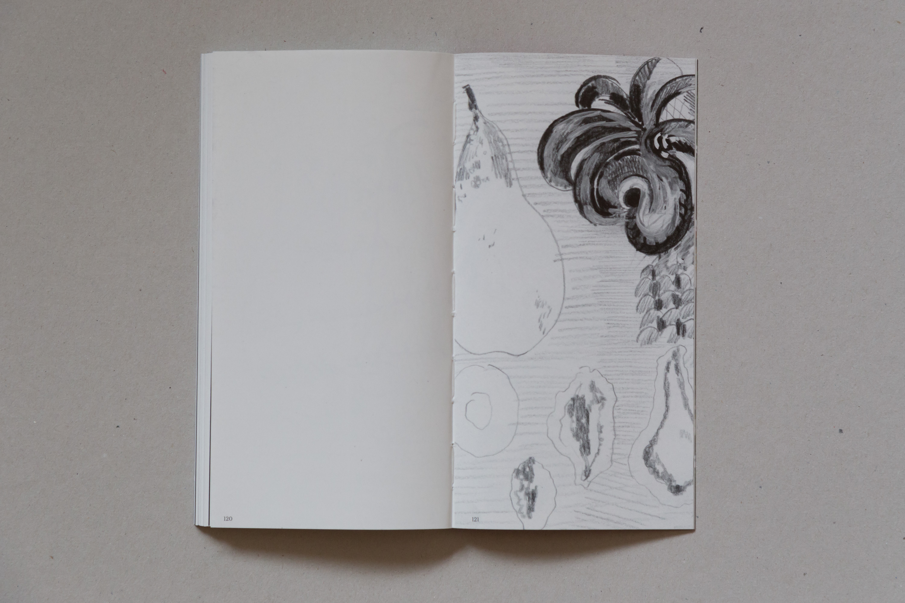
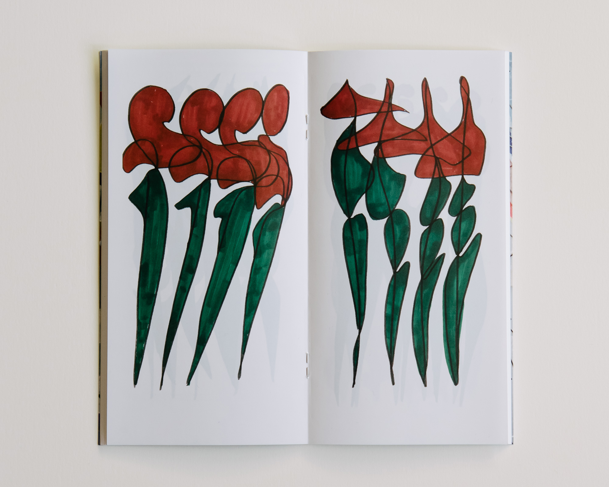
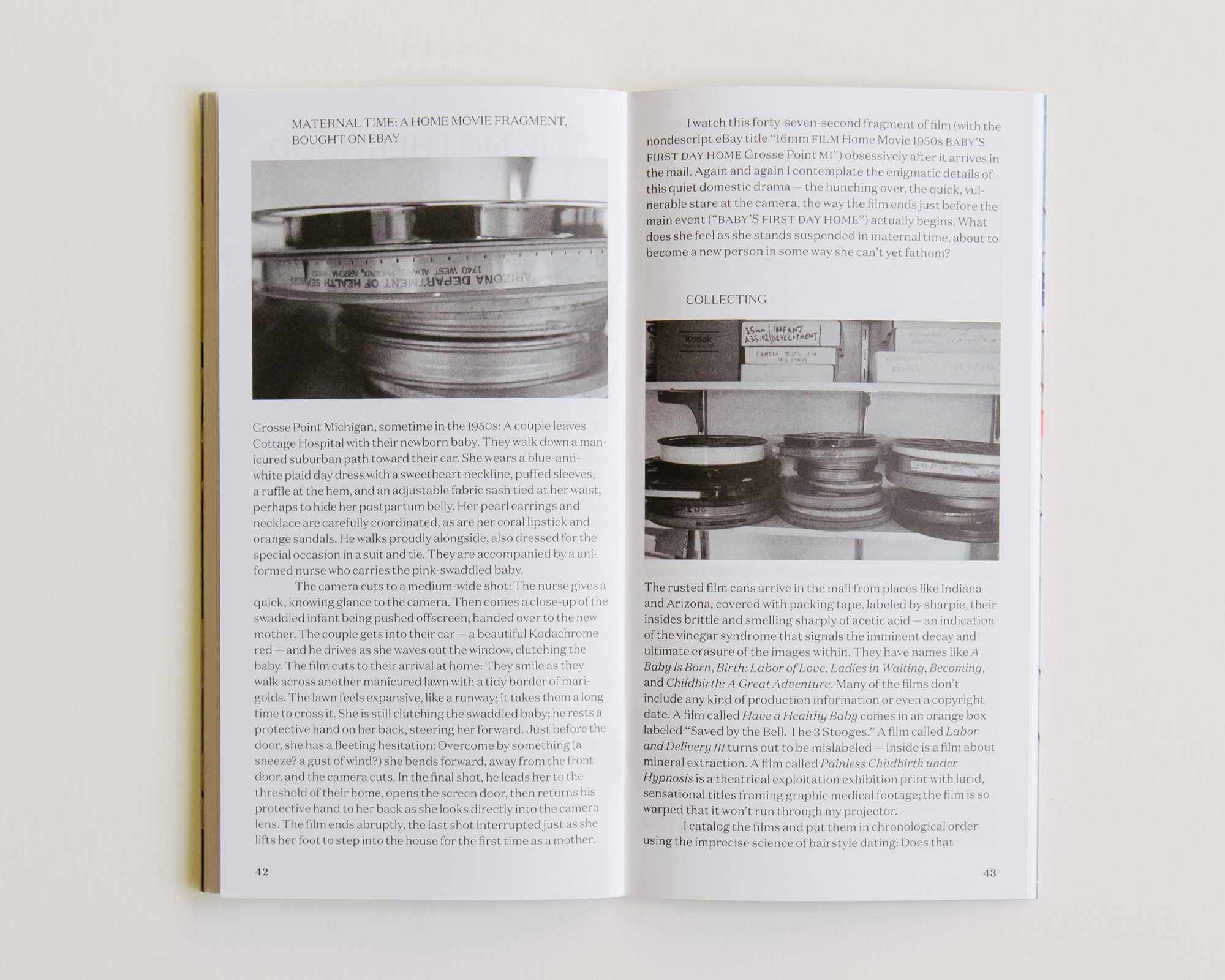
“Melting into one another ho hot chad it heating dip”, an artist book by Laure Prouvost, published by Kunsthalle Lissabon.
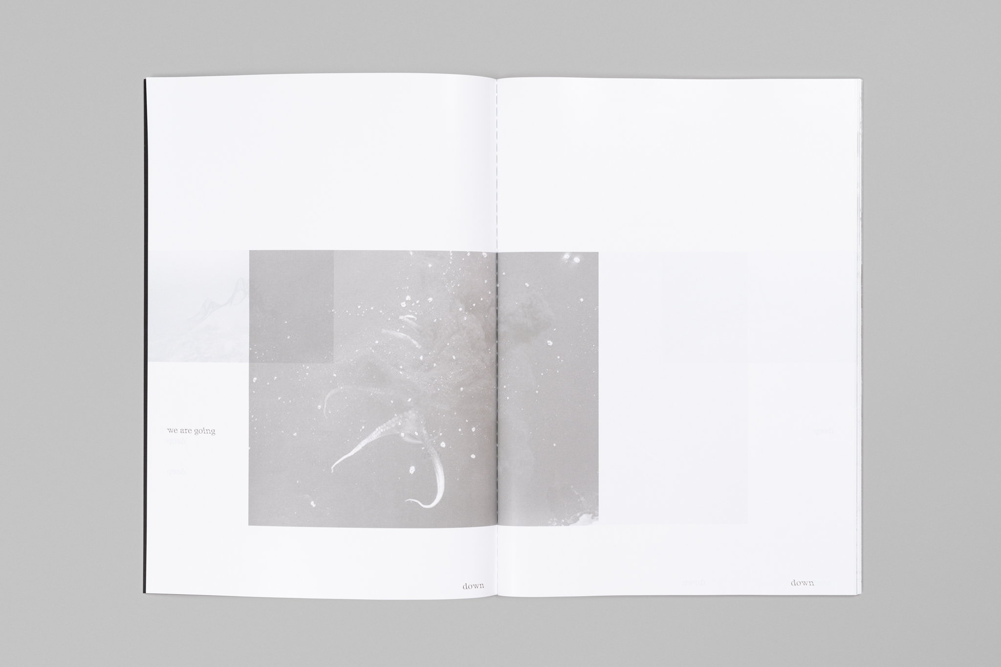
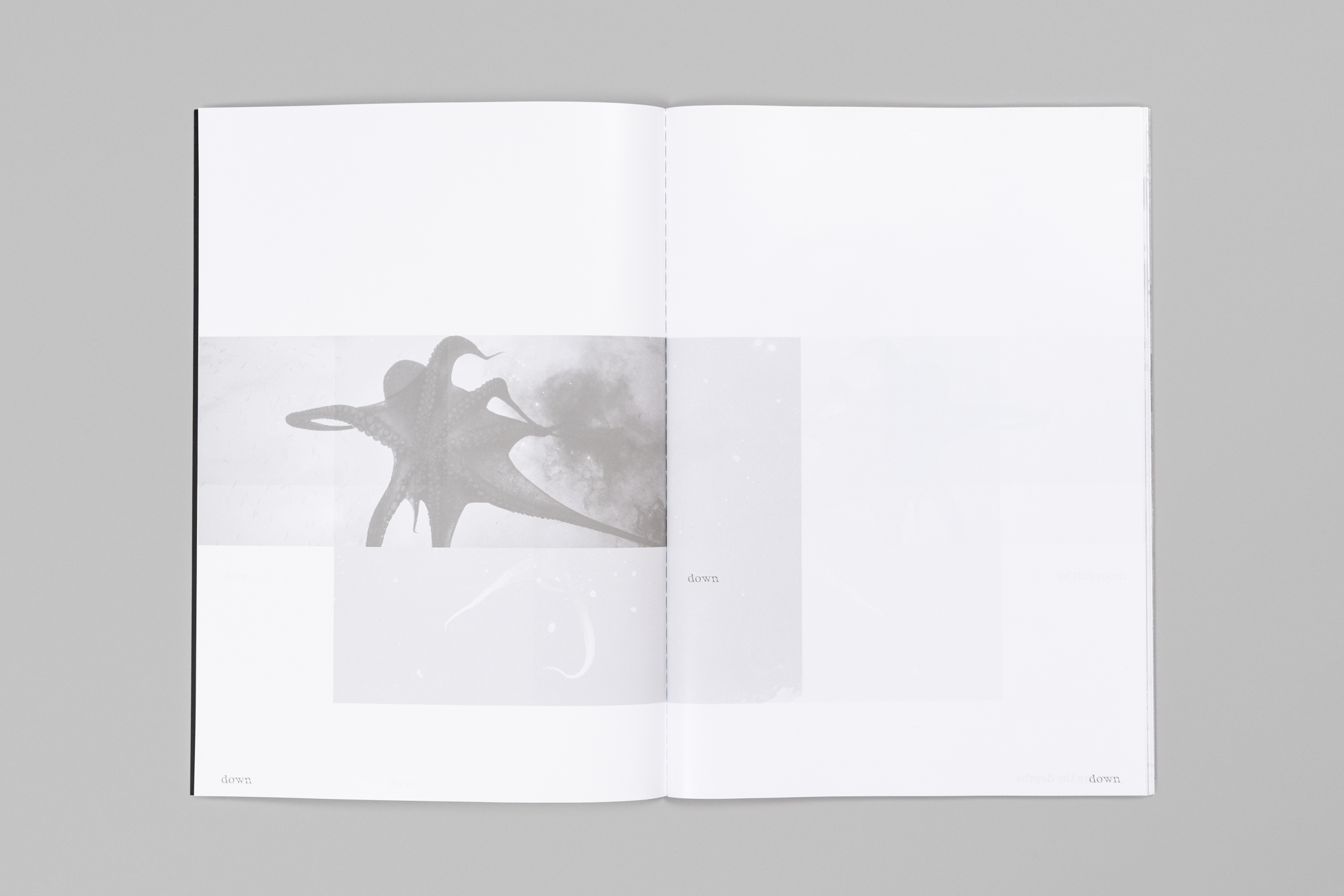
The spreads were divided into three parts horizontally: the top was the anchor for the images of the exhibition; the left middle part was for reference images; the right middle part for drawings of the pieces and sketches of the space; and the bottom part for the text. The images accumulate on the pages, overlapping each other.
Instead of using offset ink, the book was printed in squid ink, to relate to the exhibition space, which was flooded with it. This gave the book different tones and nuances of color throughout it.
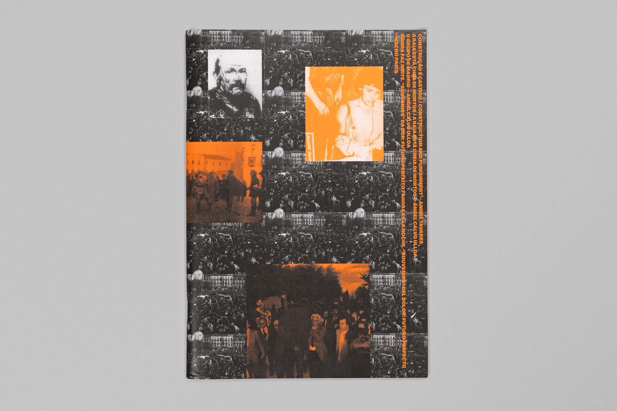
(In) consciência sob um estado de amnésia – movimentos de luta e resistência na cidade do Porto séc. XX
2021
multiple sizes
With Carla Filipe
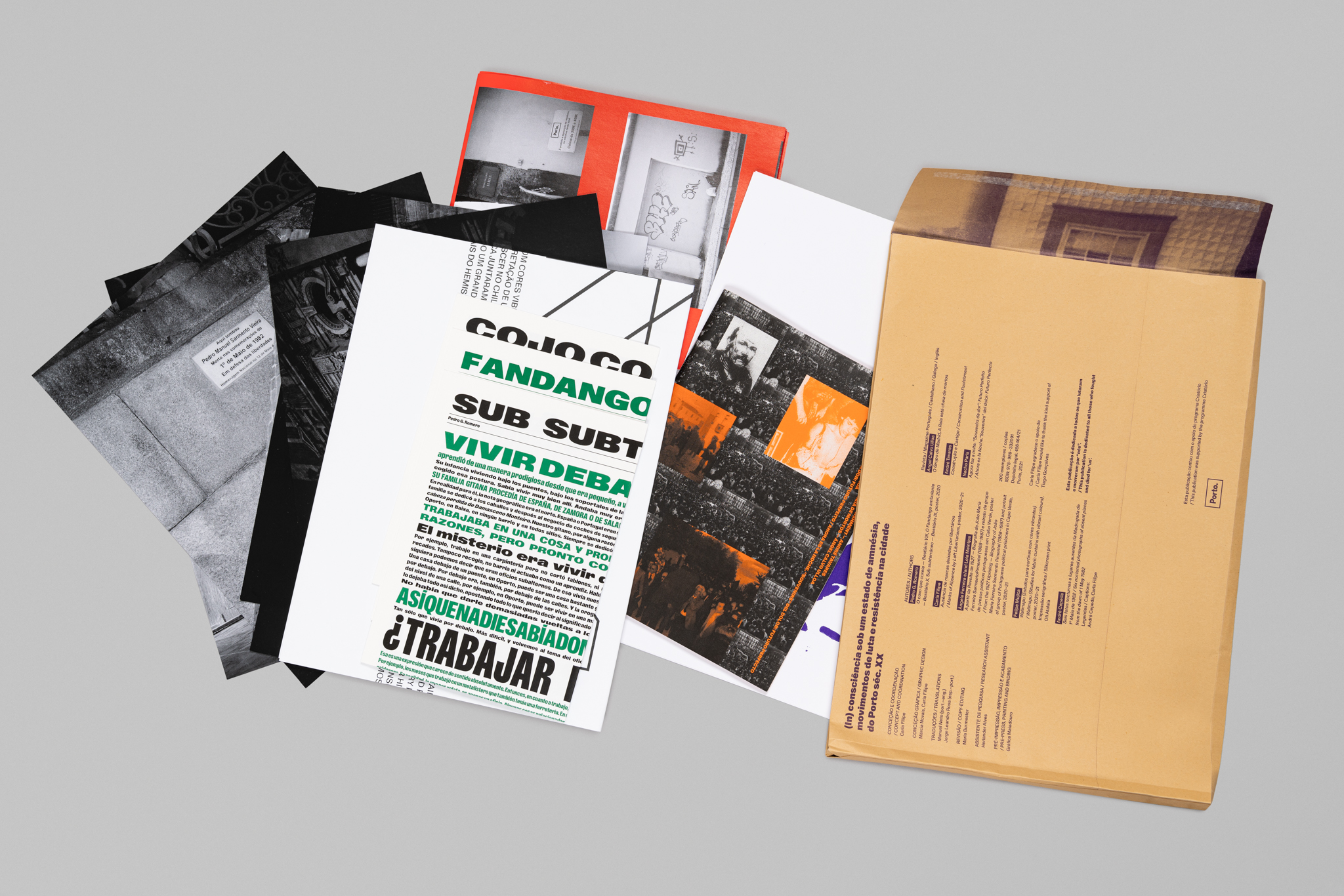
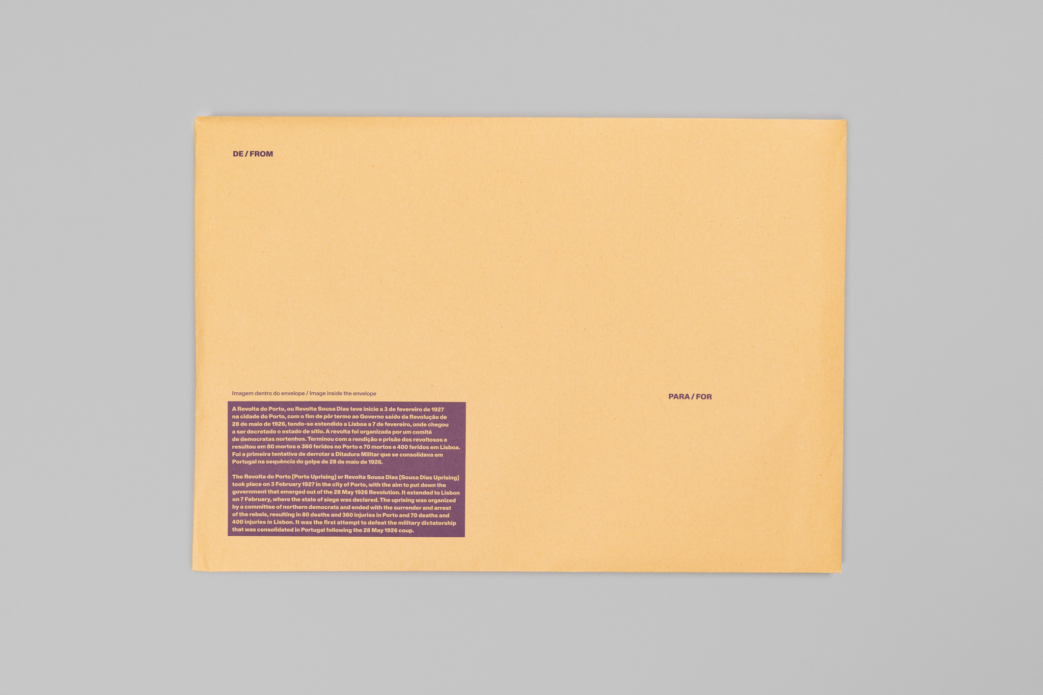
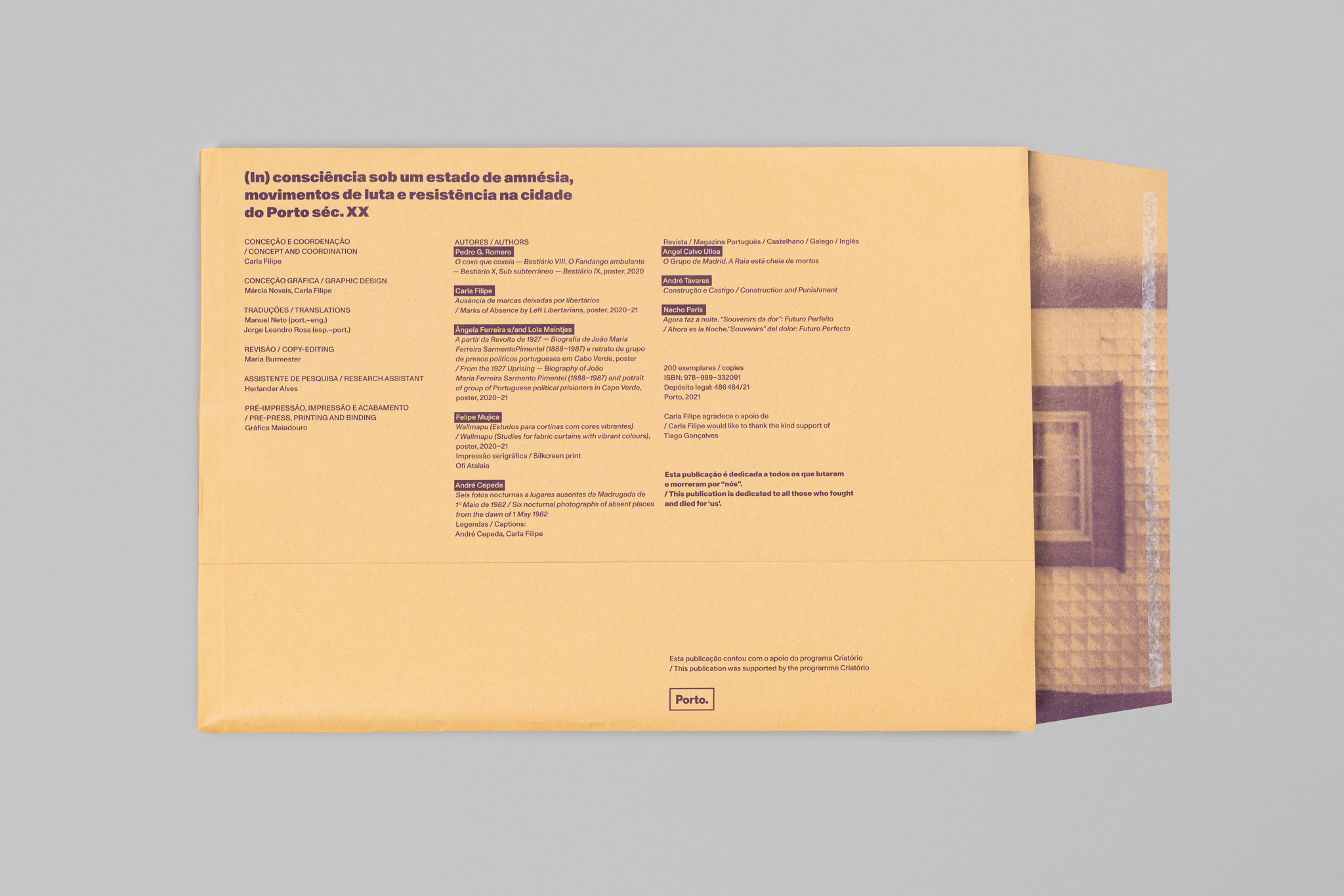
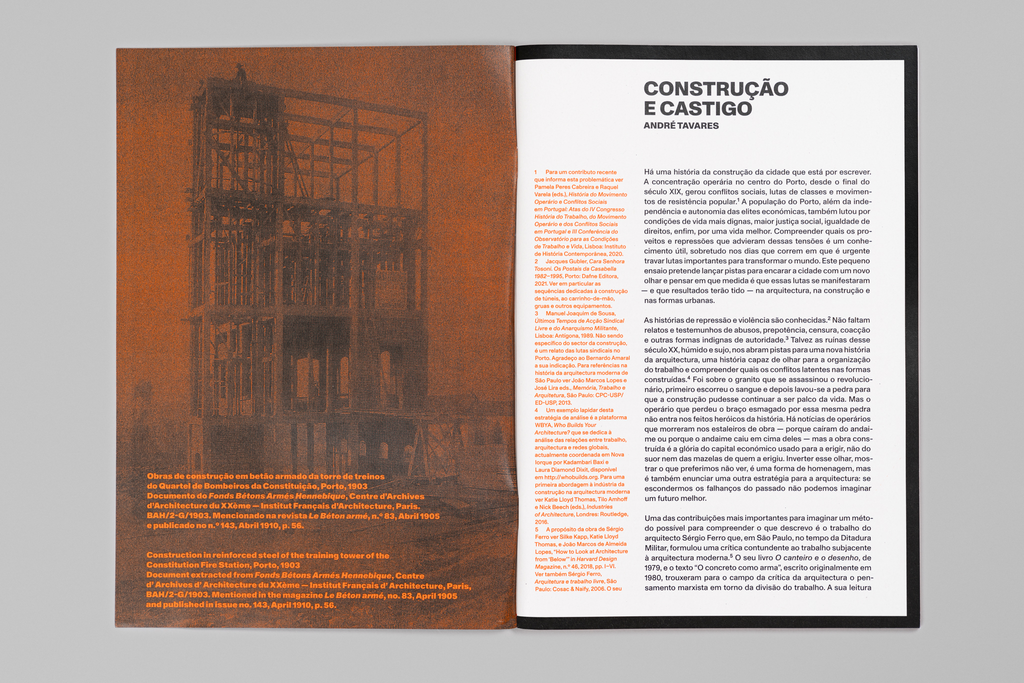
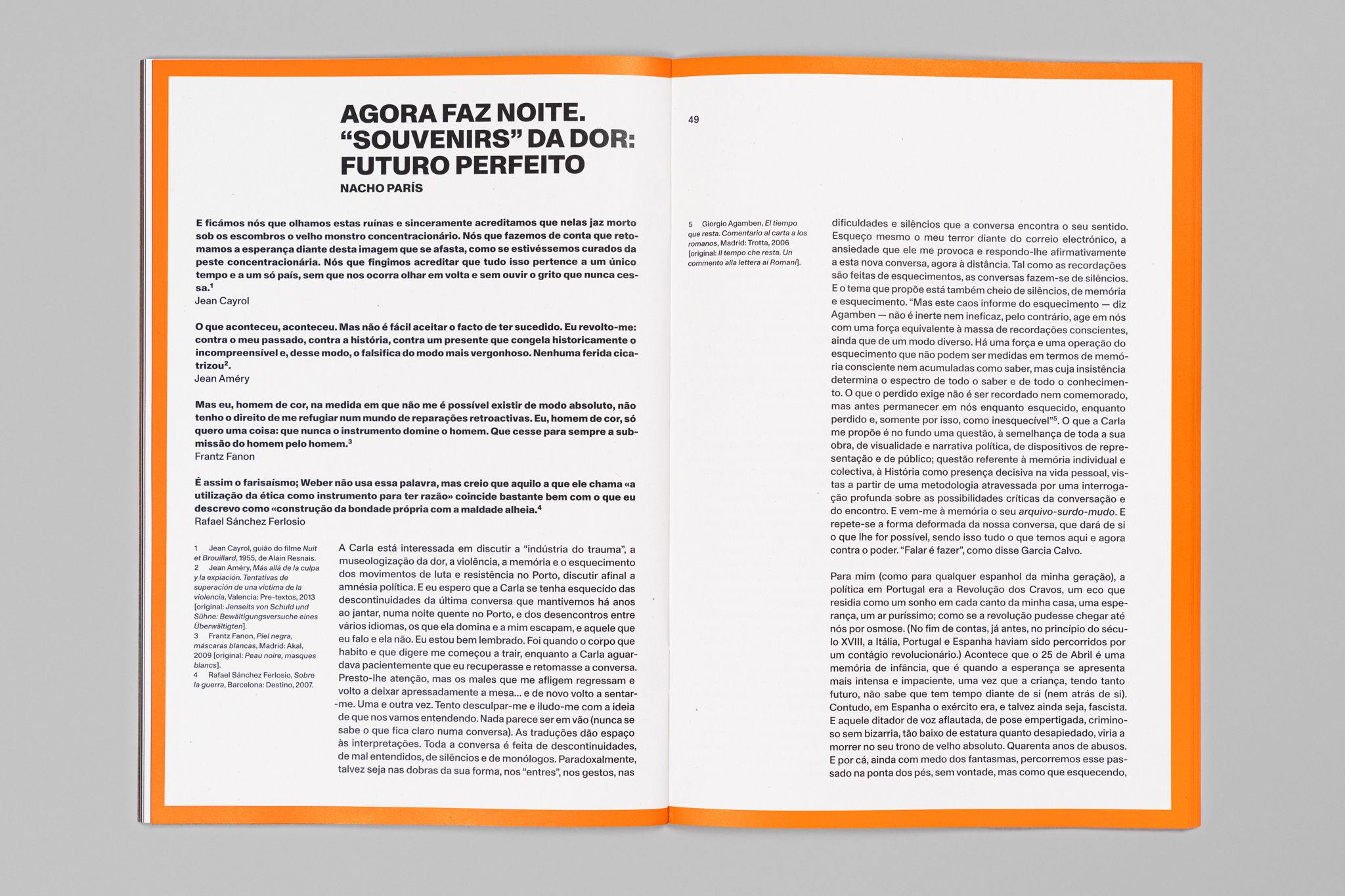
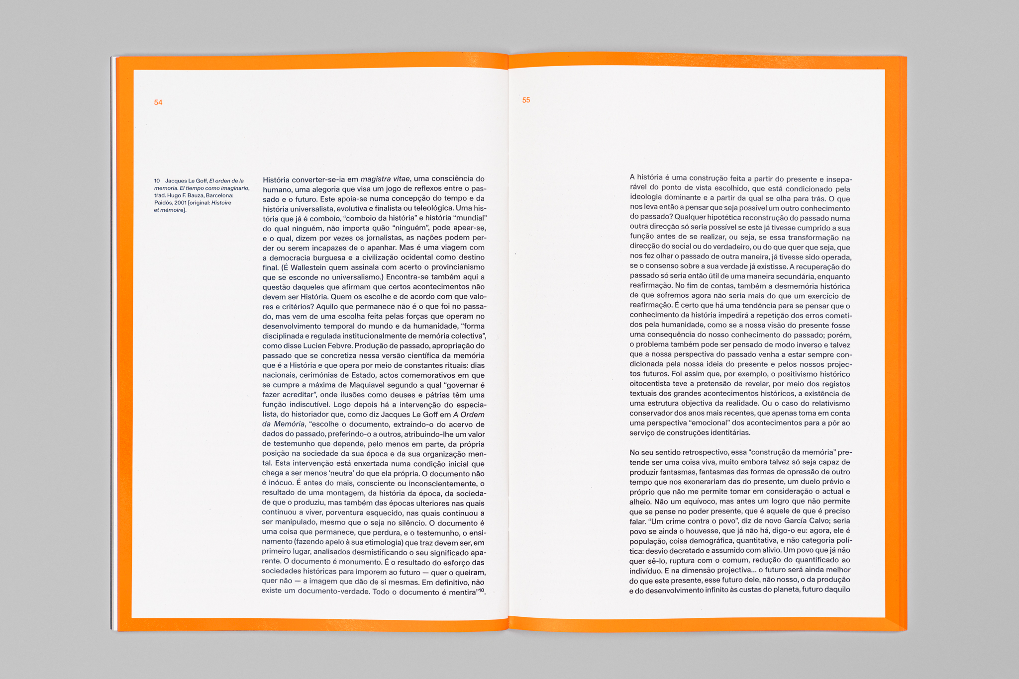
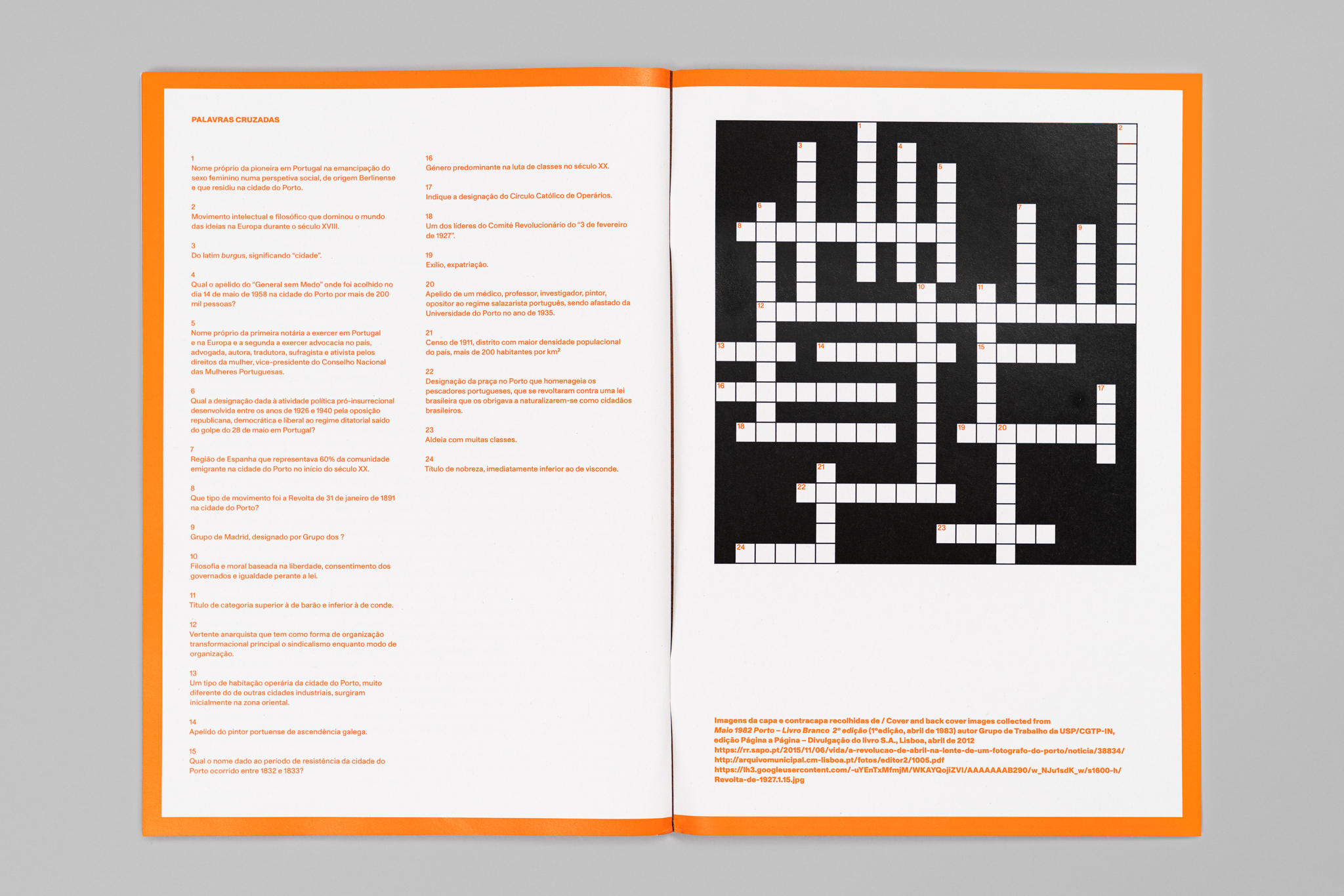
“(In) consciência sob um estado de amnésia – movimentos de luta e resistência na cidade do Porto séc. XX” [(Un) consciousness under a state of amnesia – movements of struggle and resistance in the city of Porto century. XX] is a mail-art publication conceived by Carla Filipe with whom I collaborated on the graphic design.
The focus is on the political and resistance events in the history of the city of Porto considered to be the most relevant in the late 19th century, early 20th century, the pre- and post-Republic, and post-Carnation Revolution periods.
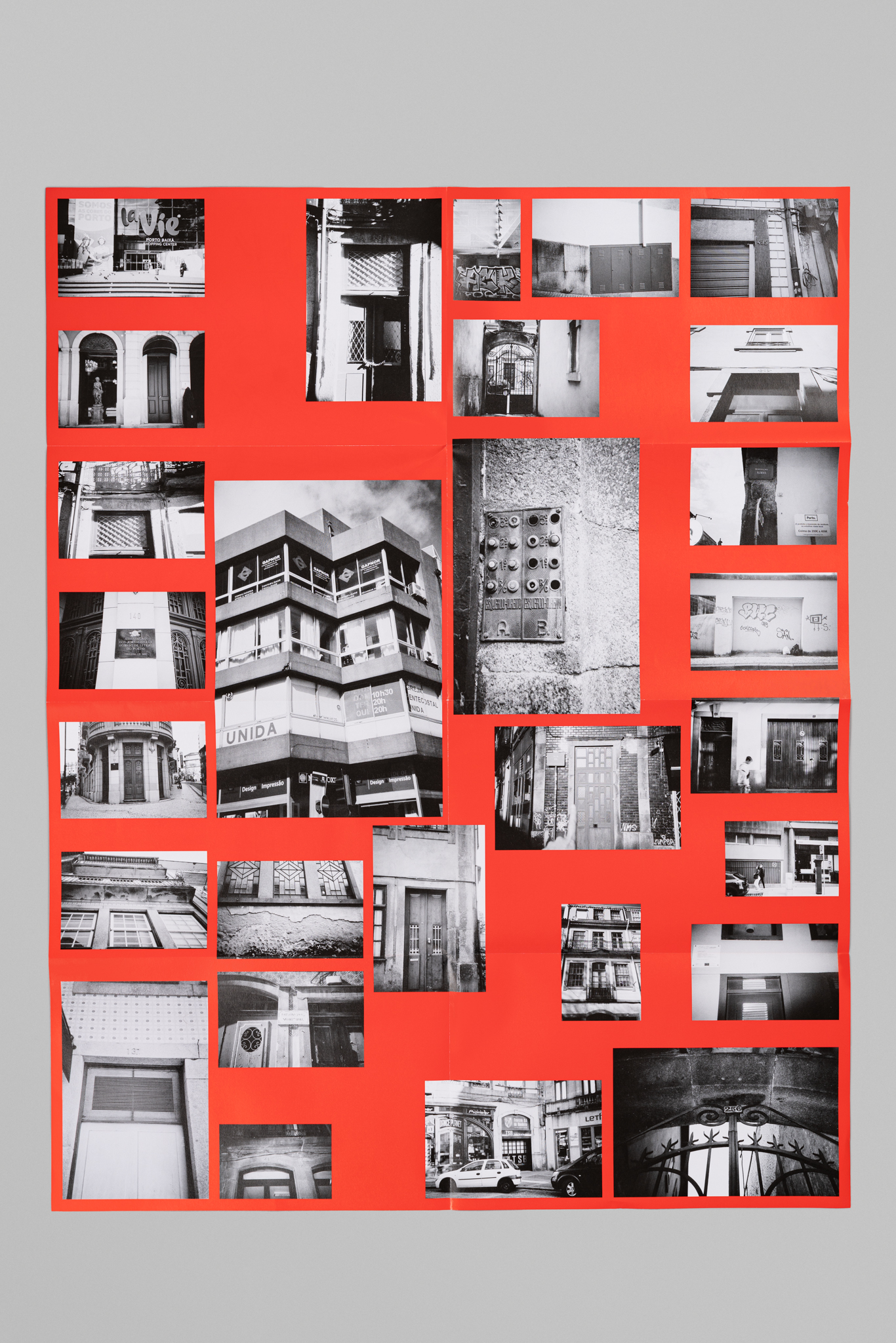
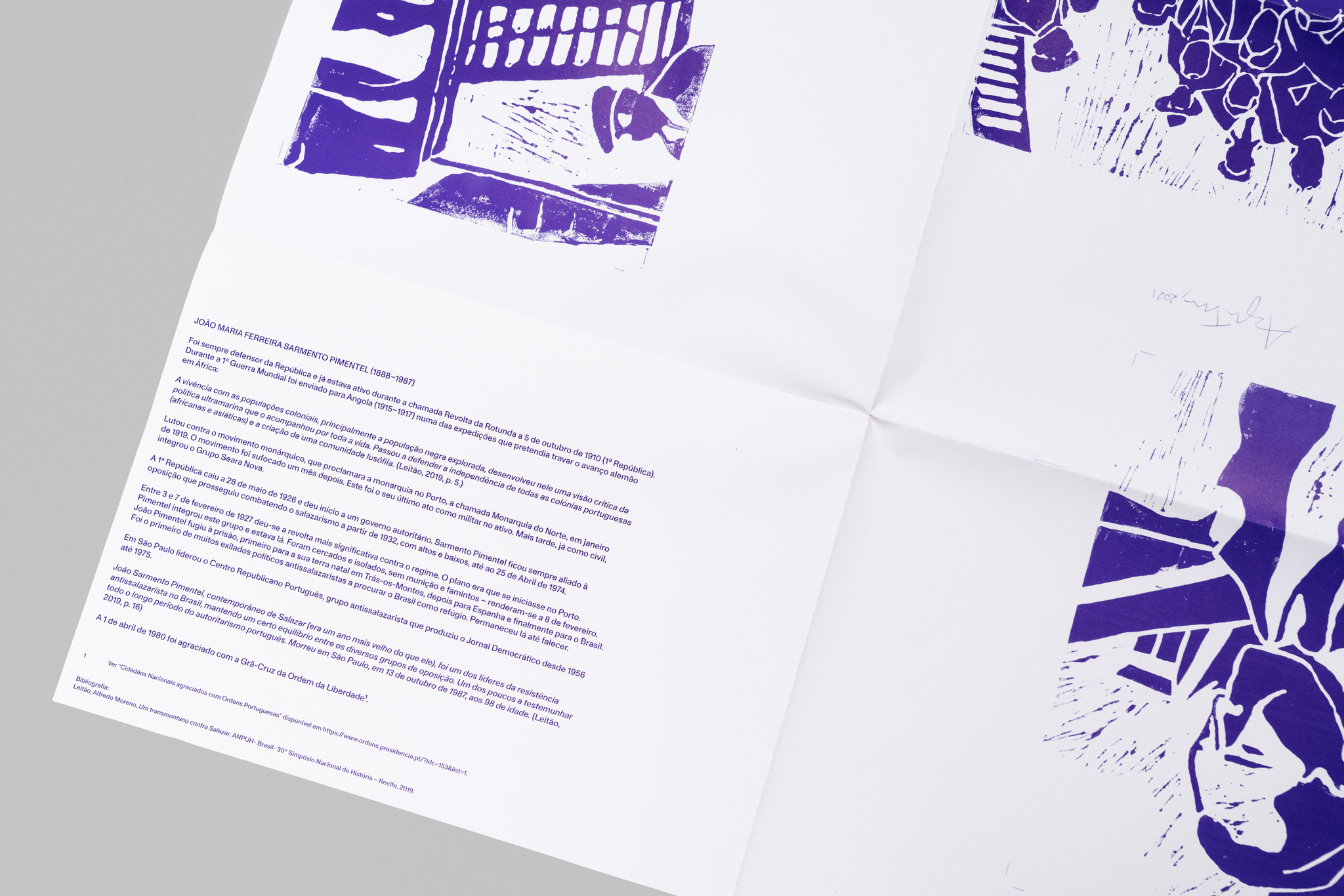
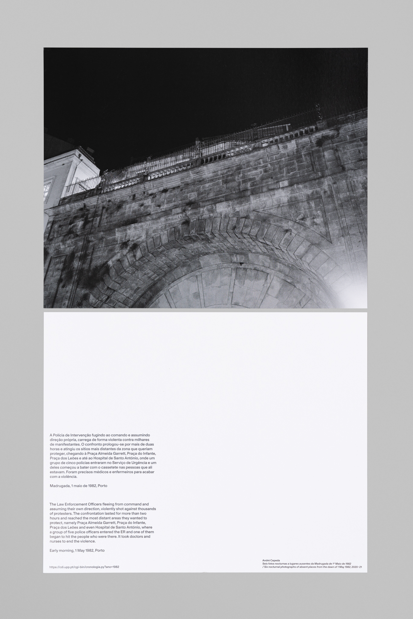
This project has several collaborations, with different formats and content. Carla and I decided to work with solid colors and bold photographs, that refer to her archive, composed by many publications and political ephemera from the years immediately after the Carnation Revolution in Portugal.
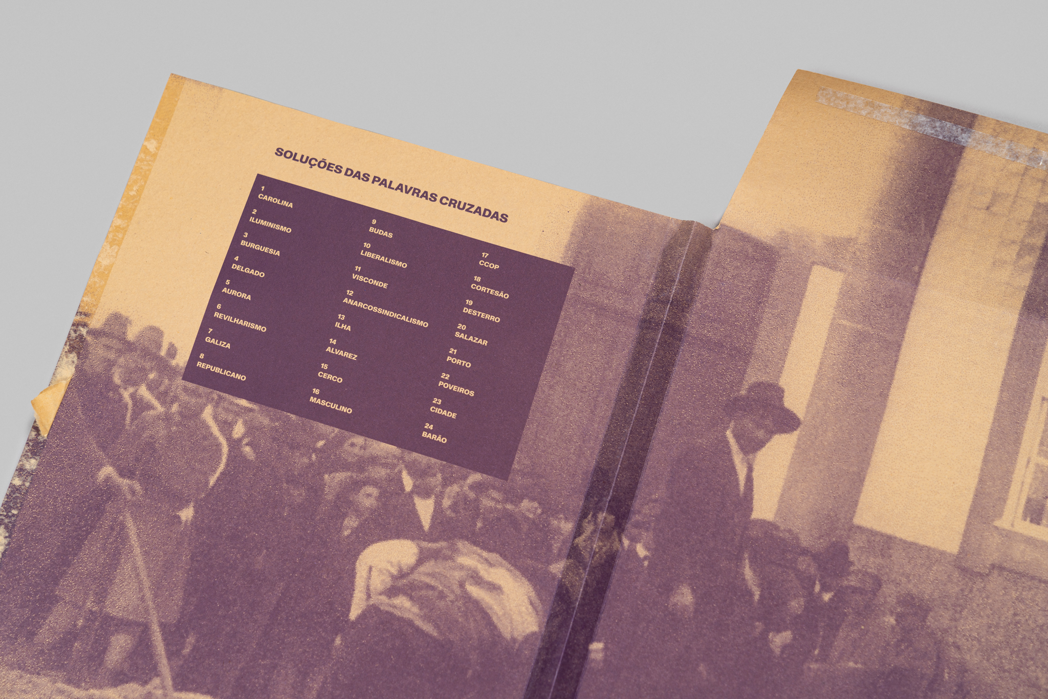
We end up with a poster by Ângela Ferreira and Lola Meintjes, six photographs by André Cepeda, a poster by Carla, a flag by Felipe Mujica, three posters by Pedro Romero, a publication with contributions of André Tavares, Angel Calvo Ulloa, and Nacho París. The envelope was printed outside and inside, where it has the solution for the crosswords Carla and I designed for the publication.
Irradiação Vieira
2021
210 × 260 mm
Client: Fundação Ilídio Pinho
Assisted by Miguel Filipe Ferreira
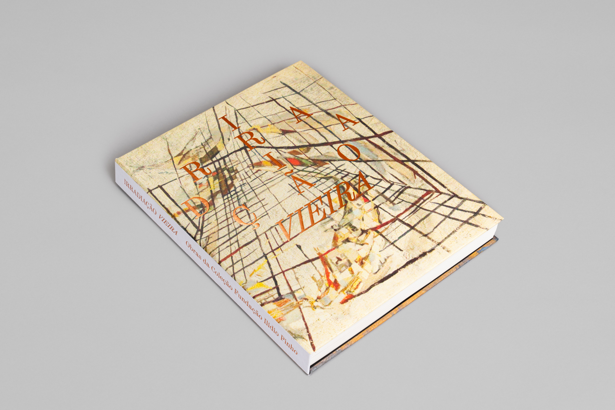
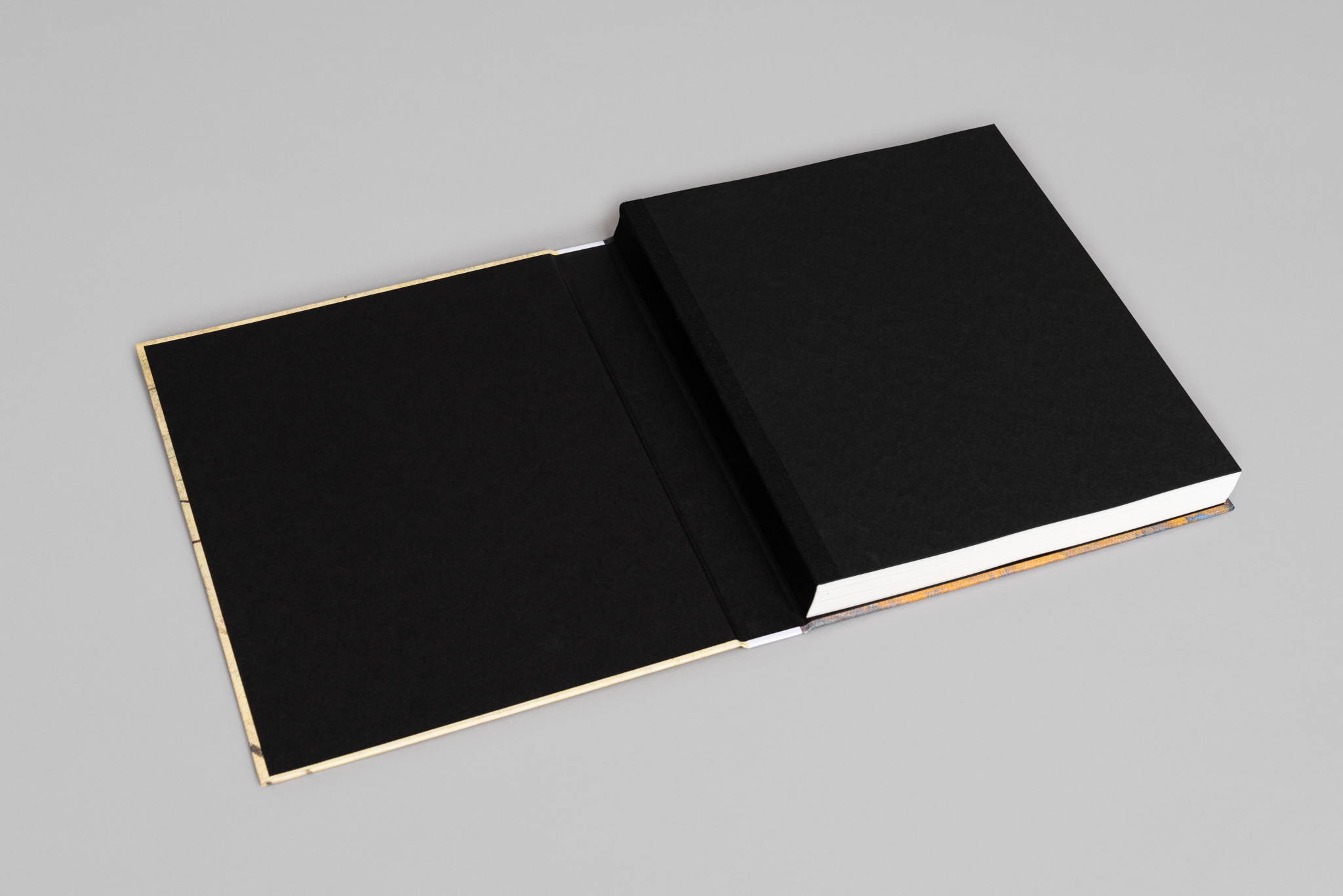
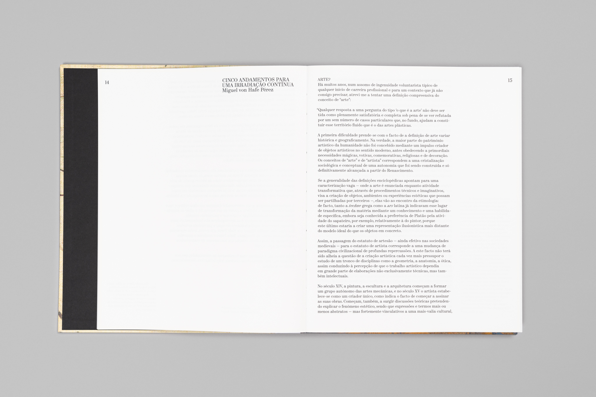
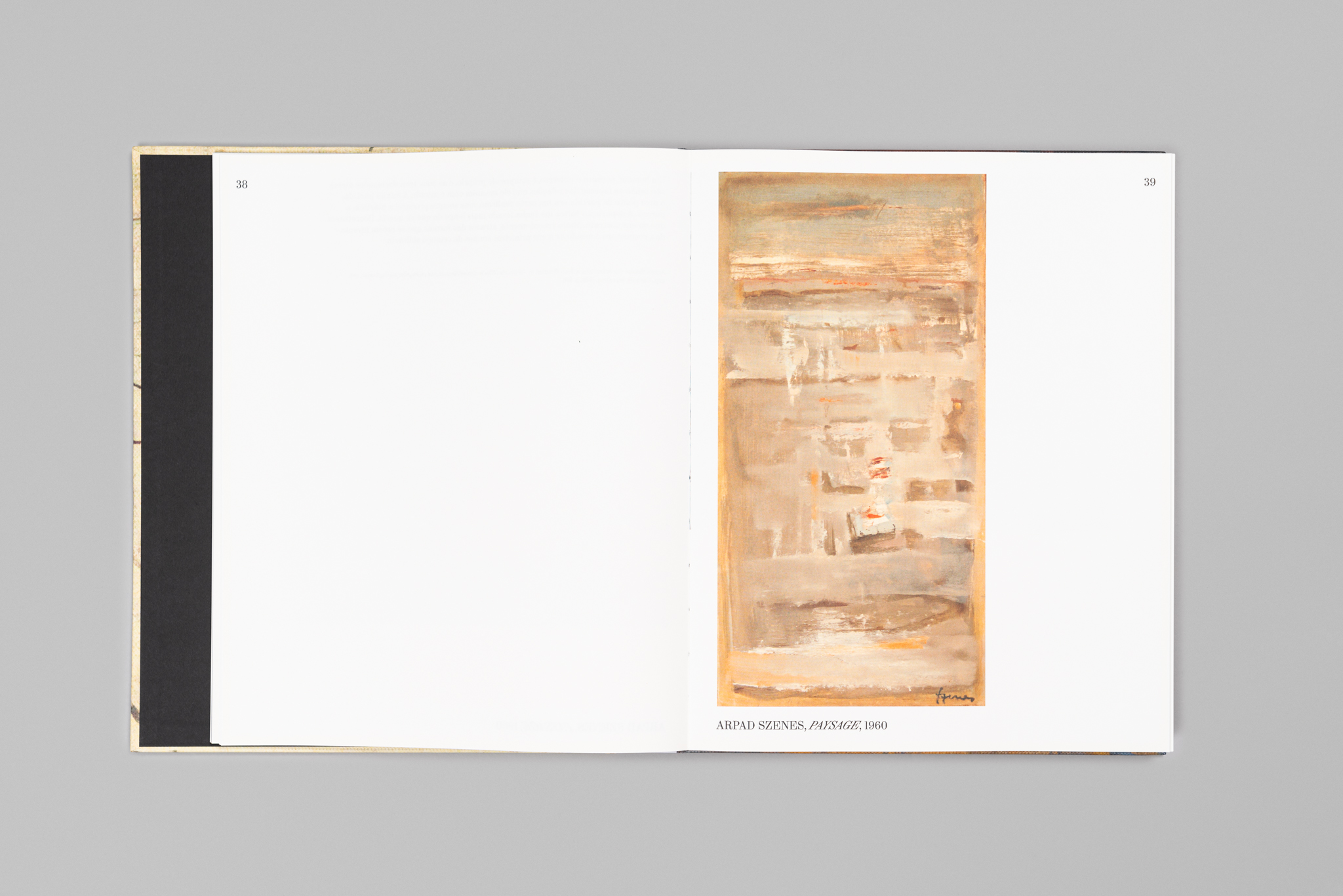
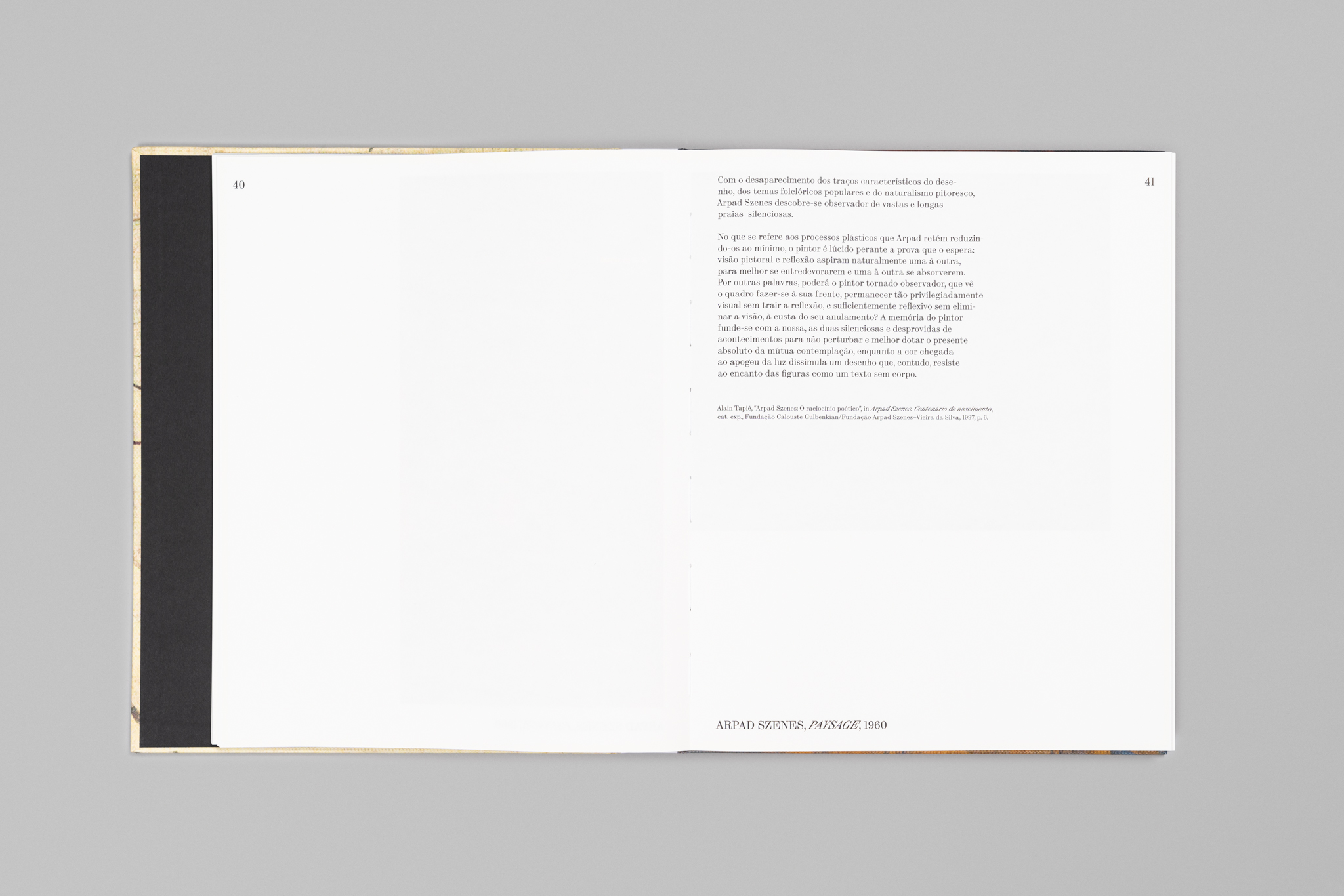
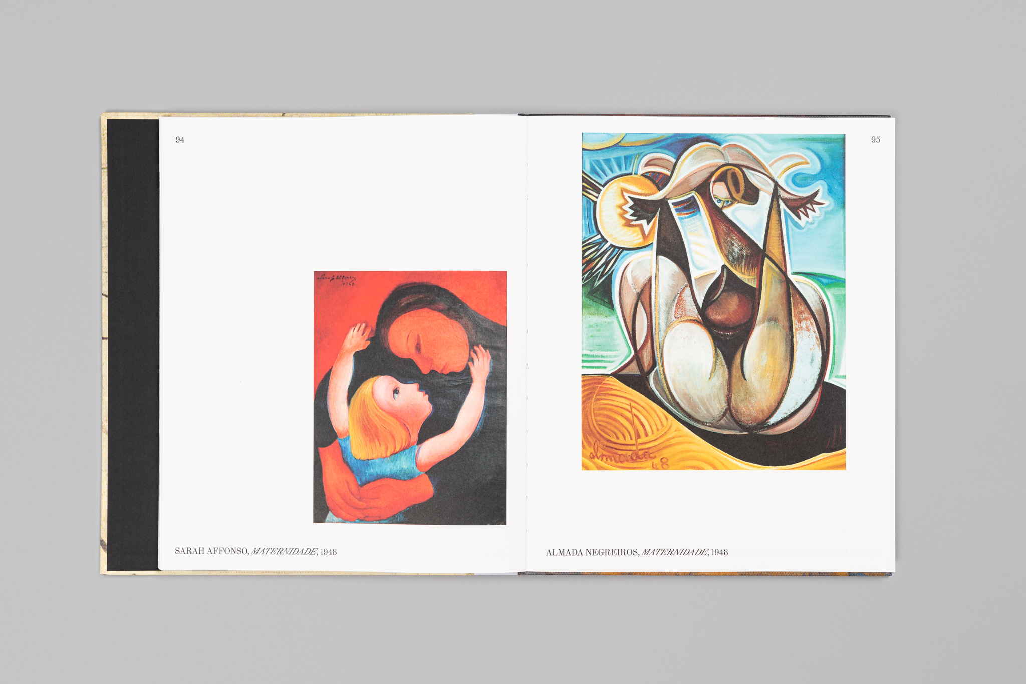
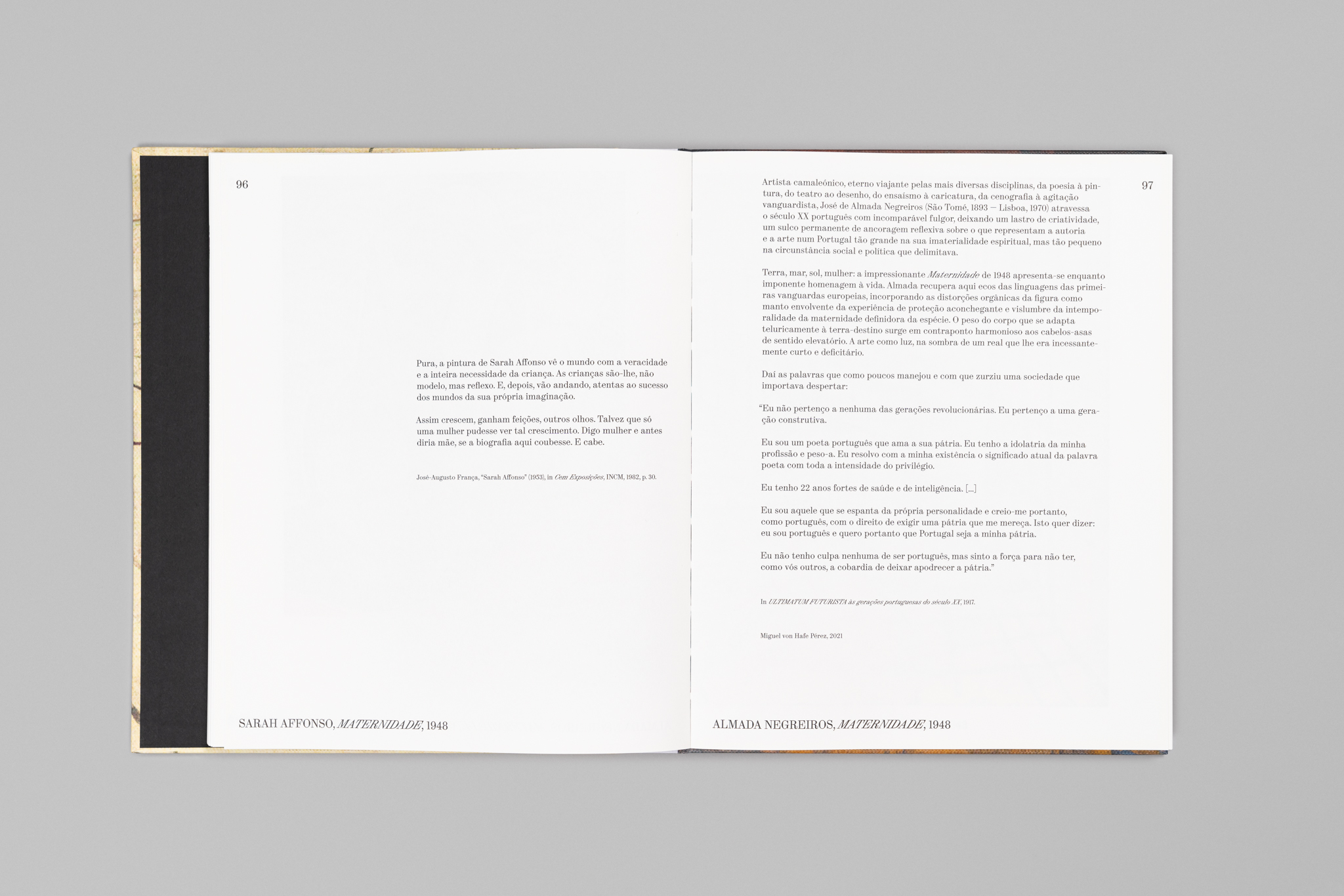
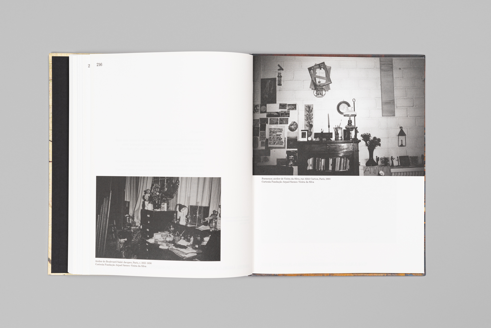
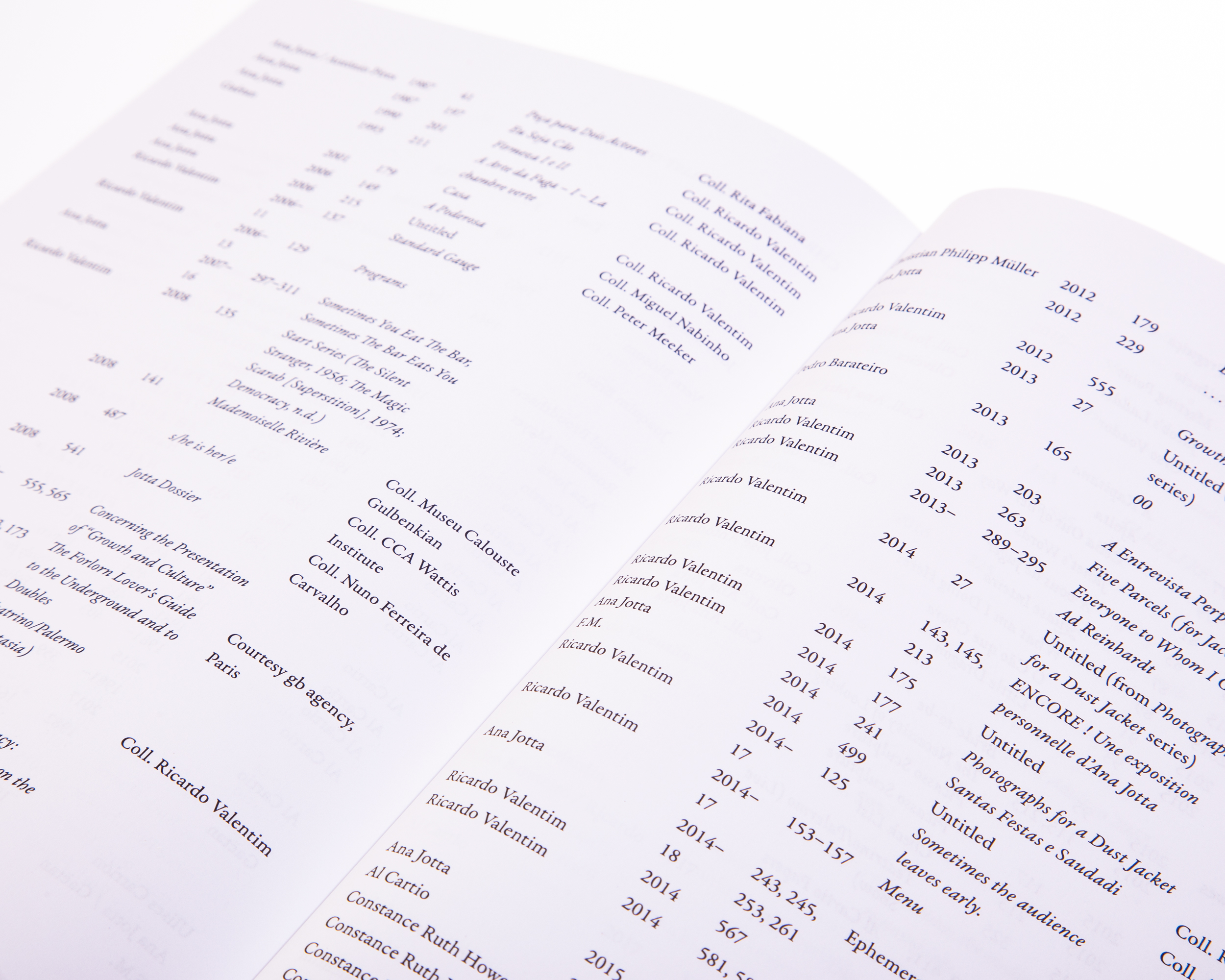
Irradiação Vieira is the catalogue of the exhibition that Miguel von Hafe Pérez curated at Museu Arpad Szenes–Vieira da Silva, from the art collection of Fundação Ilídio Pinho.
The relationship between the sizes of the texts that accompany the works on the show is based on the width of the column: the grid expands and shrinks.
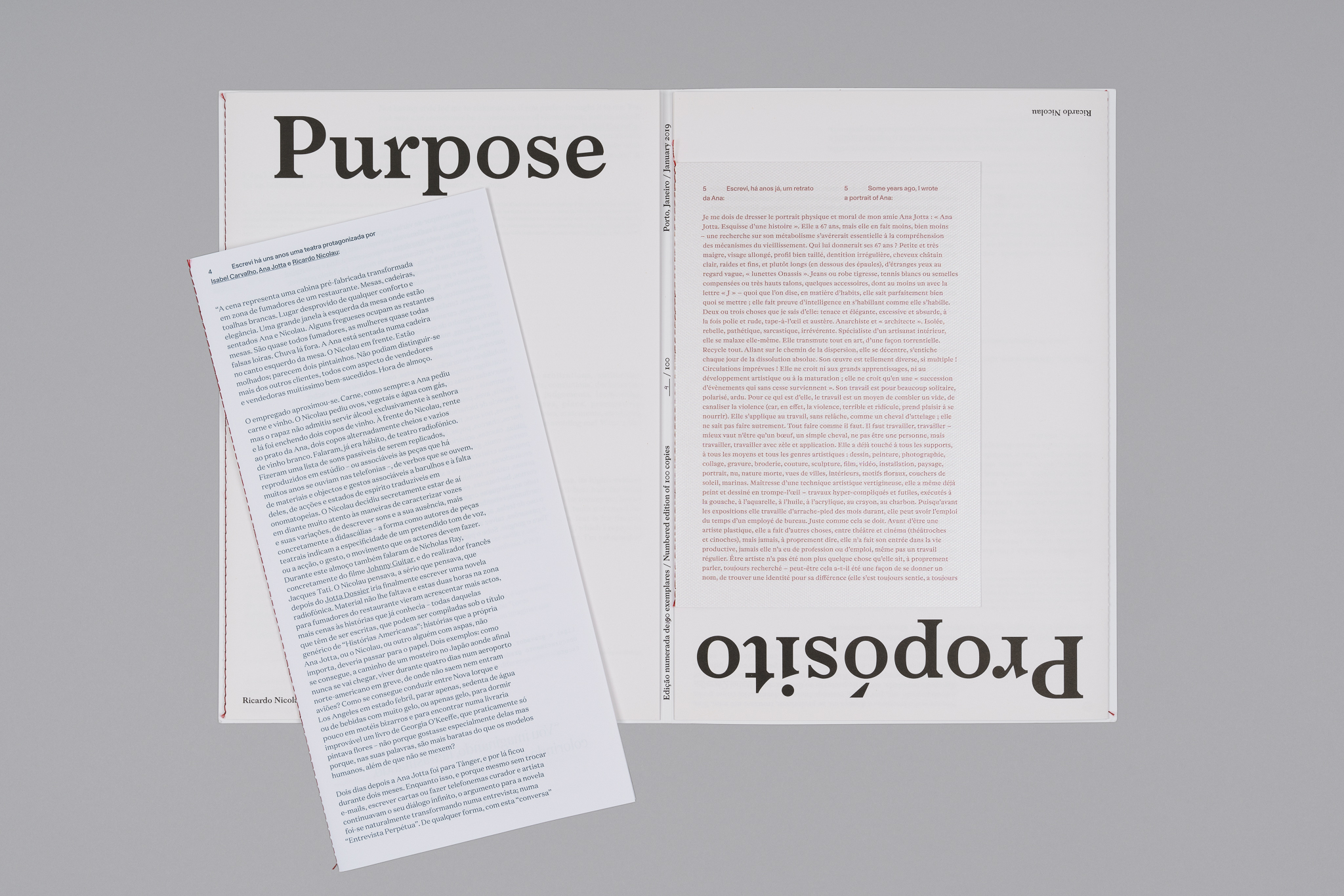
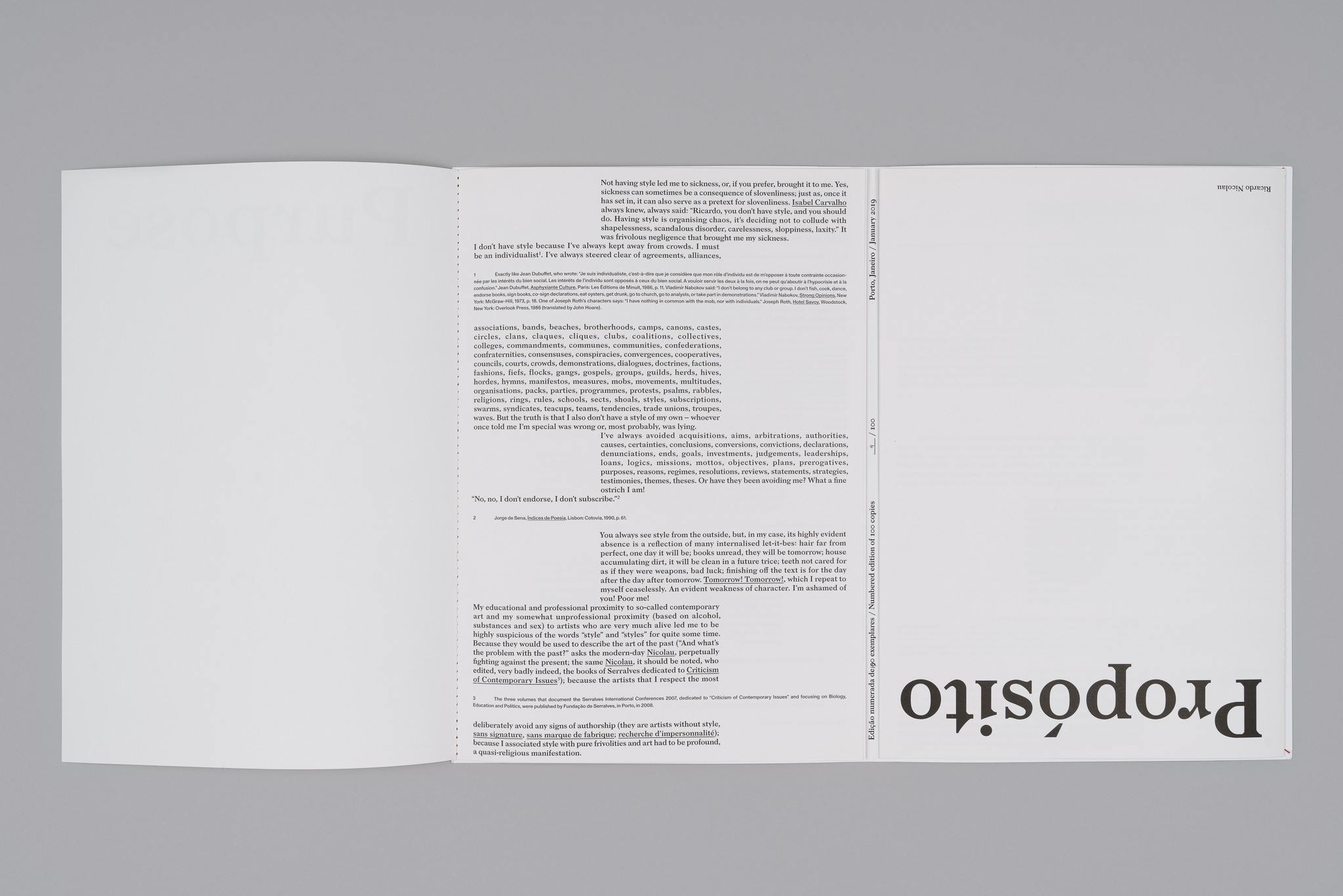
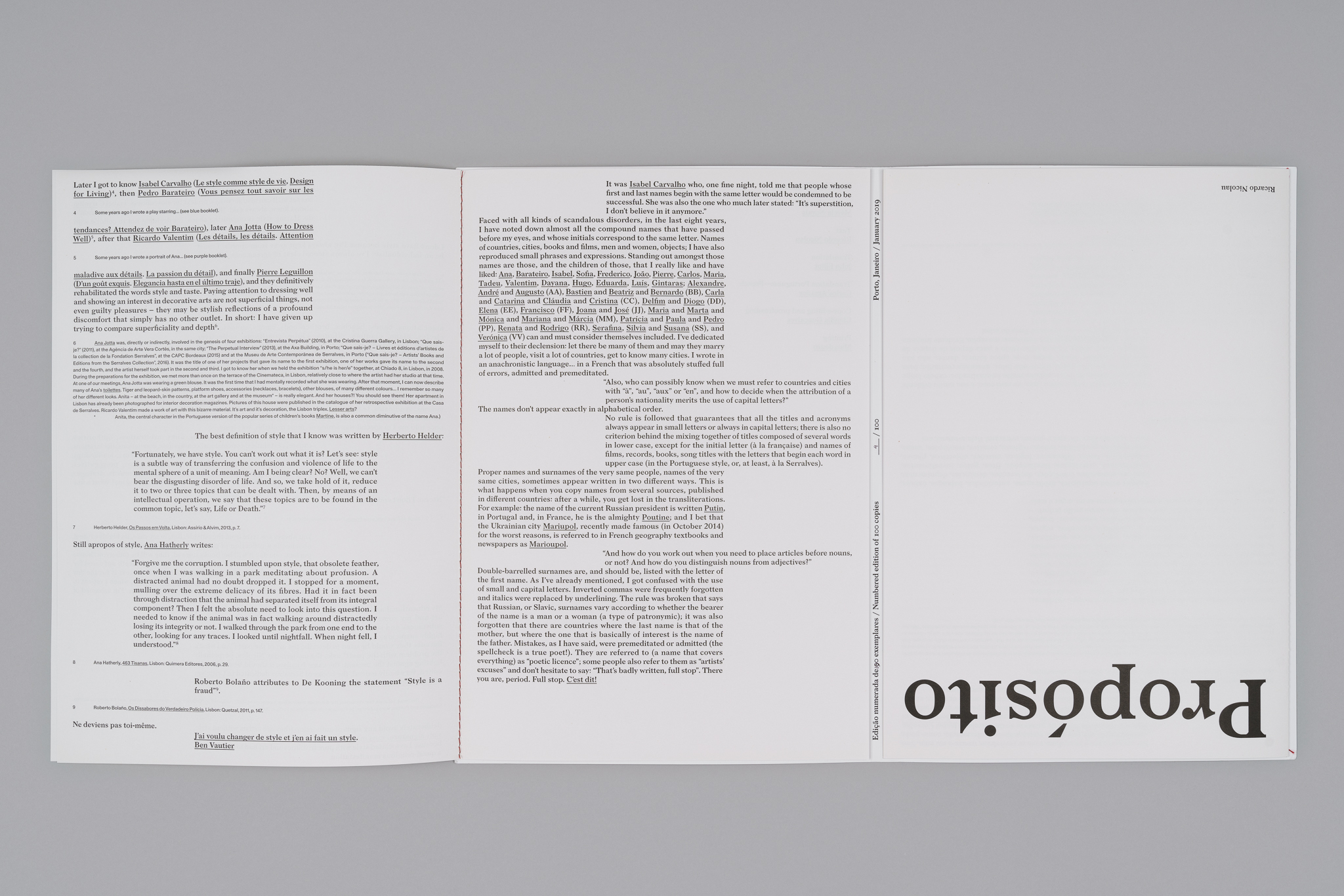
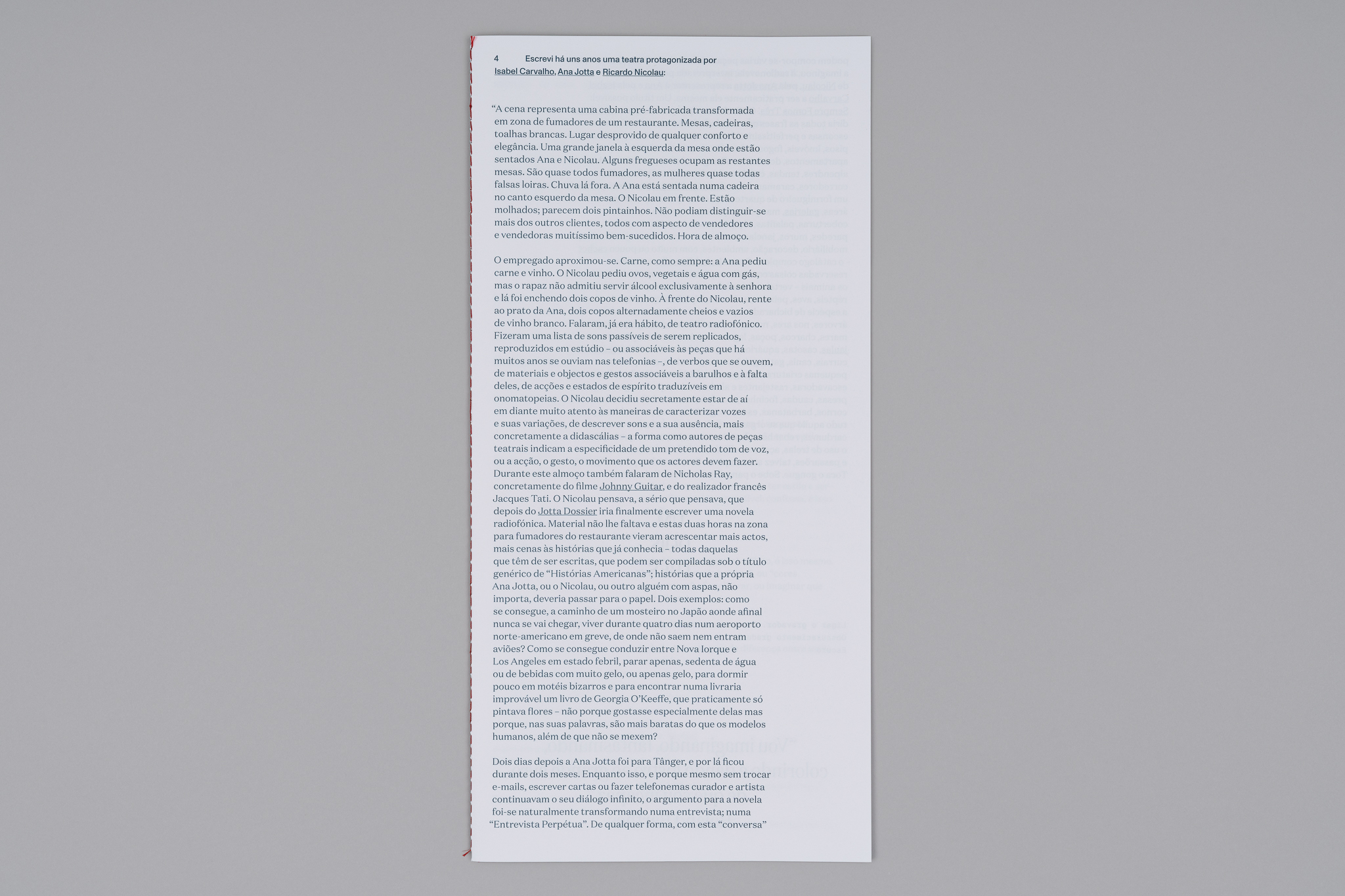
Propósito / Purpose
2018—present
320 × 240 mm
Client: Ricardo Nicolau
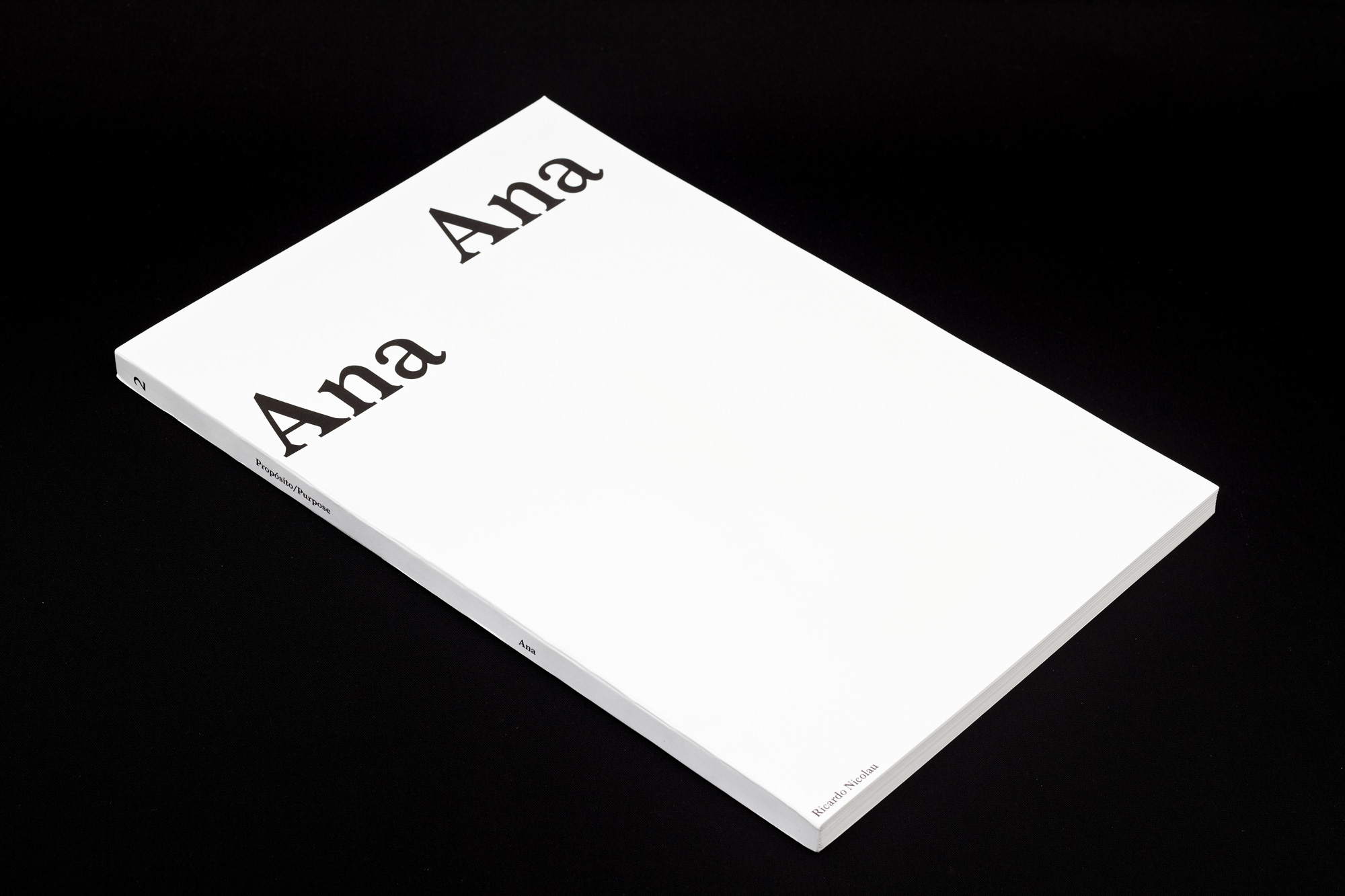
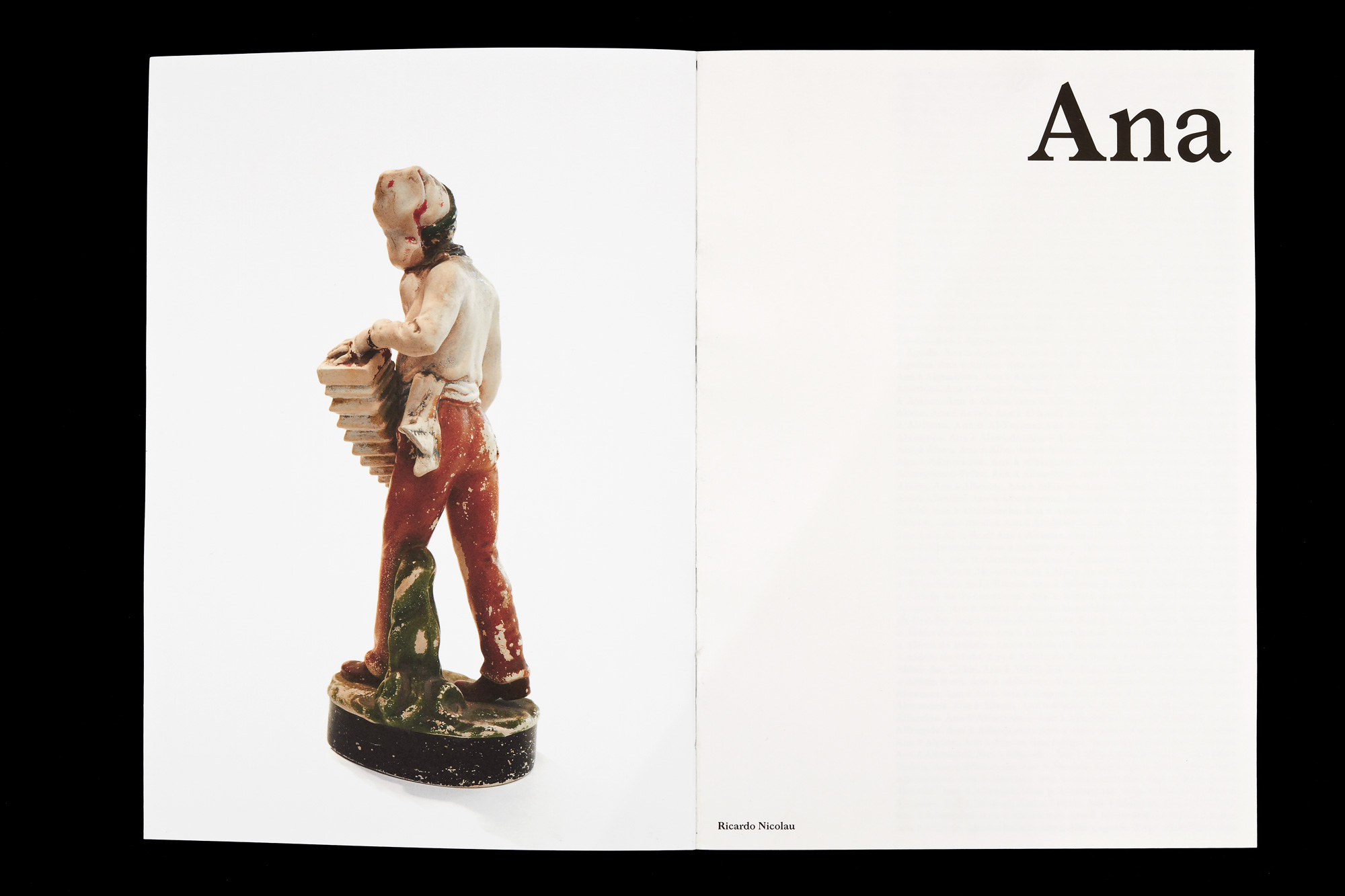
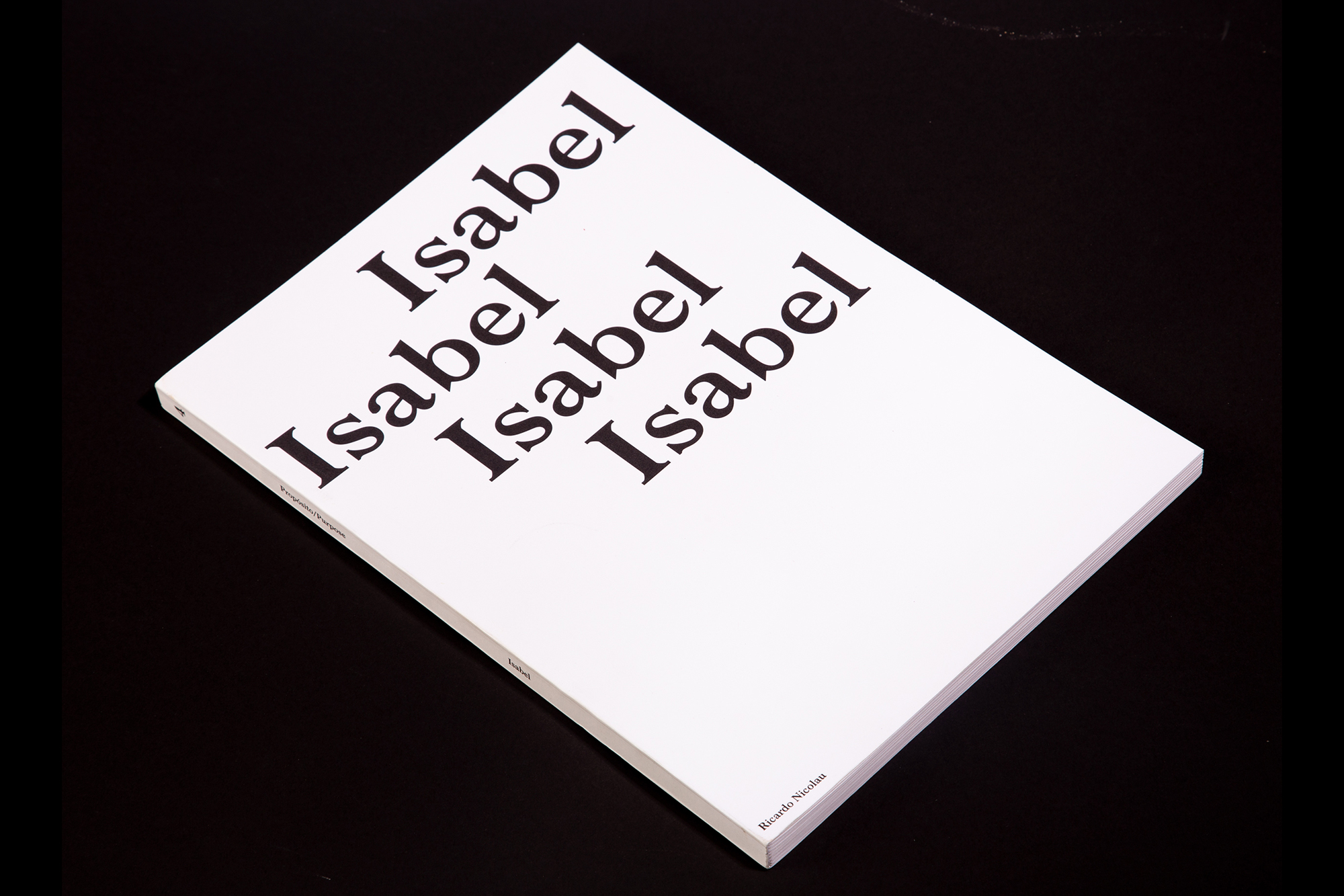
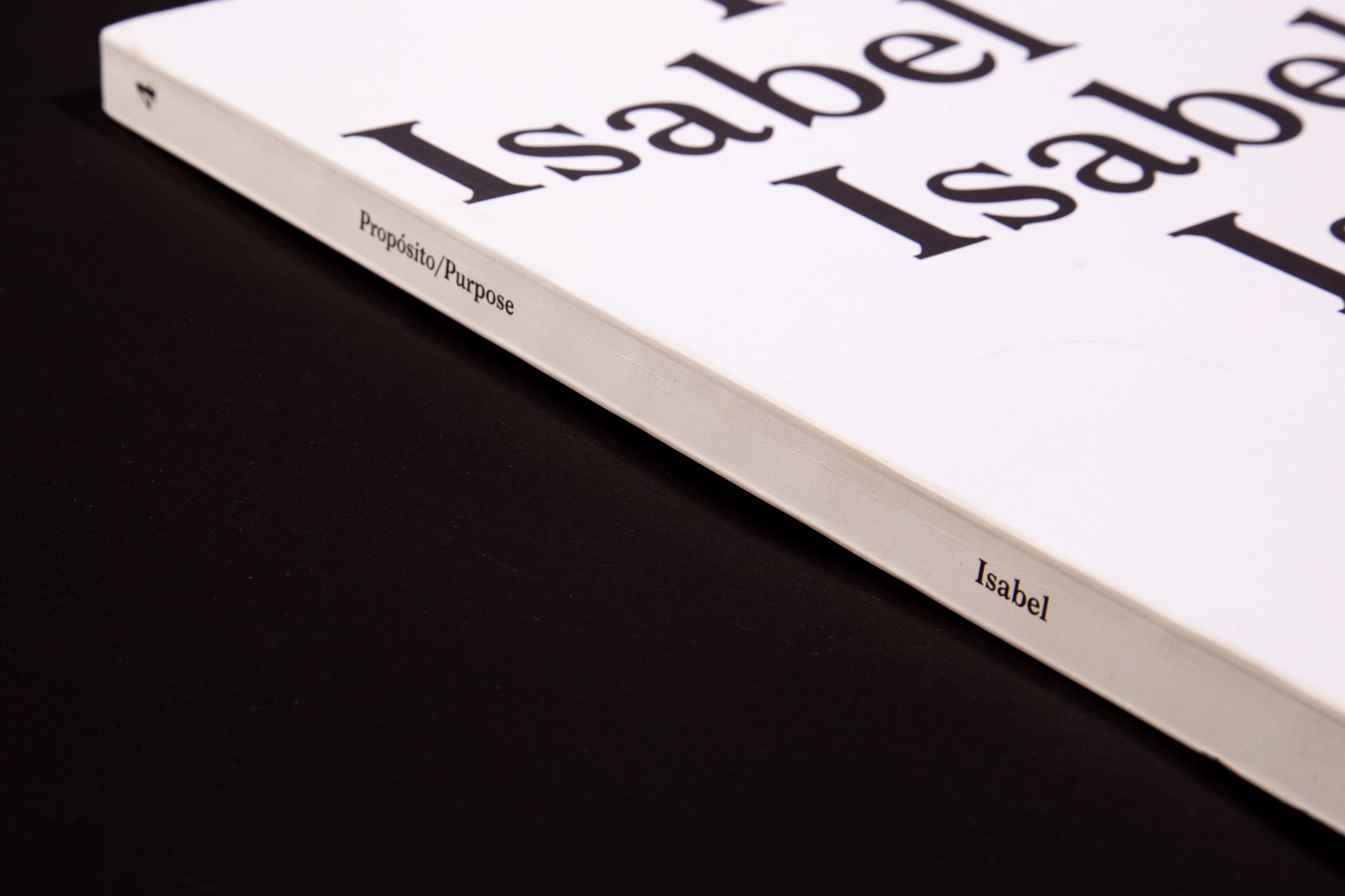
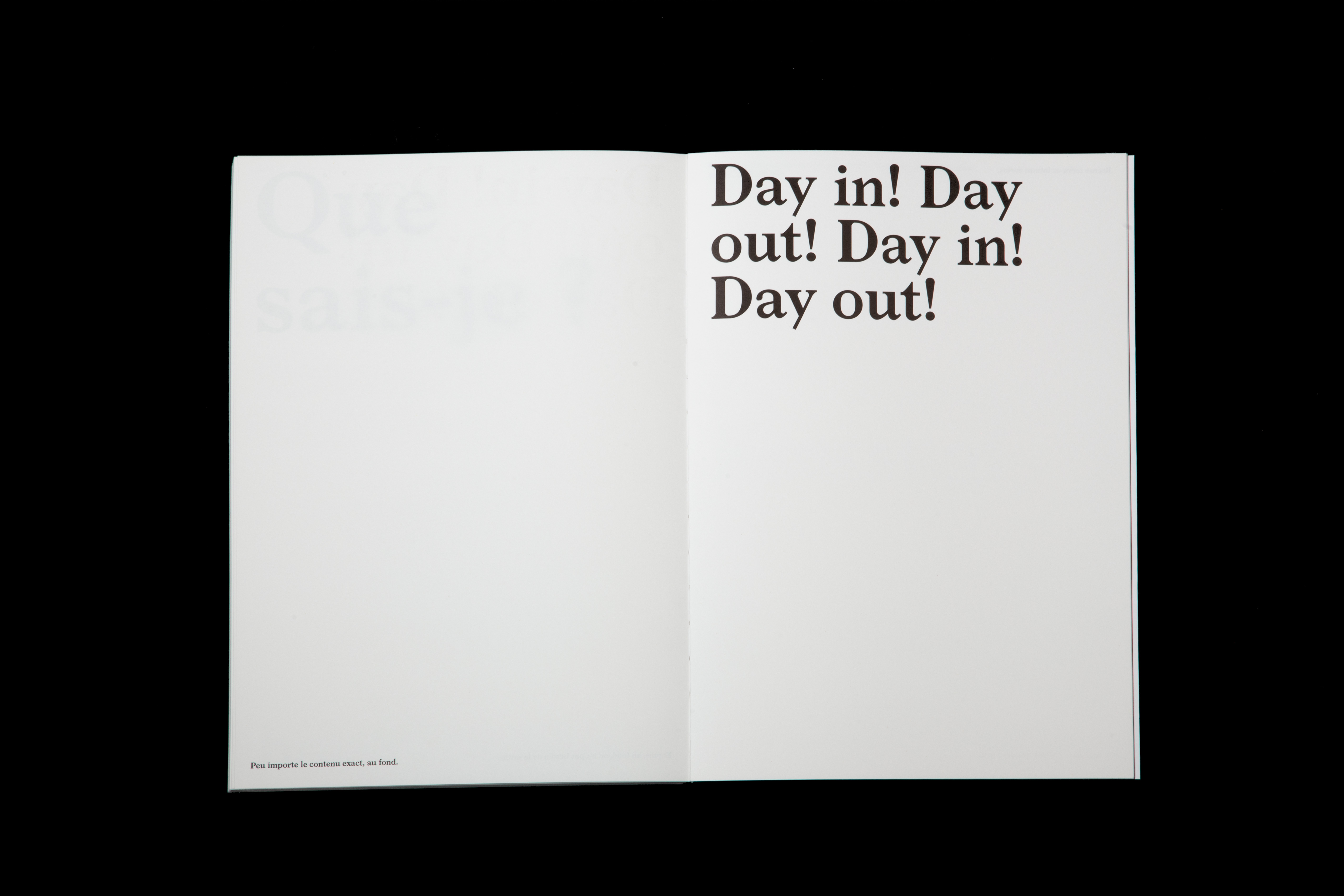
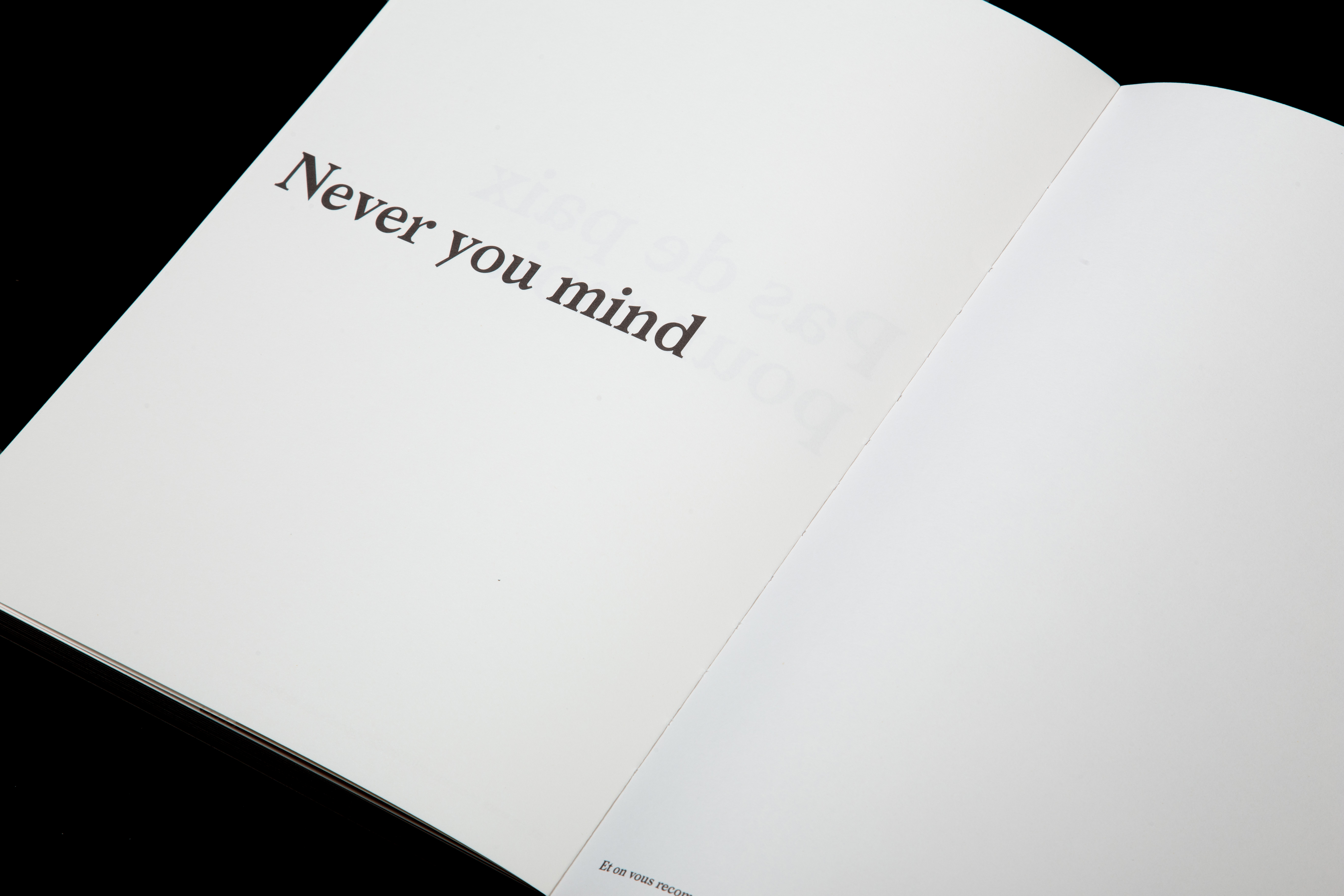
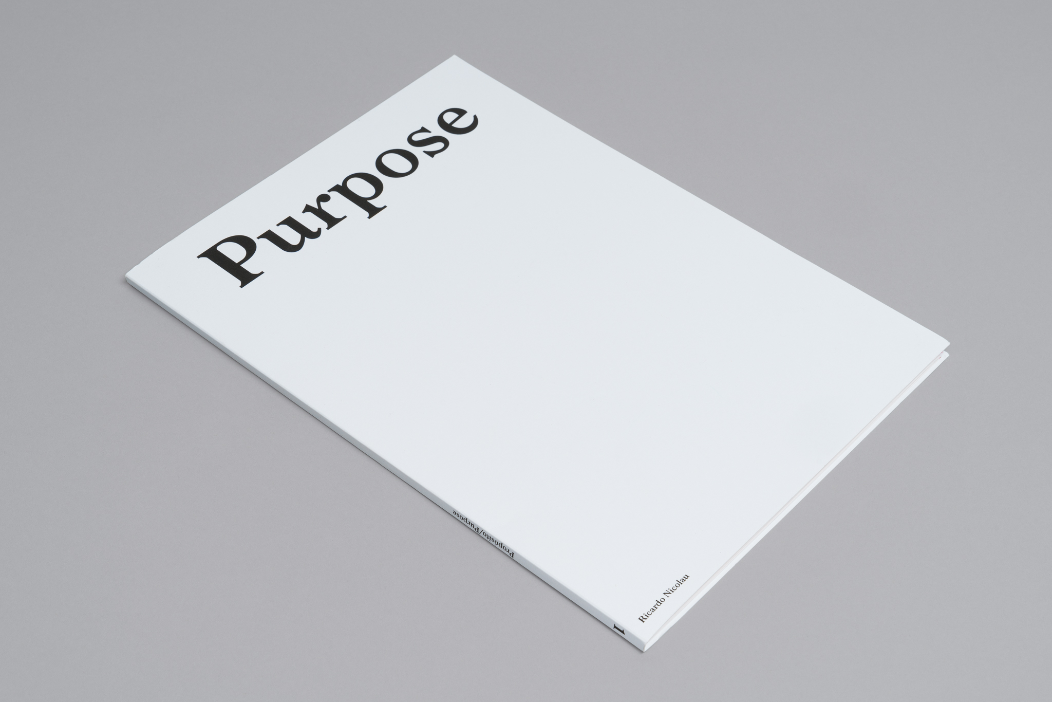
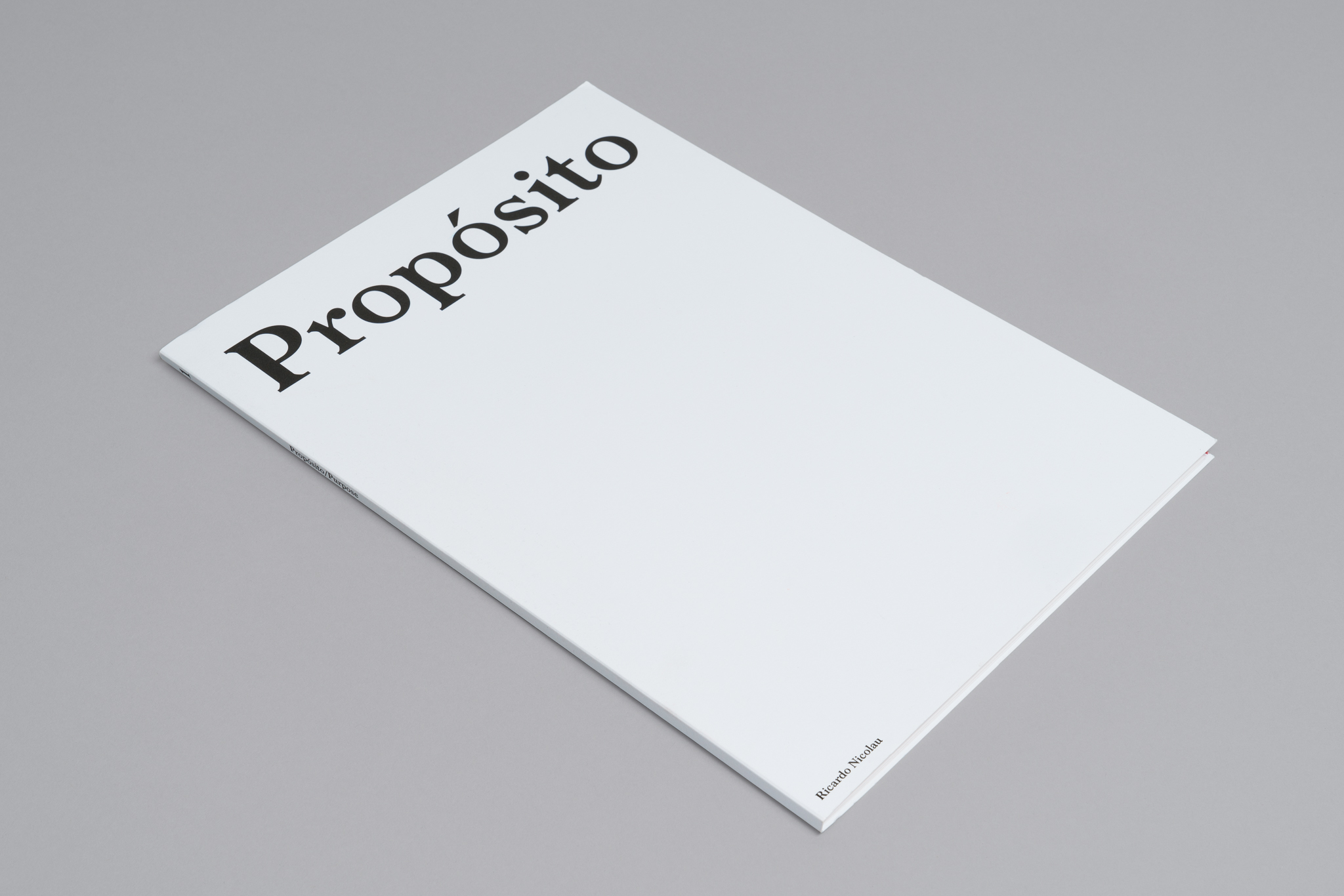
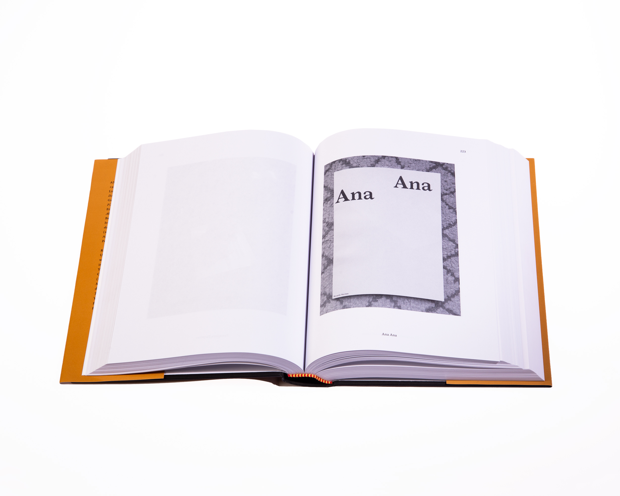
Propósito / Purpose is a collection edited by Ricardo Nicolau.
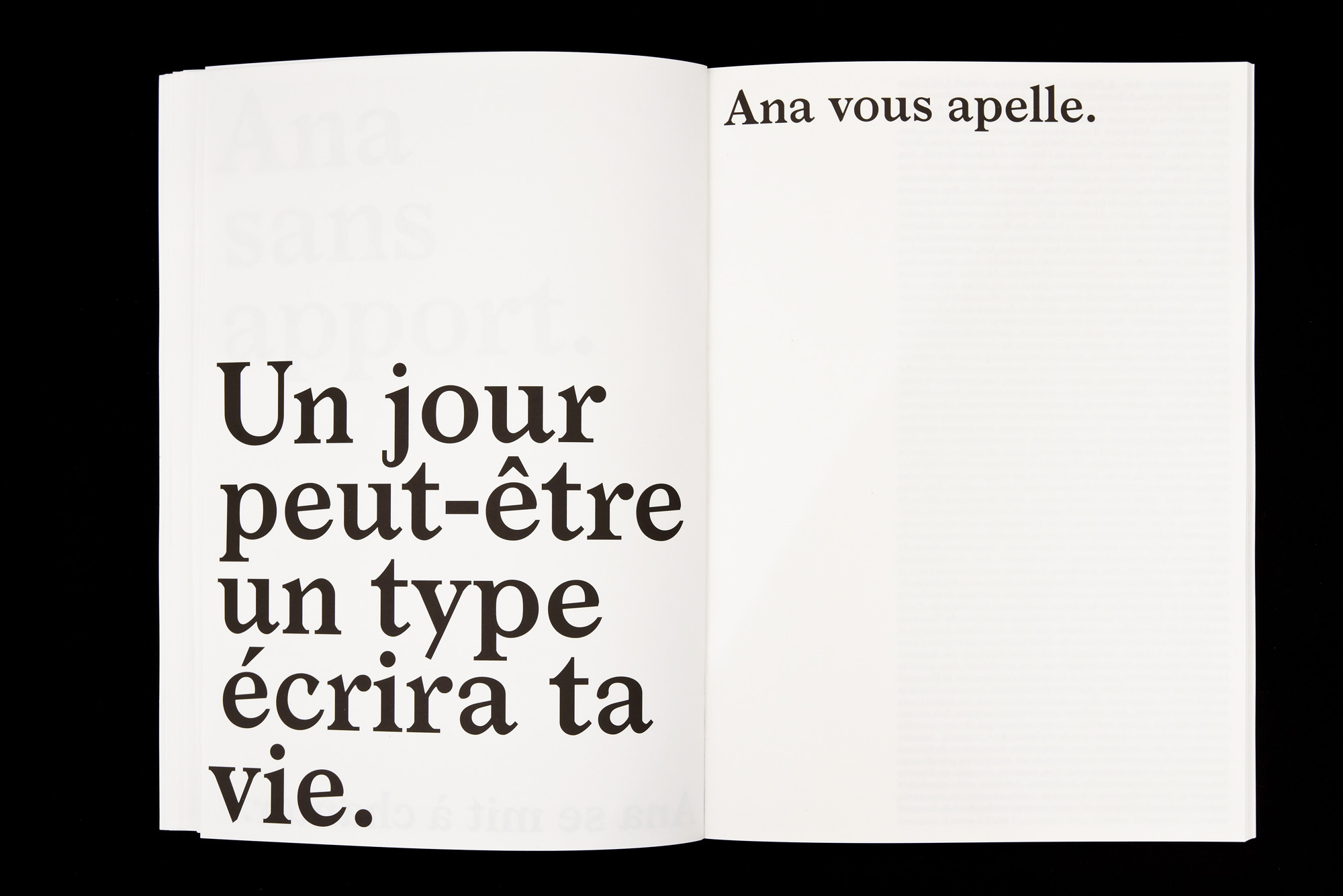
Ana was awarded with a Honourable Mention in Portuguese Best Book Design in 2018.
Each book is a limited numbered edition of 100.
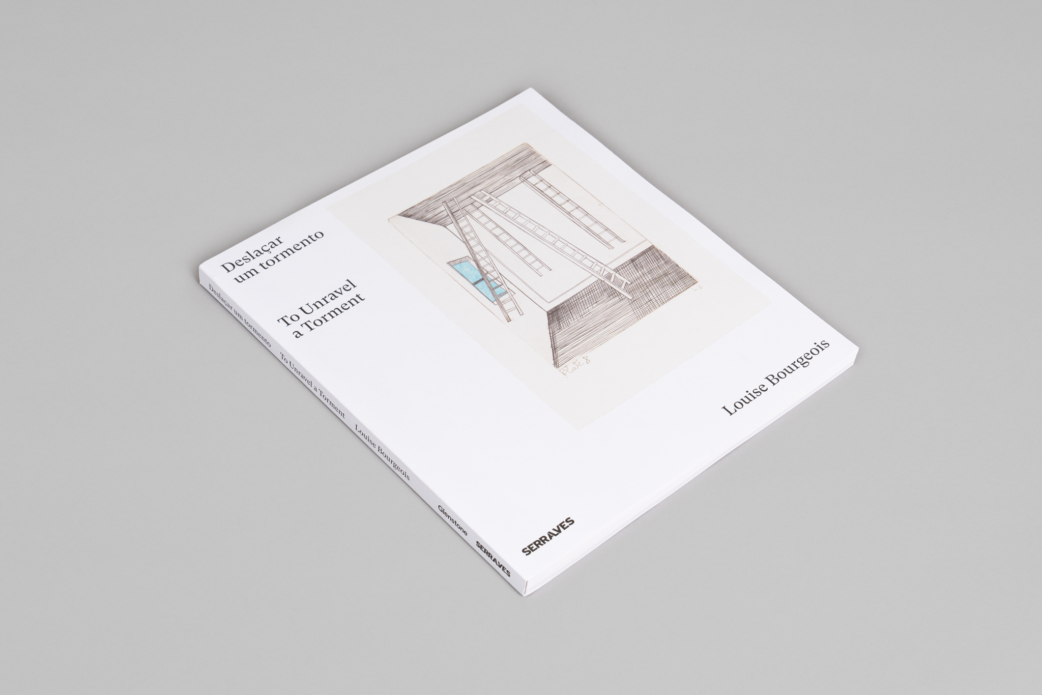
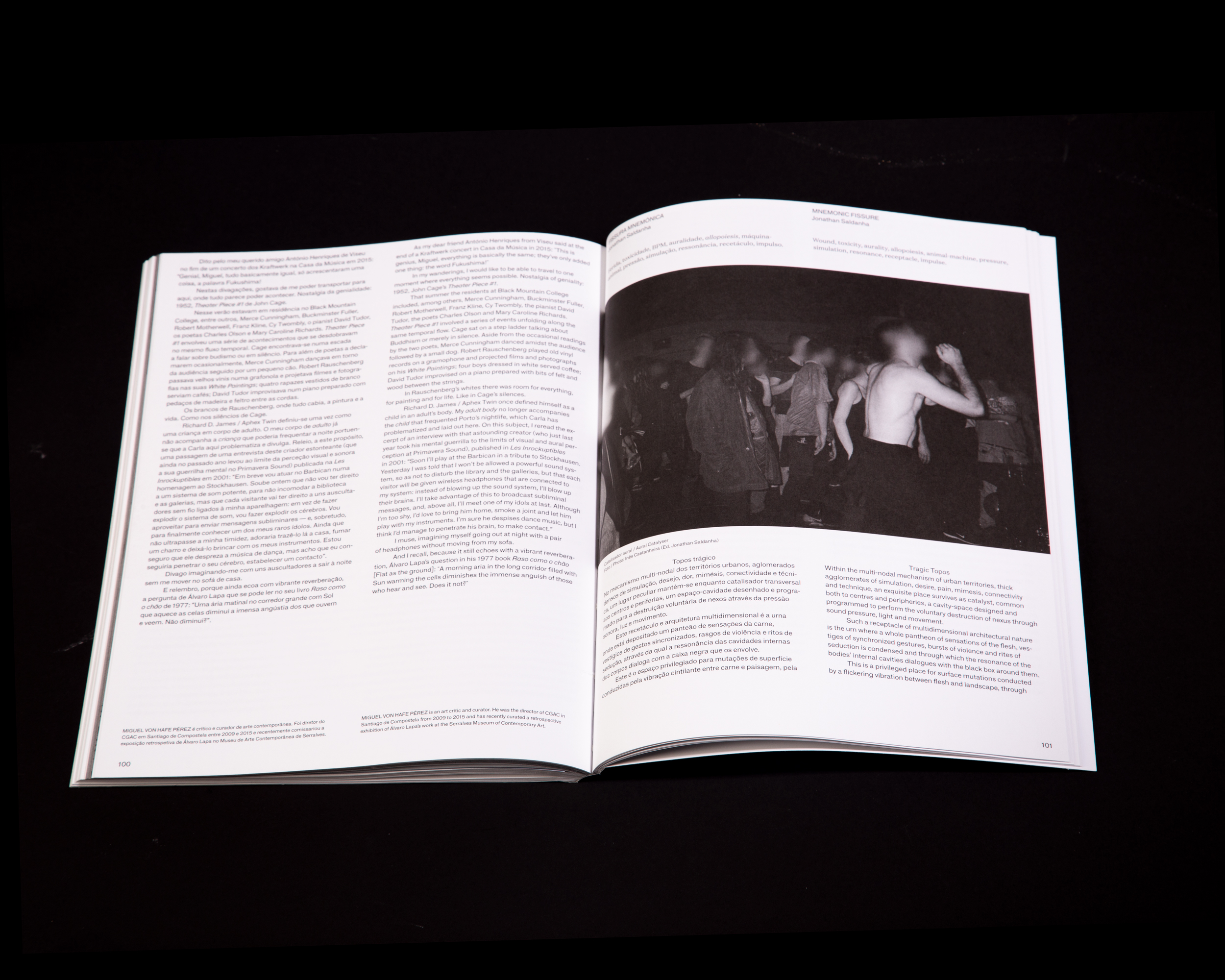
To Unravel a Torment
2020
240 × 280 mm
Client: Museum of Contemporary Art — Serralves
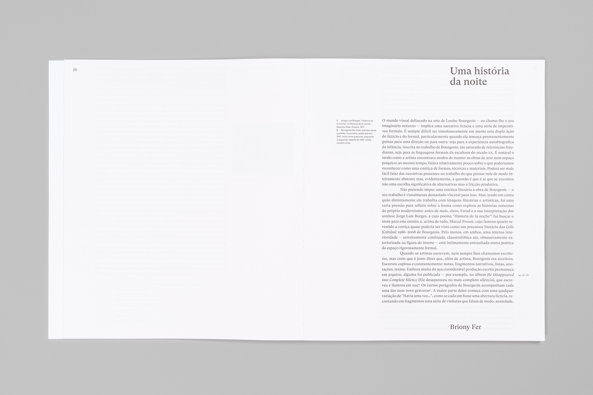
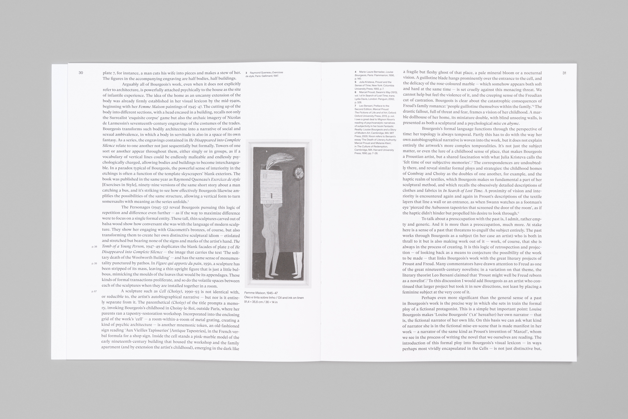
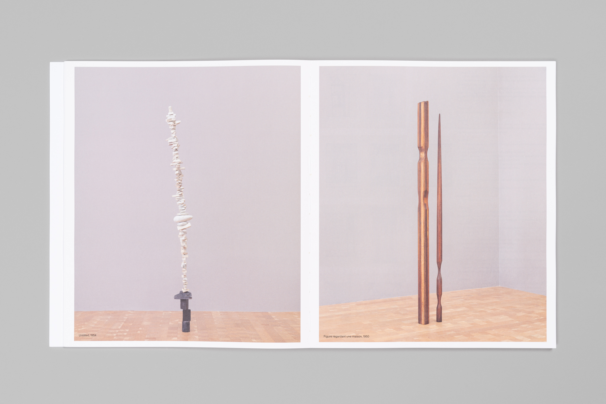
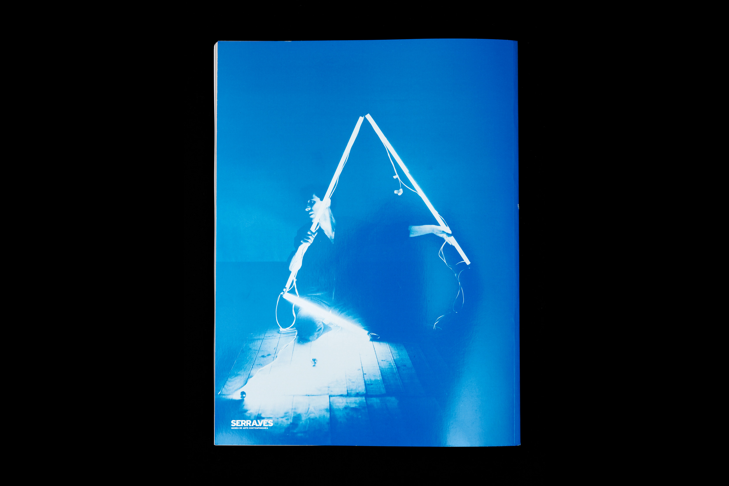
“To Unravel a Torment” is the book that accompanies the exhibition of Louise Bourgeois at Museu de Serralves.
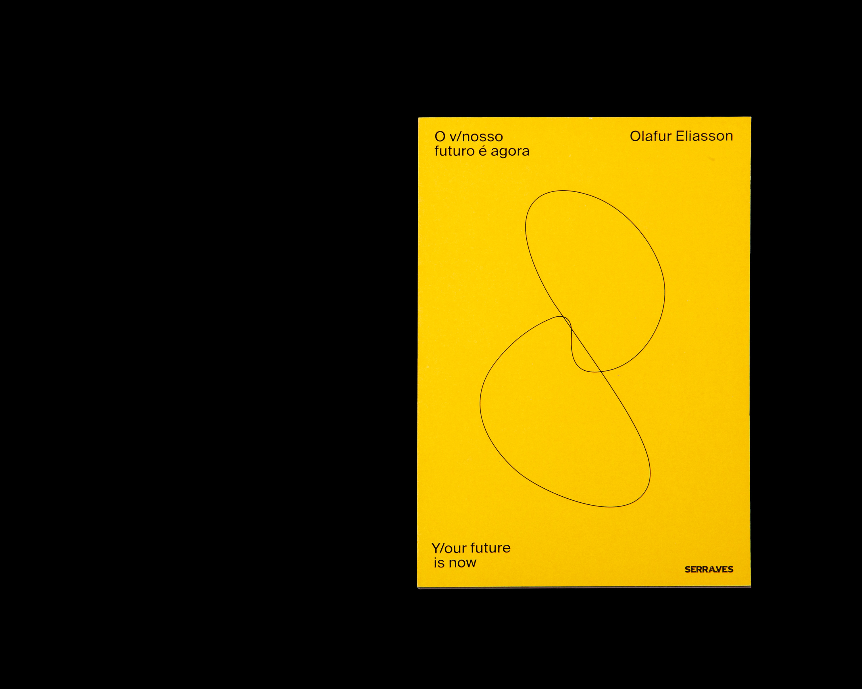
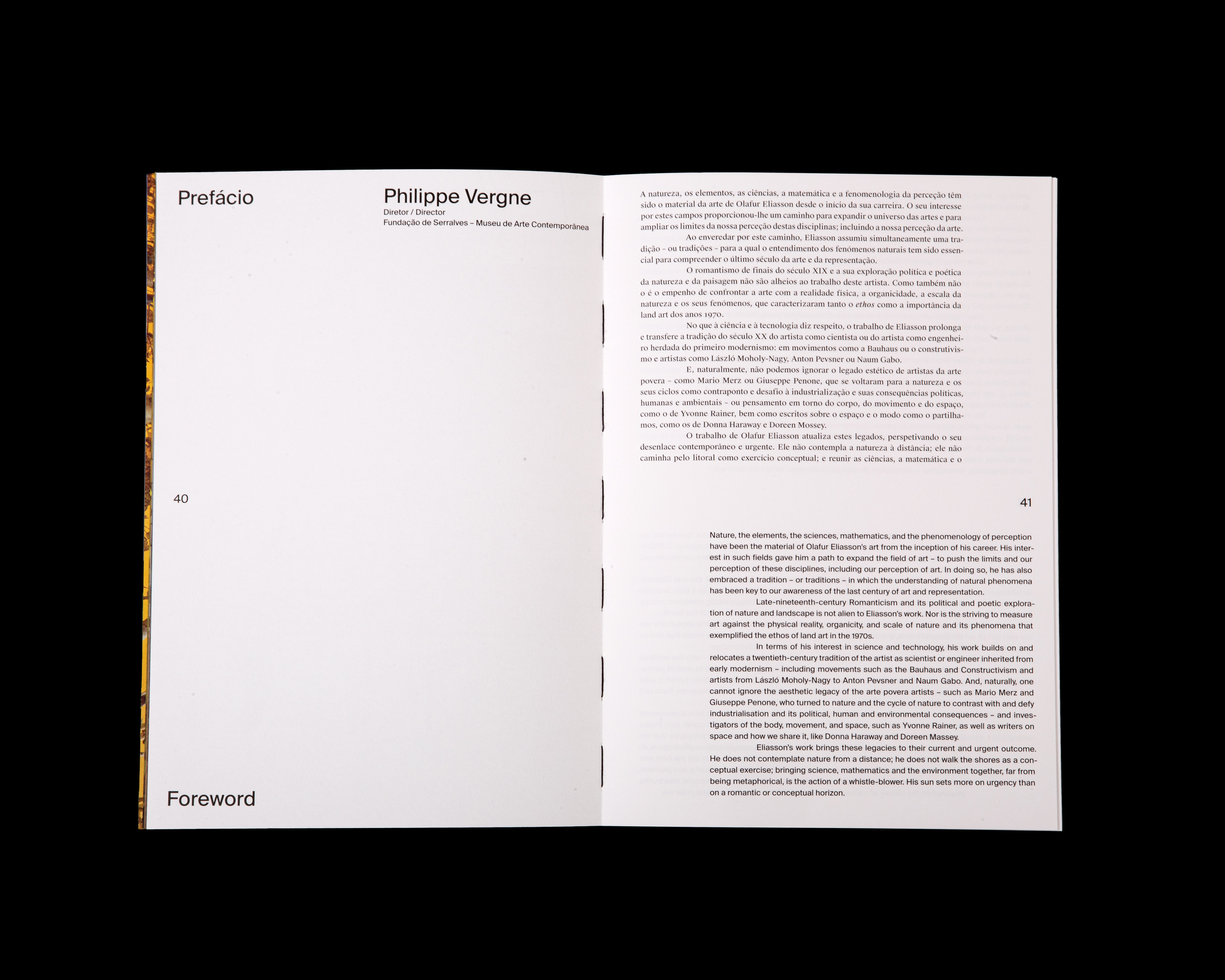
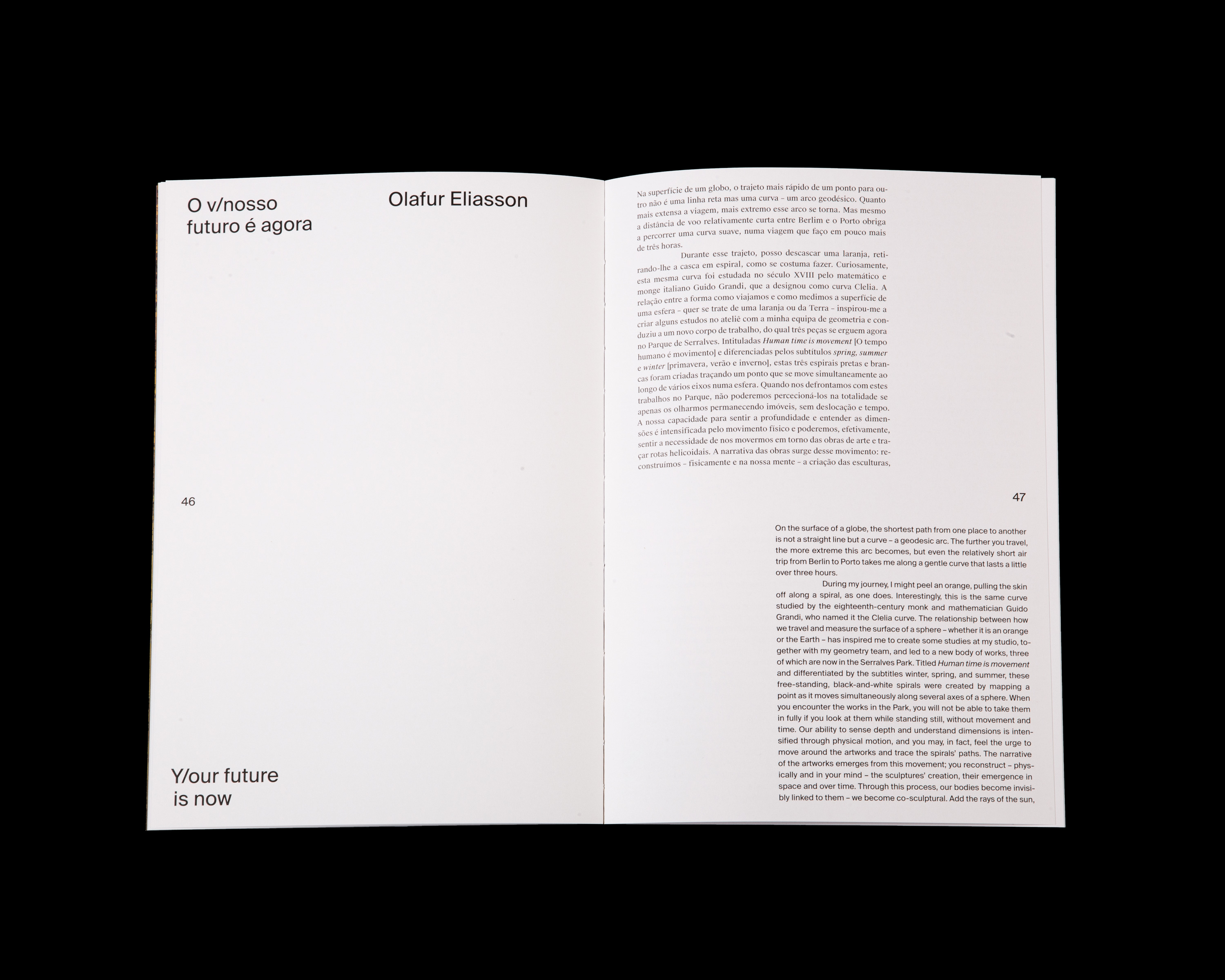
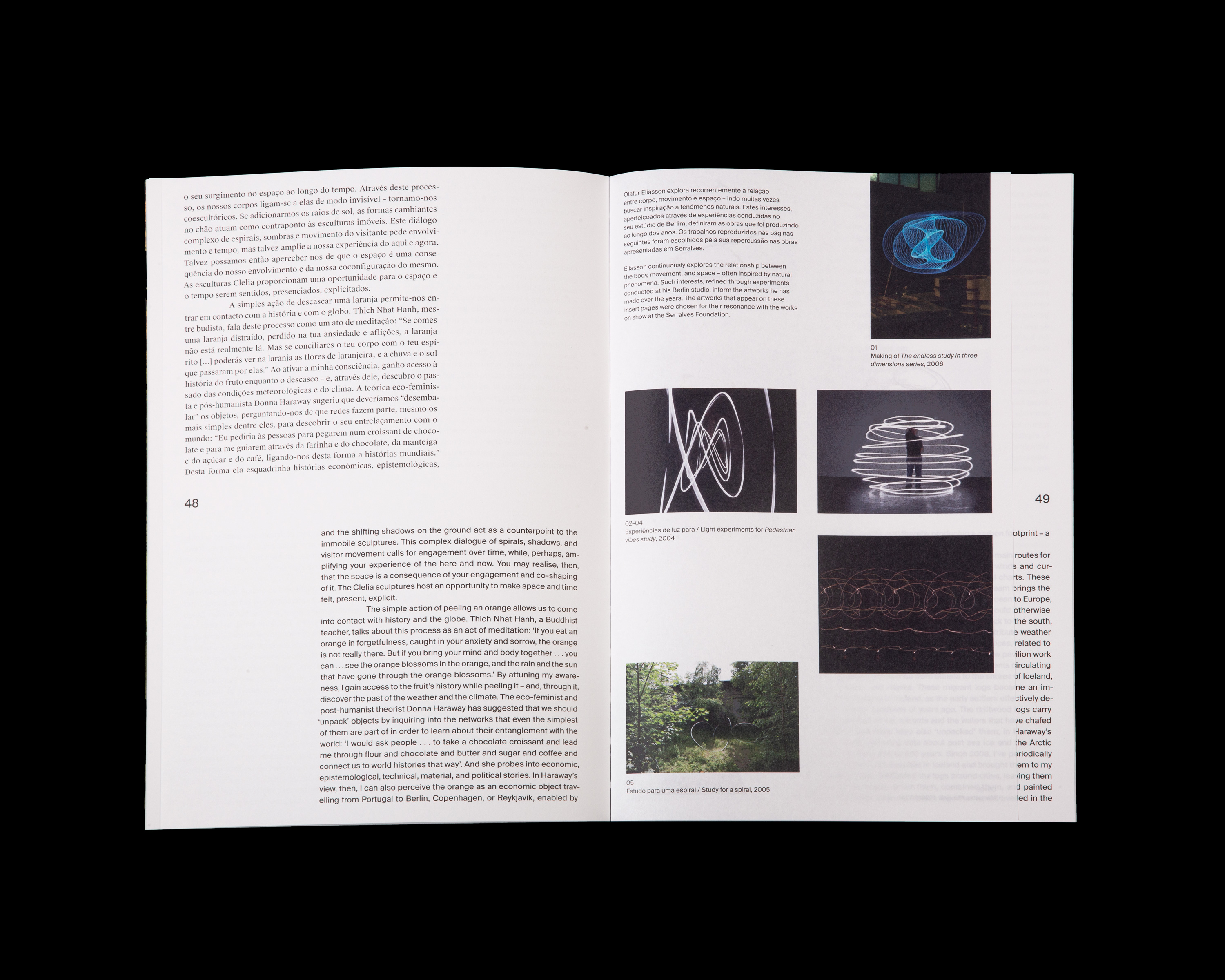
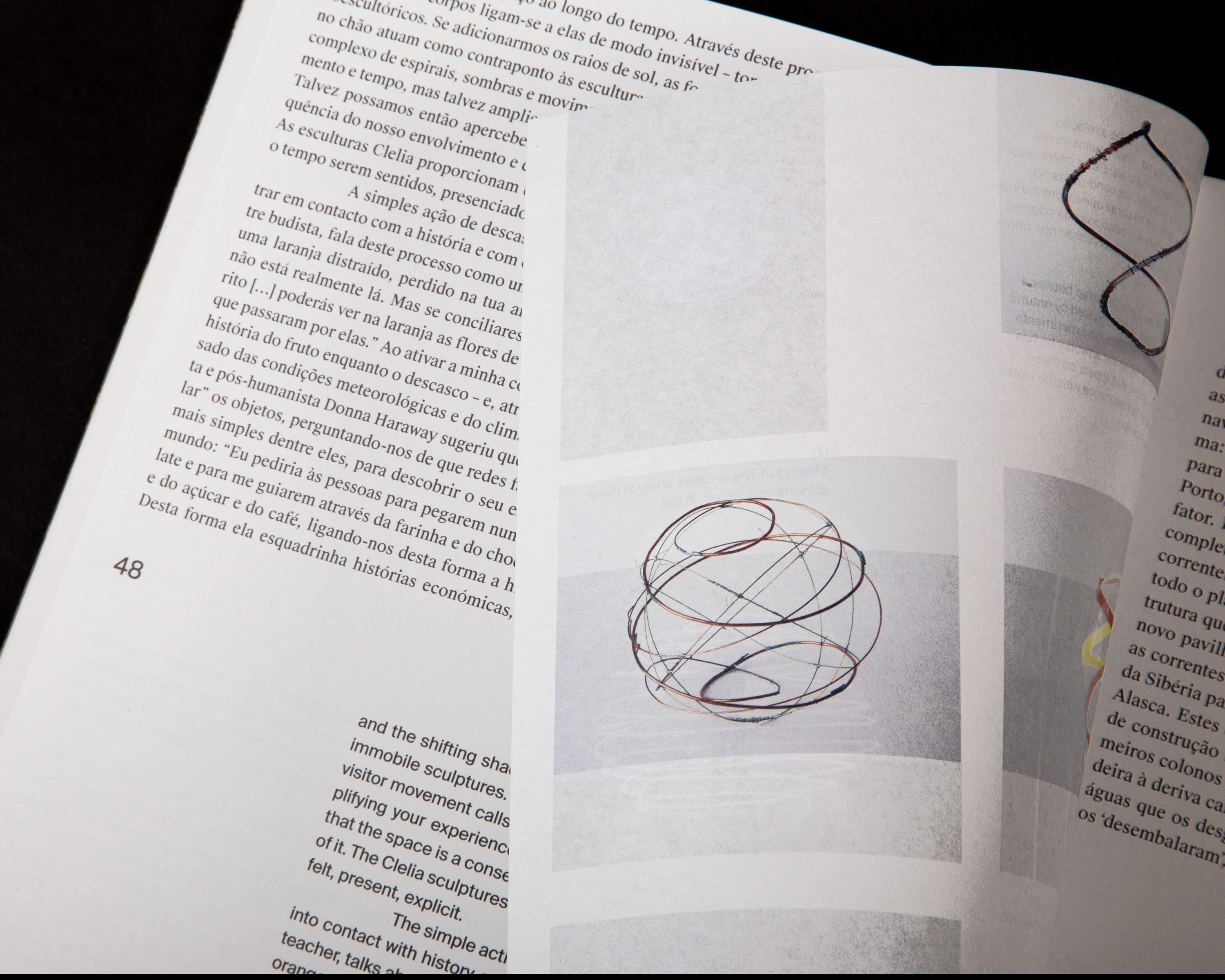
Y/our future is now
2019
190 × 280 mm
Client: Museum of Contemporary Art — Serralves
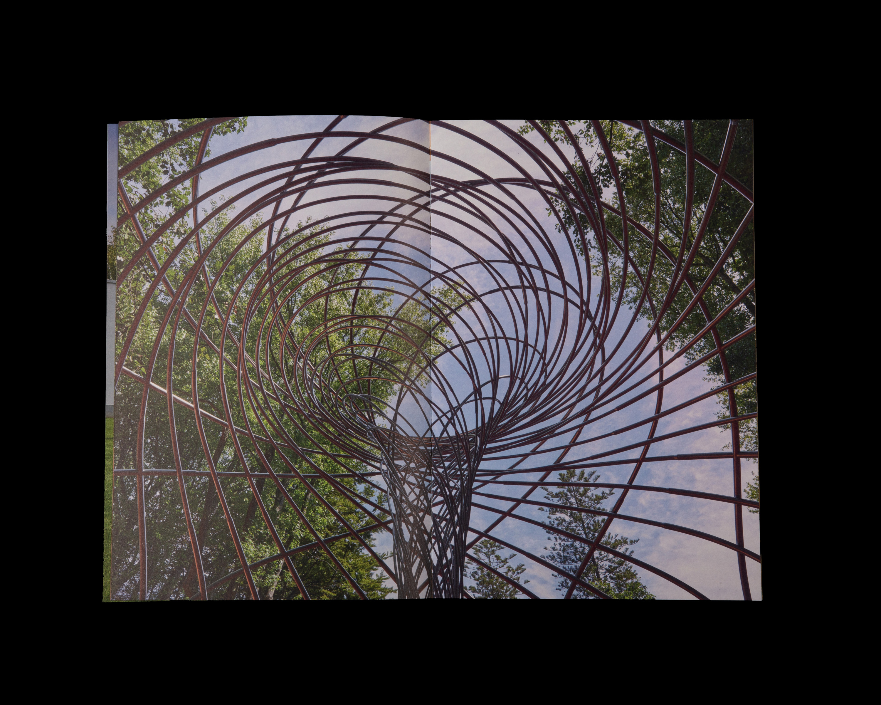
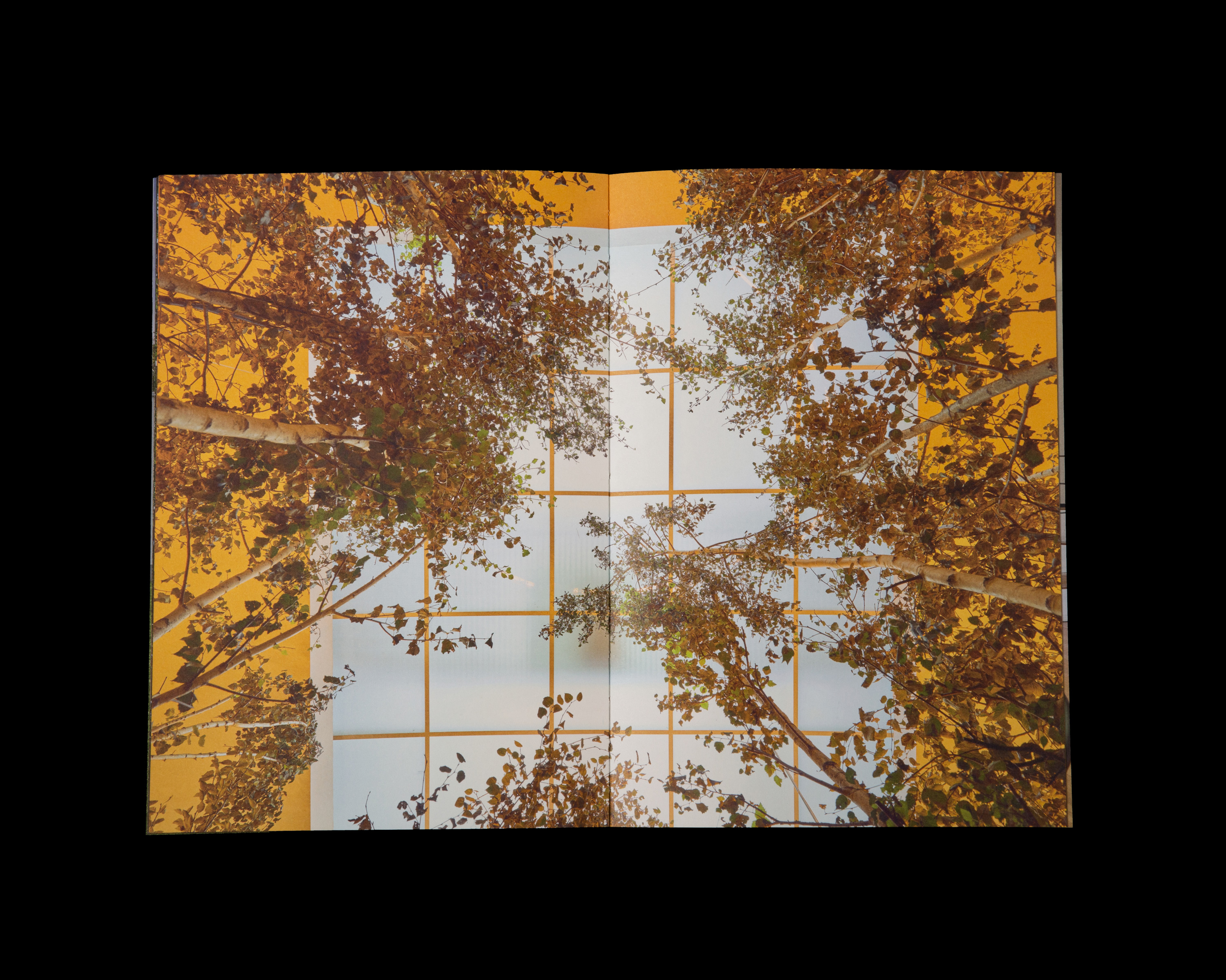
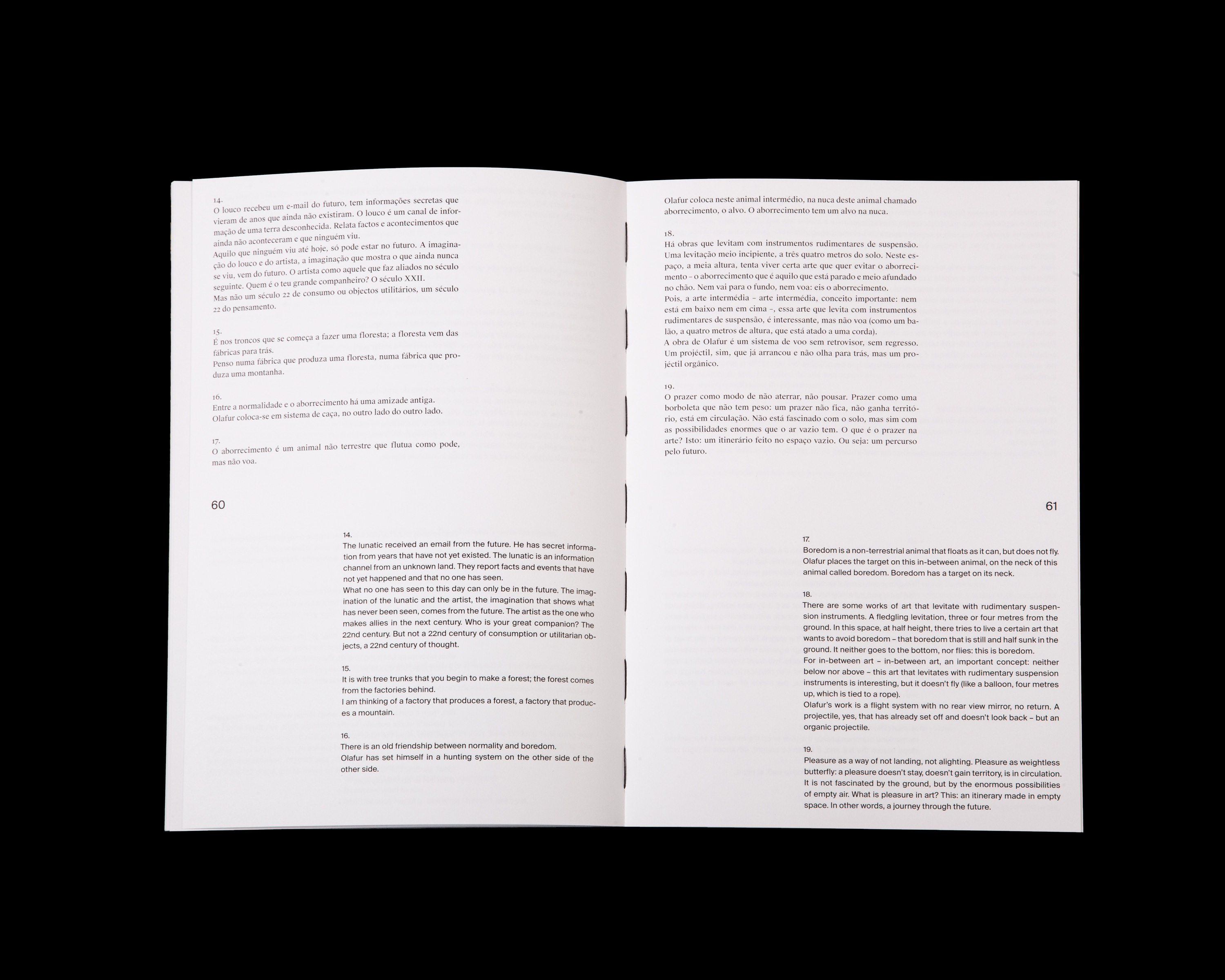
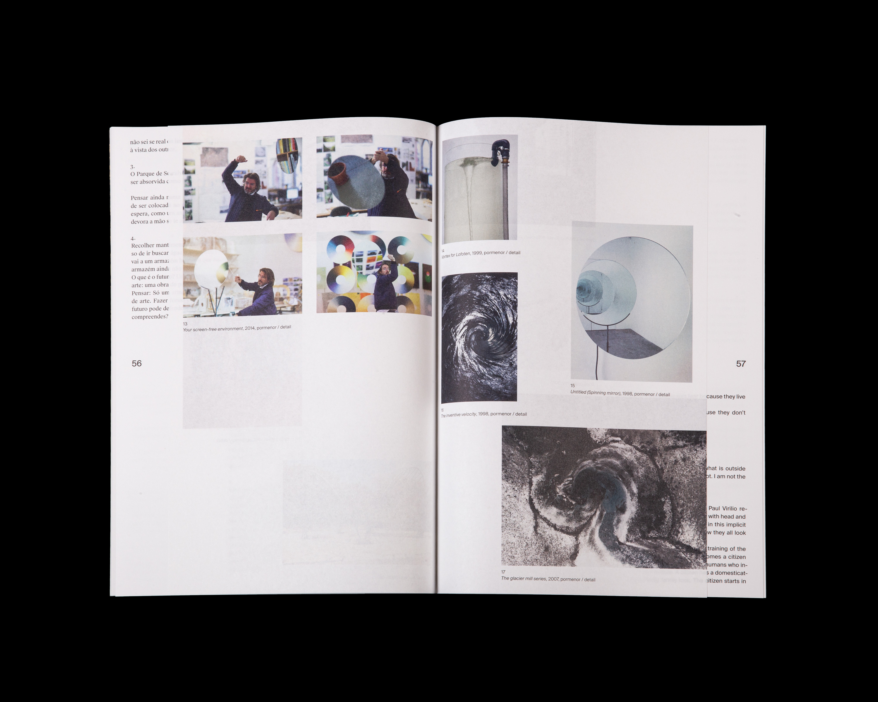
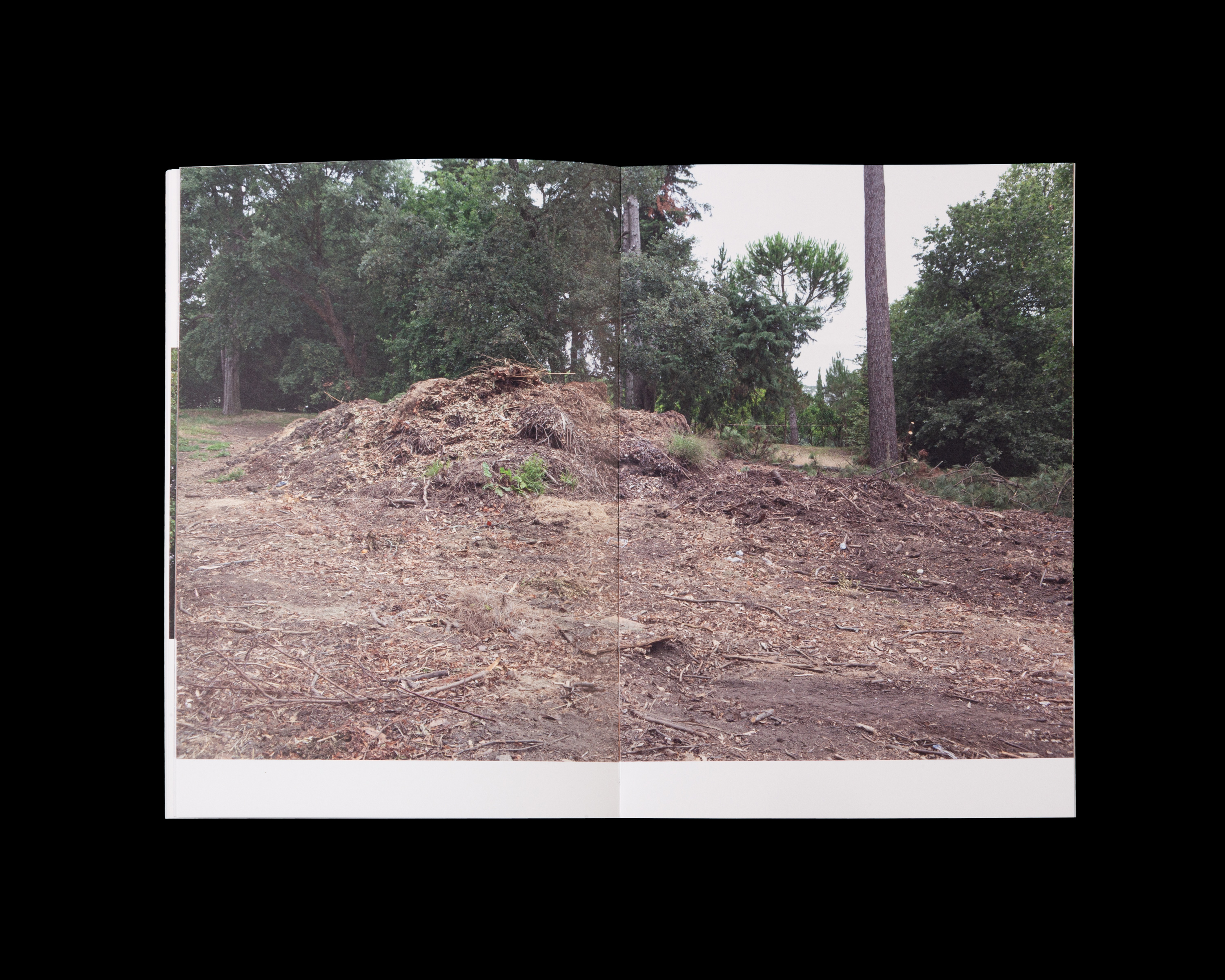
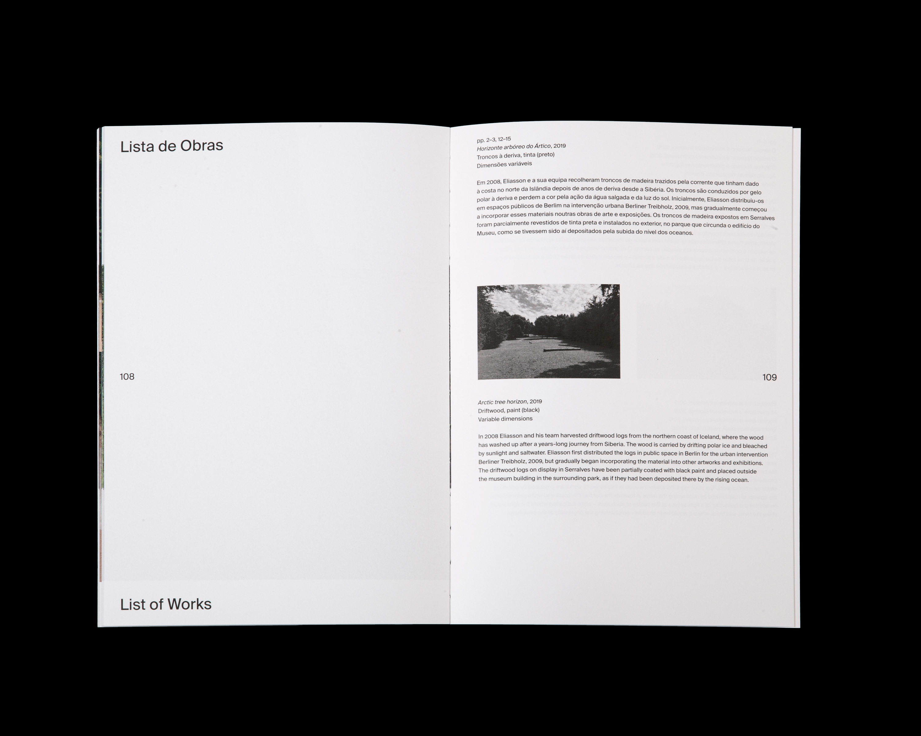
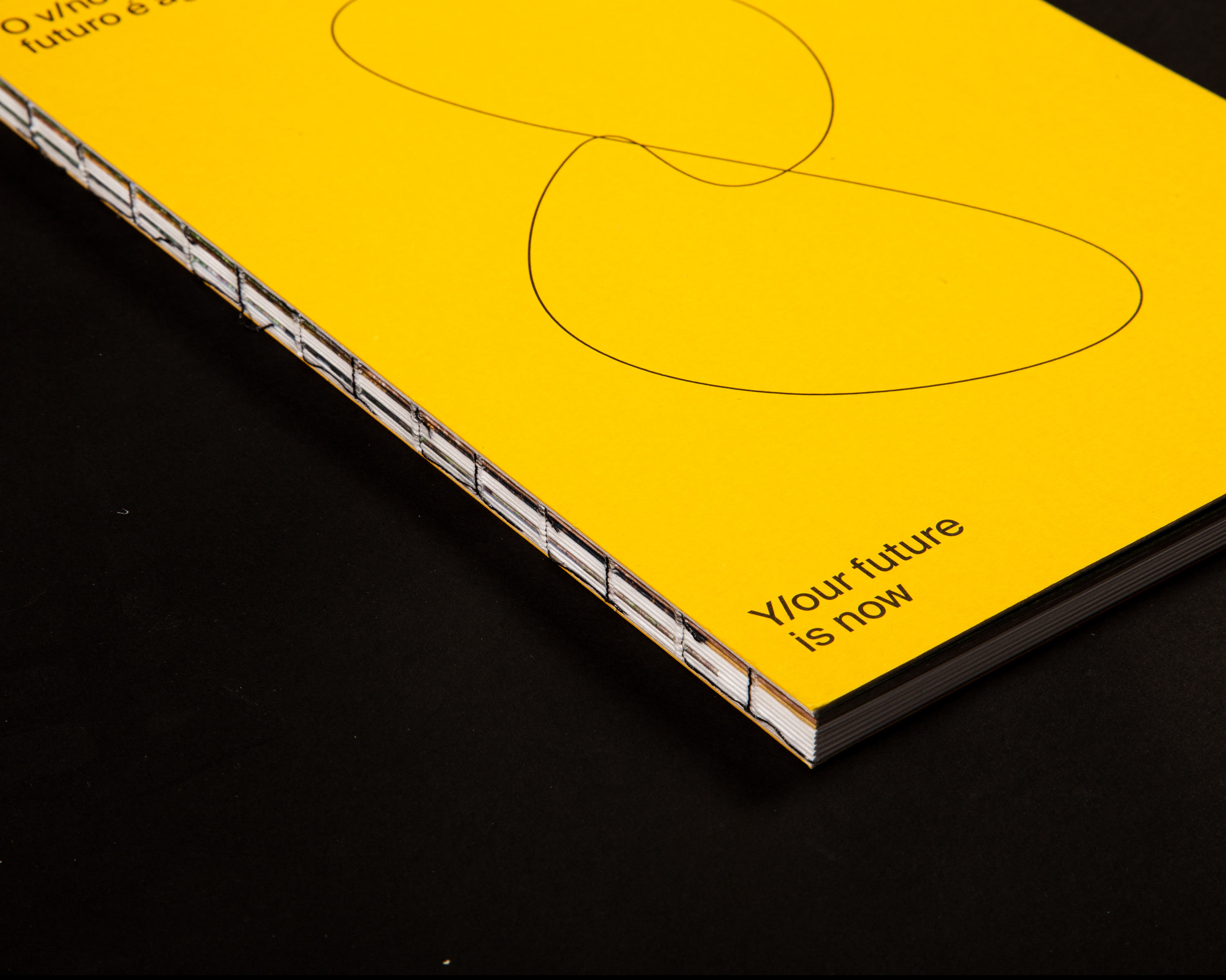
Catalogue for Olafur Eliasson's exhibition at Museum of Contemporary Art of Serralves. Using different paper weights, the book presents installation views, texts intercalated with archival images and a photo essay by Olafur Eliasson.
This book was awarded with the 50 Books, 50 Covers distinction.
Tropismo Fotográfico
2019
290 × 380 mm
Edited by Susana Lourenço Marques
Client: Faculty of Fine Arts of University of Porto
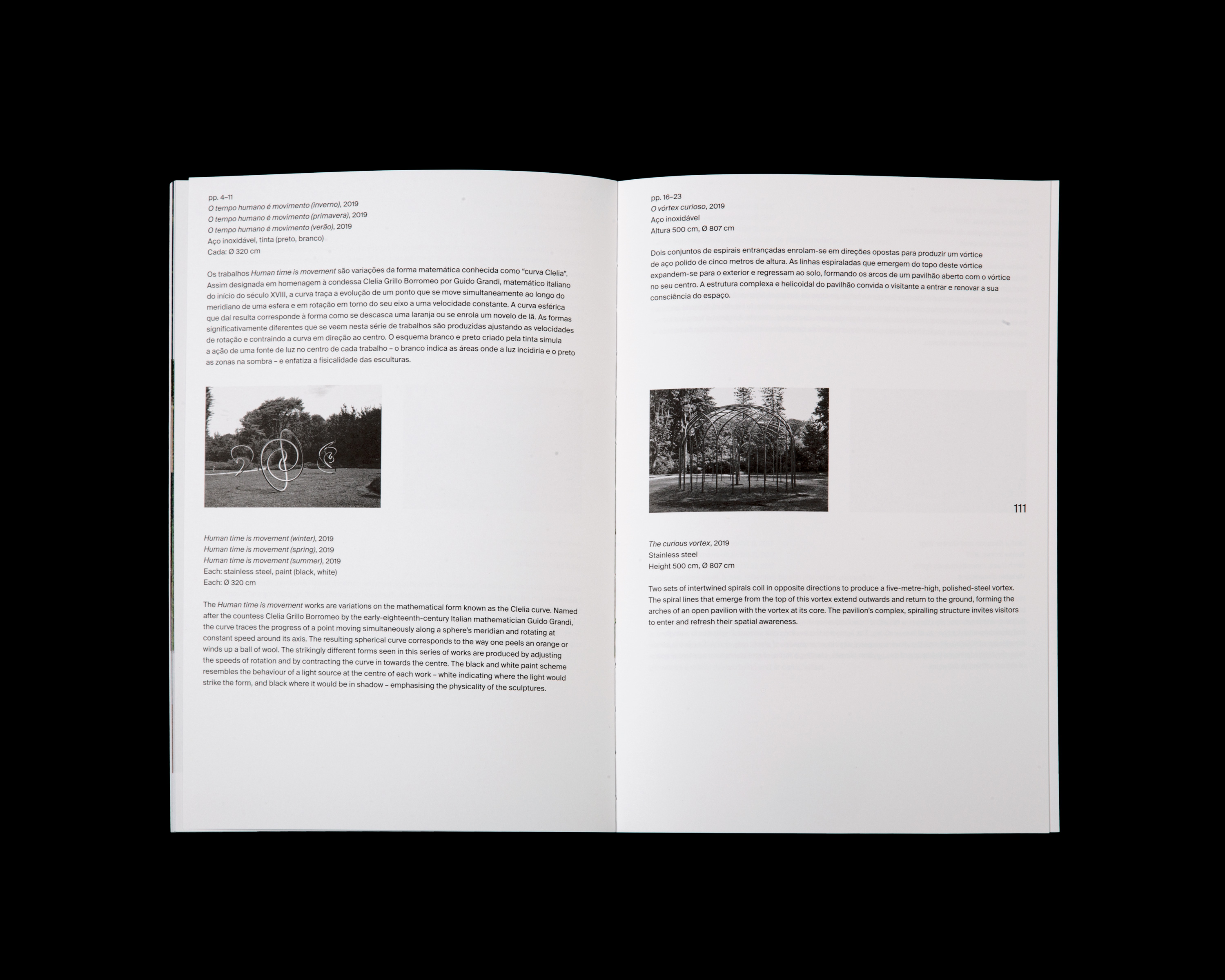
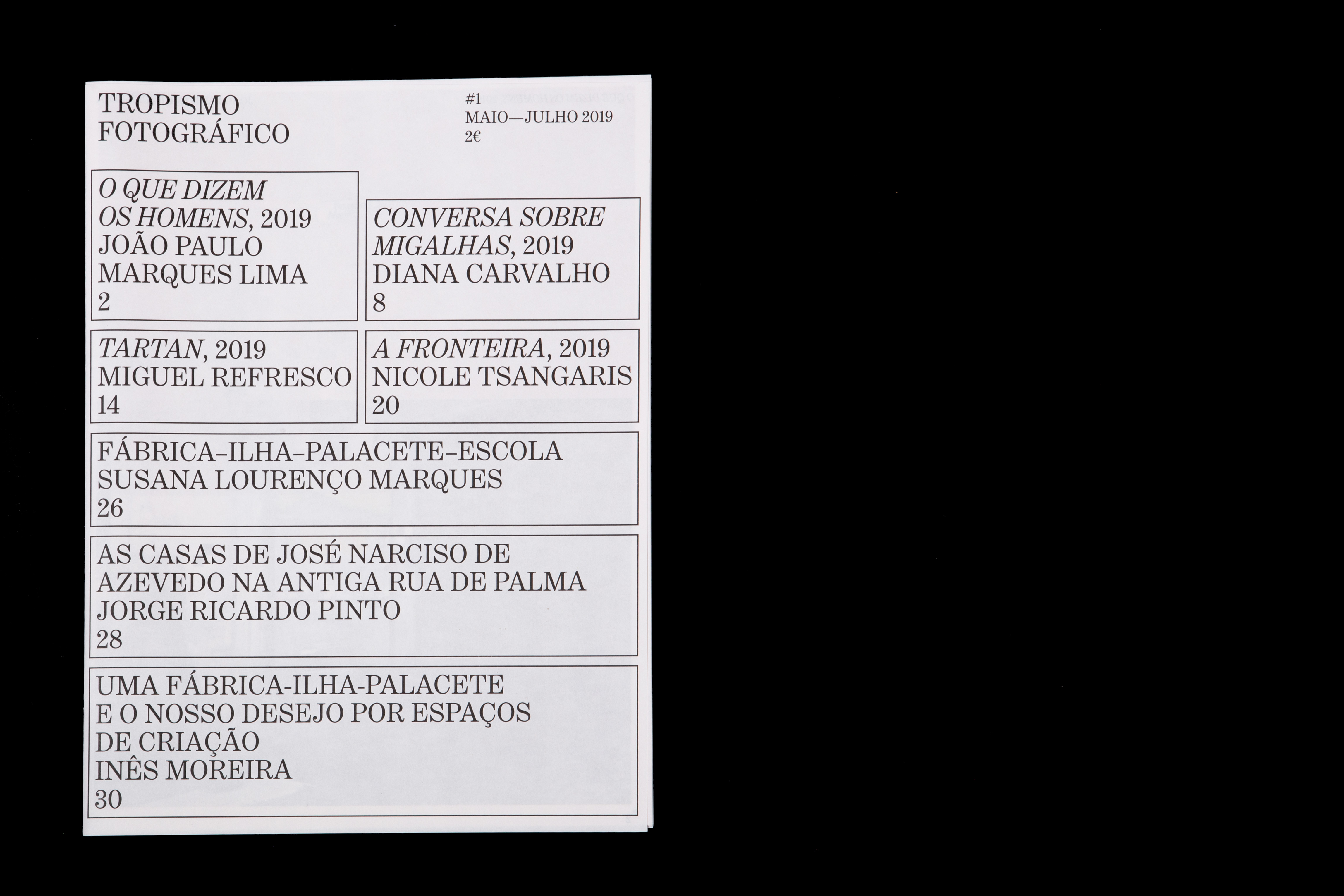
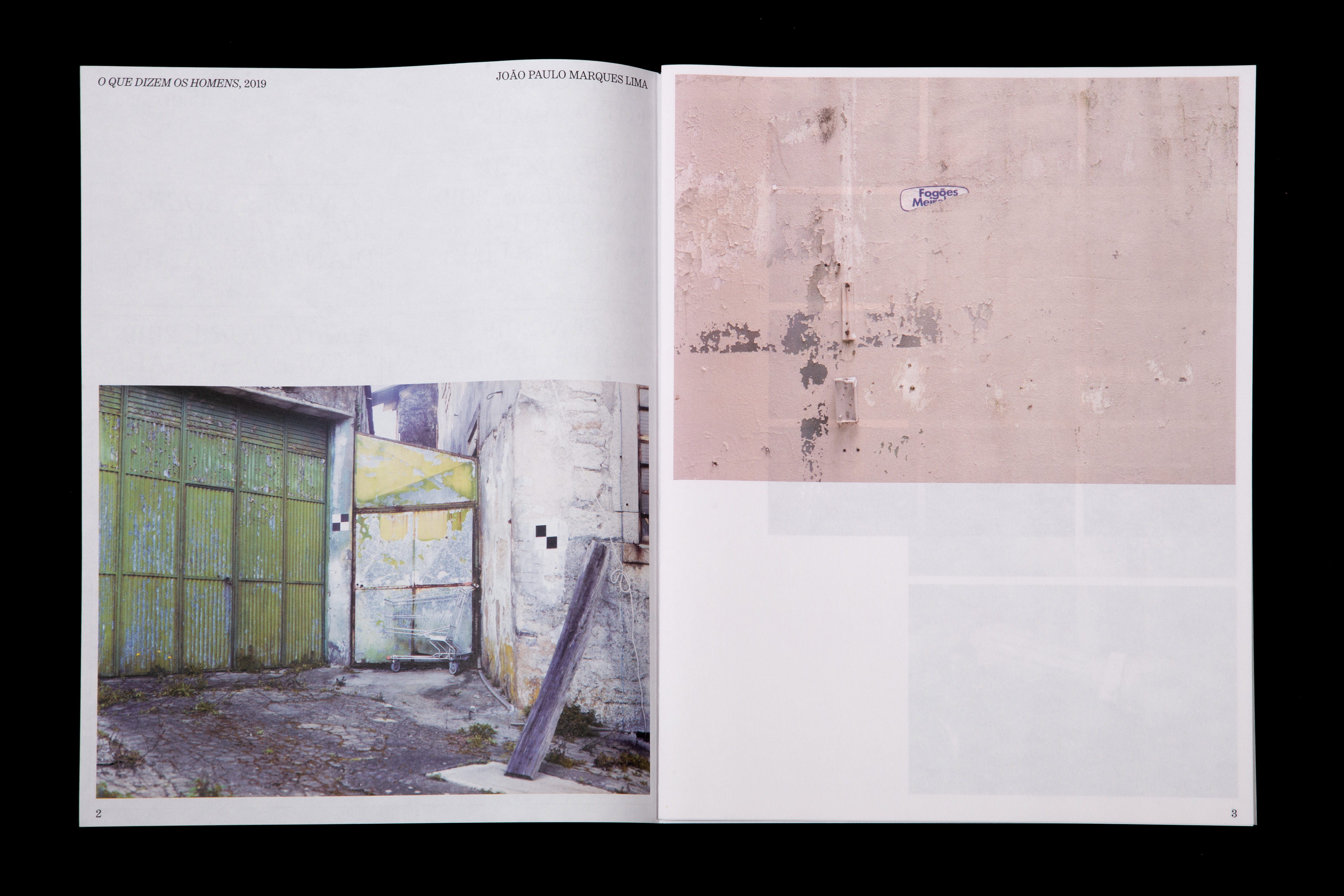
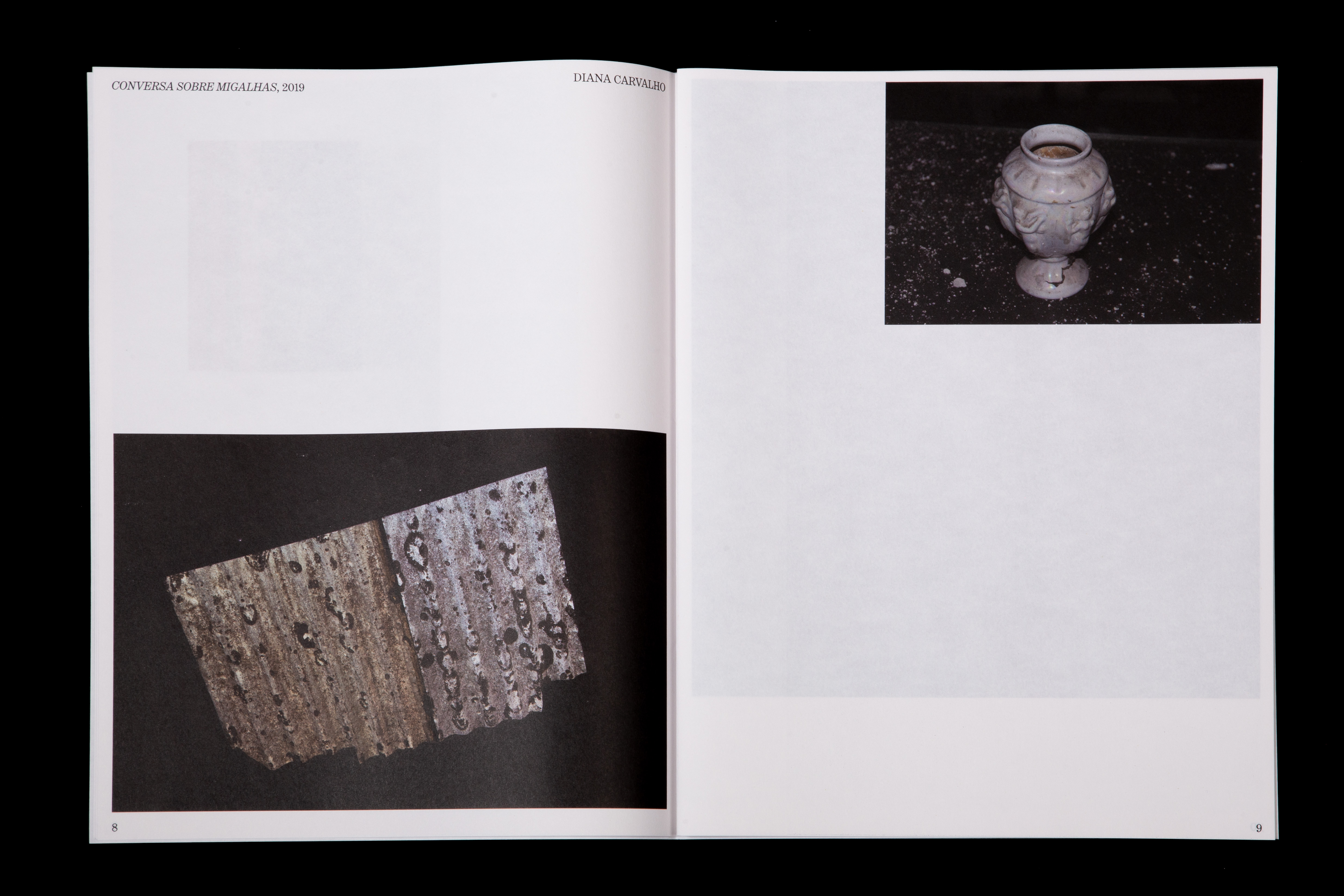
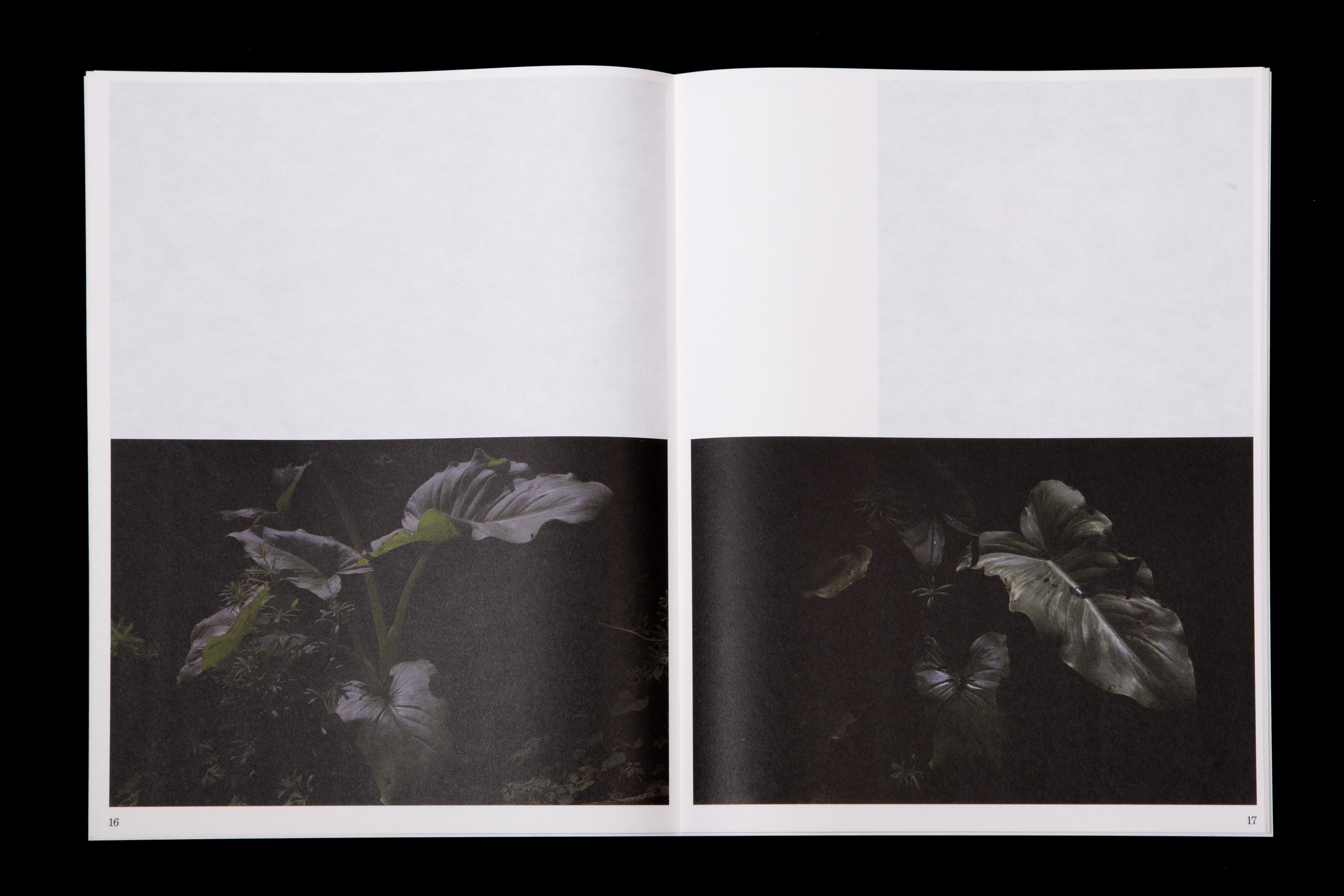
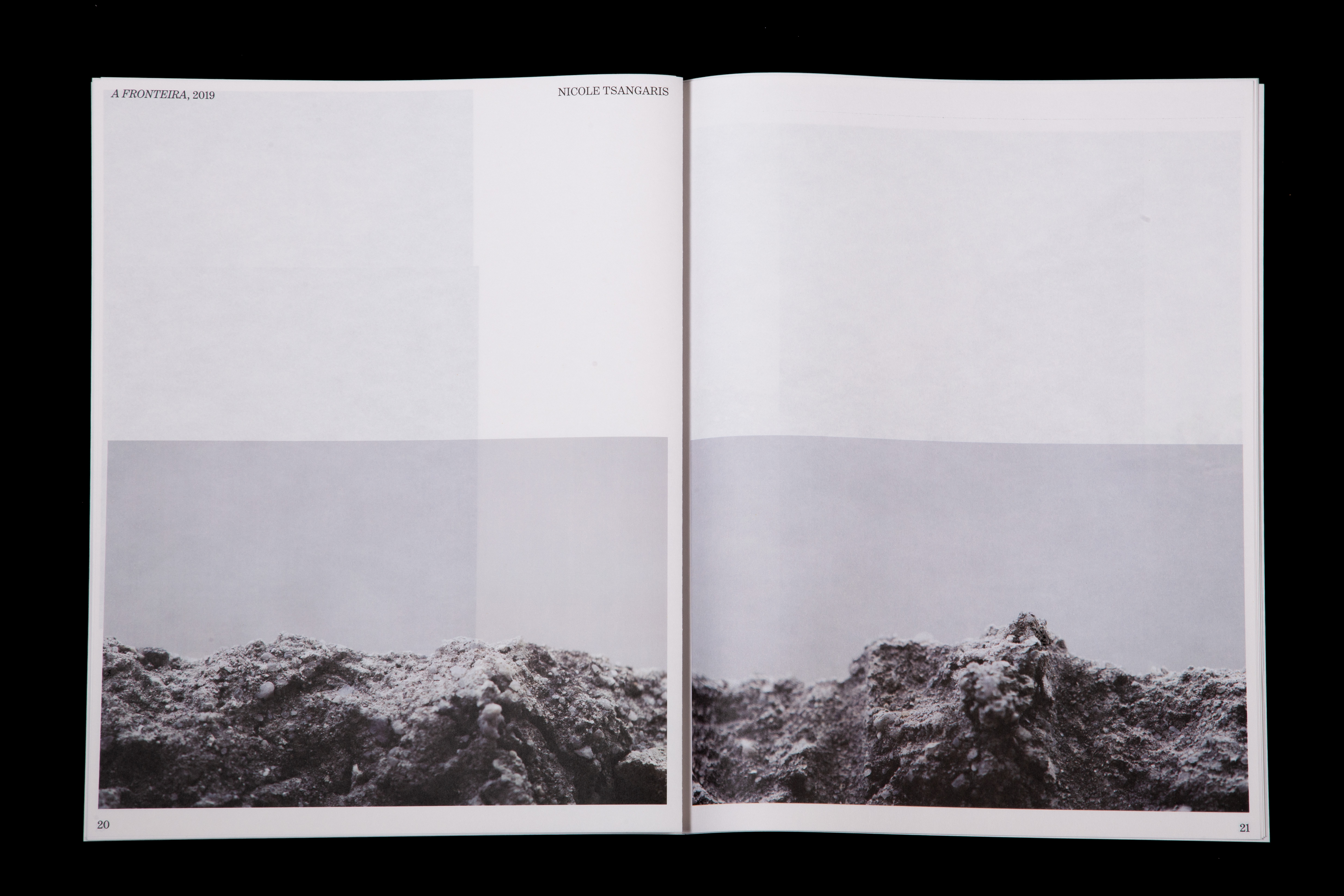
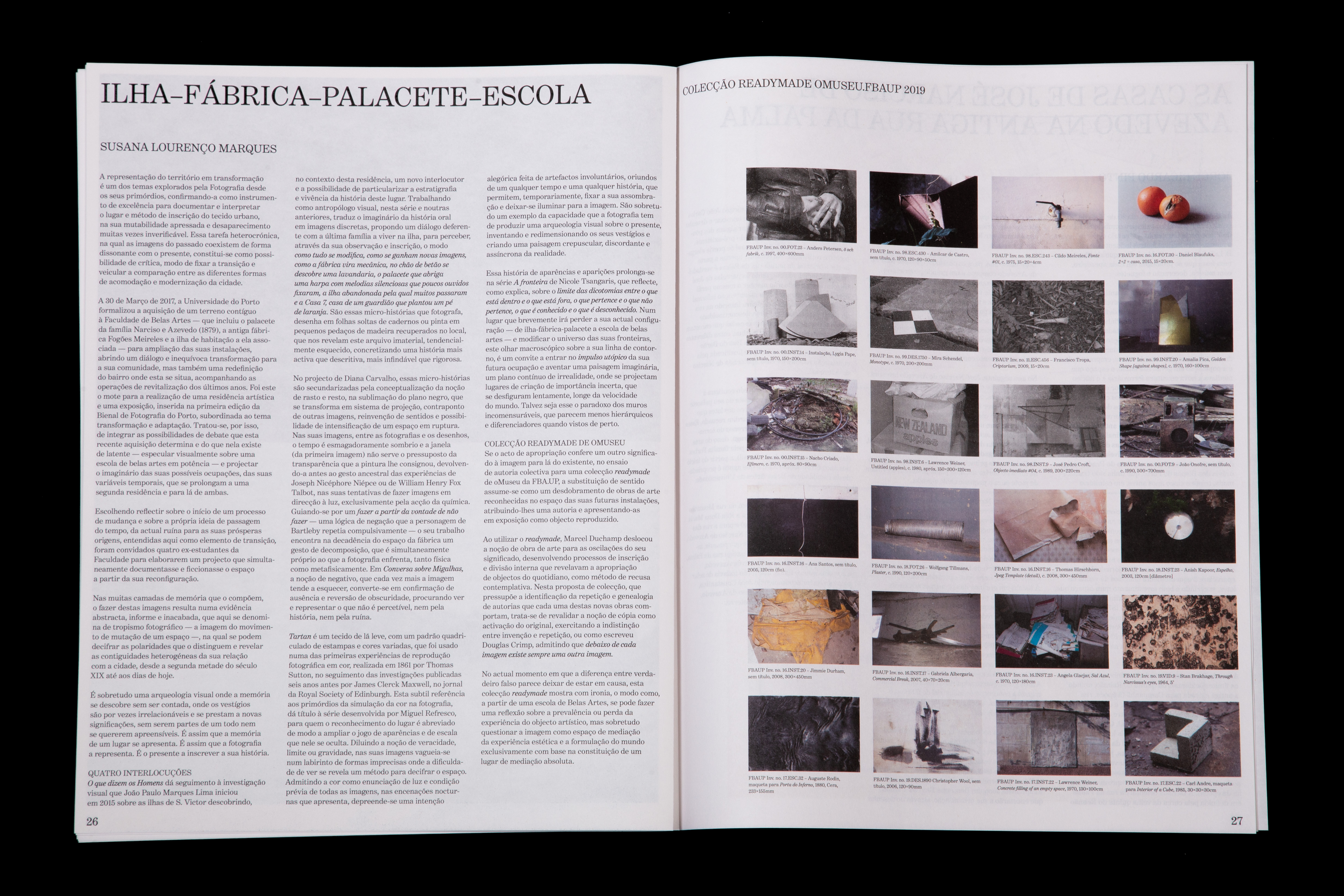
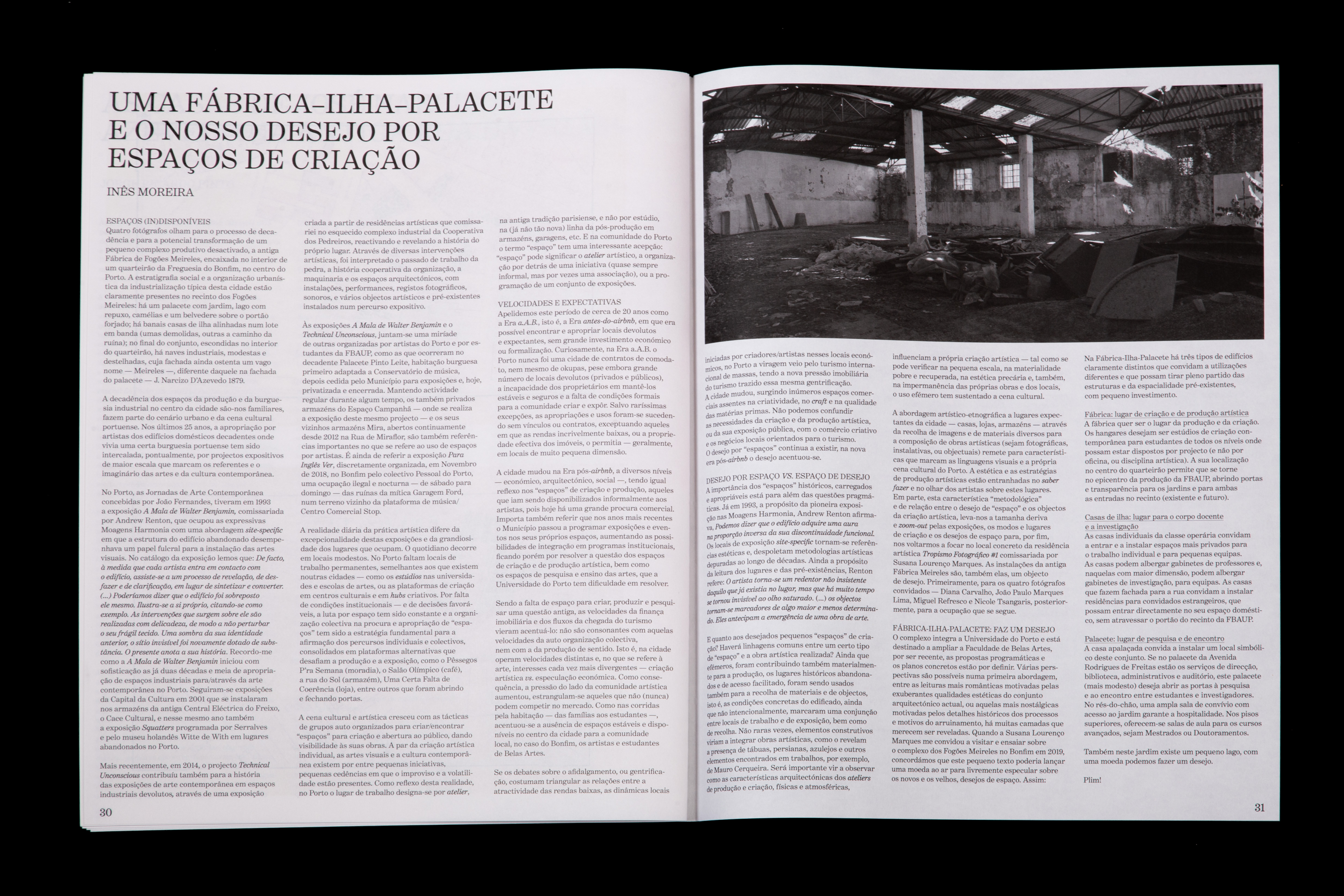
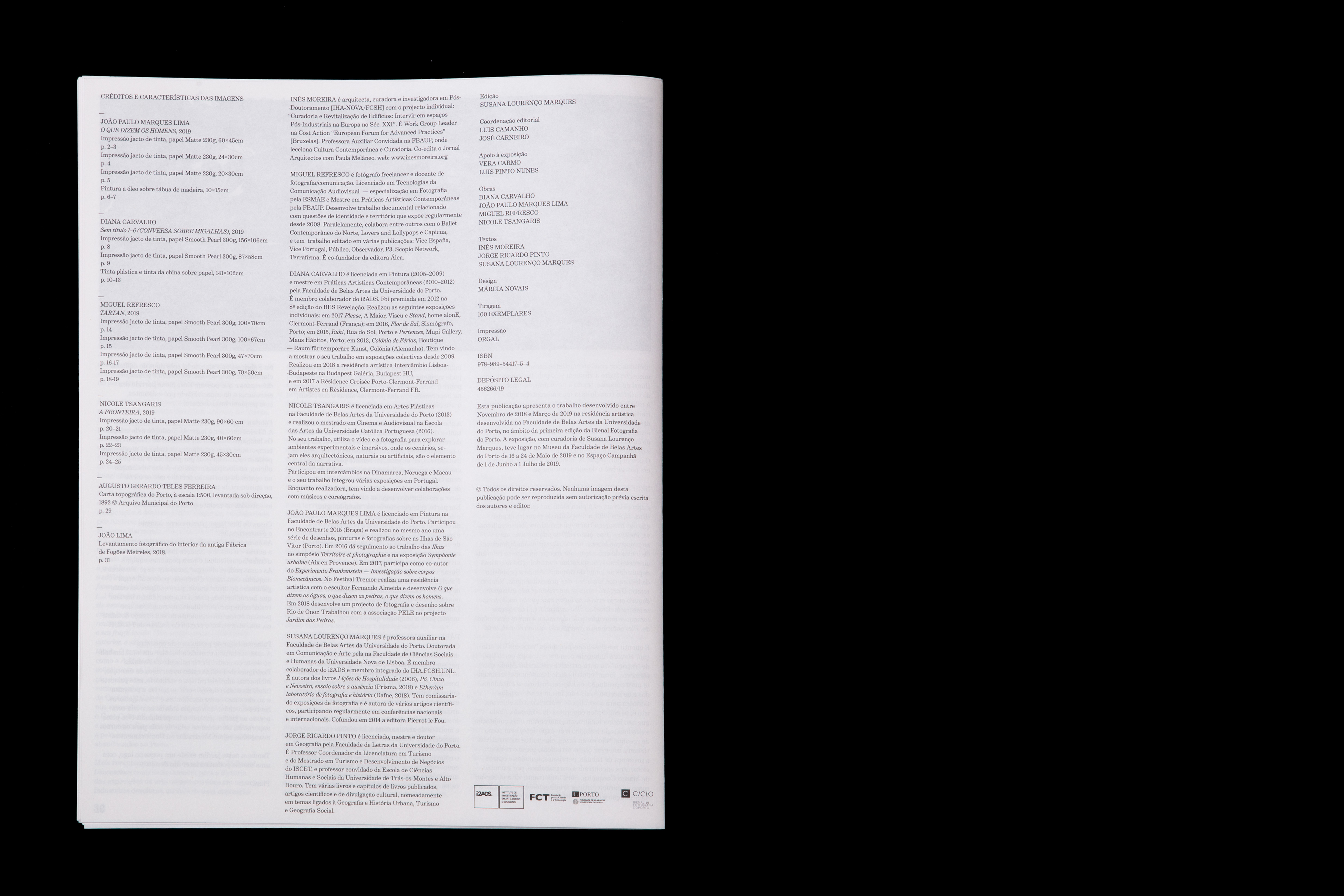
This newspaper was published for the exhibition Tropismo Fotográfico, a residency in the recently bought complex next to the Faculty of Fine Arts.
It is a limited numbered edition of 100 newspapers.
Casa São Roque editions
2019—ongoing
170 × 240 mm
Client: Casa São Roque
Assisted by Nuno Maio
These books accompany the exhibitions at Casa São Roque.
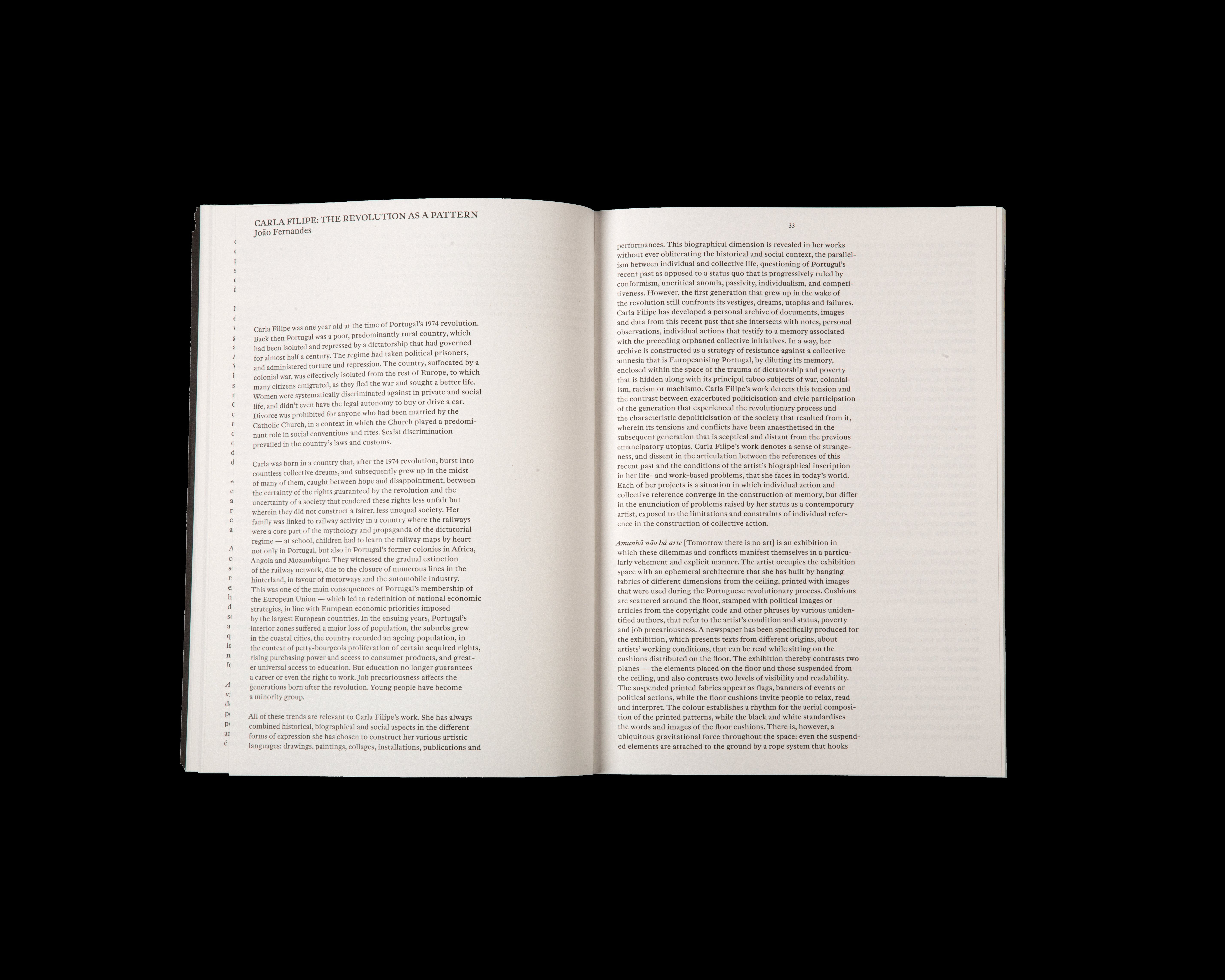
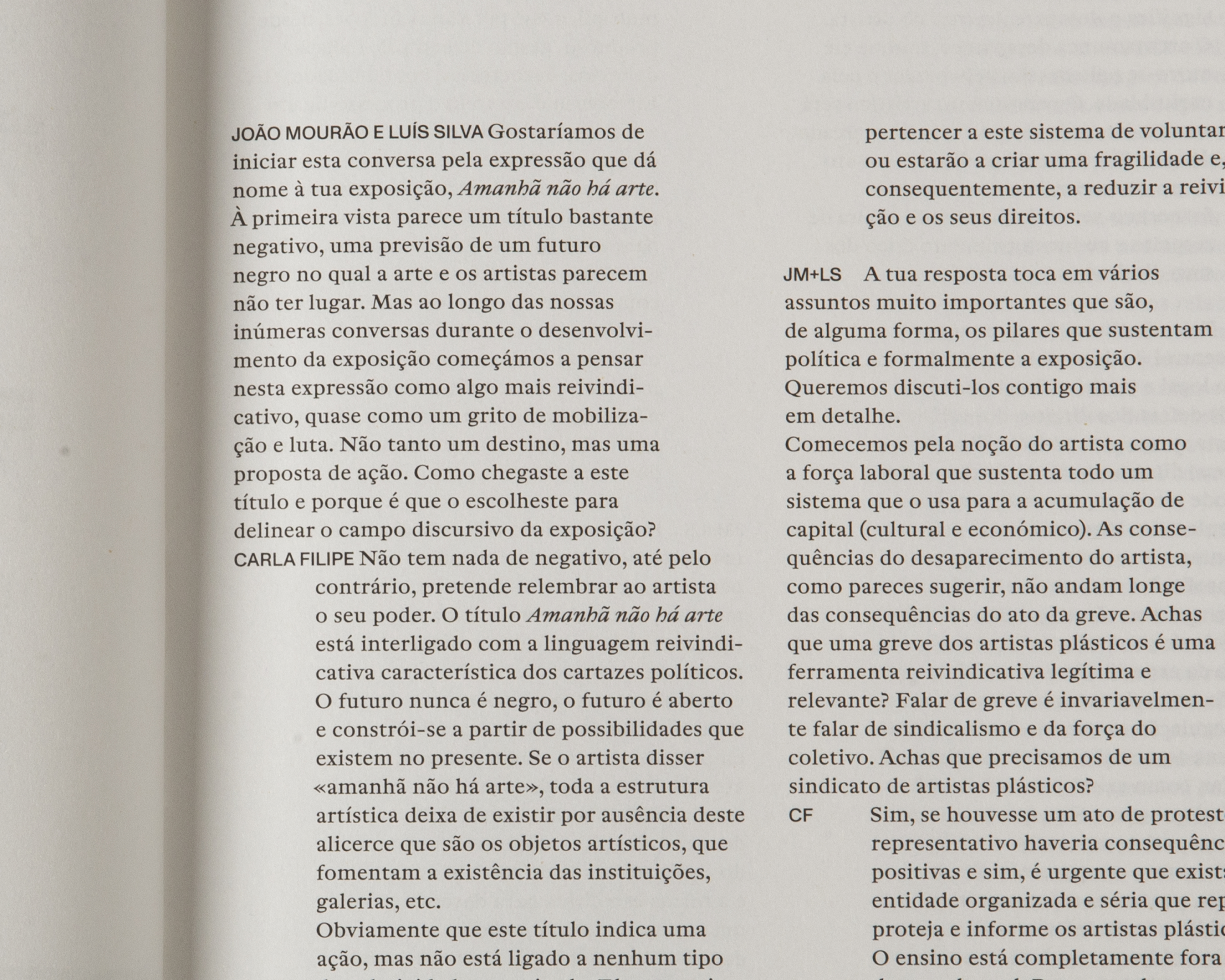
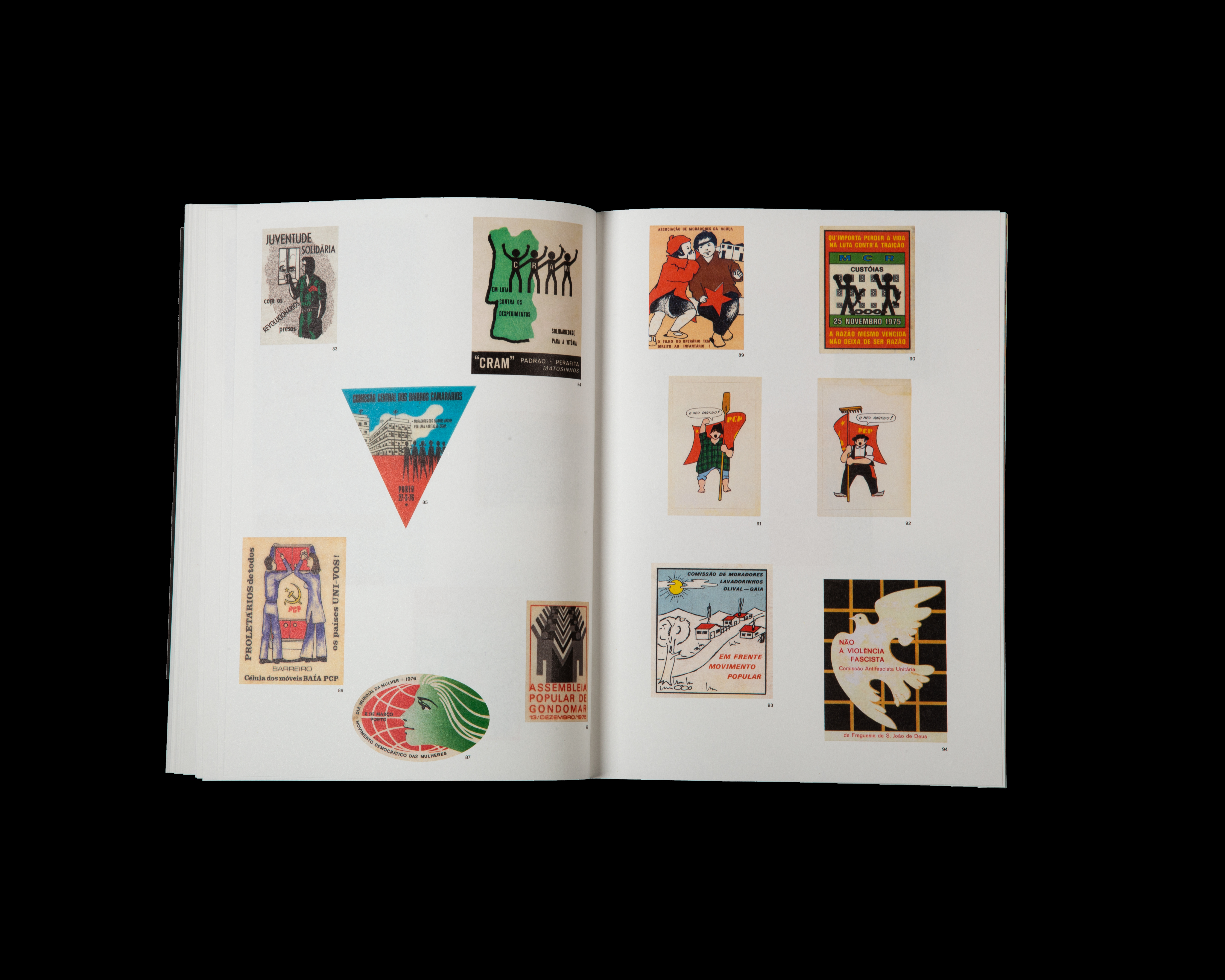
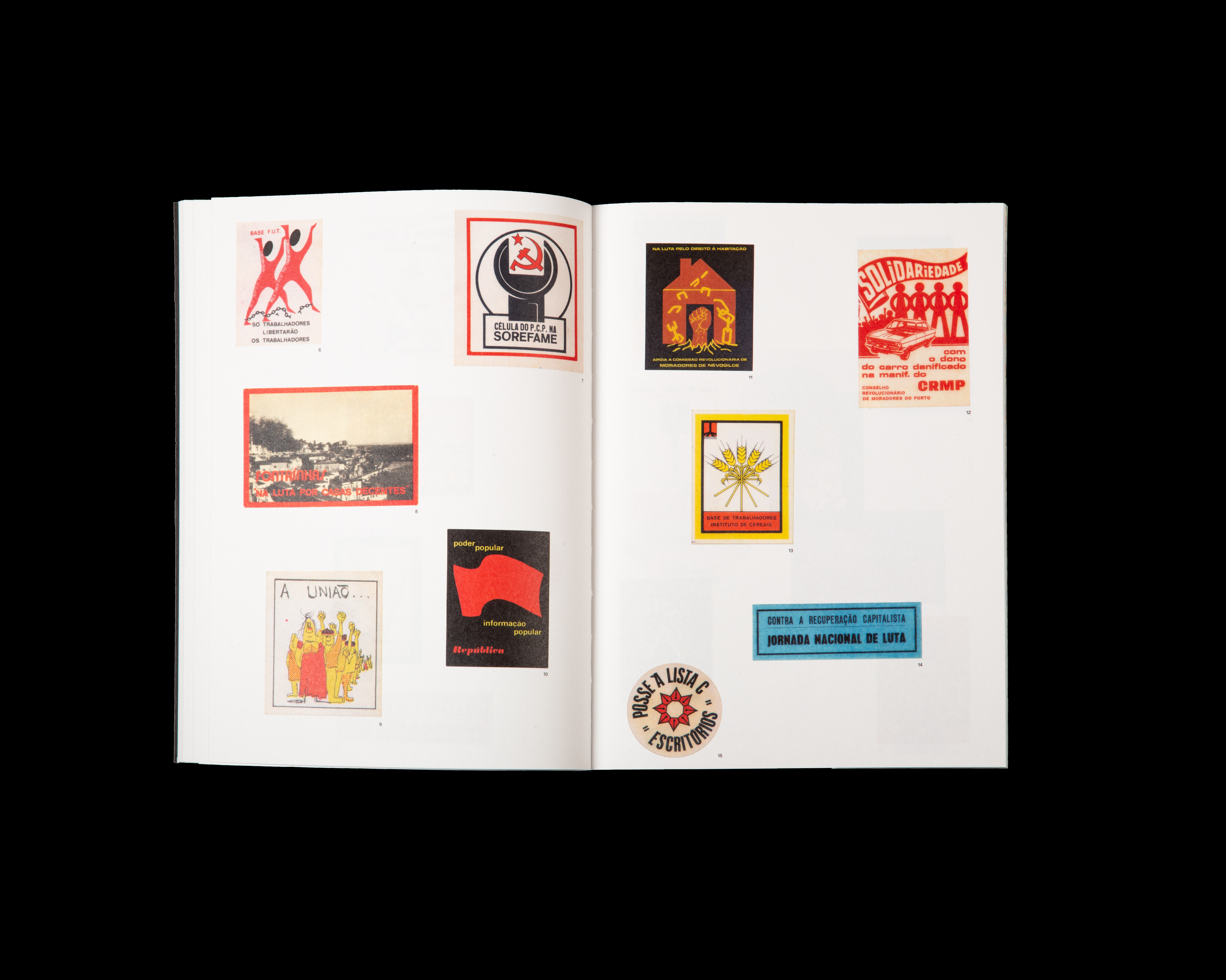
Amanhã não há arte
2019
Book for Carla Filipe exhibition at MAAT
180 × 250 mm
Client: MAAT
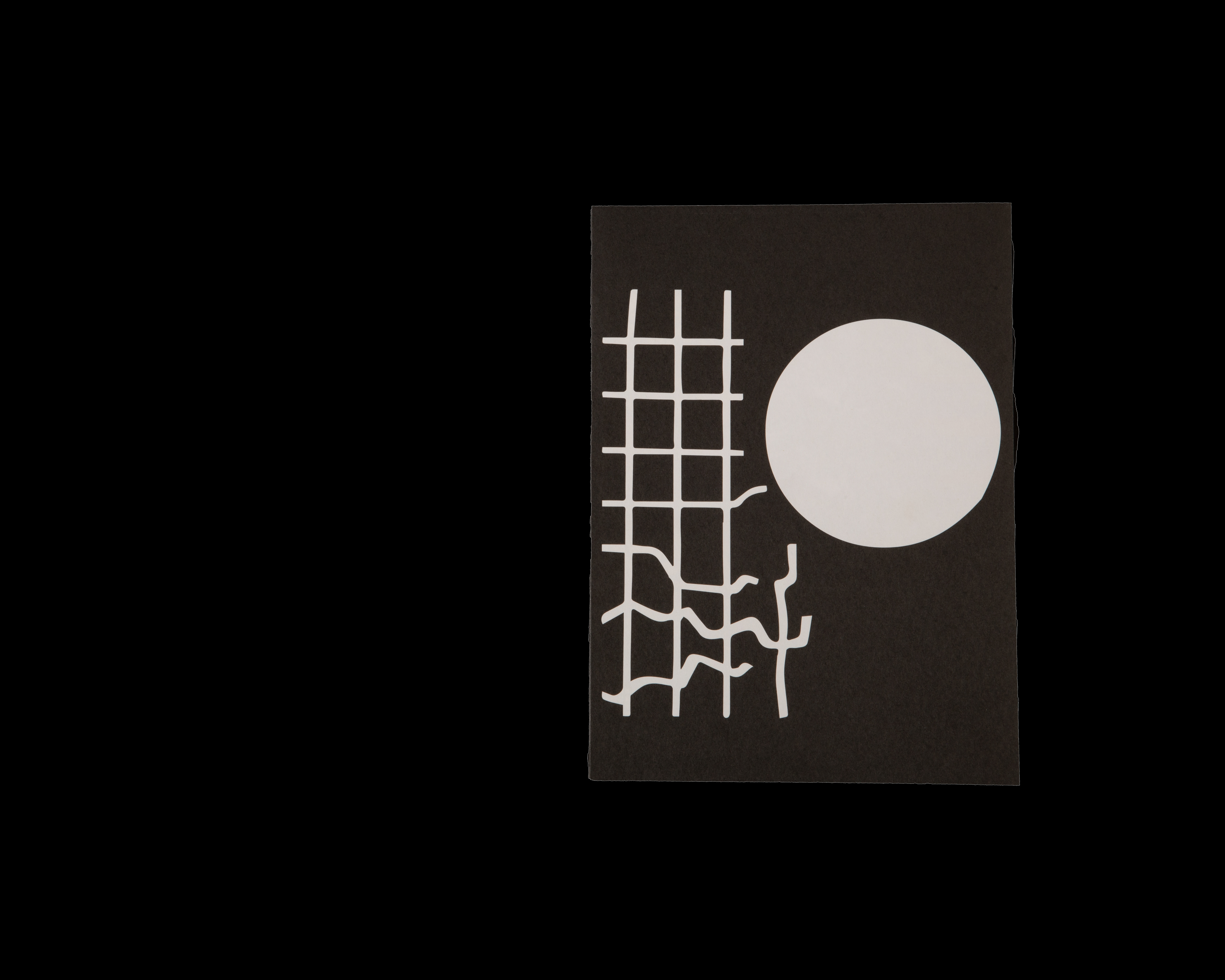
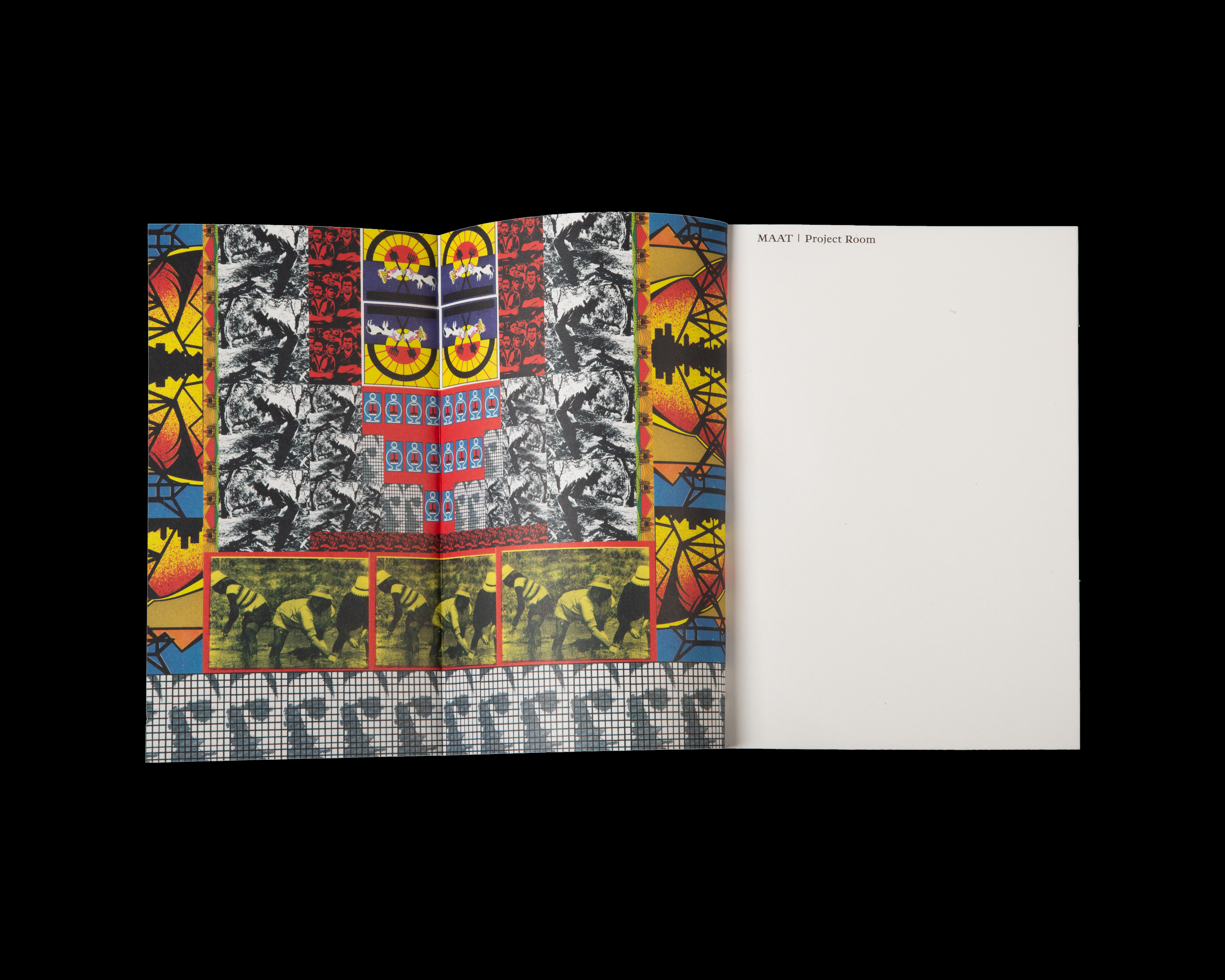
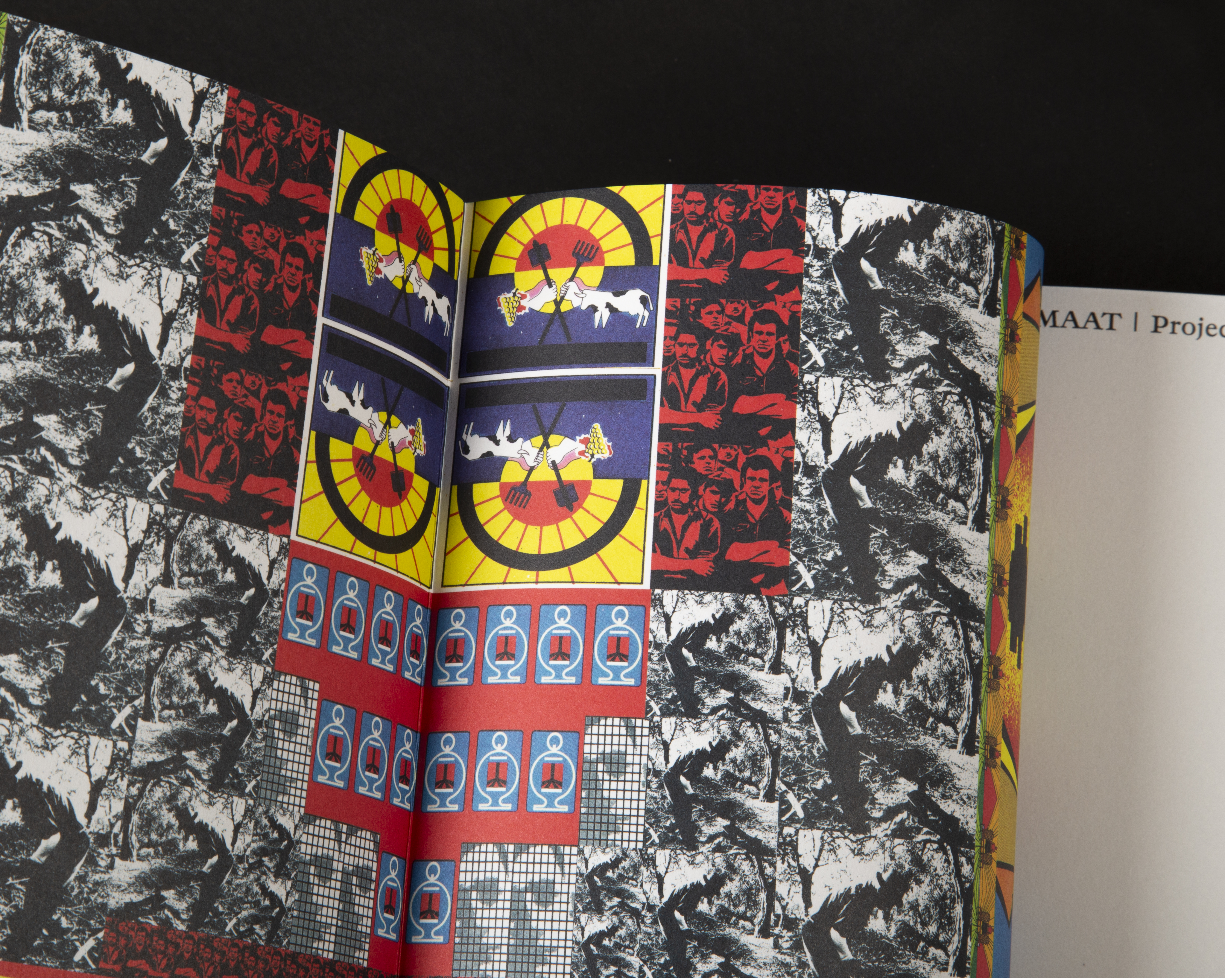
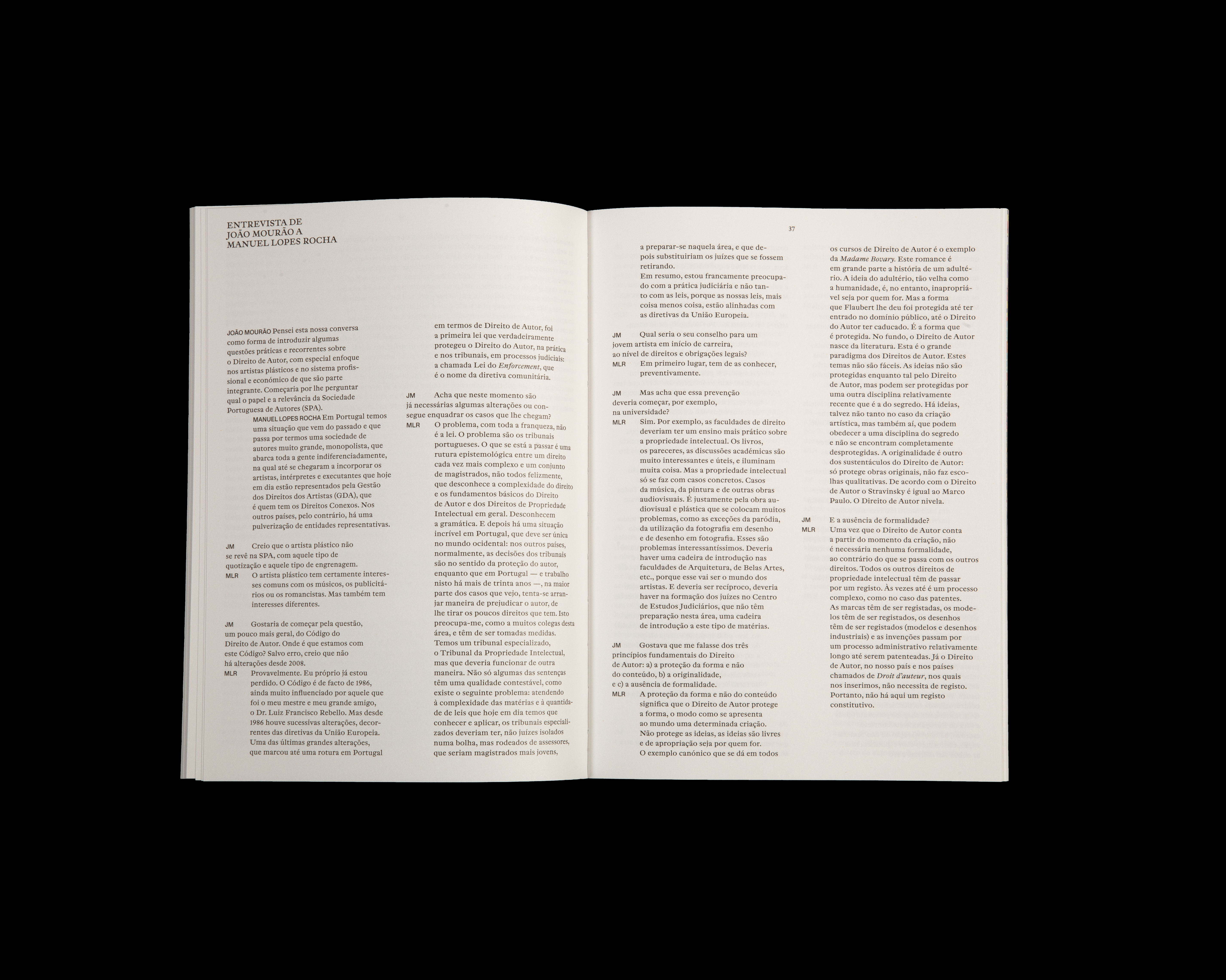
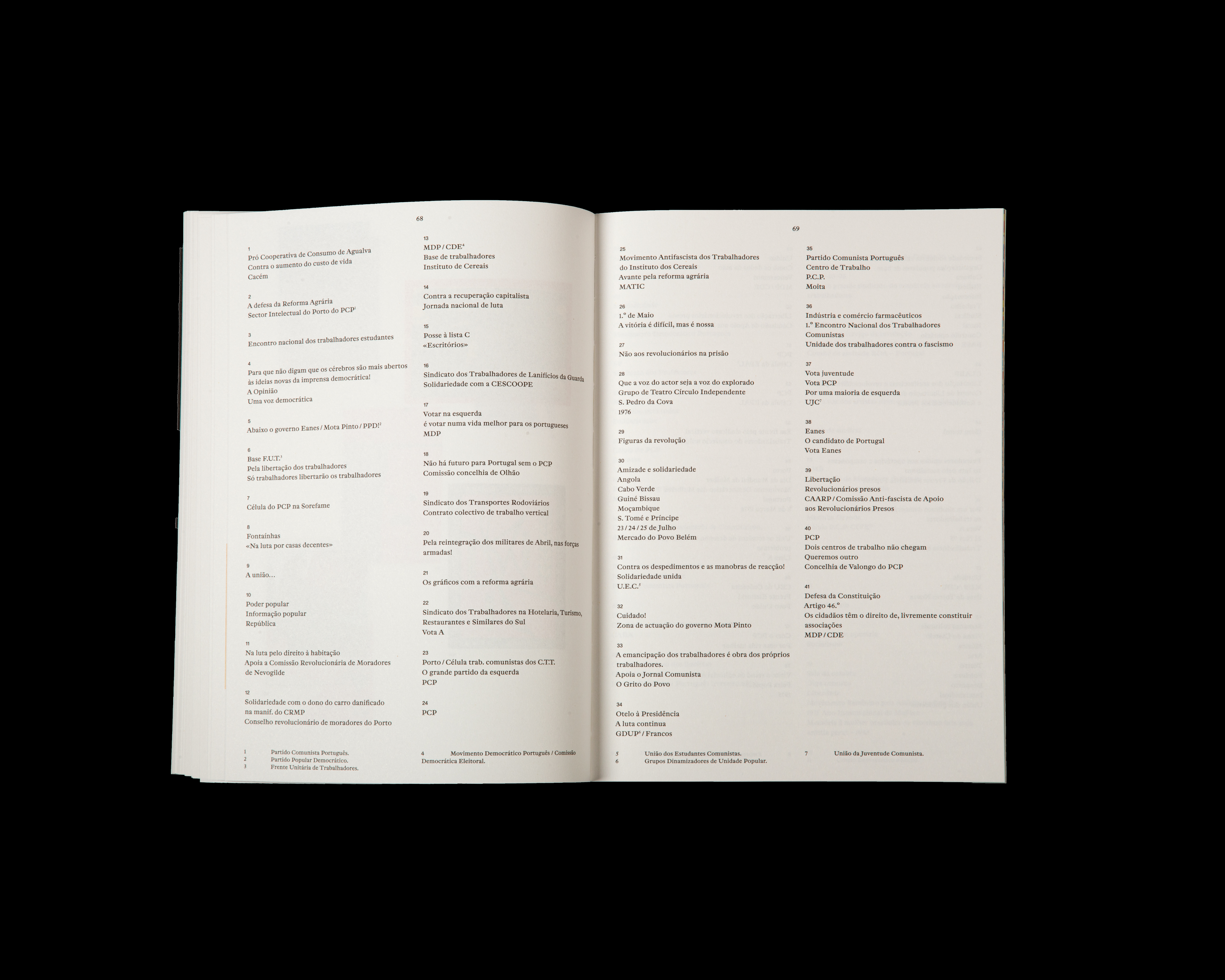
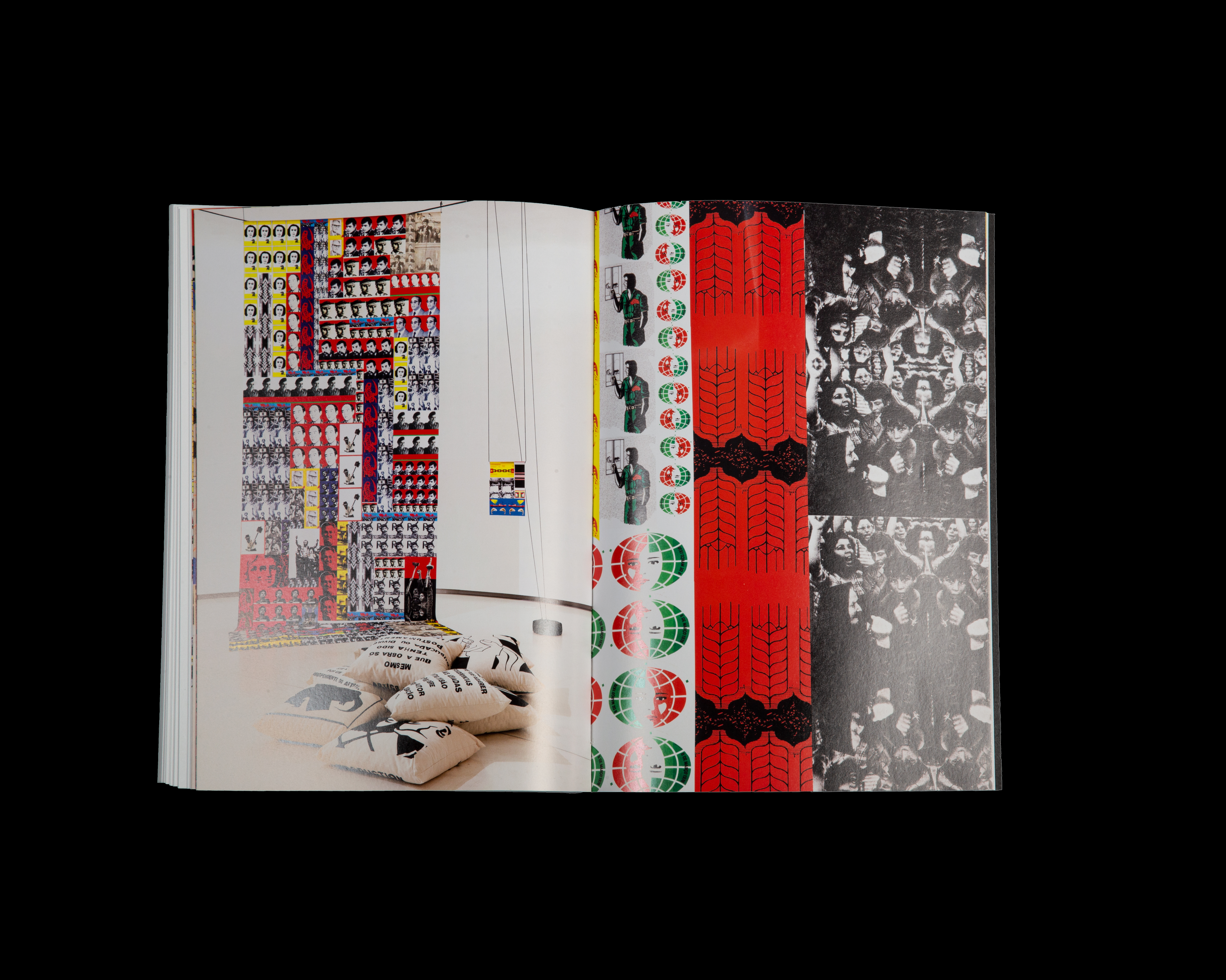
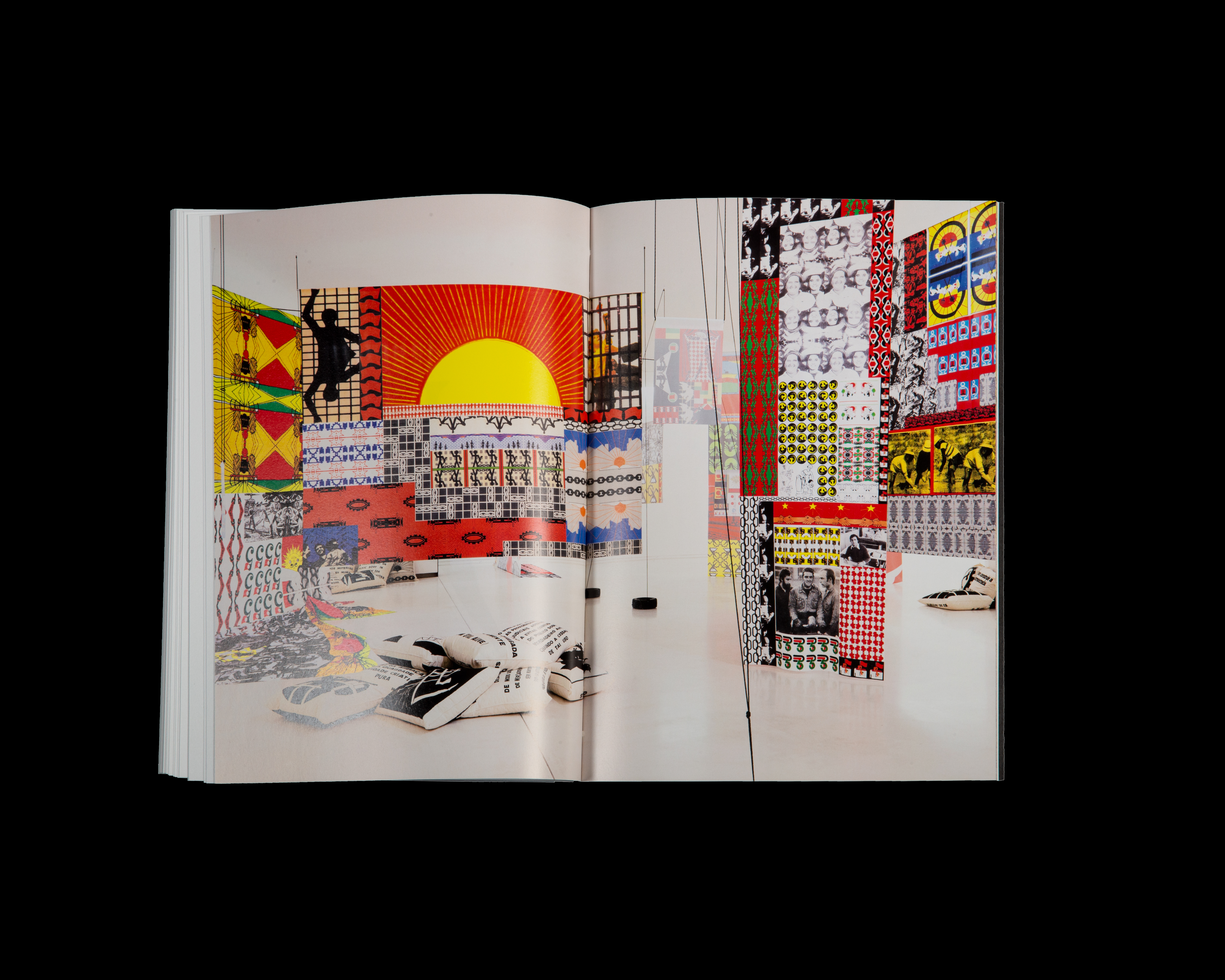
This book accompanied the exhibition by Carla Filipe at MAAT in Lisbon. It has texts and a reproduction of part of the artist's archive of political stickers and views from the exhibition.
Criteria
2019
Curated by Miguel von Hafe Perez
Client: Arco / IFEMA
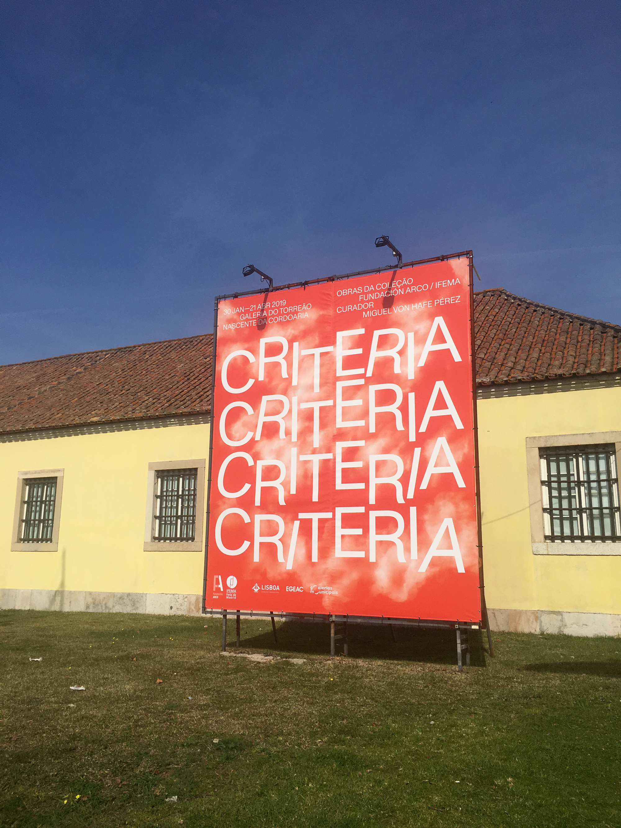
Criteria presented pieces from the collections of Arco and IFEMA, the organisers of Arco art fair.
(publication soon)
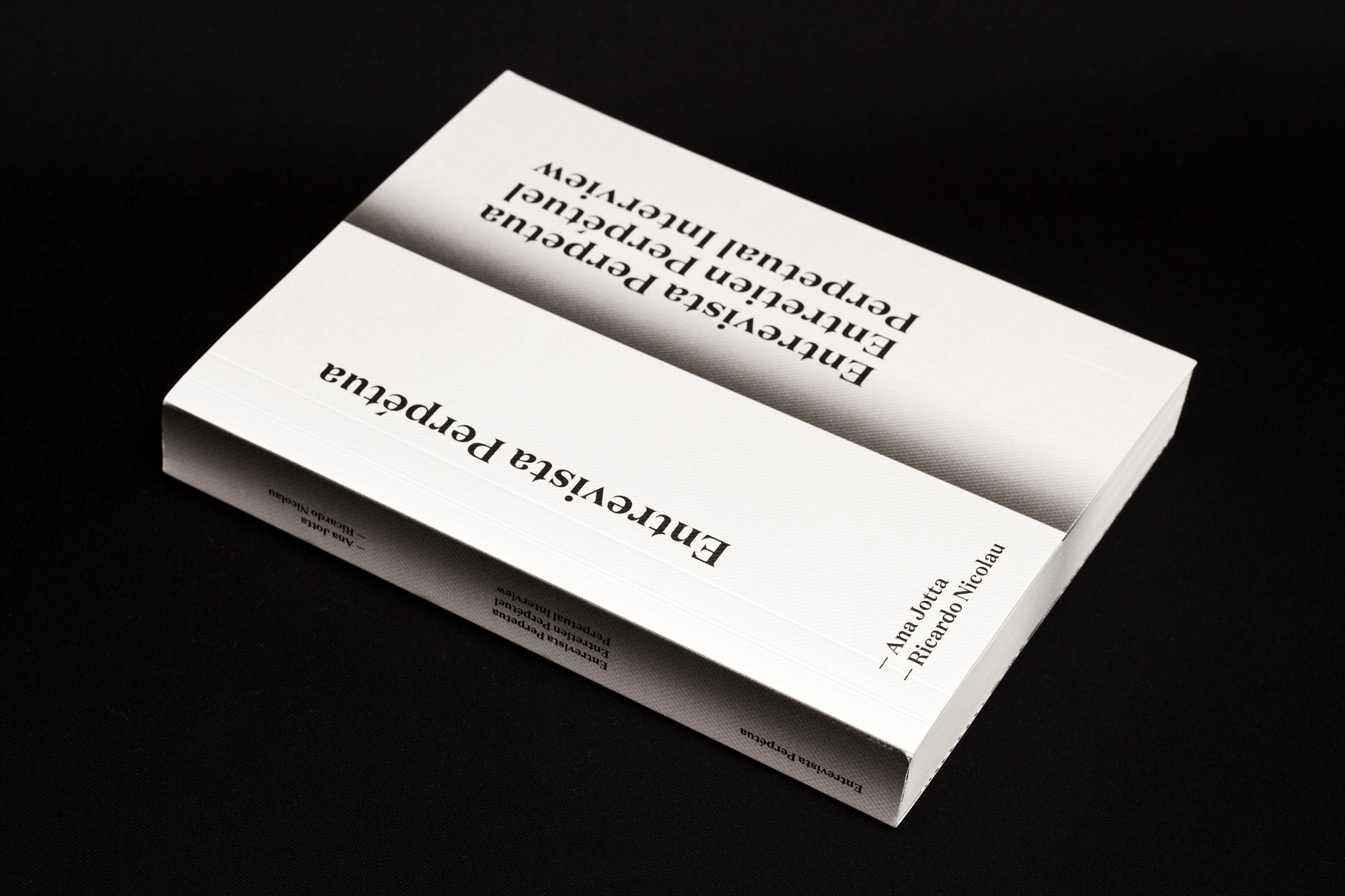
Entrevista Perpétua
2017
170 × 230 mm
Client: Ricardo Nicolau
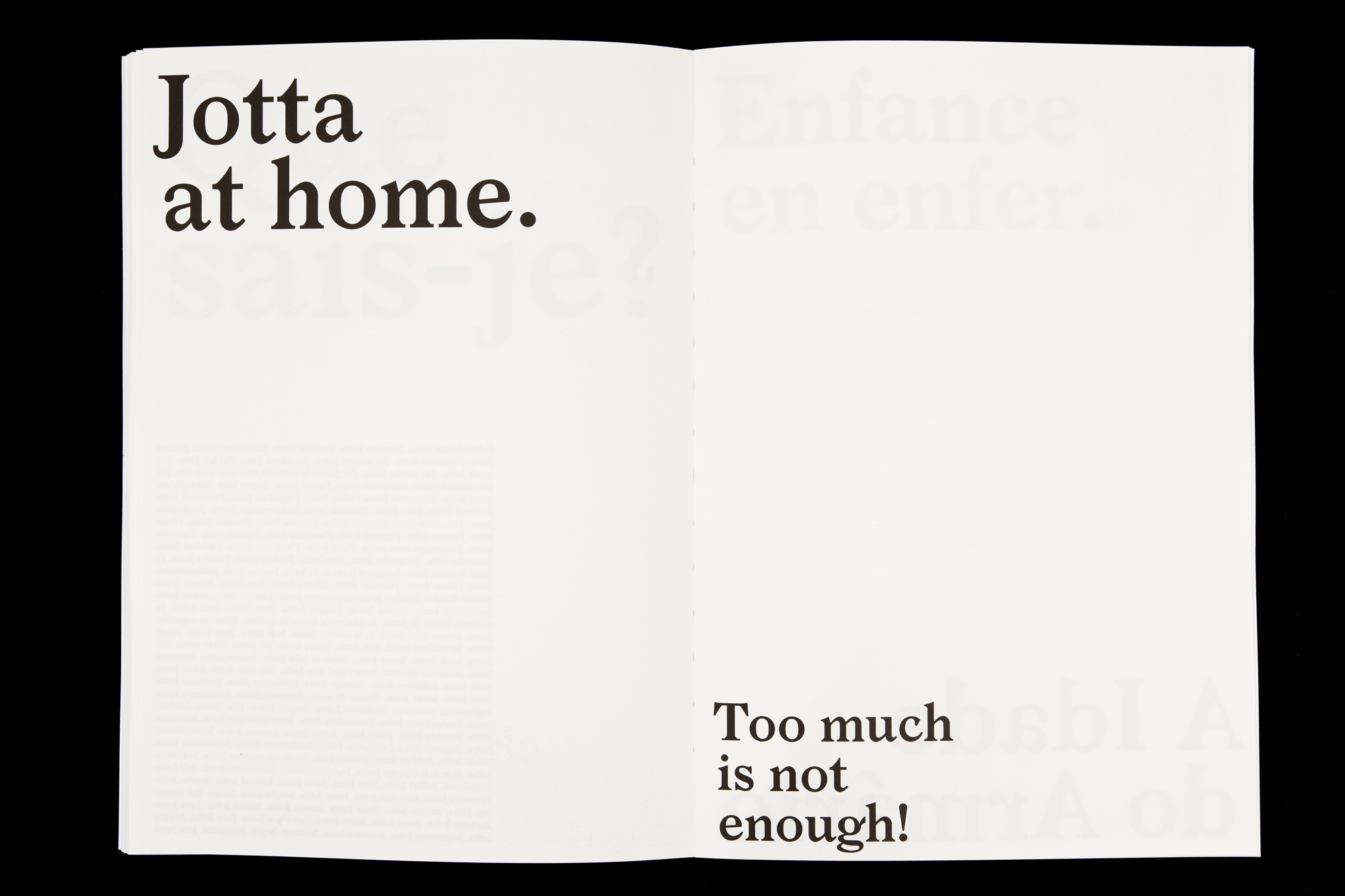
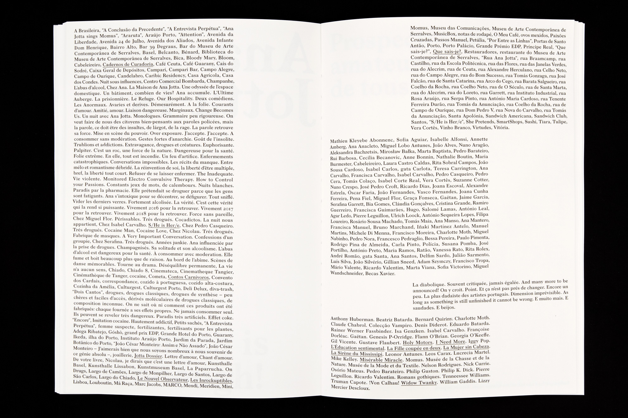
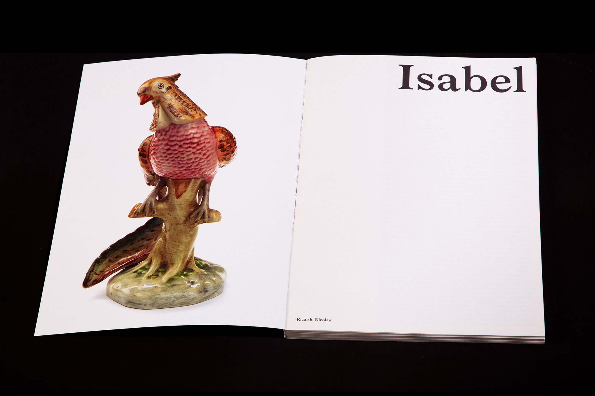
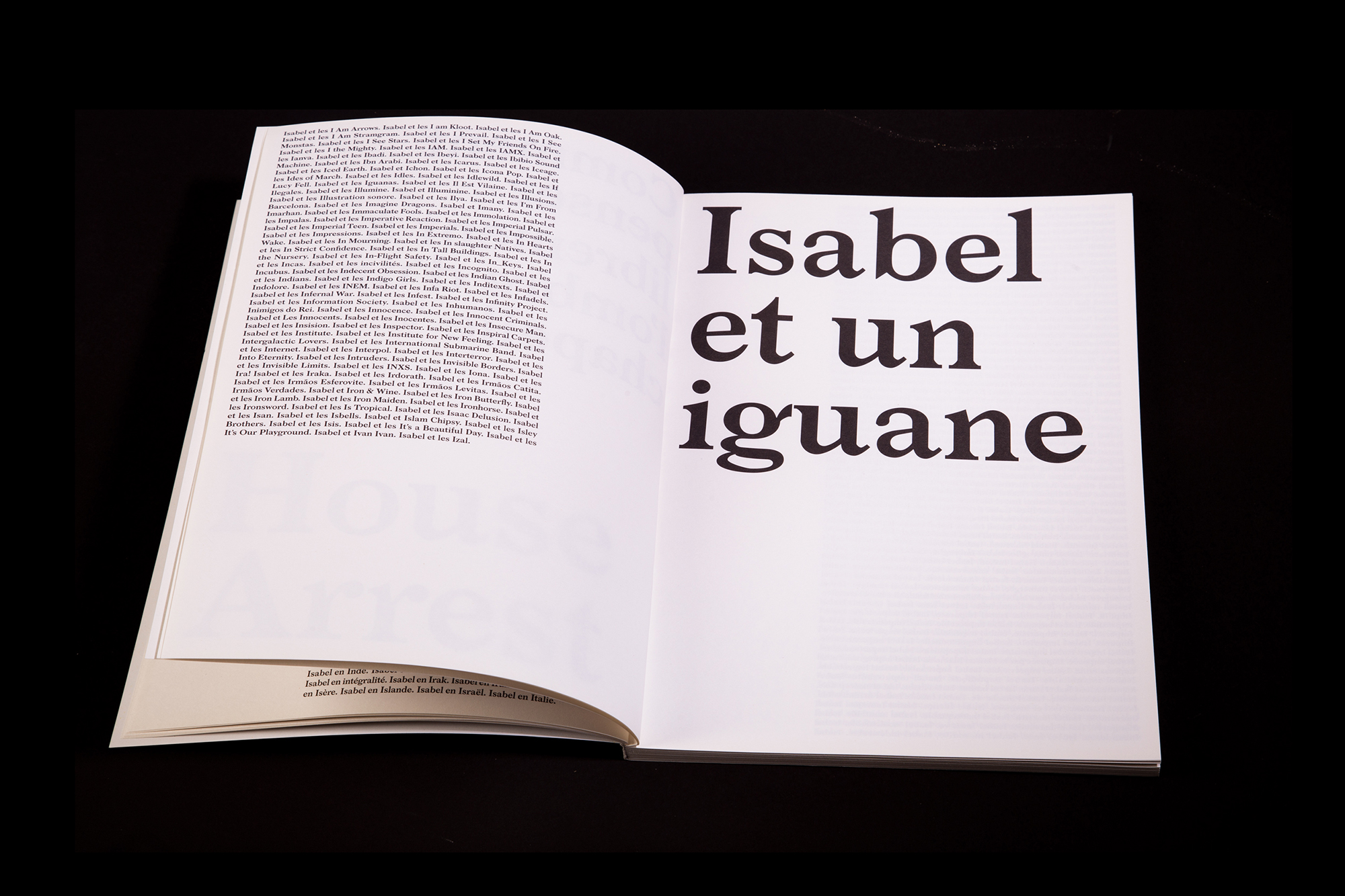
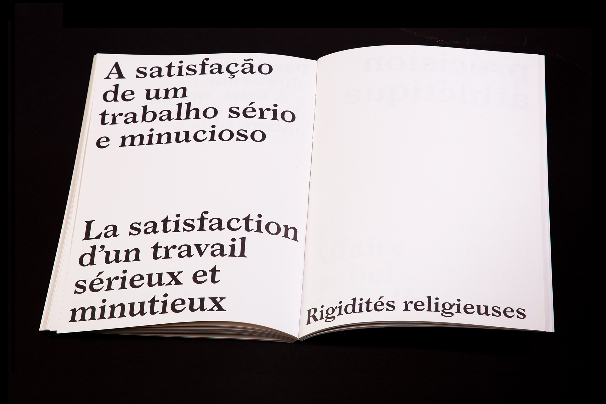
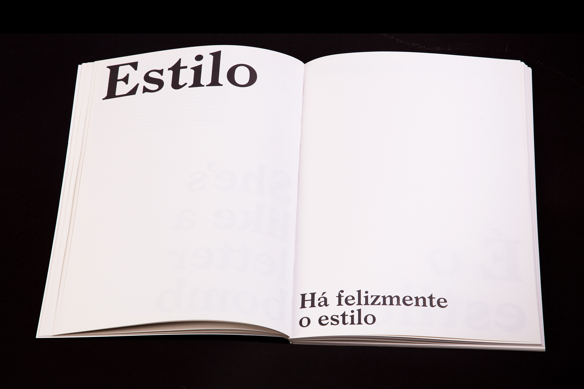
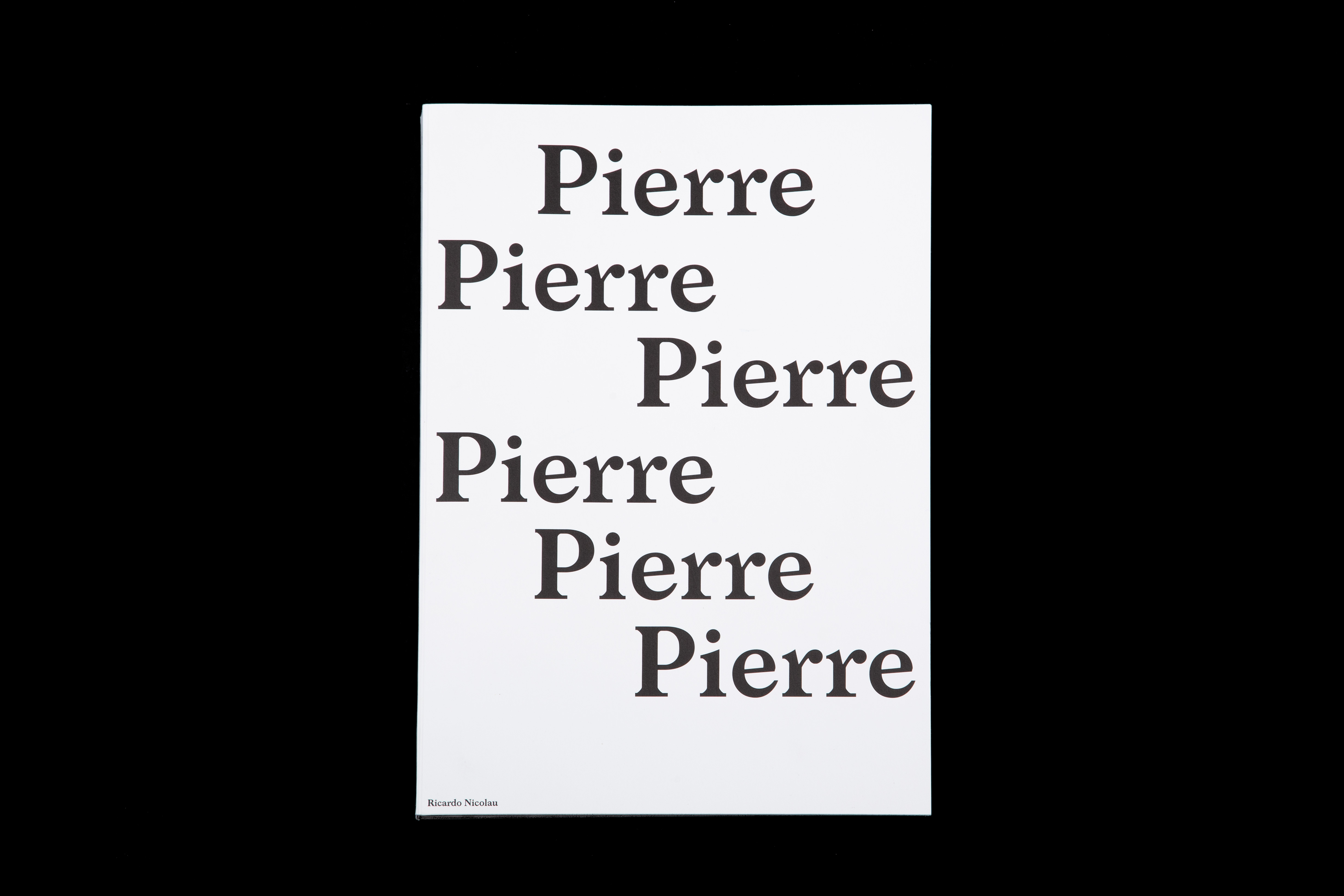
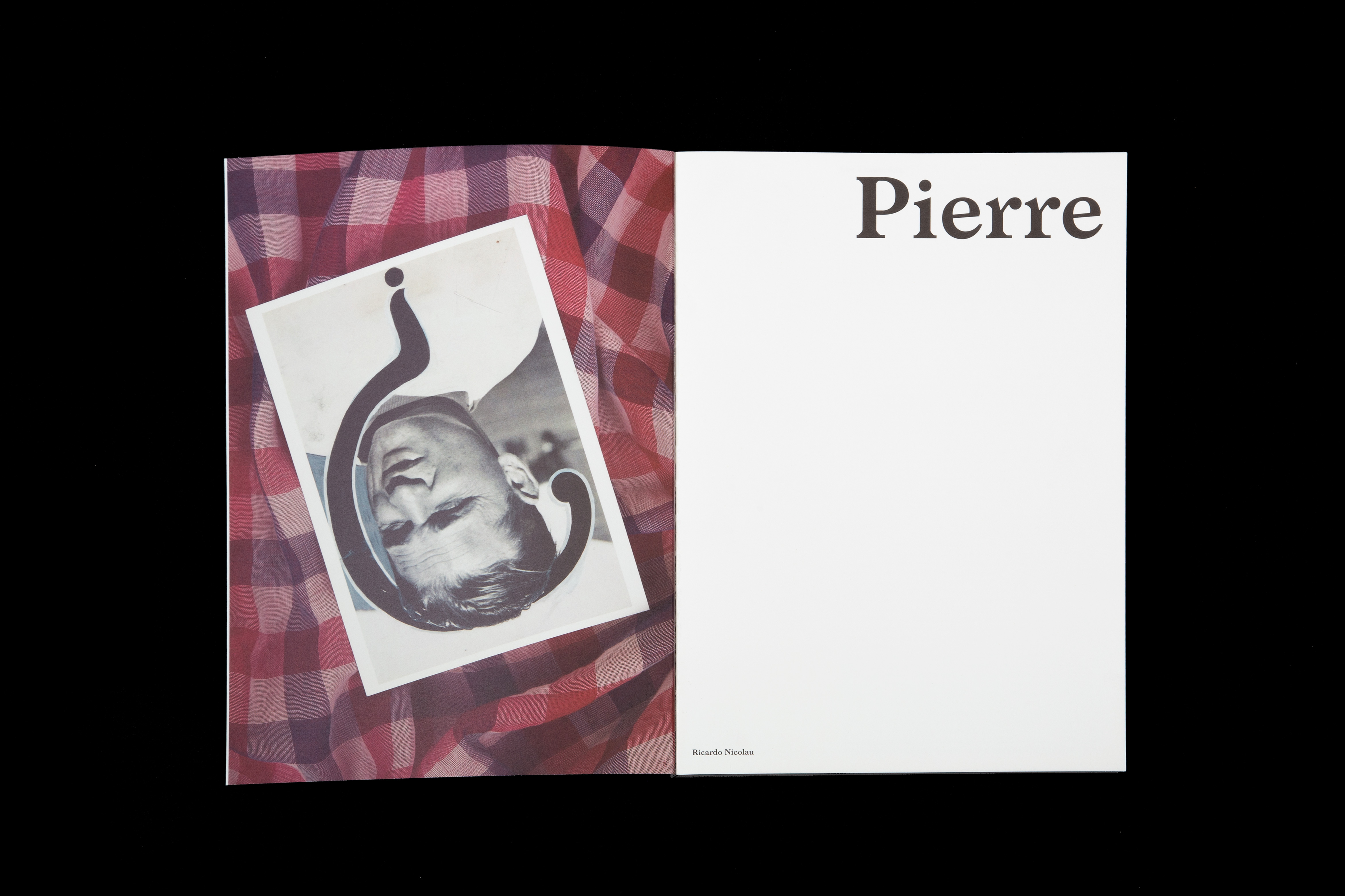
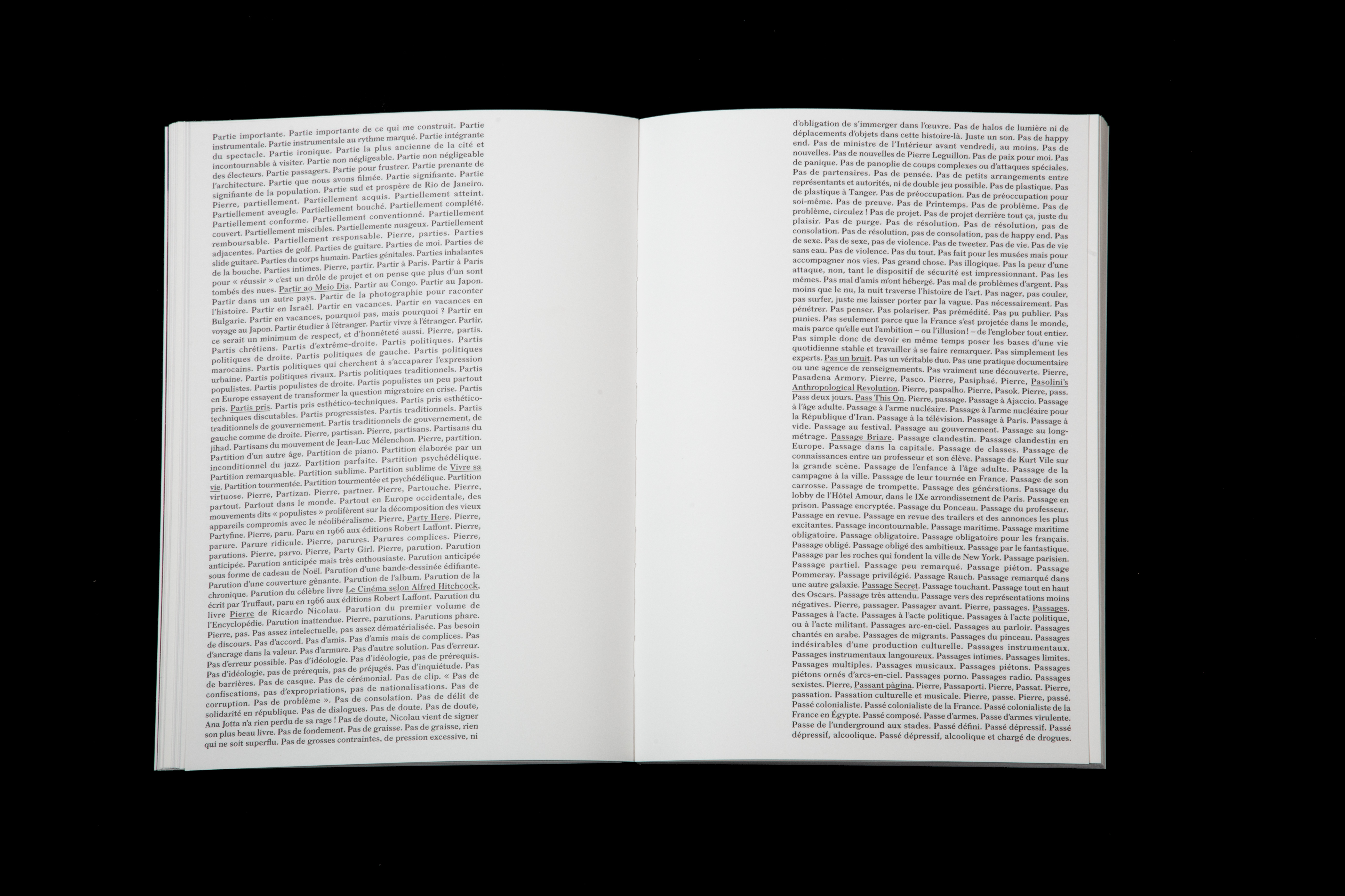
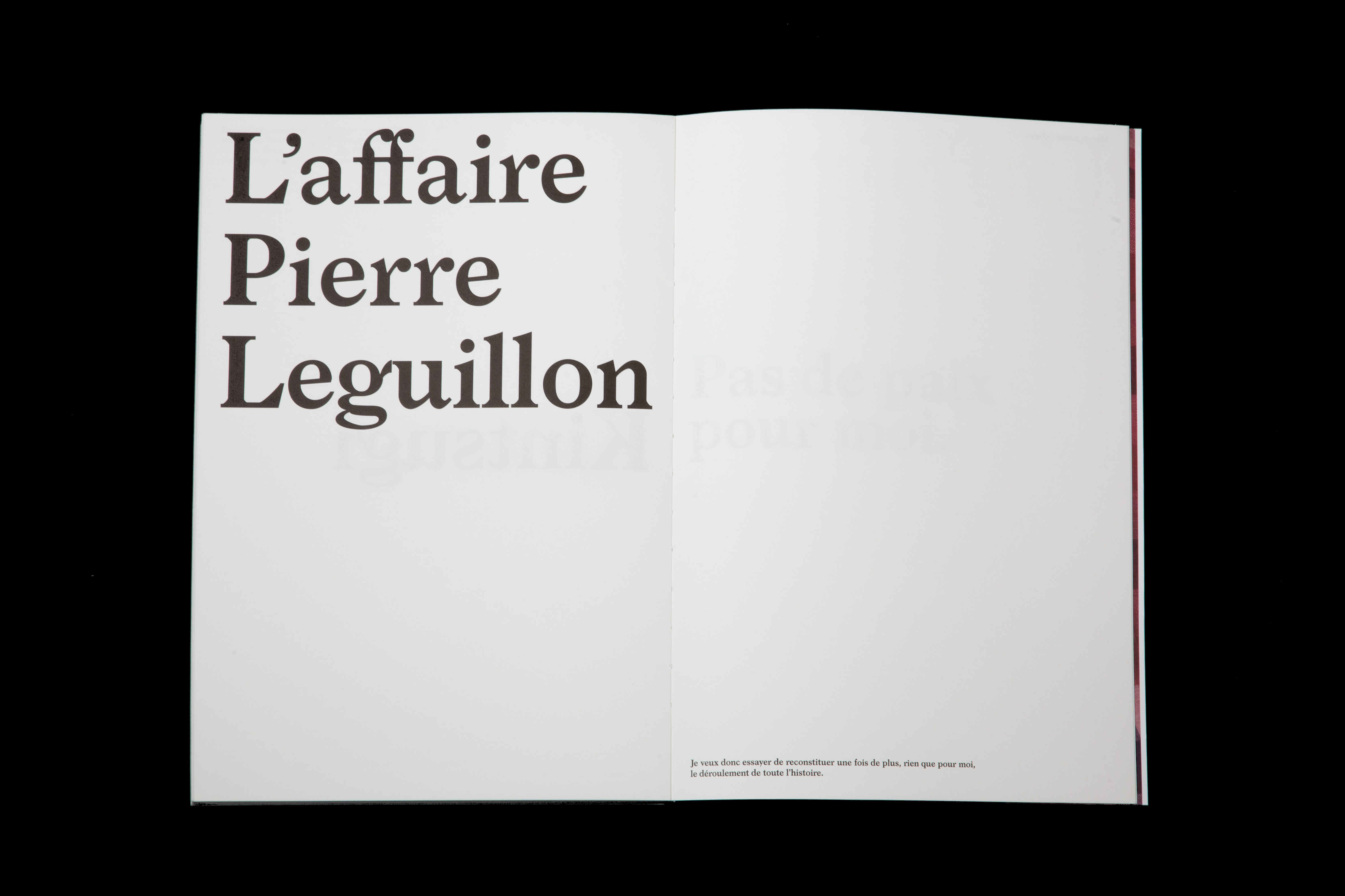
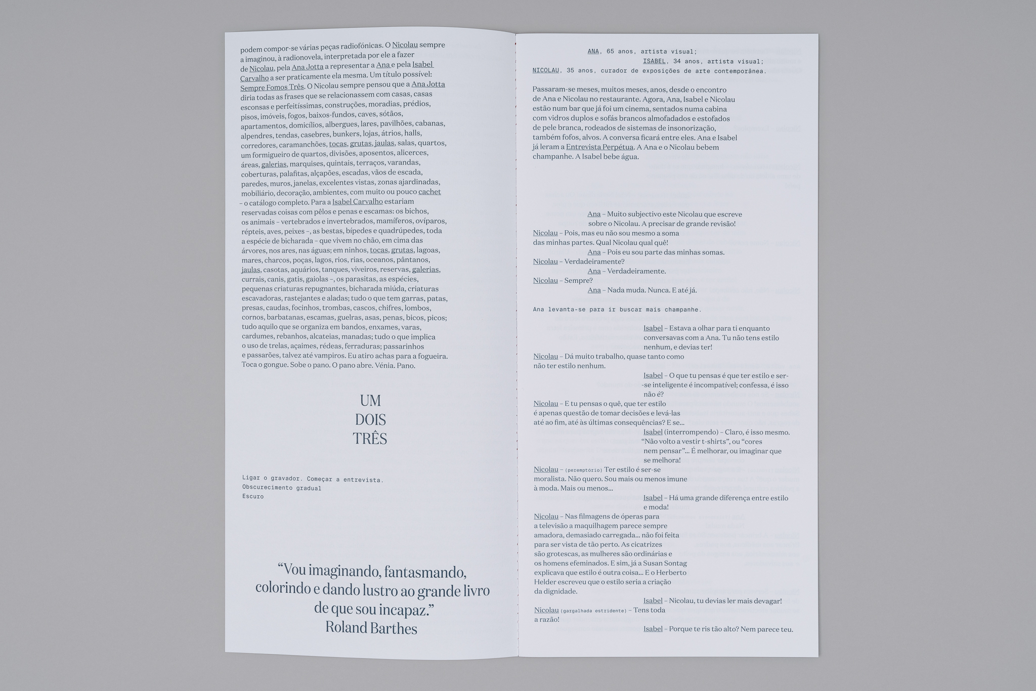
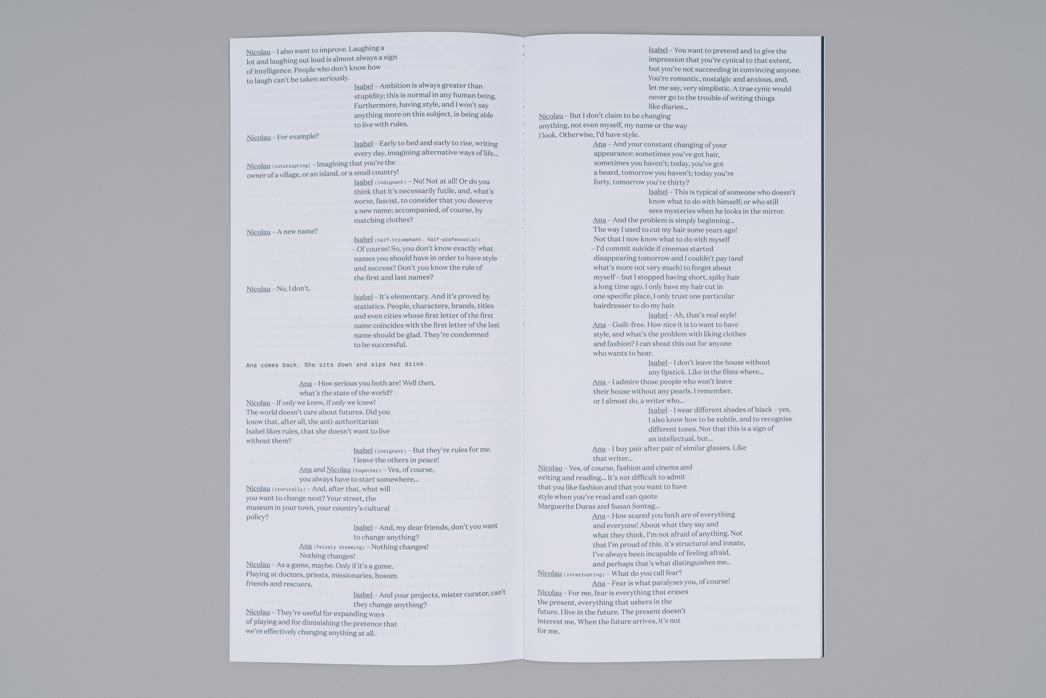
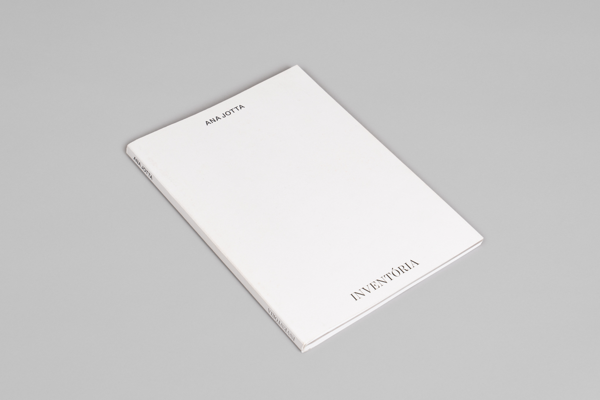
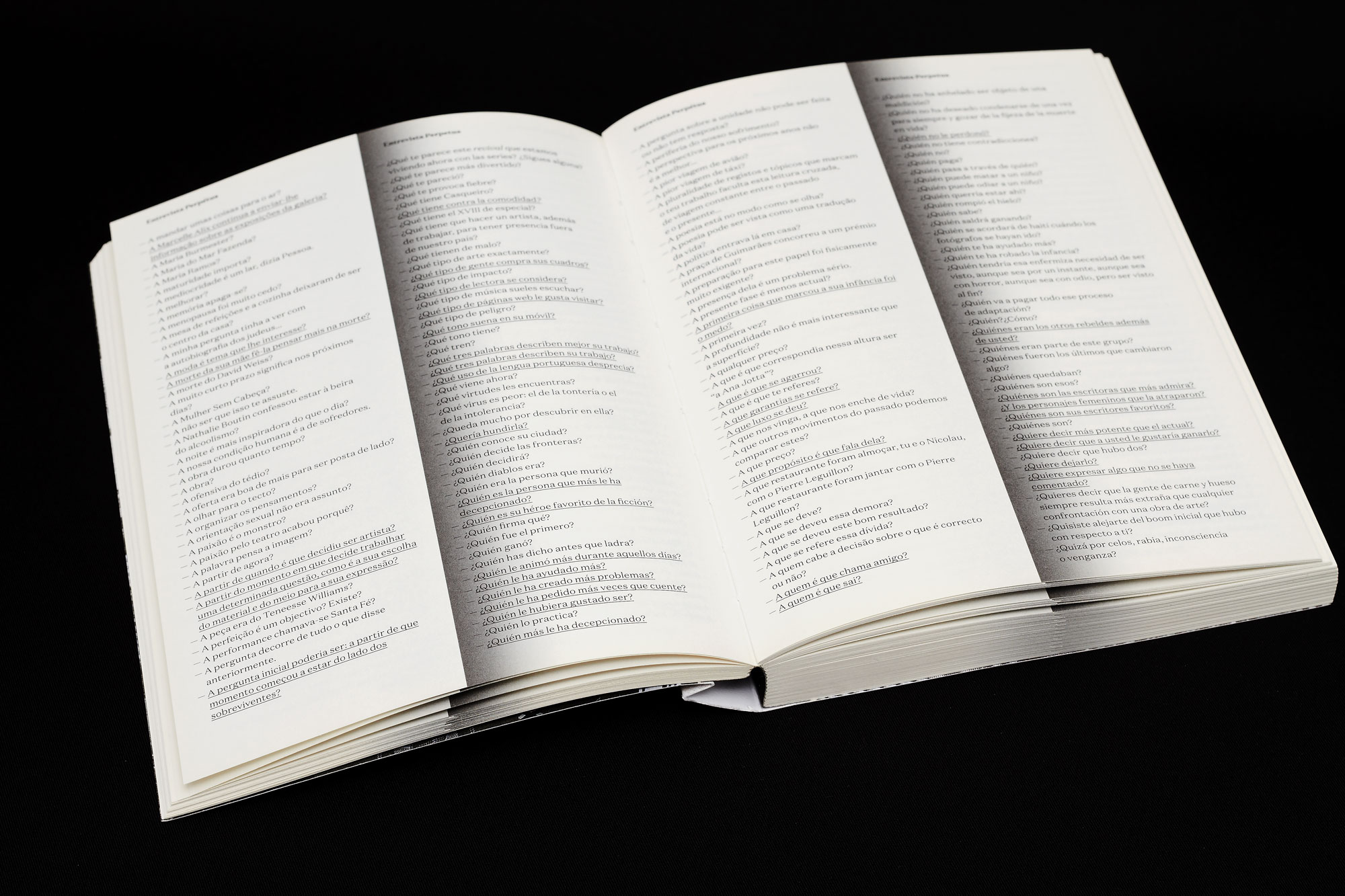
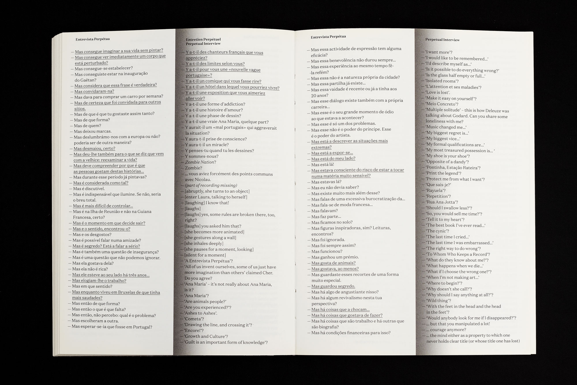
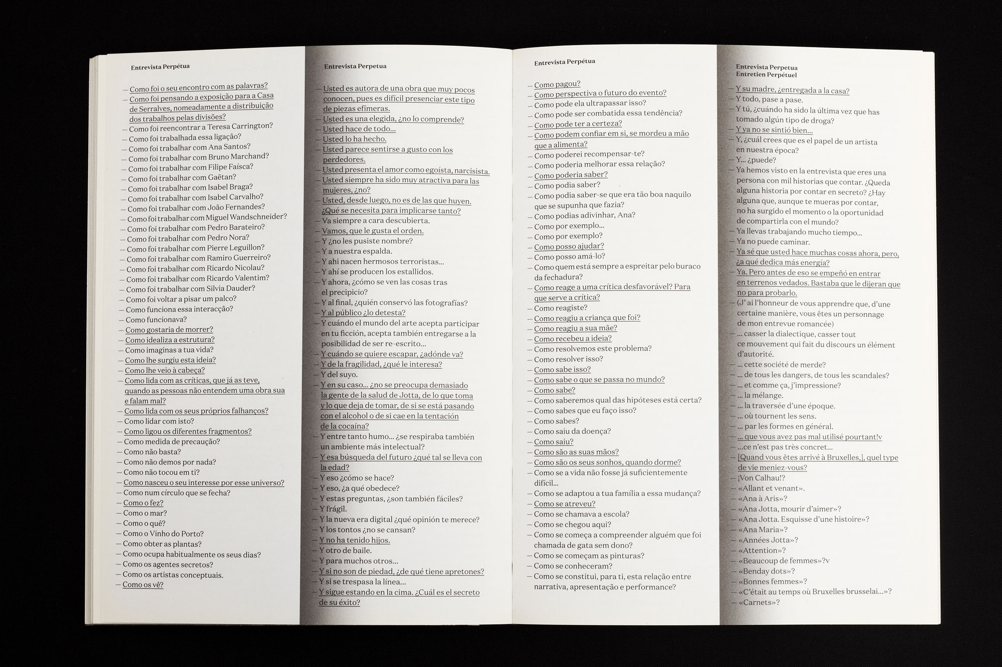
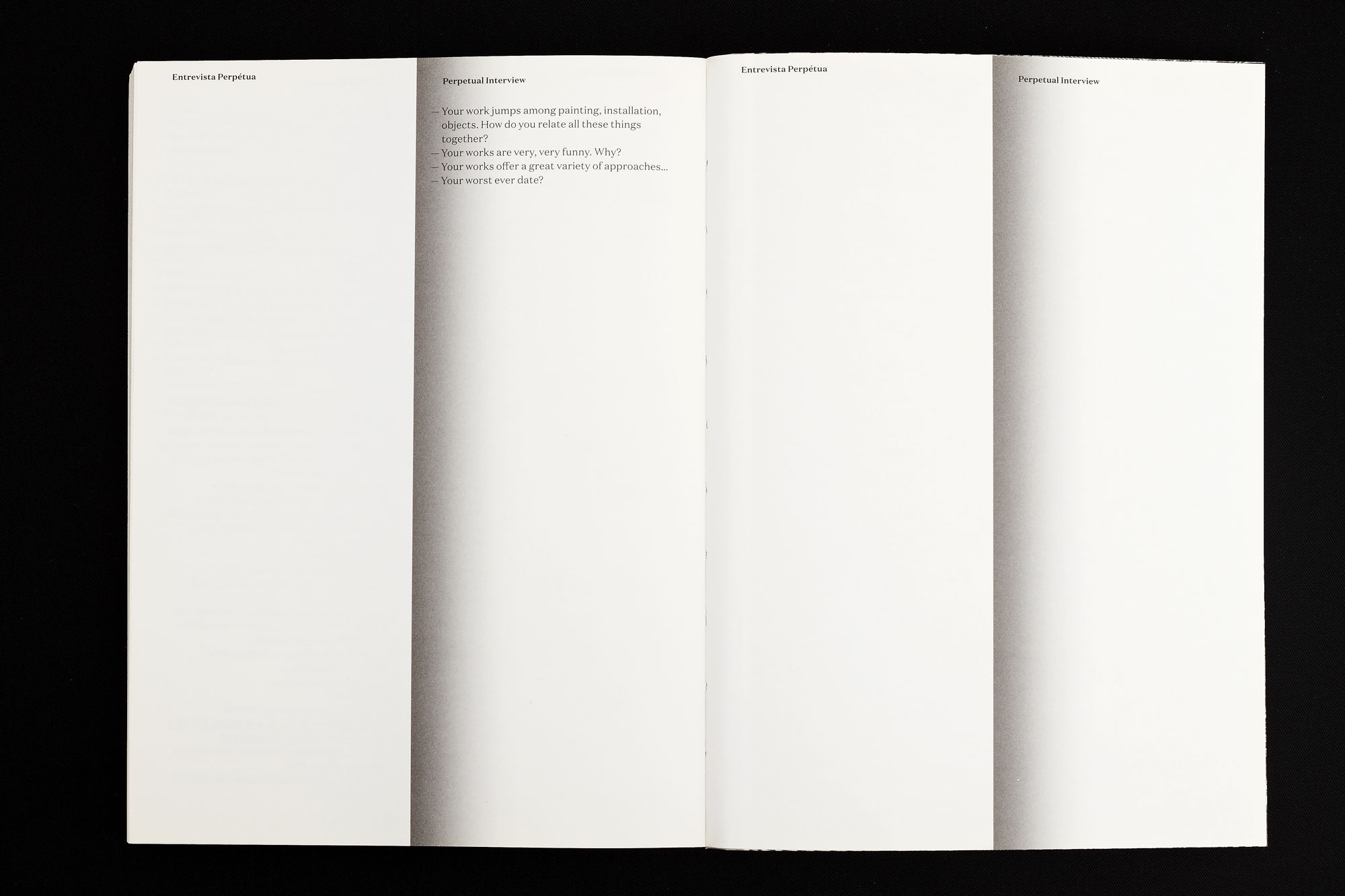
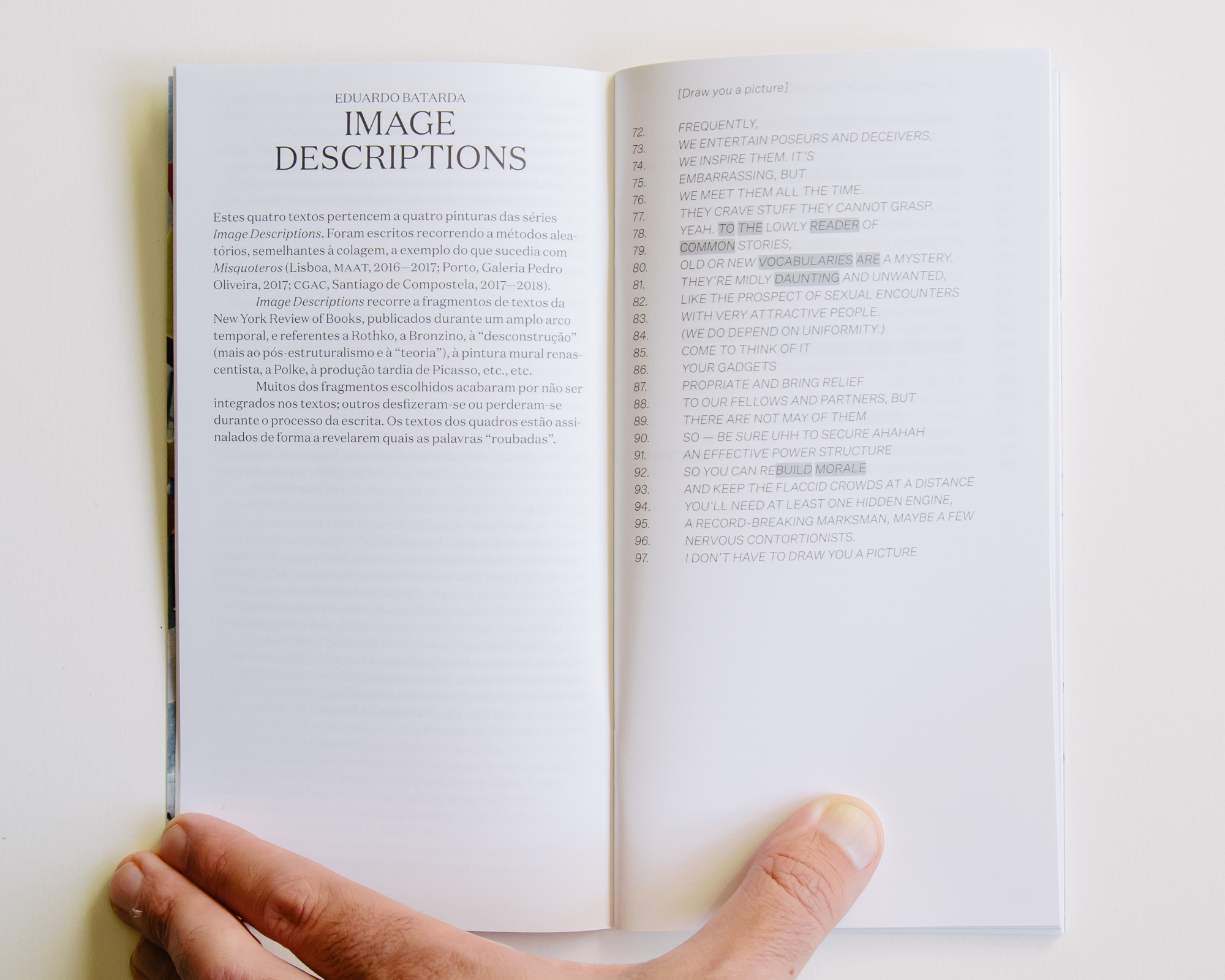
This book is an perpetual interview by Ricardo Nicolau to Ana Jotta. This interview never gives the reader the answers by Jotta, but it presents all the questions Nicolau has been making her during the years, in several languages.
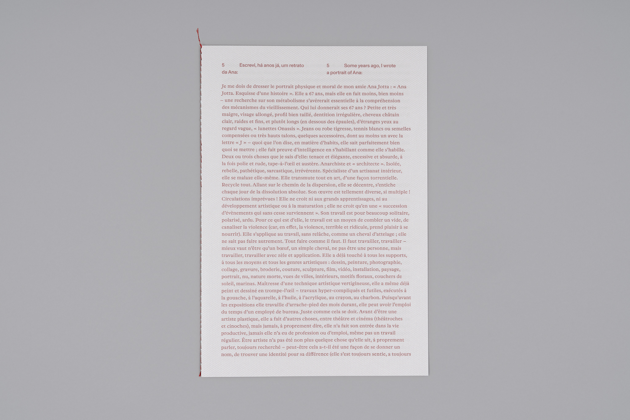
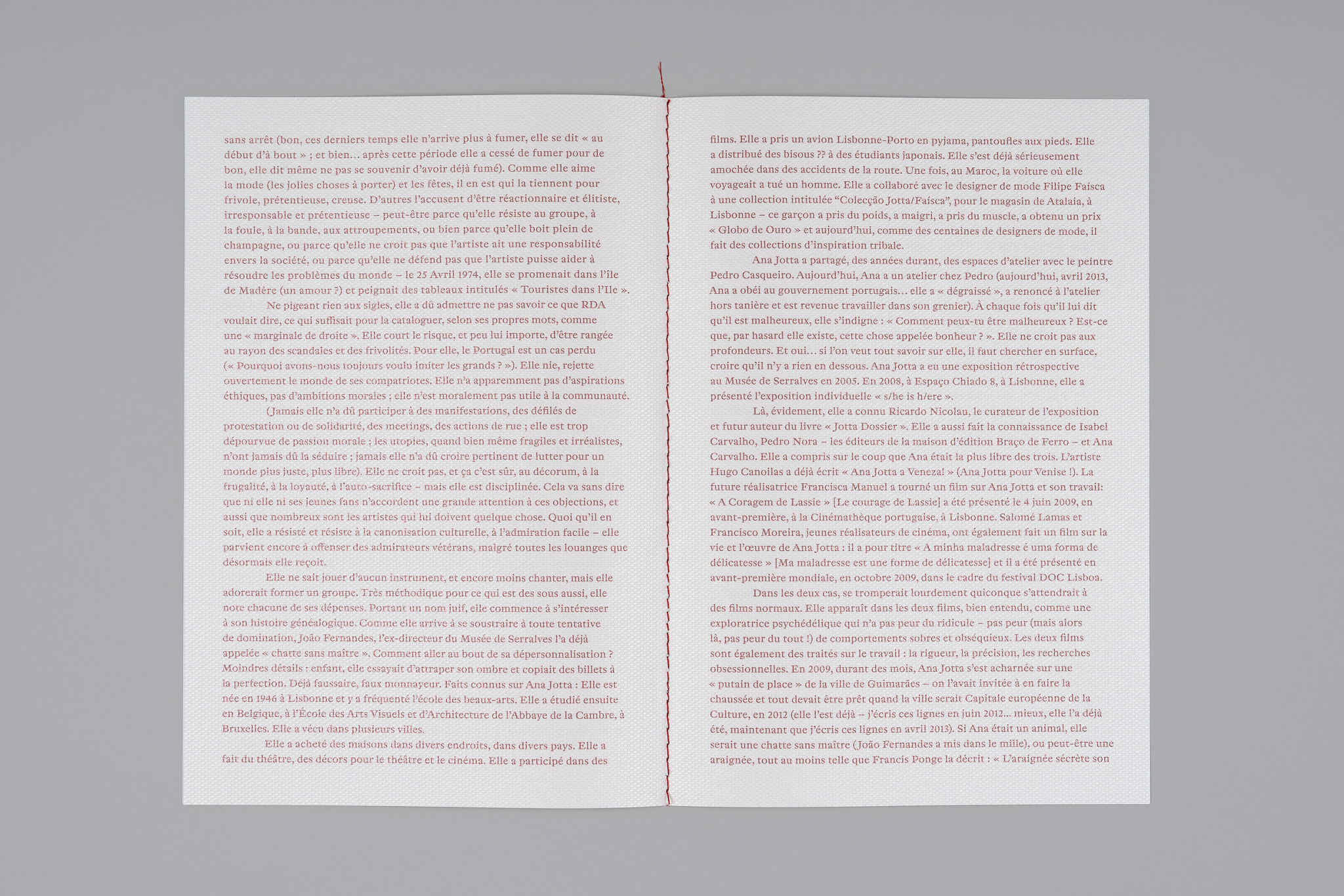
The book page is organised in two columns. The one in left presents the text in Portuguese, and the one in the right, the text either in Spanish, French or in English — they run one after the other.
It is a limited numbered edition of 100 books.
Cabine de Escalas
2018
Client: Câmara Municipal do Porto
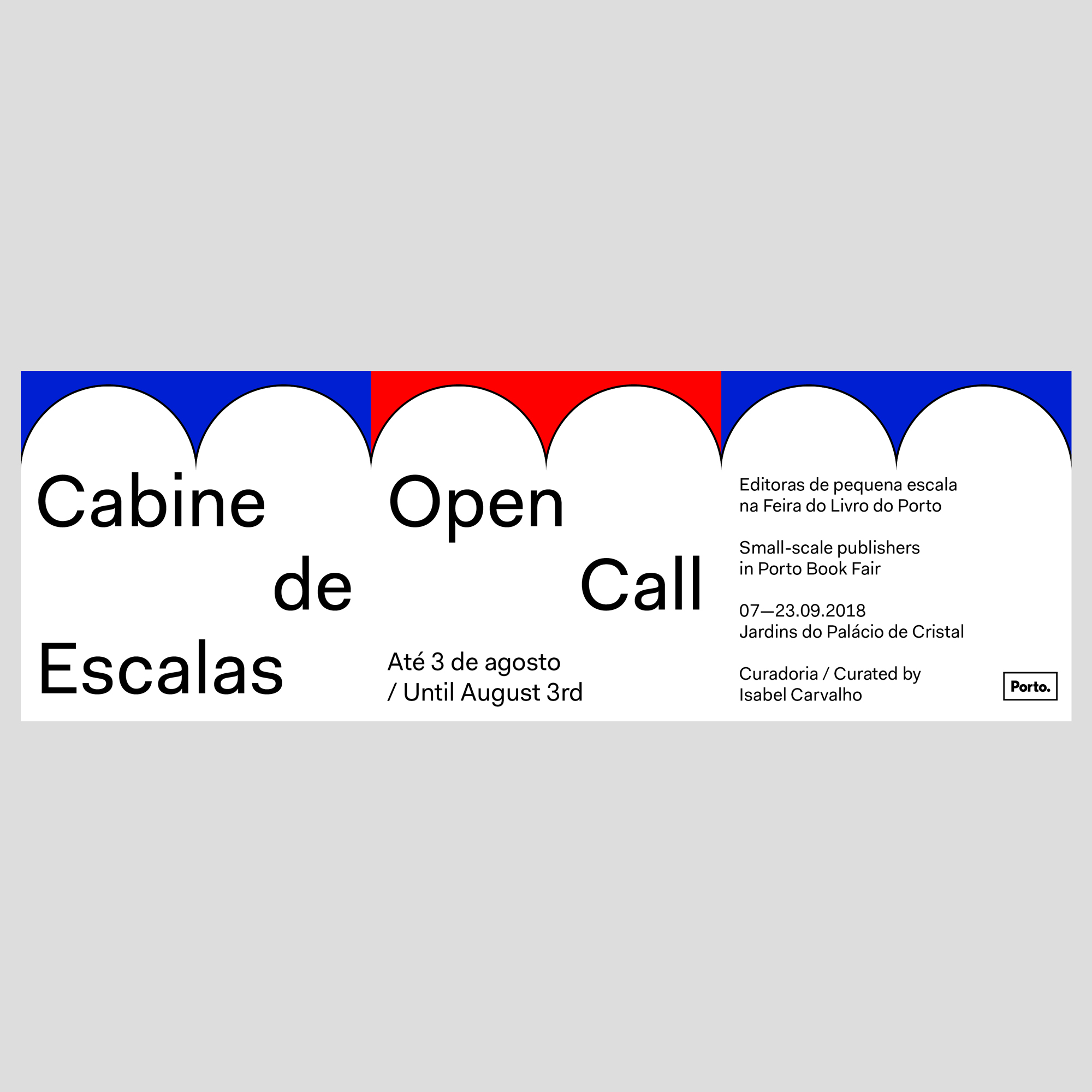
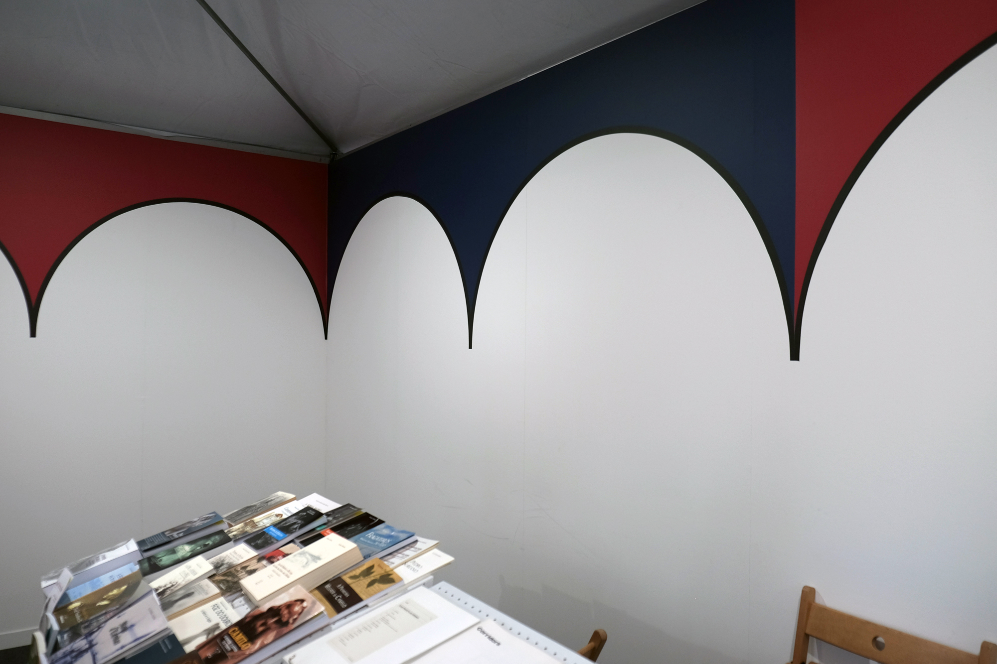
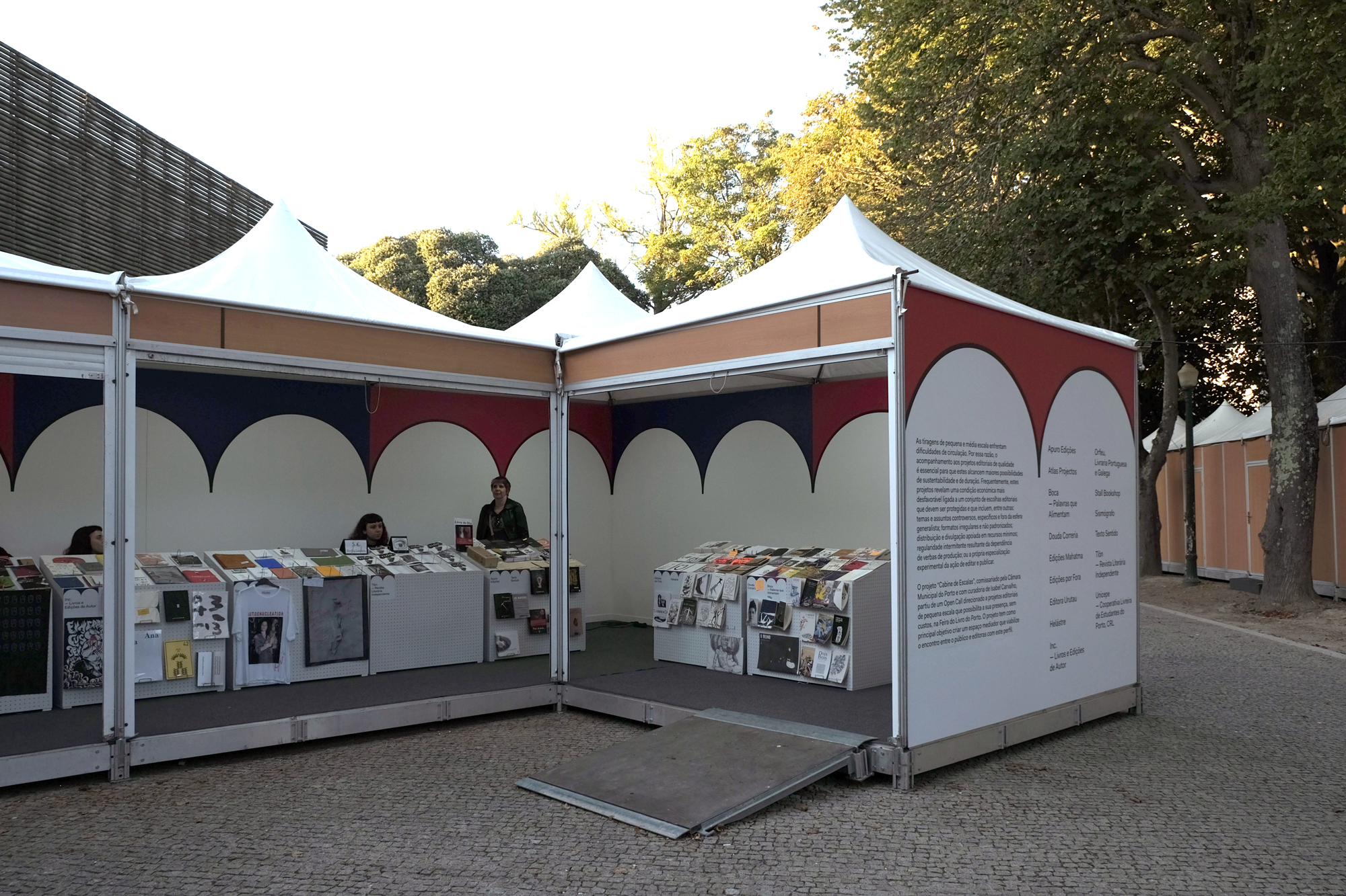
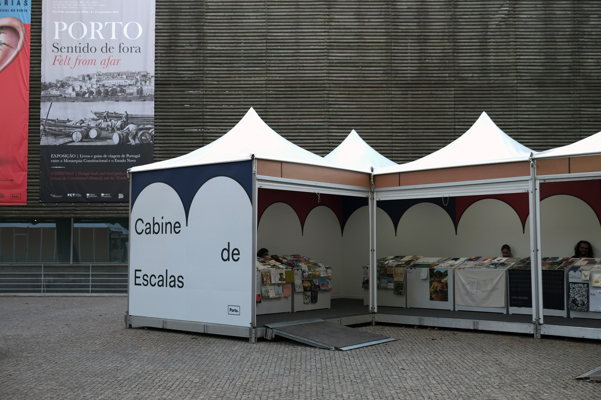
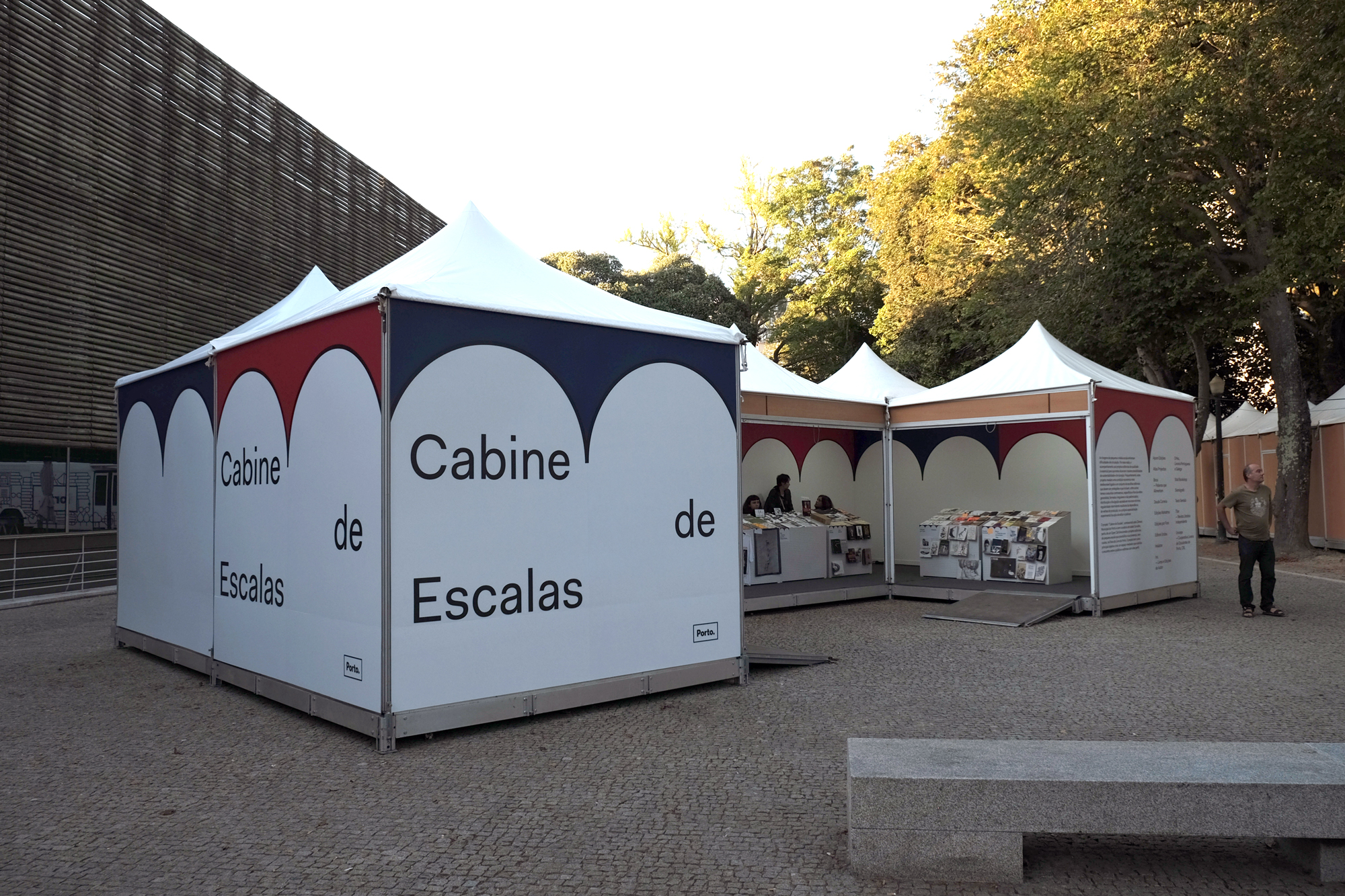
Cabine de Escalas is a stand for small publishers at Feira do Livro do Porto.
Boletim
2019
170 × 230 mm
Client: Museum of Contemporary Art — Serralves
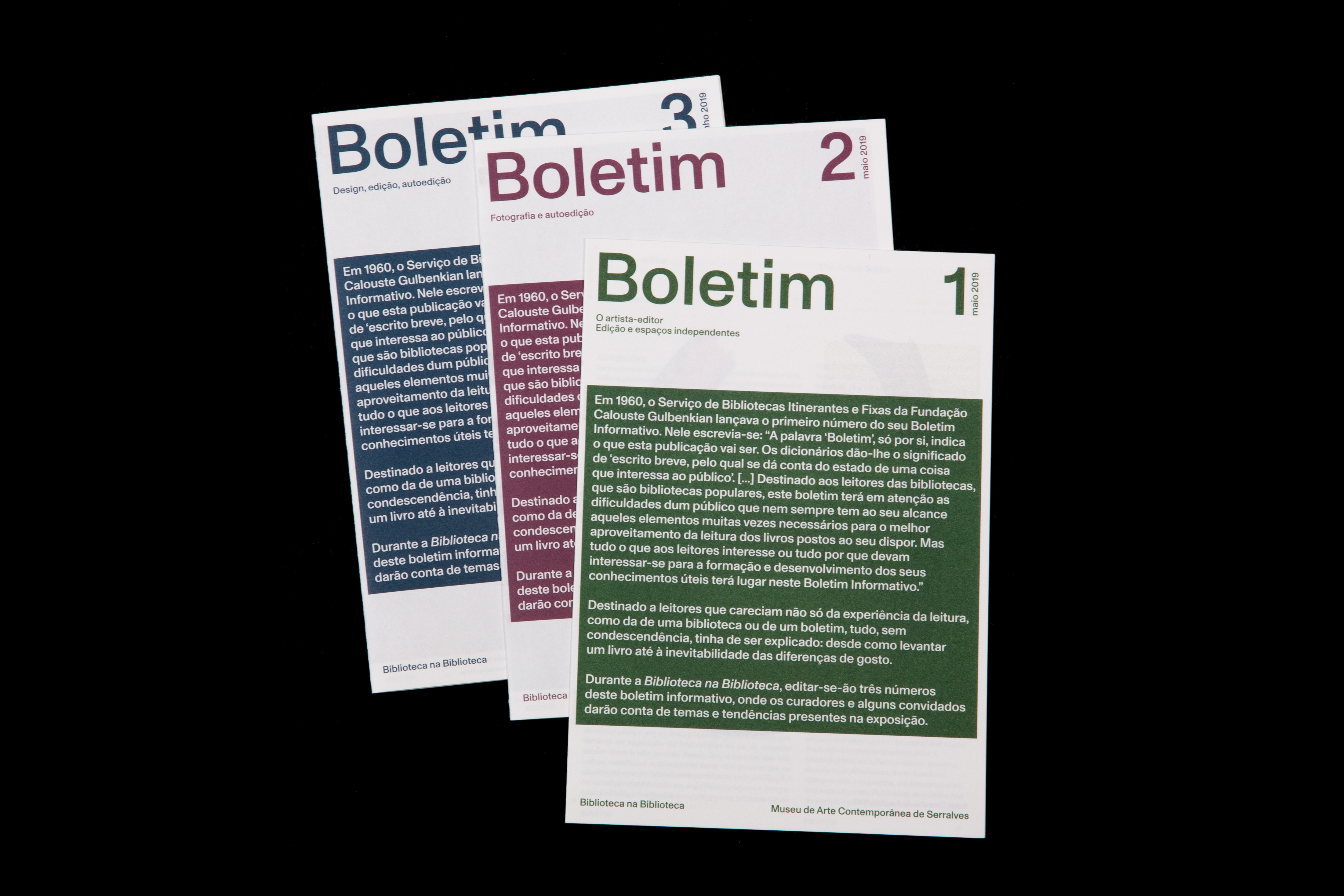
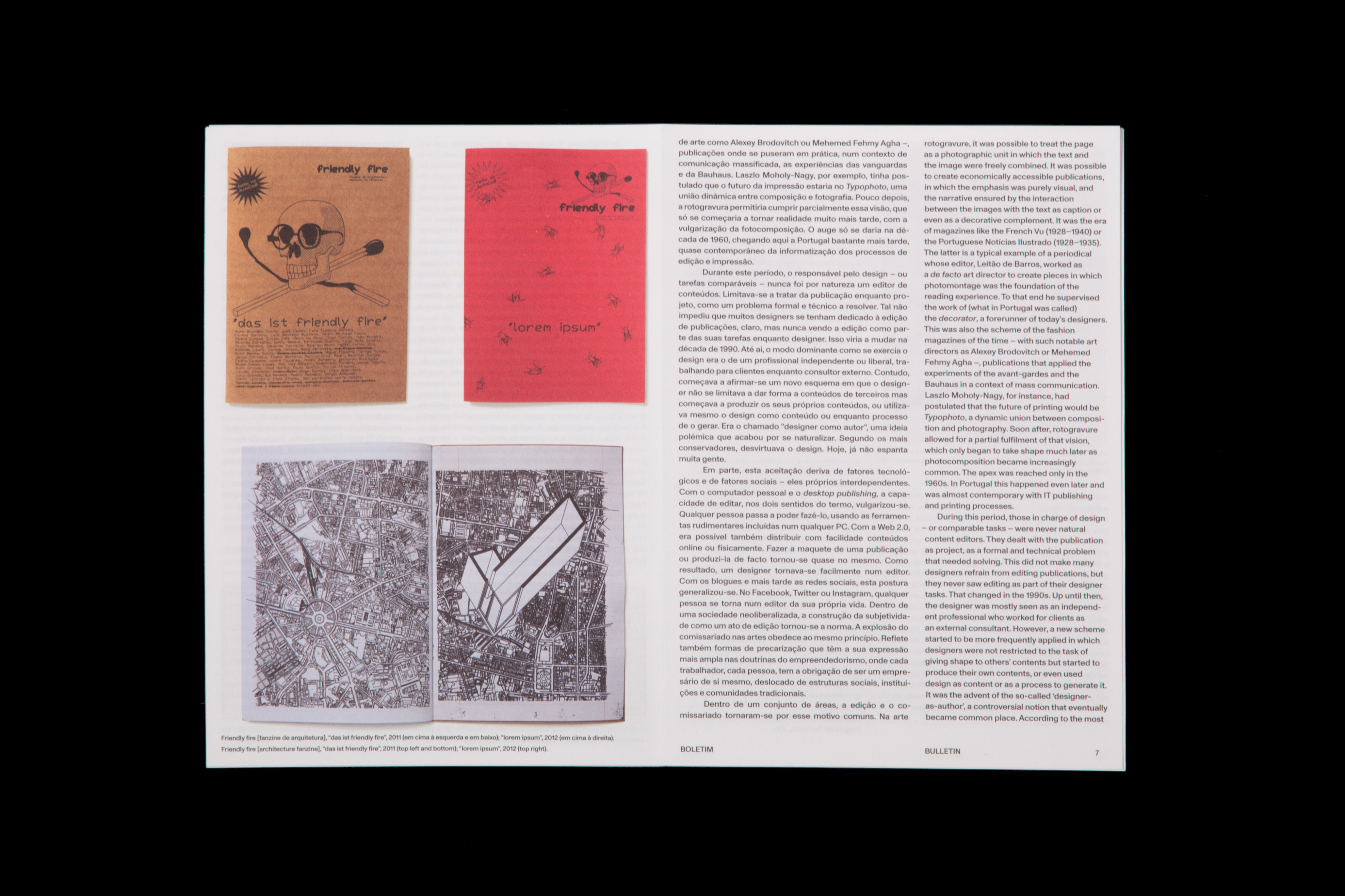
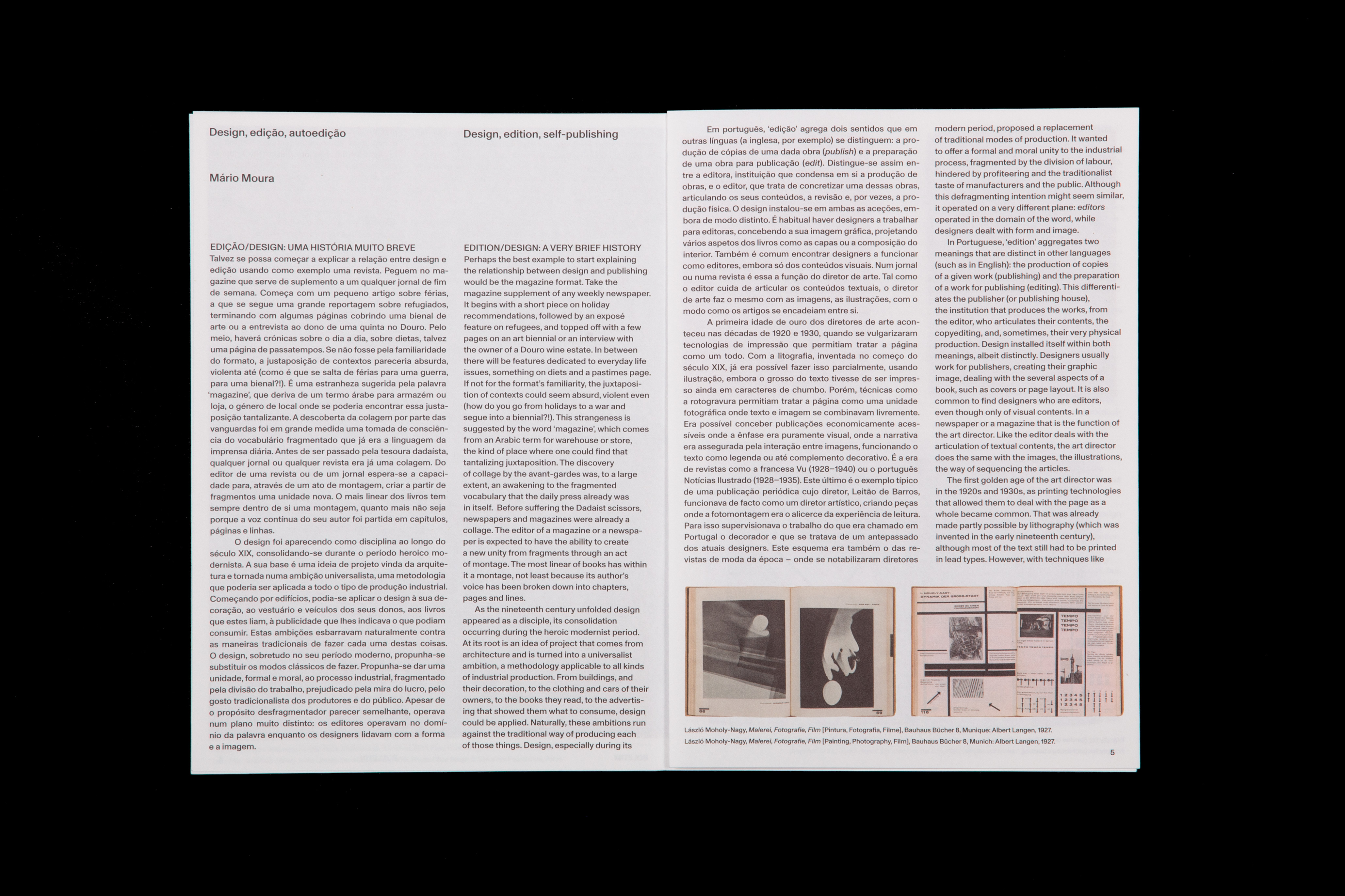
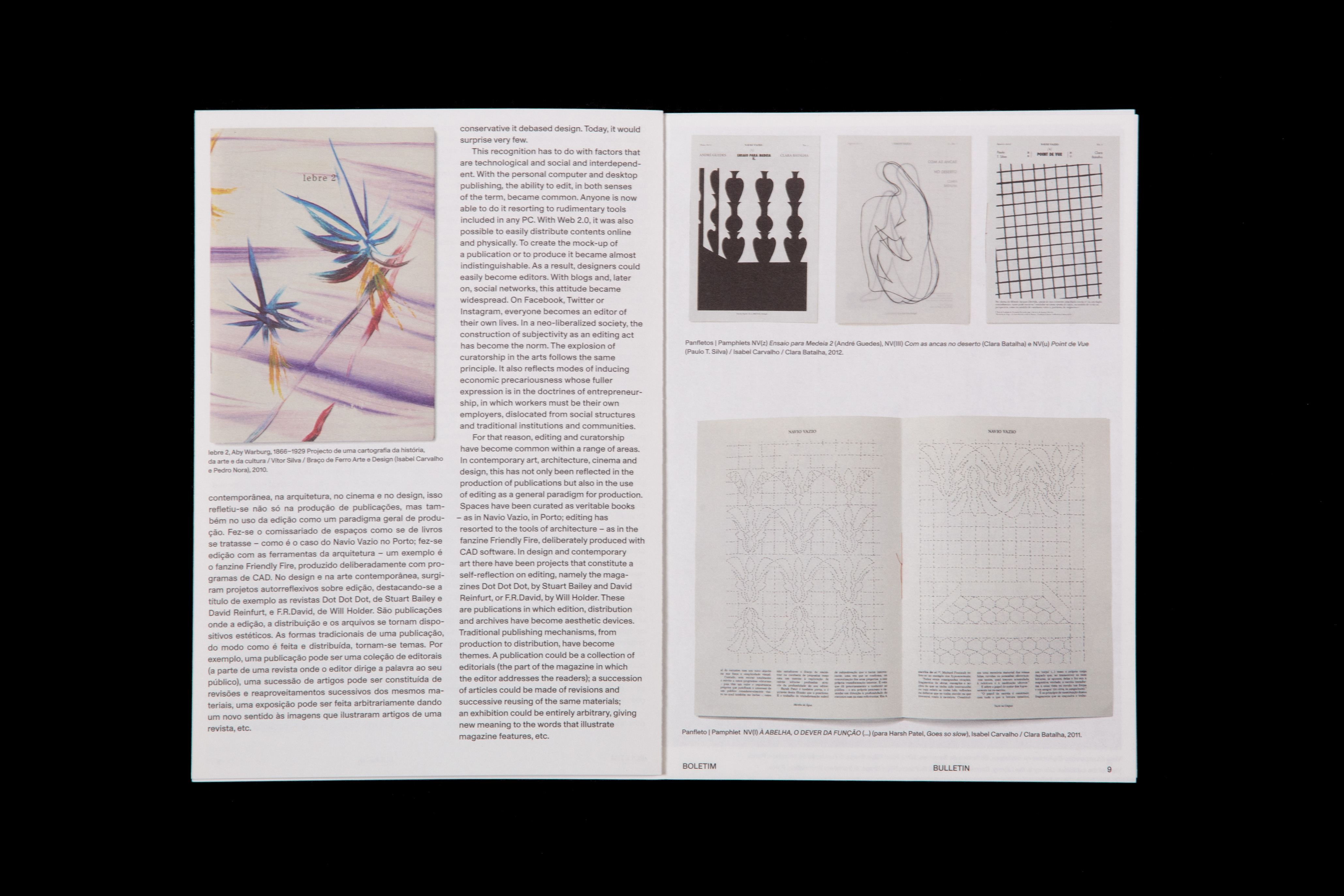
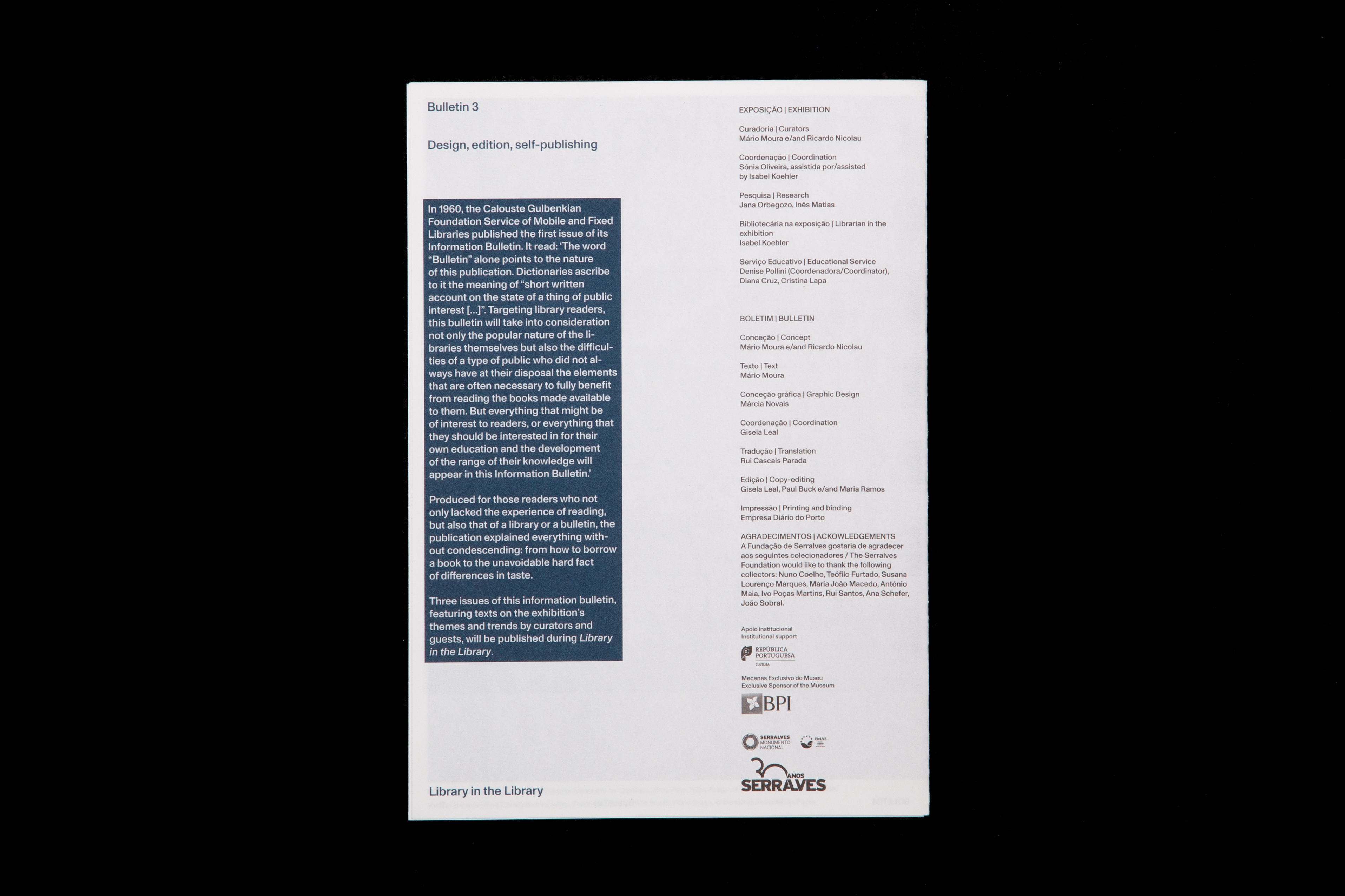
Boletim/Bulletin features texts and images of the exhibition Biblioteca na Biblioteca / Library in the Library, a show that documents and presents the independent publishing scene in Porto.
Pedagogy of the streets
2019
170 × 230 mm
Edited by Susana Lourenço Marques and Lúcia Almeida Matos
Client: Faculty of Fine Arts of University of Porto + Pierrot Le Fou
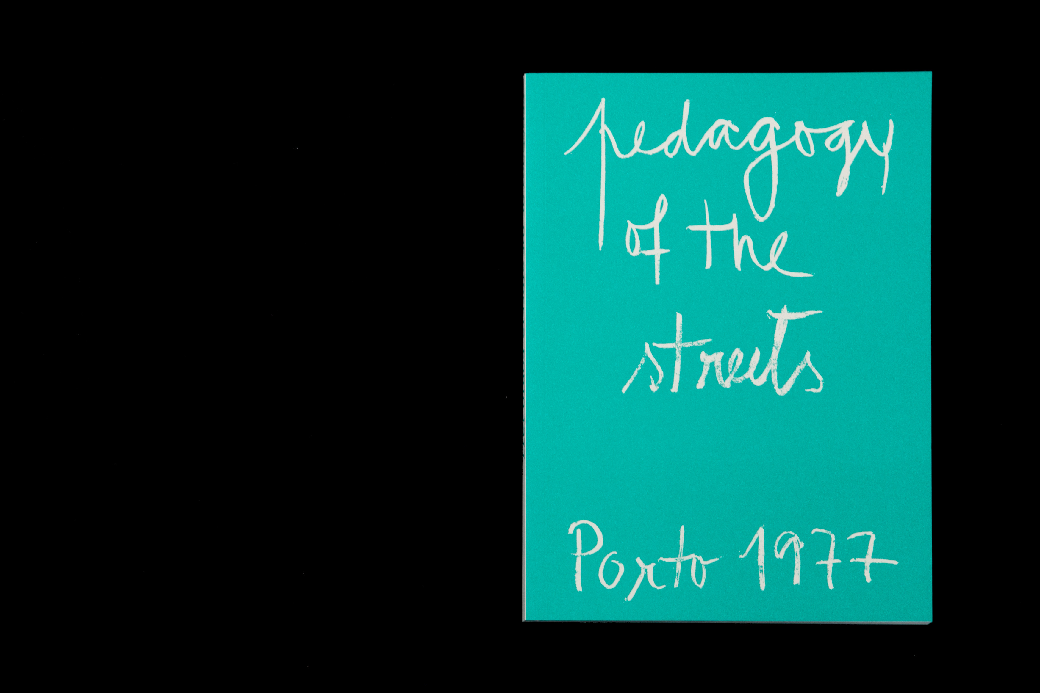
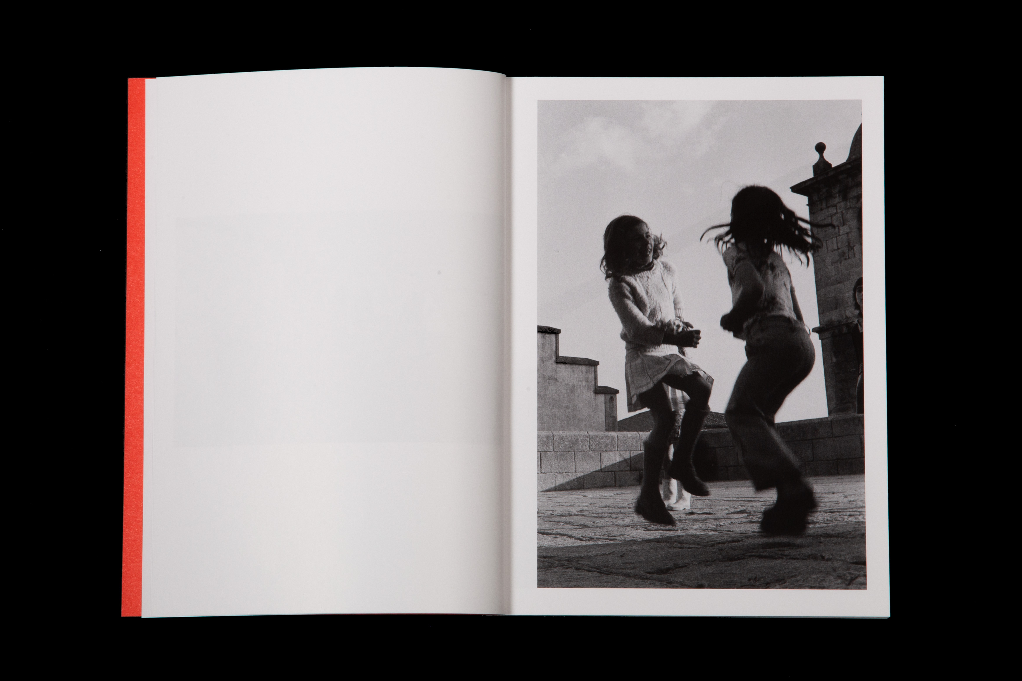
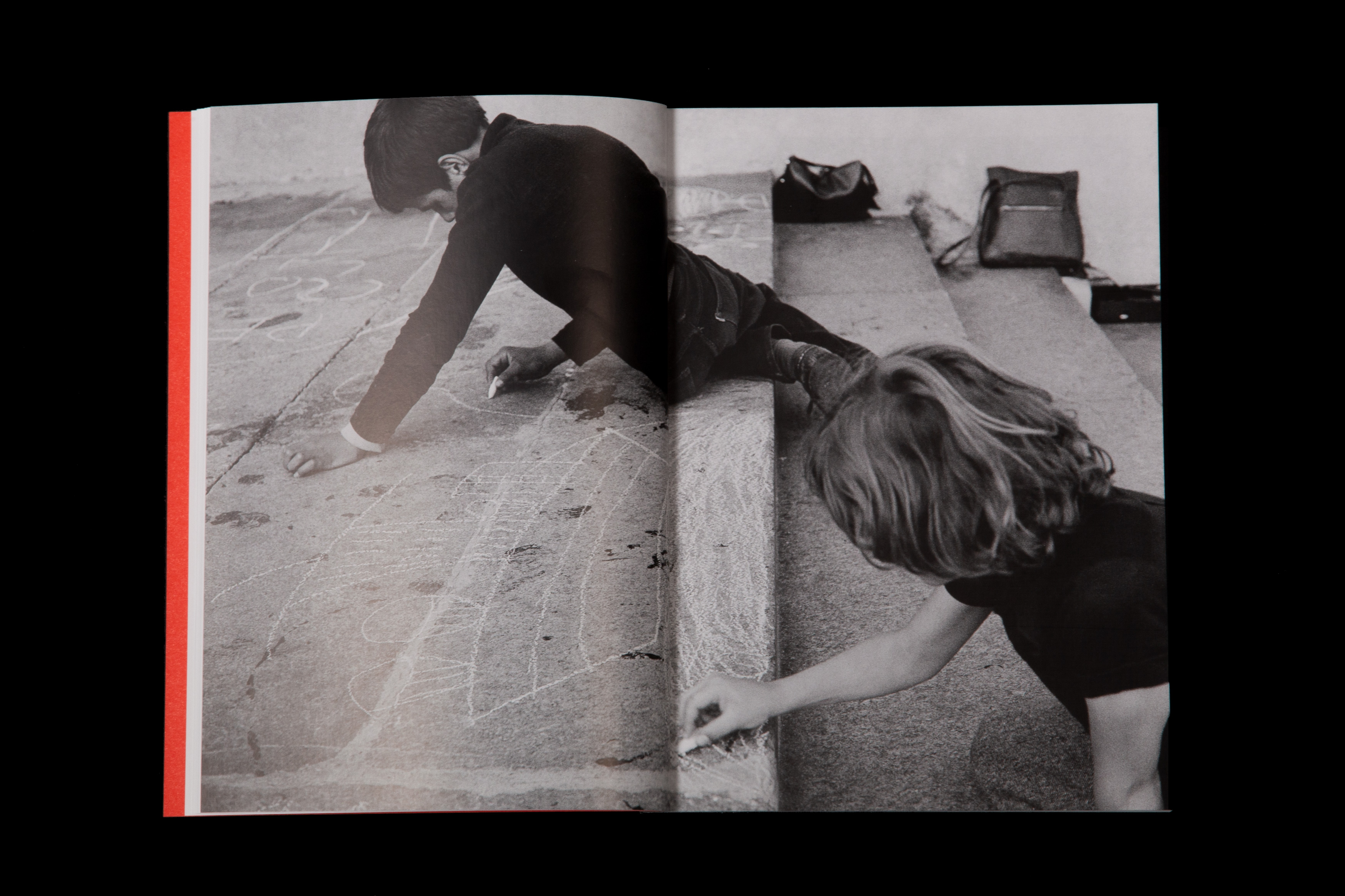
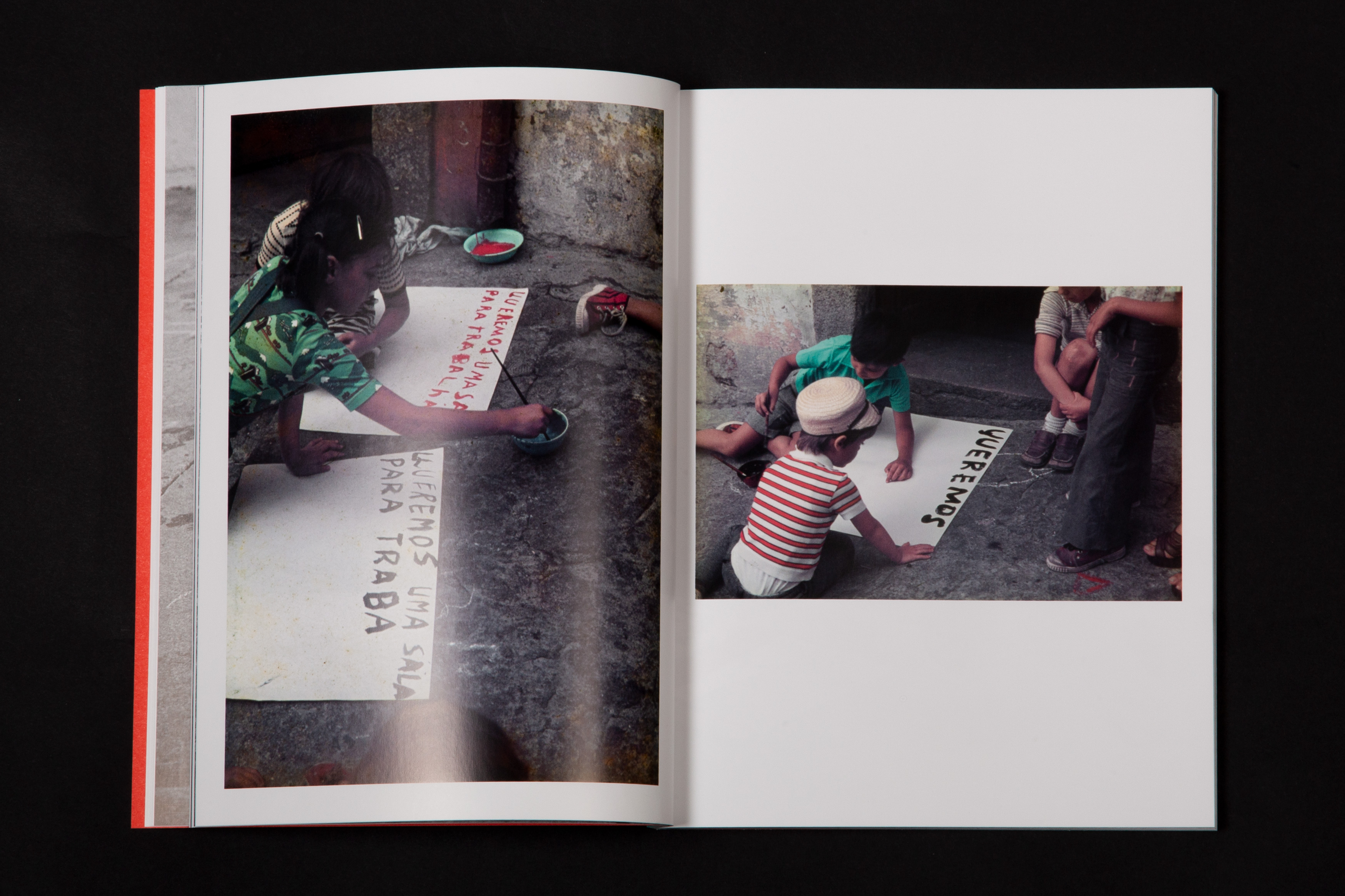
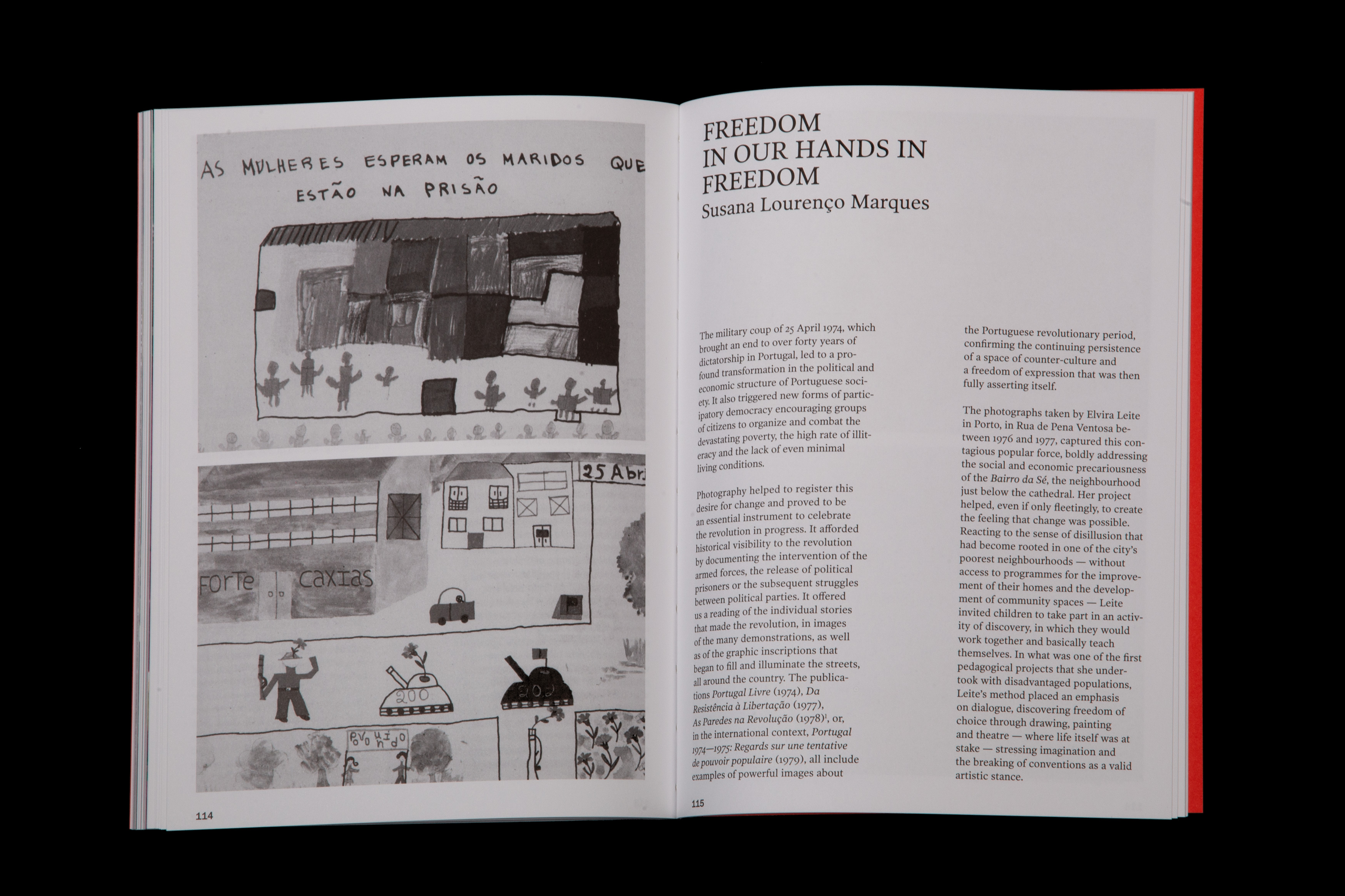
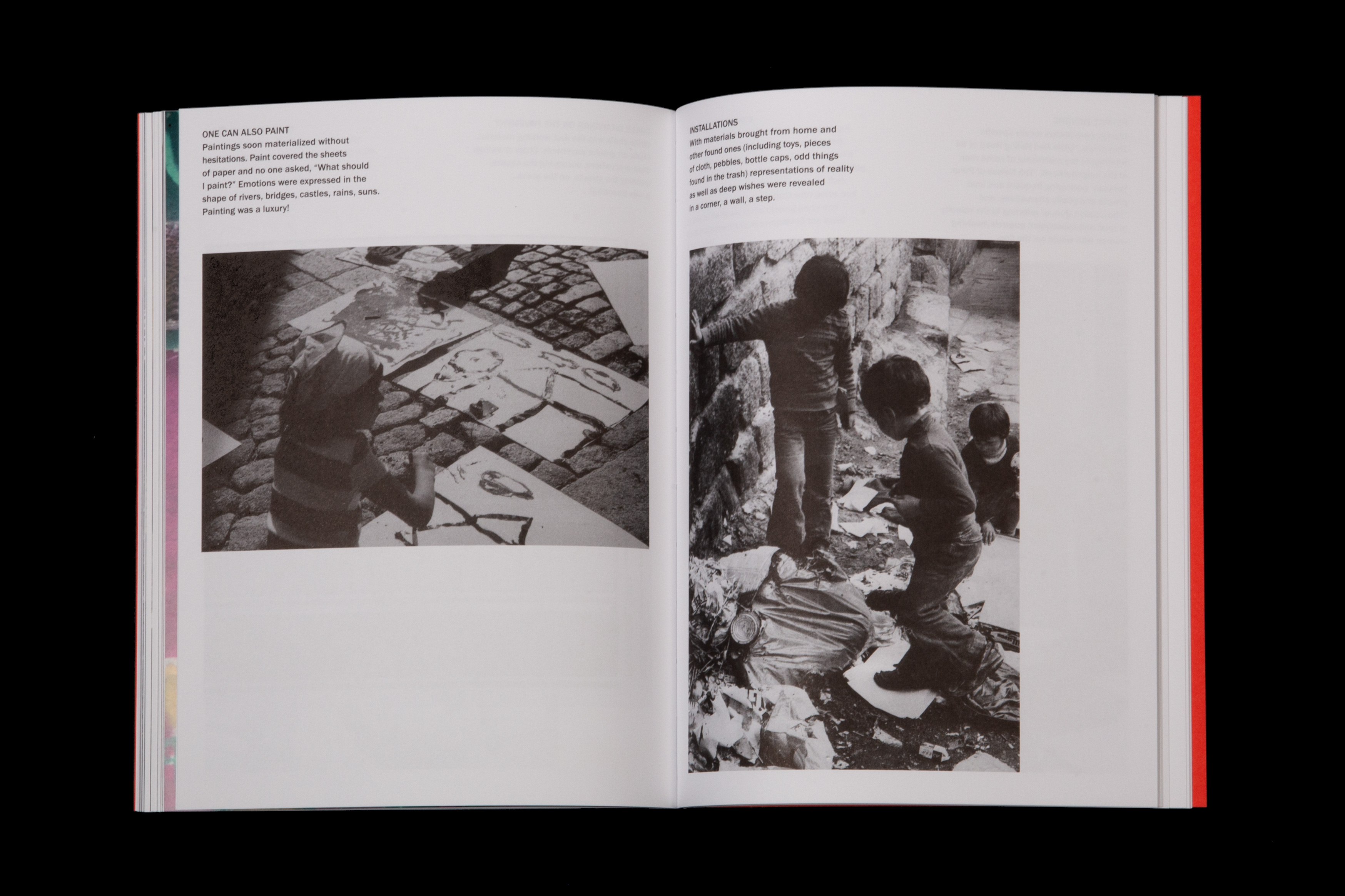
Pedagogy of the streets presentes the process of Elvira Leite, that during the years after the 1974 revolution in Portugal, developed a social project with the kids of a very poor neighbourhood in Porto.
Moer
2018
170 × 230 mm
Client: Calouste Gulbenkian Foundation
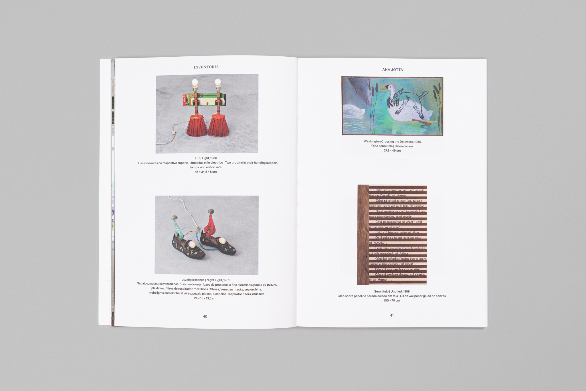
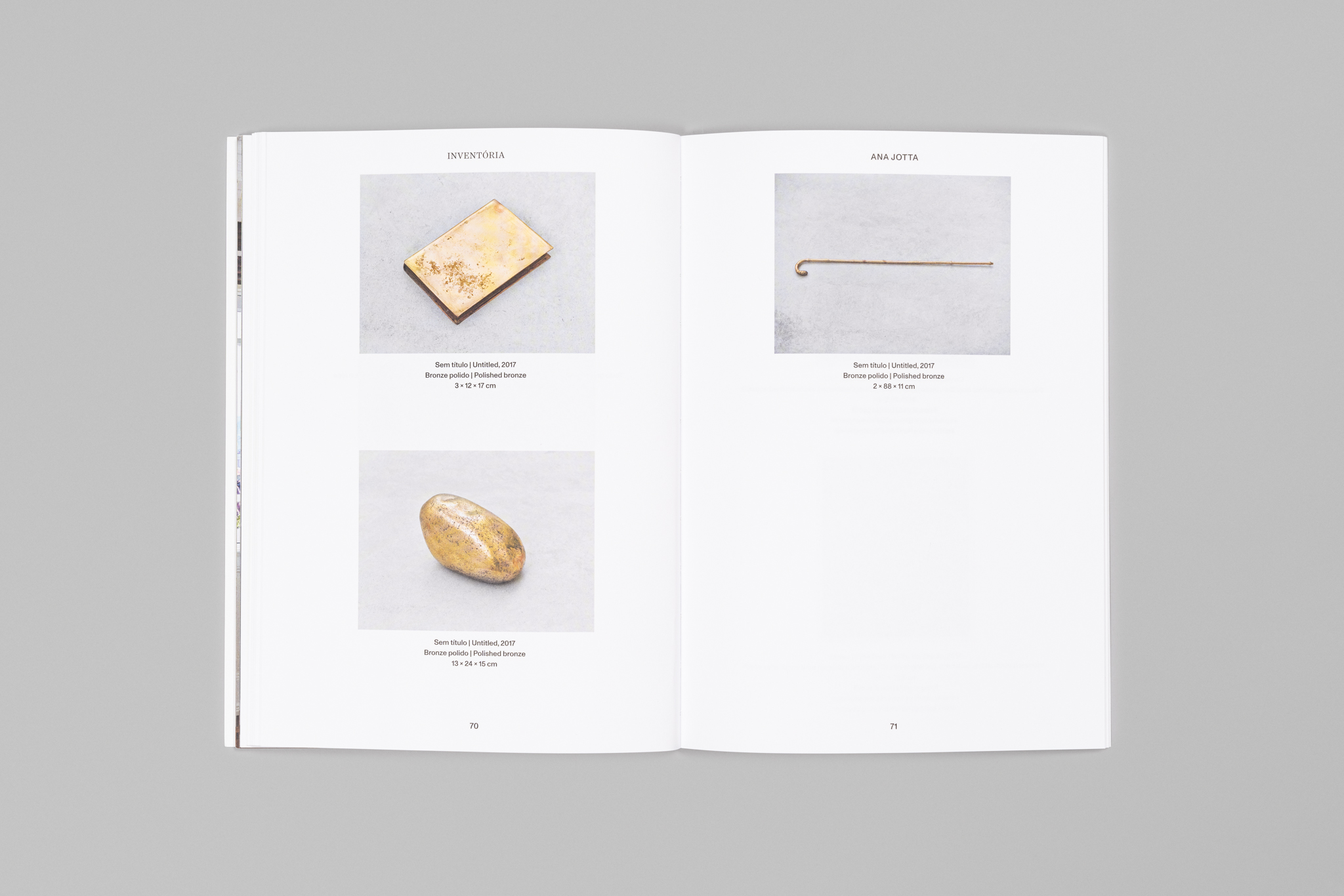
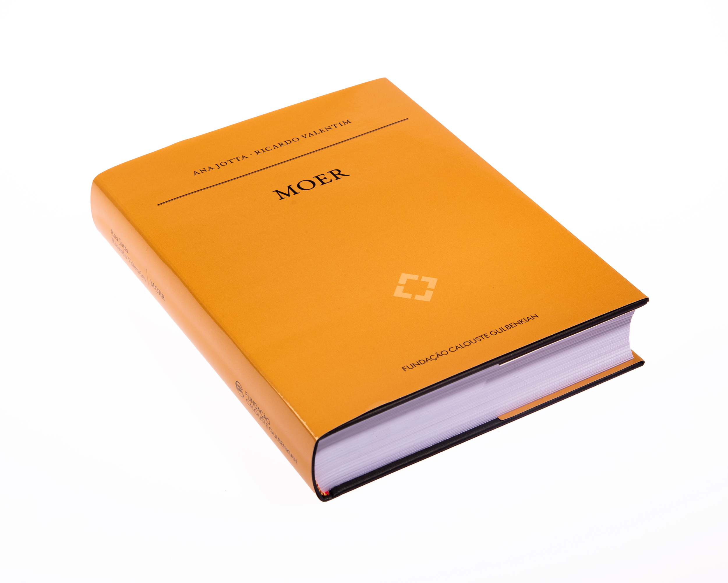
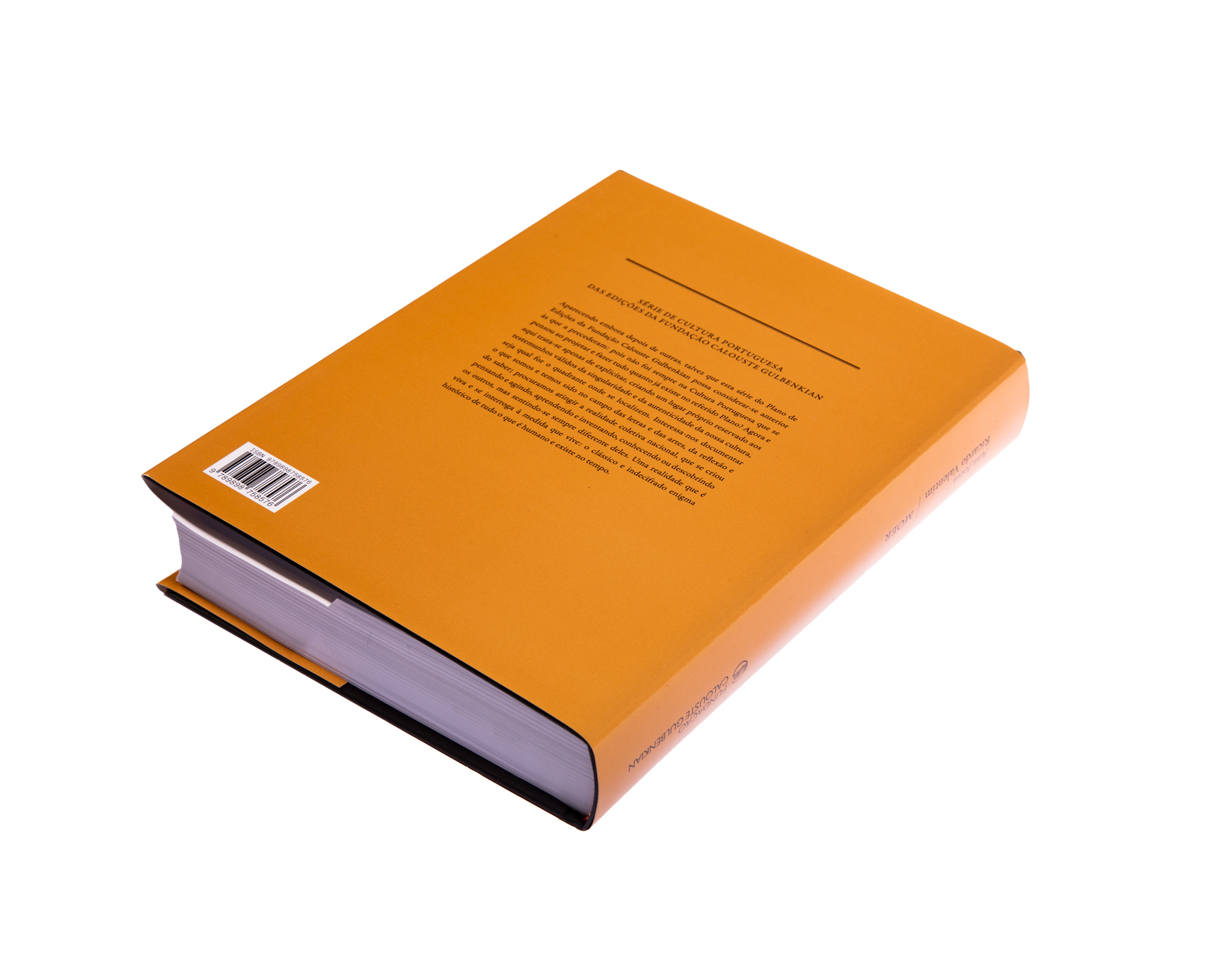
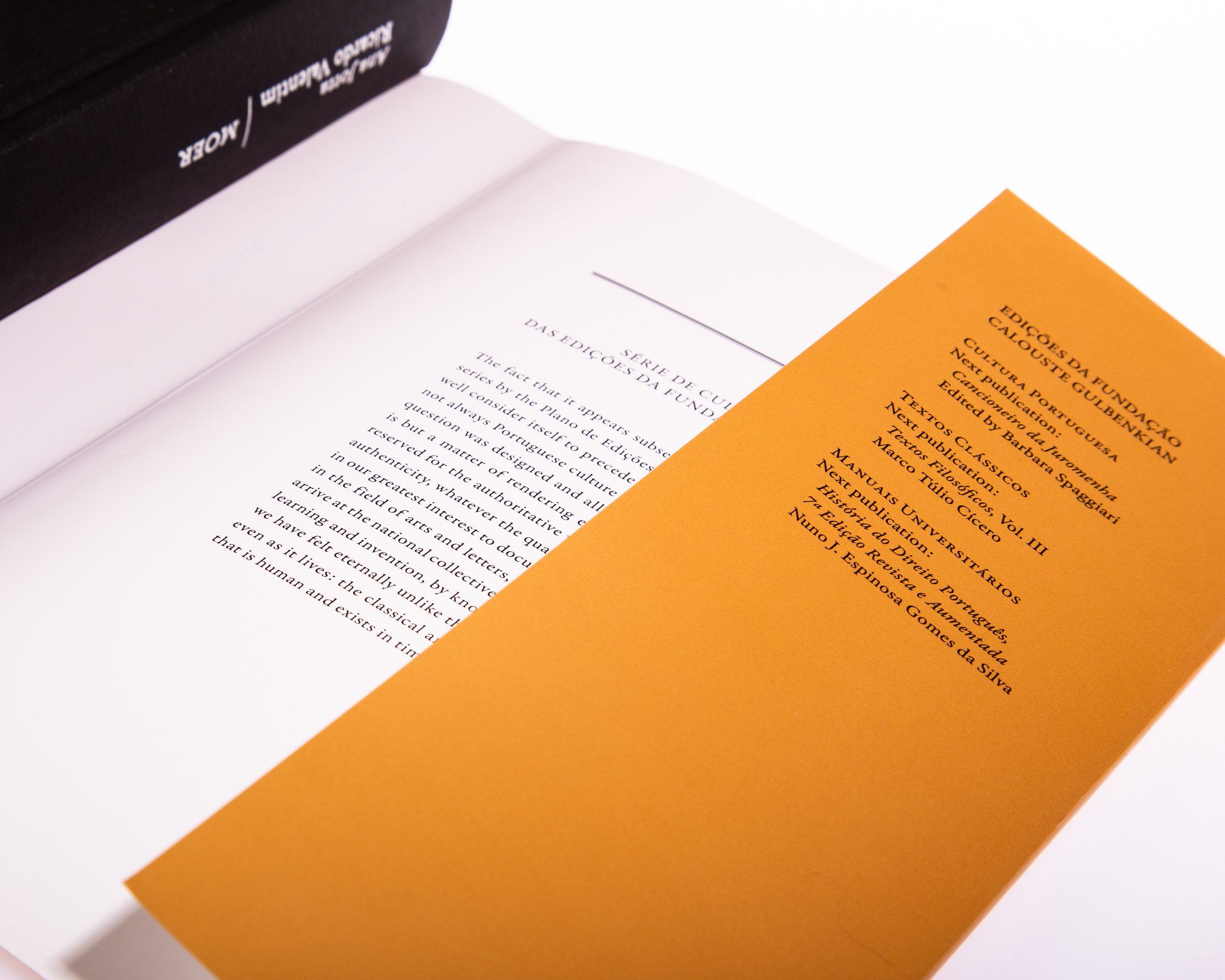
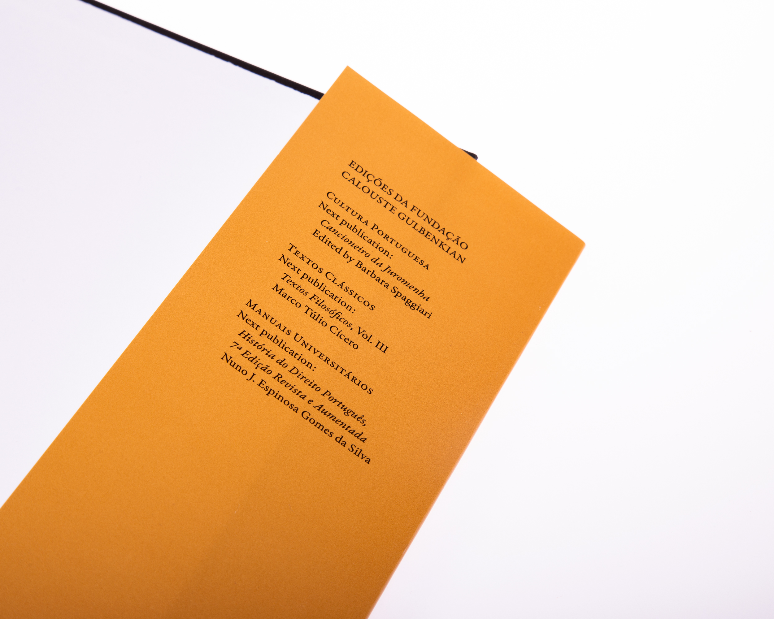
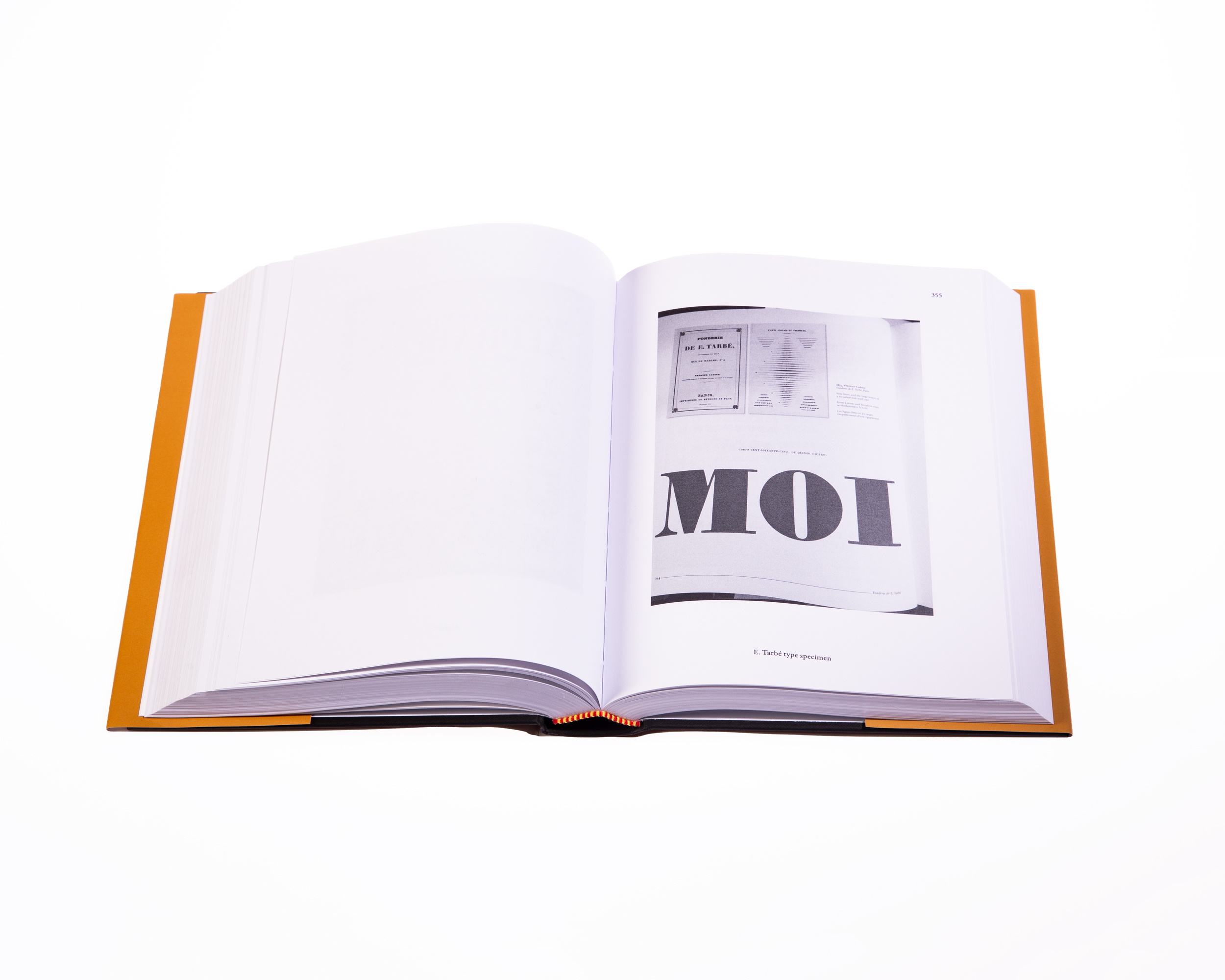
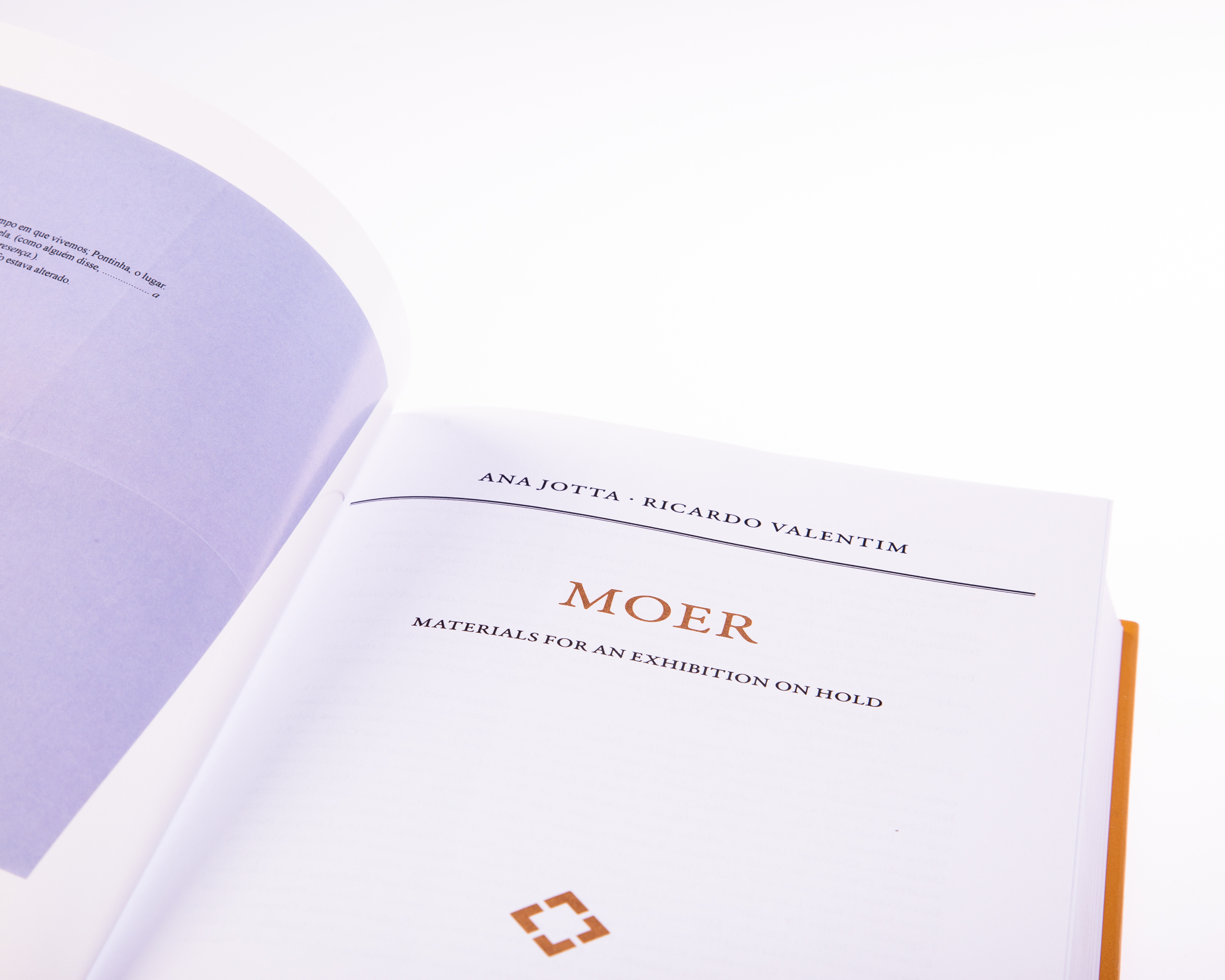
Moer is a book by Ana Jotta and Ricardo Valentim that was published by Calouste Gulbenkian Foundation.
It was published on occasion of the exhibition they curated for Project Space at the Museum.
The layout departs from the guidelines of the Series, Cultura Portuguesa, published by the Foundation, by Sebastião Rodrigues.
This book was awarded a Bronze Medal from the Best Book Design from all over the World.
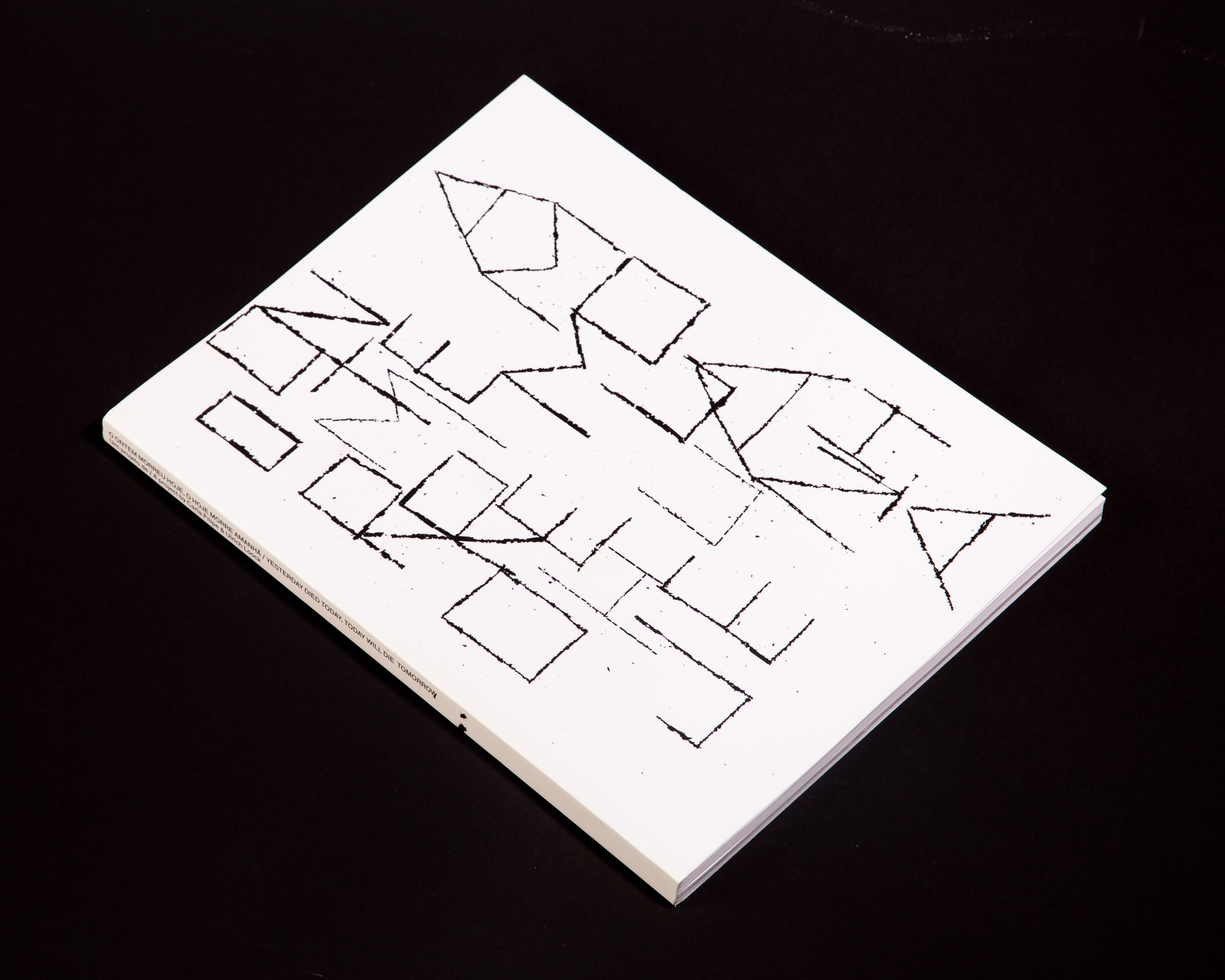
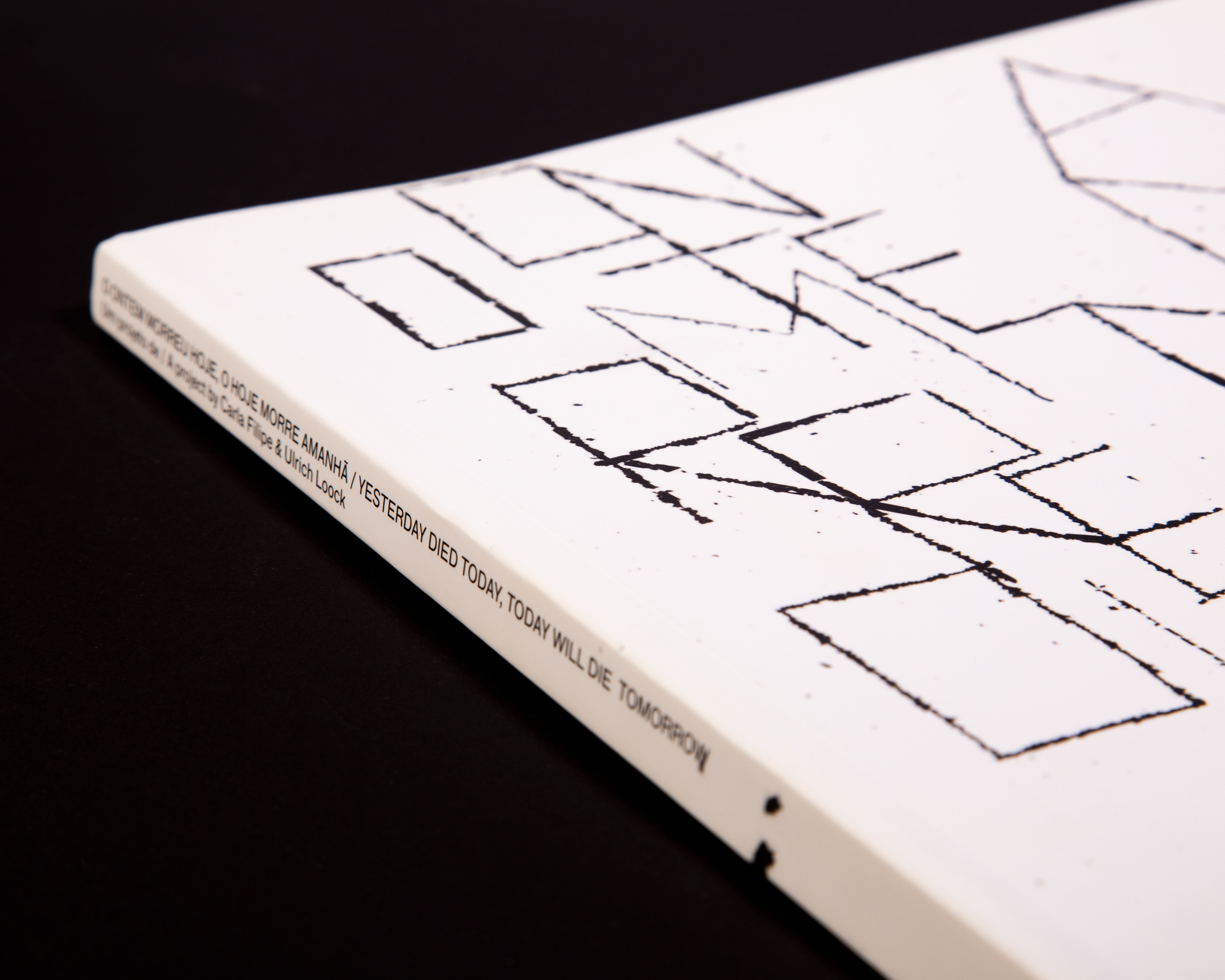
O Ontem Morreu Hoje, O Hoje Morre Amanhã
2018
230 × 305 mm
Client: Câmara Municipal do Porto
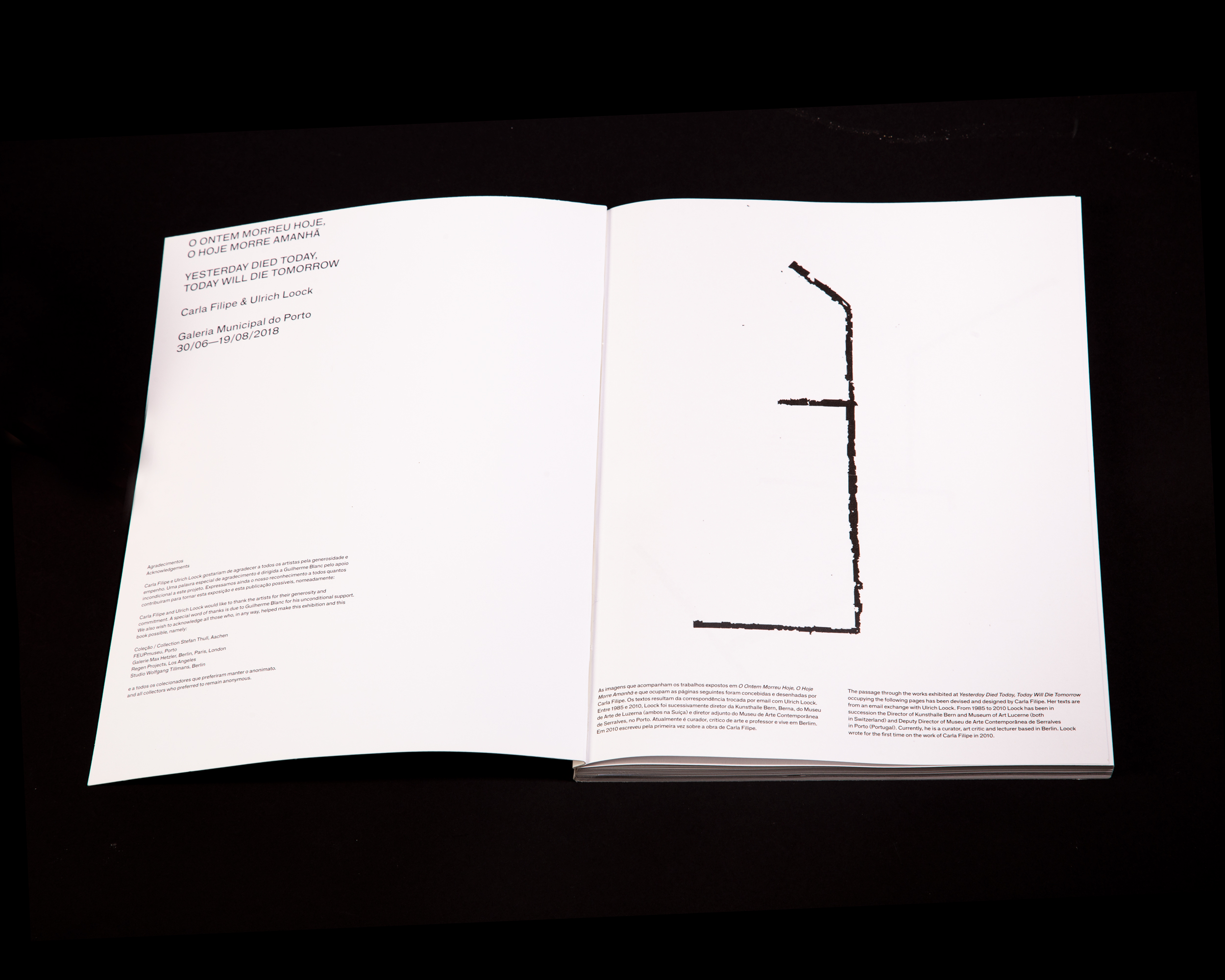
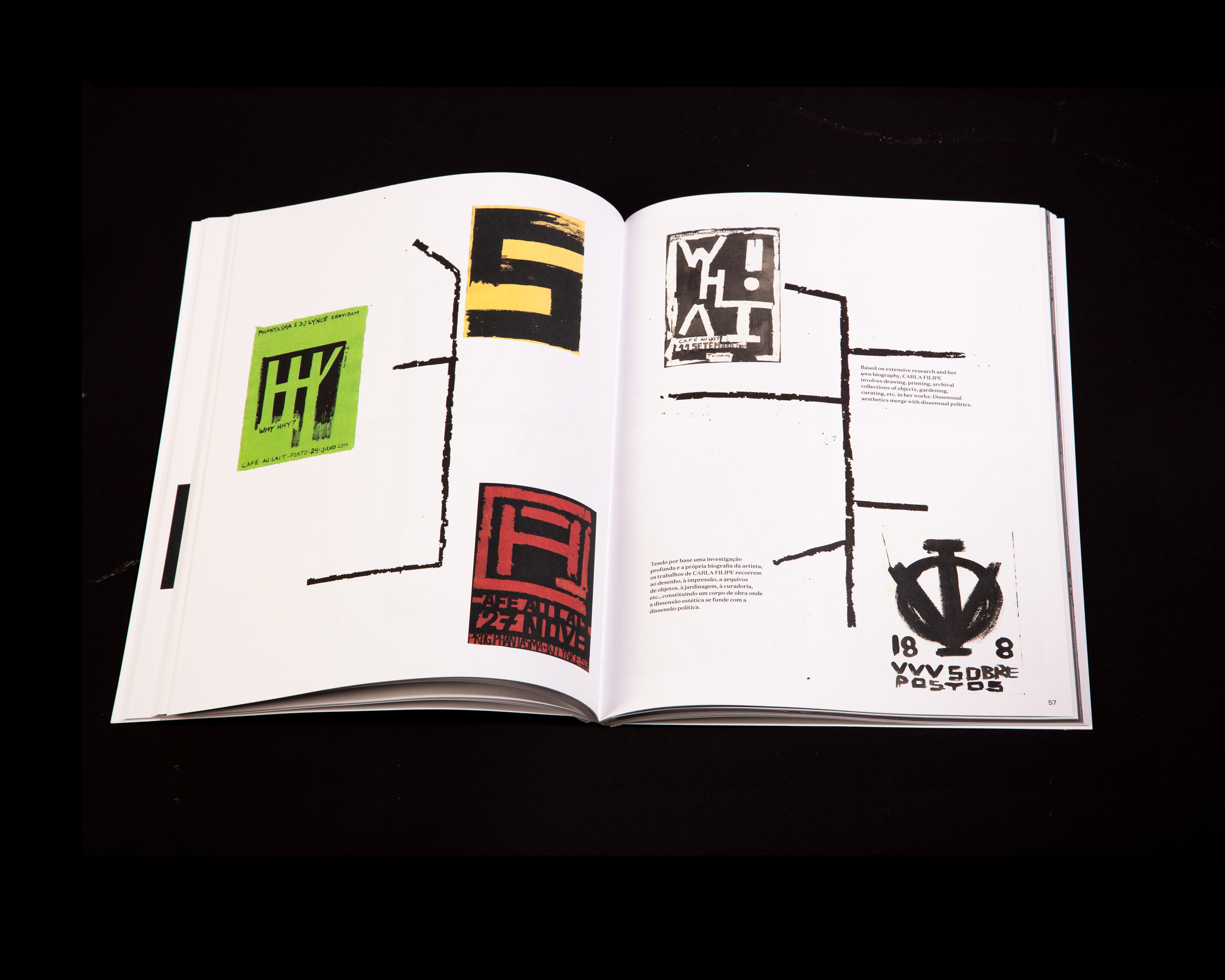
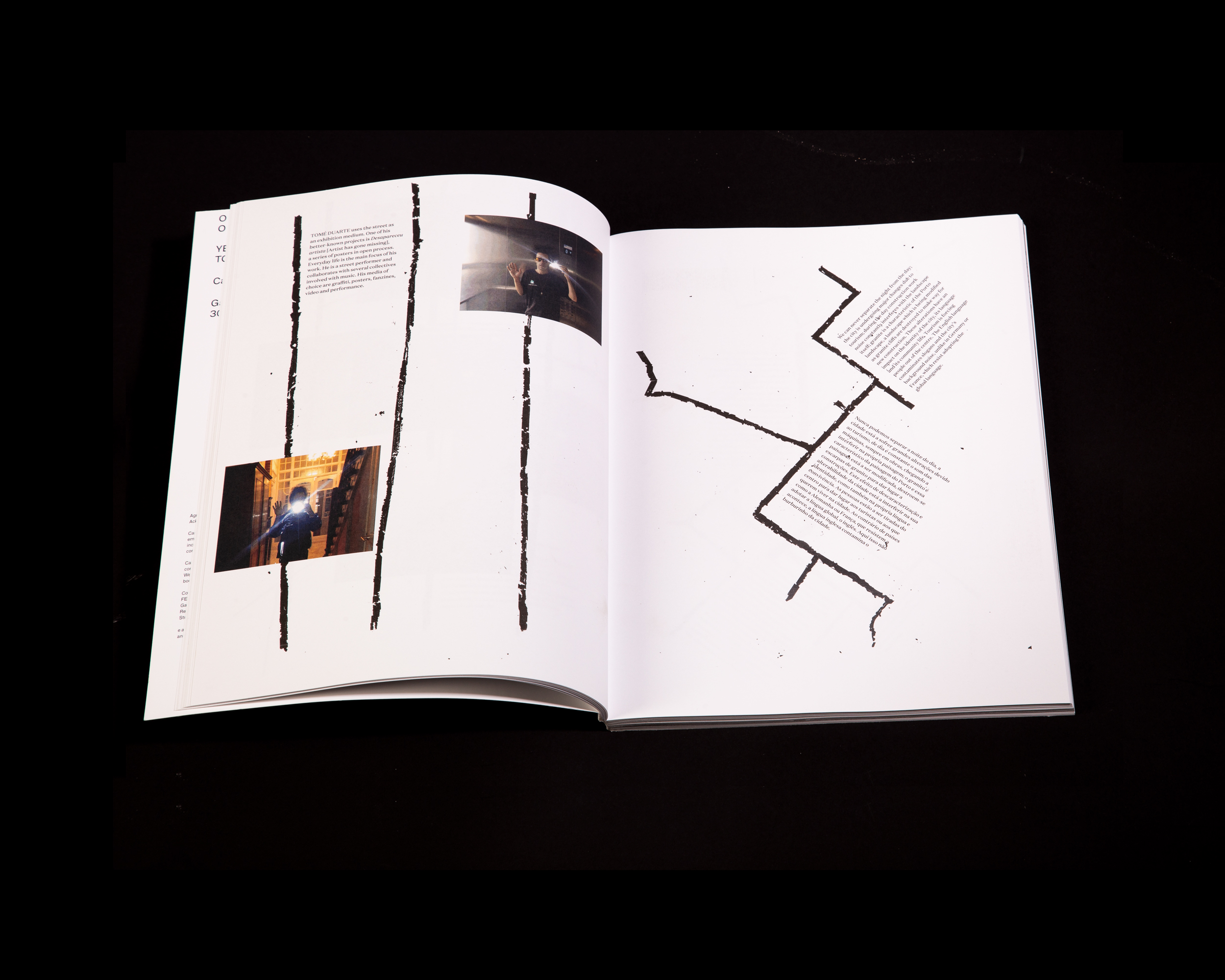
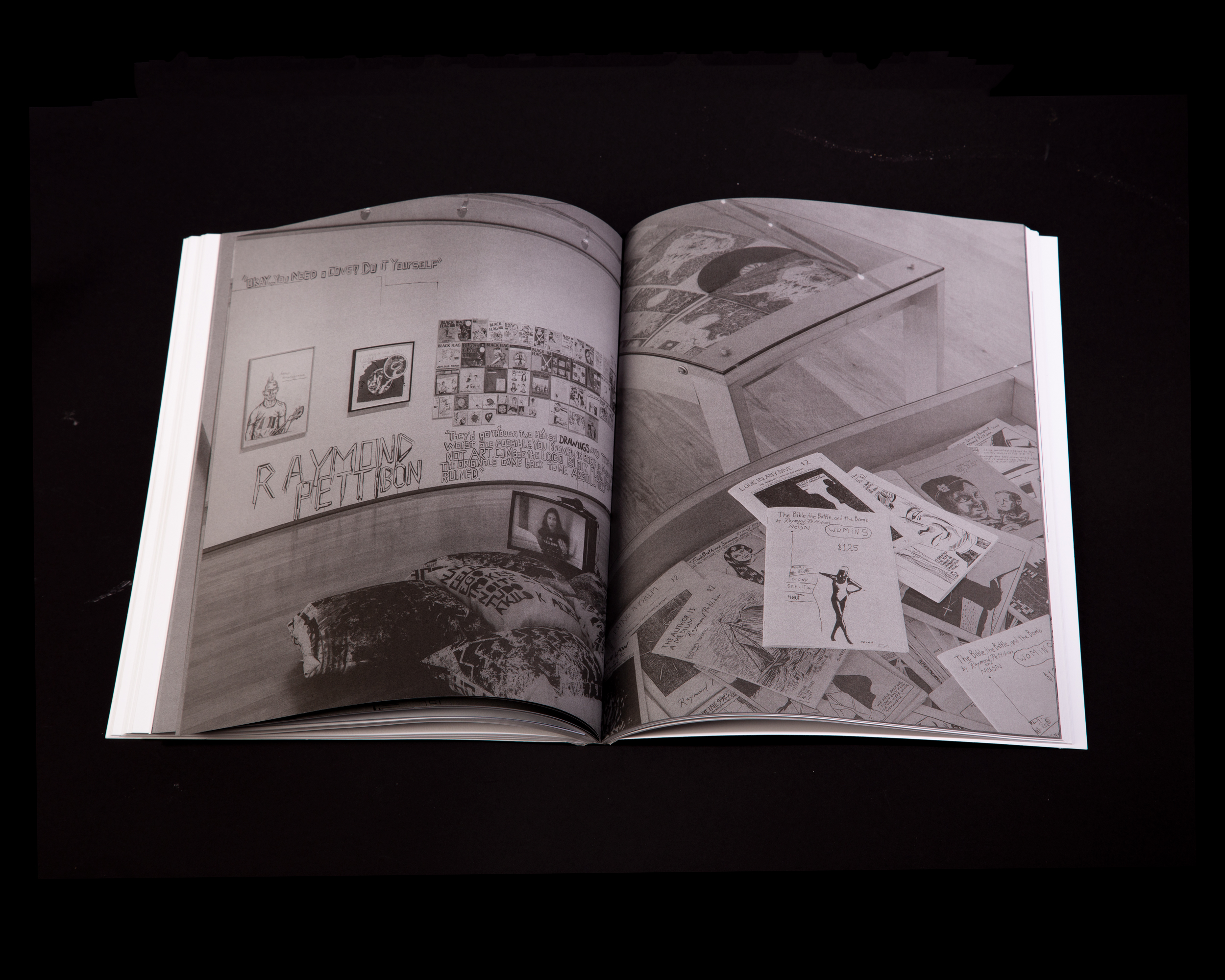
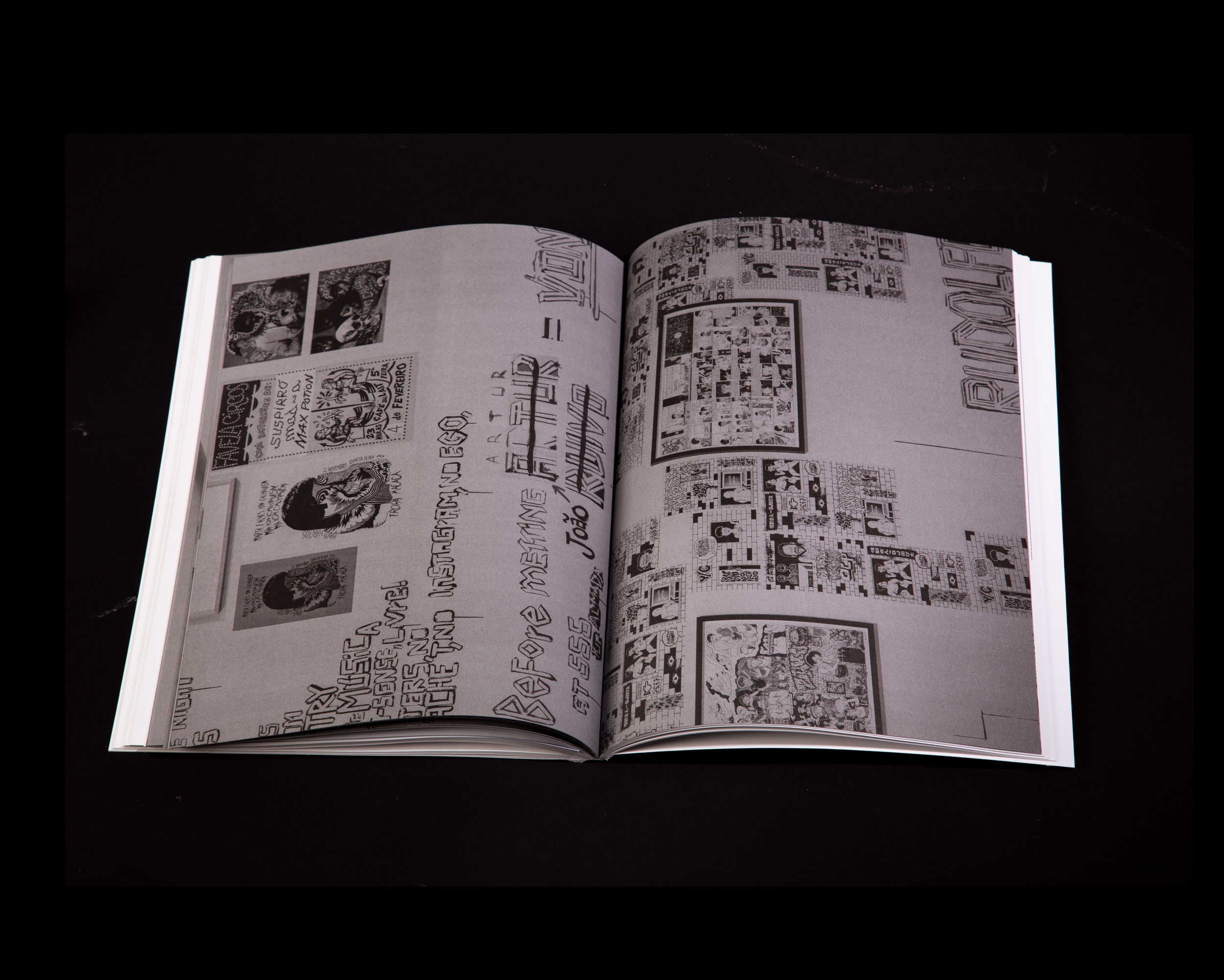
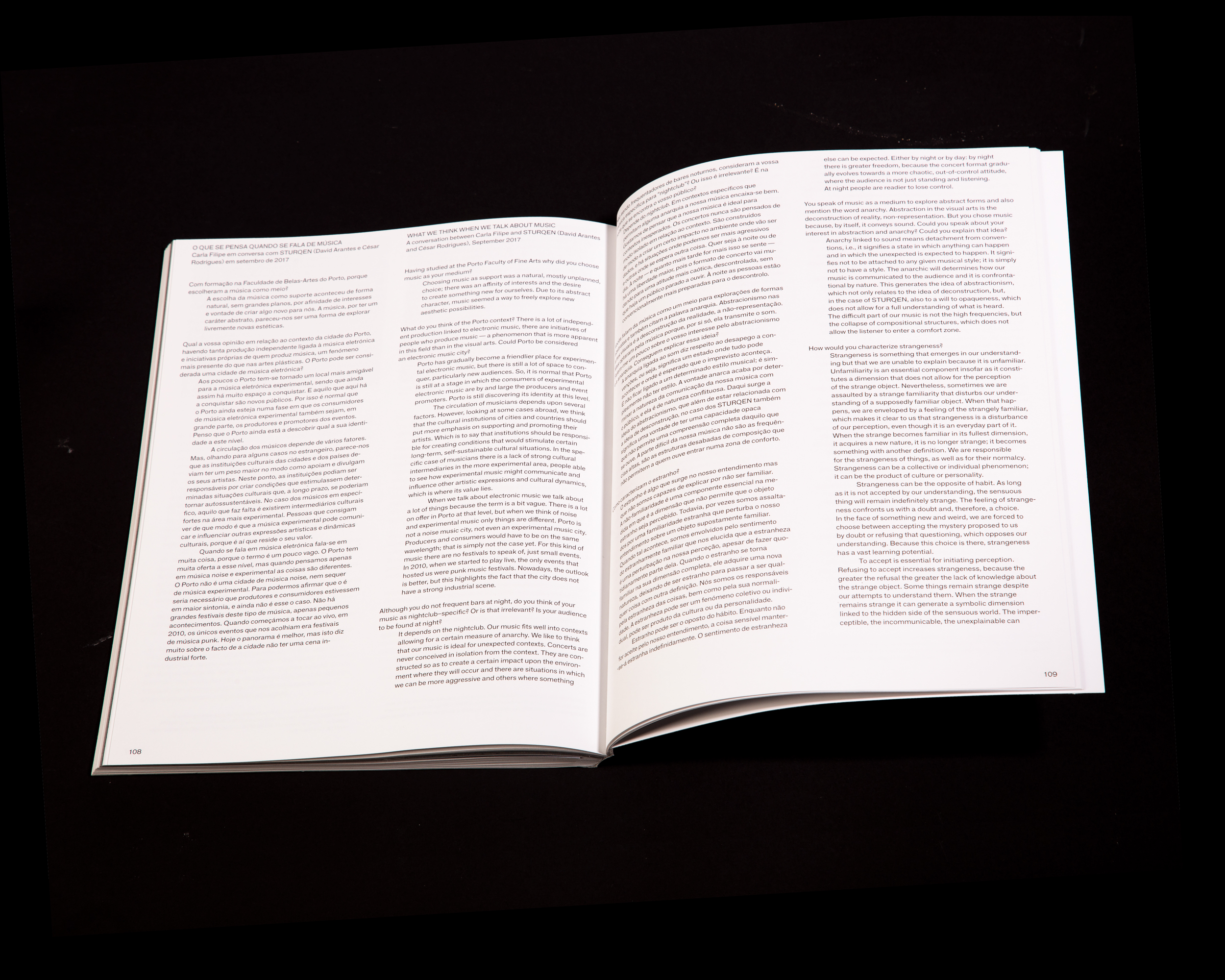
Catalogue for the exhibition curated by Carla Filipe and Ulrich Loock at Galeria Municipal, Porto.
Like in the show, Filipe used the pages as the exhibition space, intervening on the book.
The views of the exhibition are printed in black, occupying full pages.
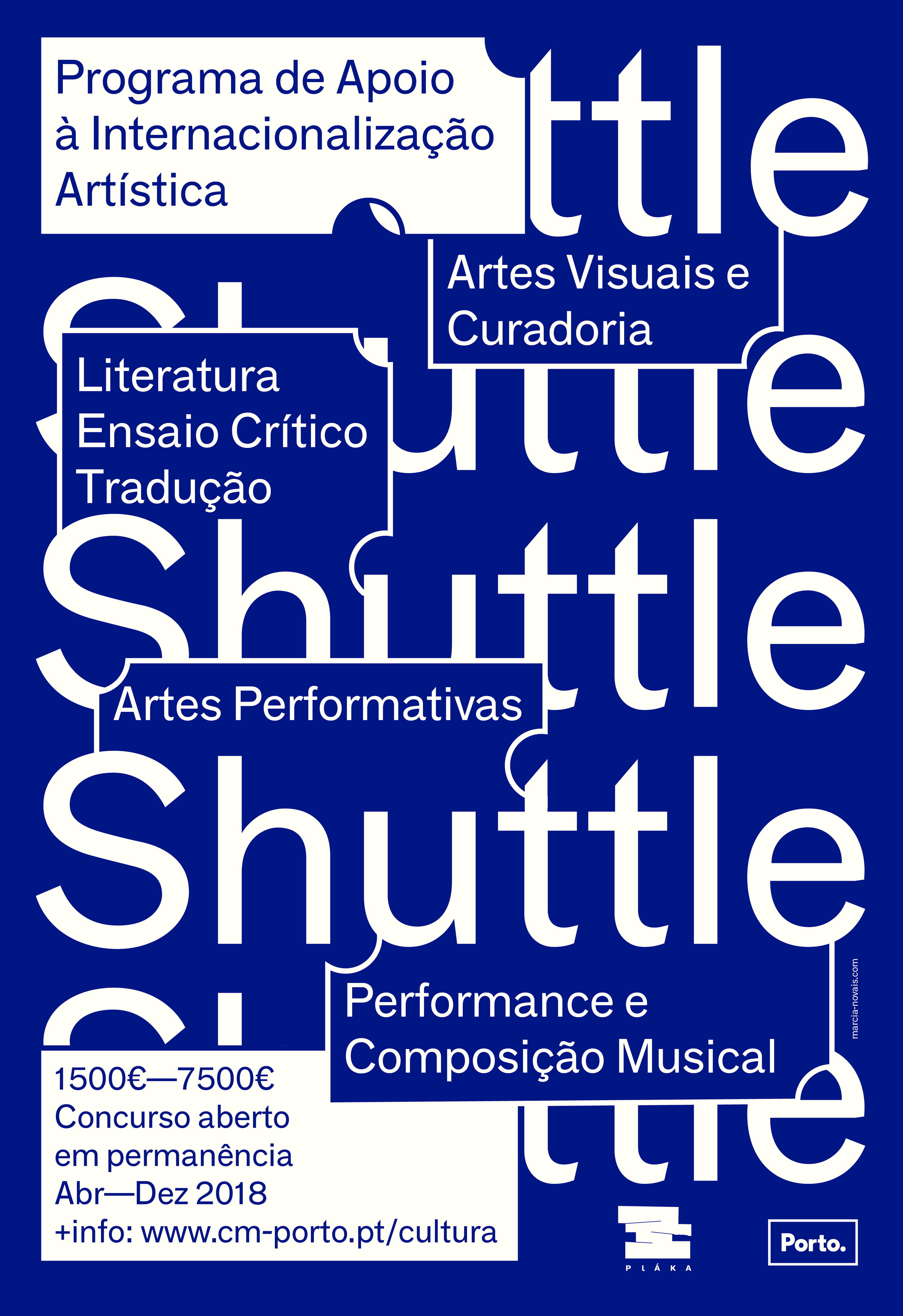
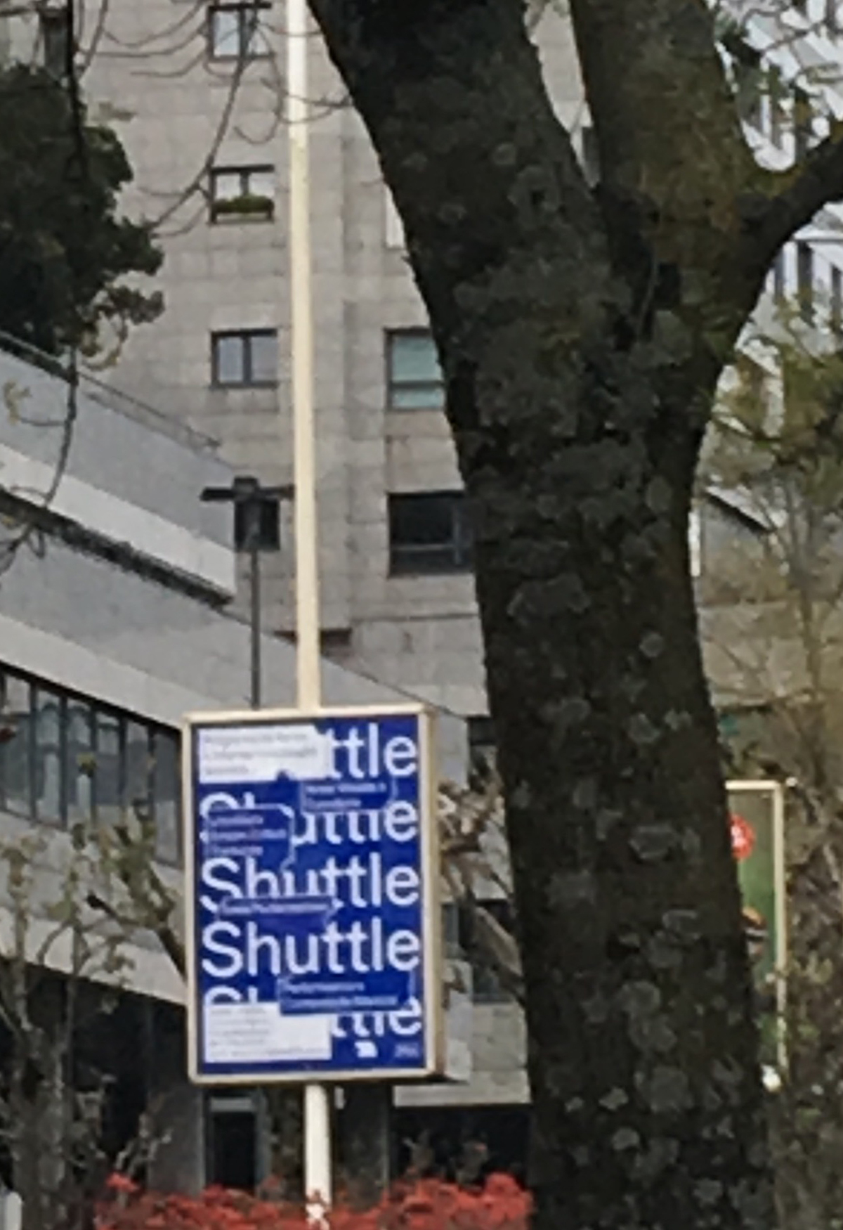
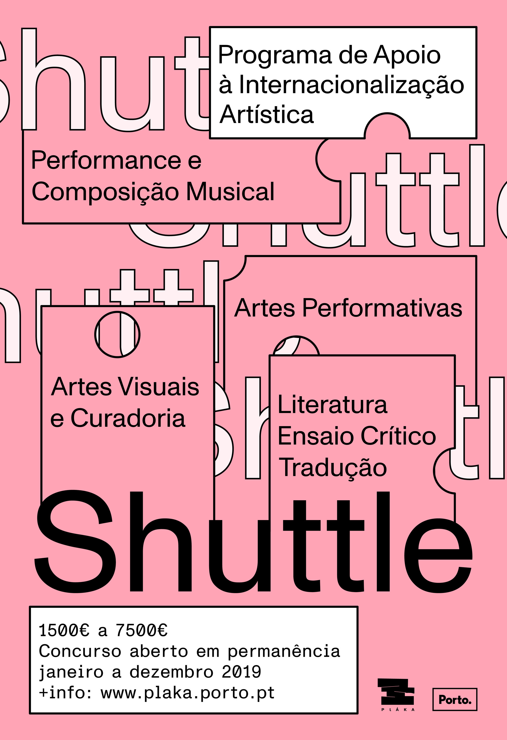
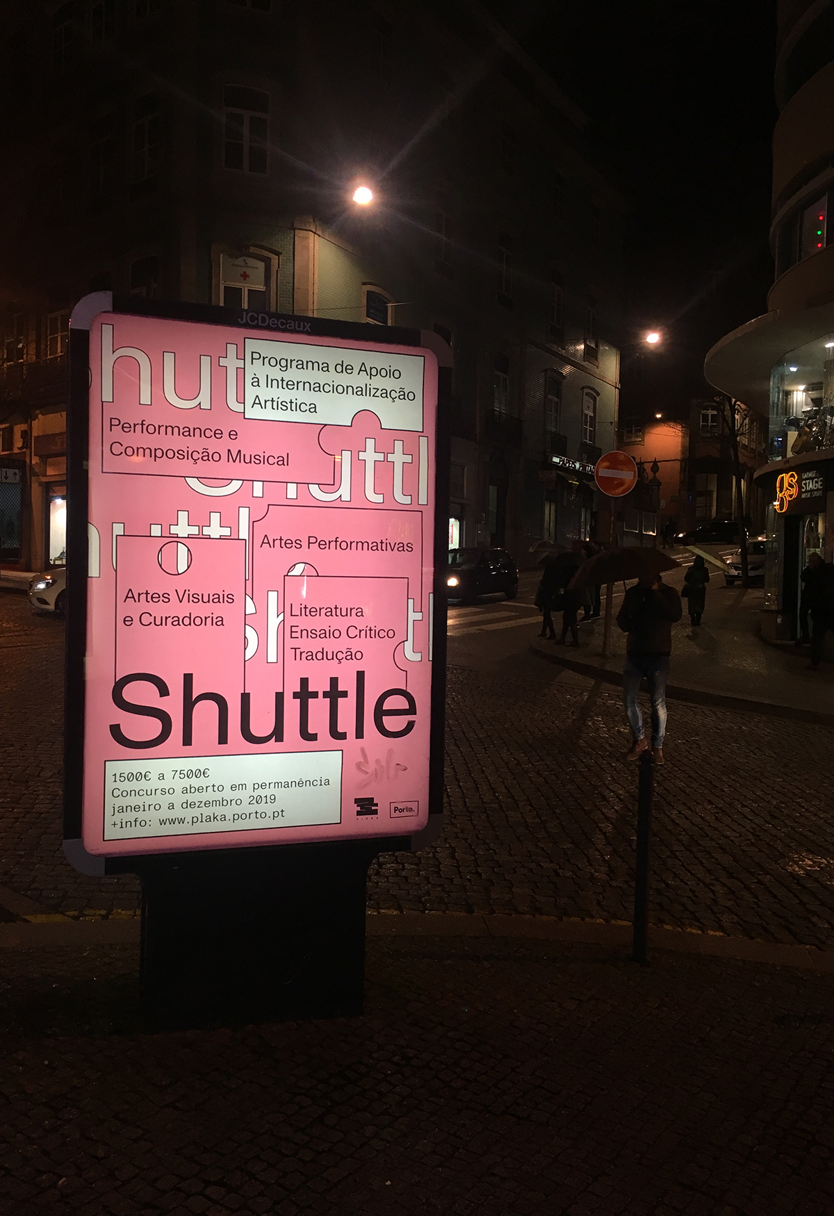
Shuttle
2018 & 19
1750 × 1200 mm
Client: Câmara Municipal do Porto
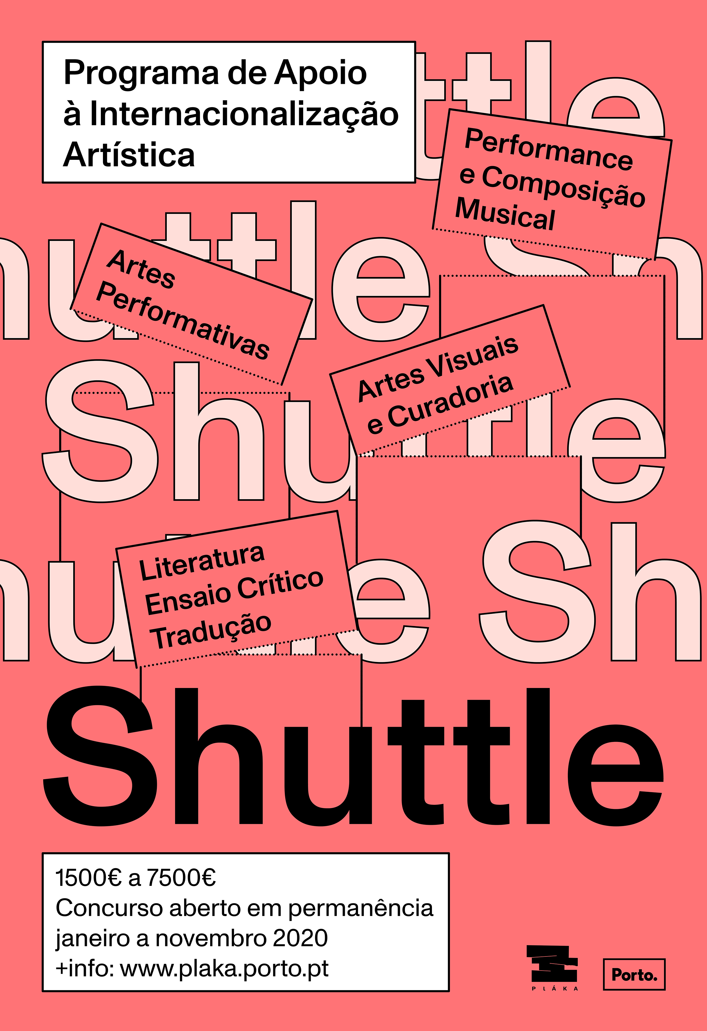
Shuttle is a internationalisation support programme for artists of Porto Municipality.
The identity of the program was designed from the idea of the Shuttle as a ticket for internationalisation of art projects of Porto.
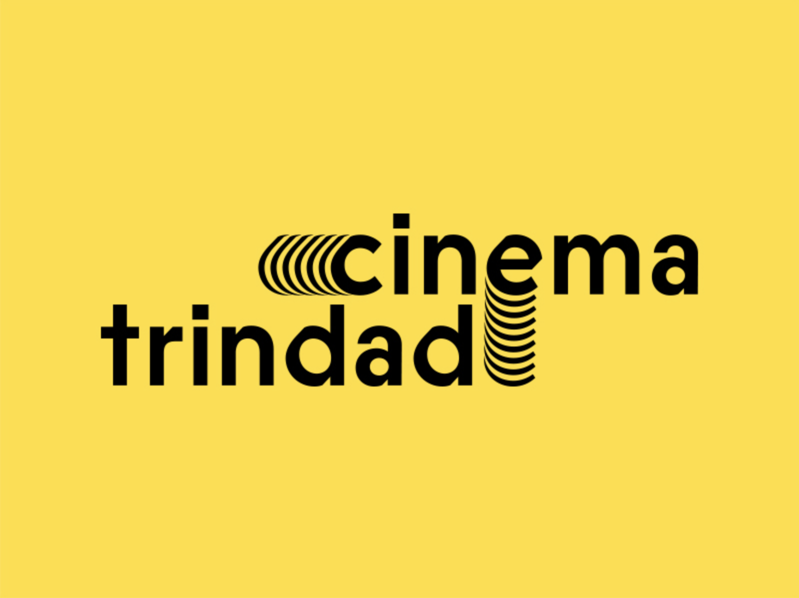
Cinema Trindade
Logo for Cinema Trindade, which reopened in 2016.
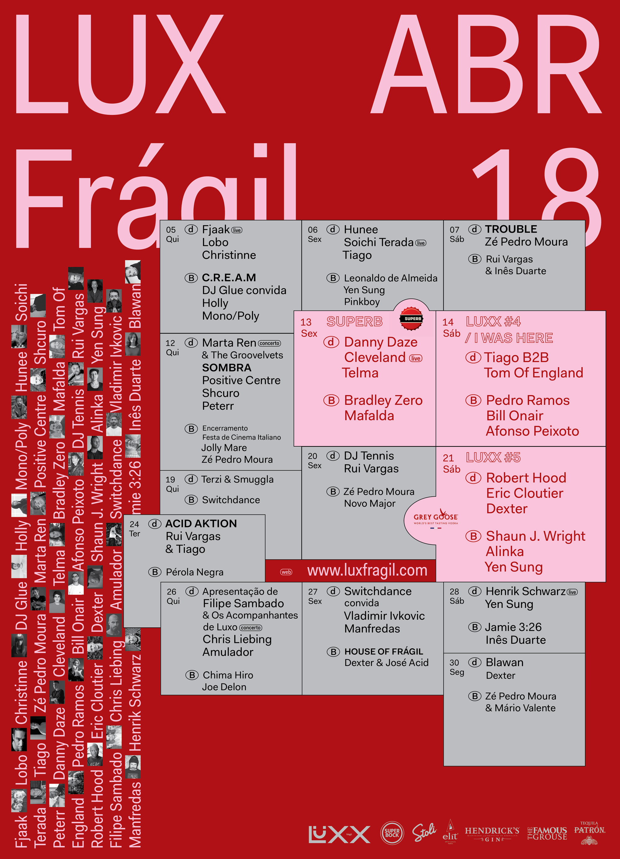
Lux-Frágil
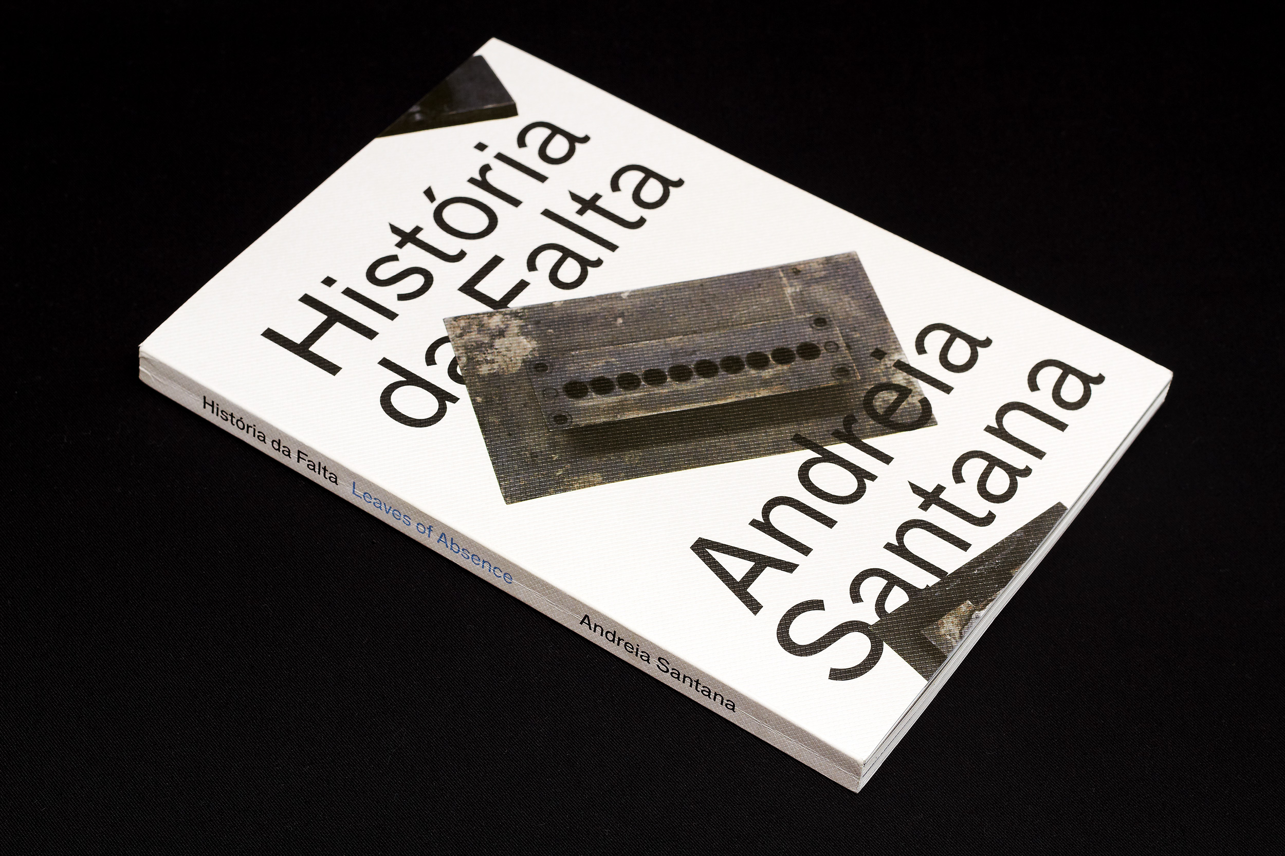
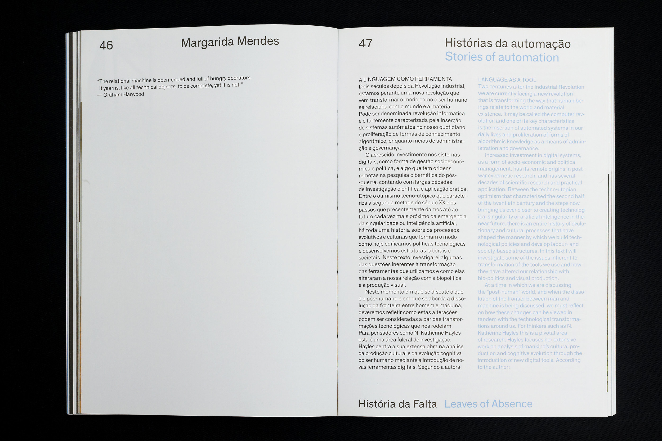
História da Falta / Leaves of Absence
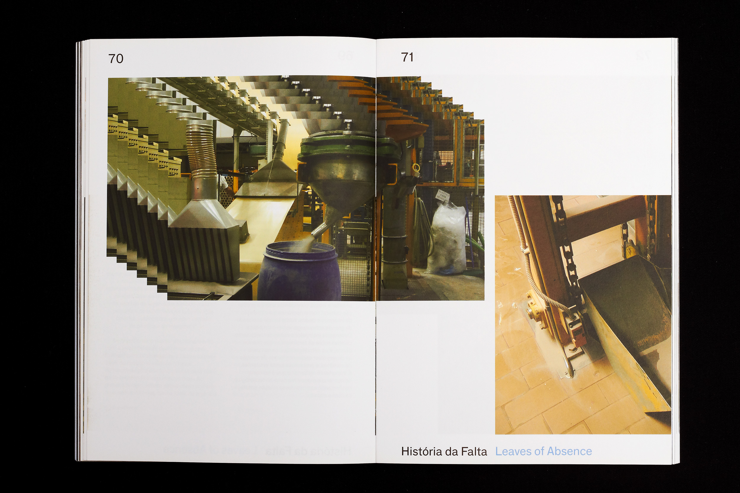
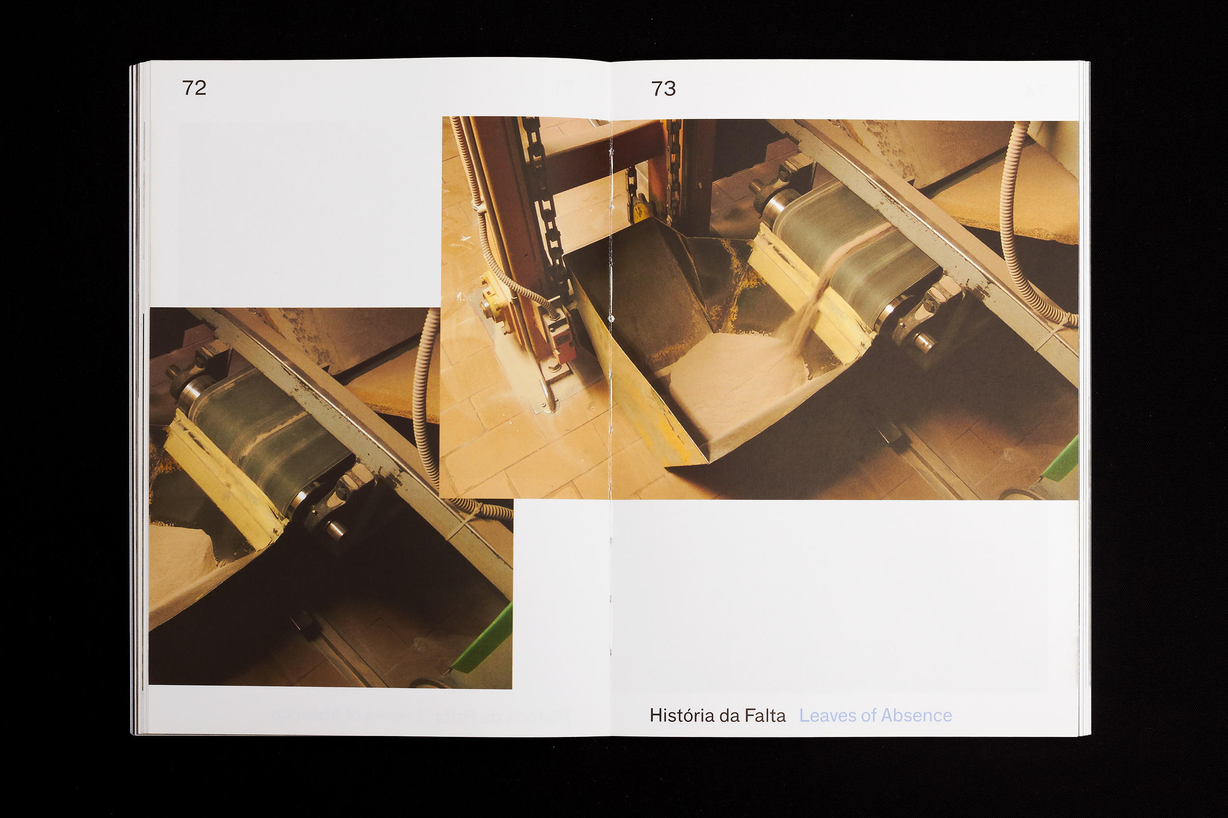
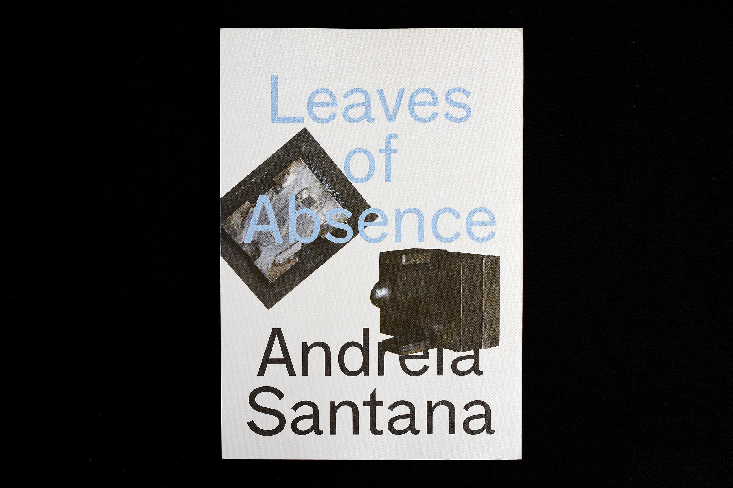
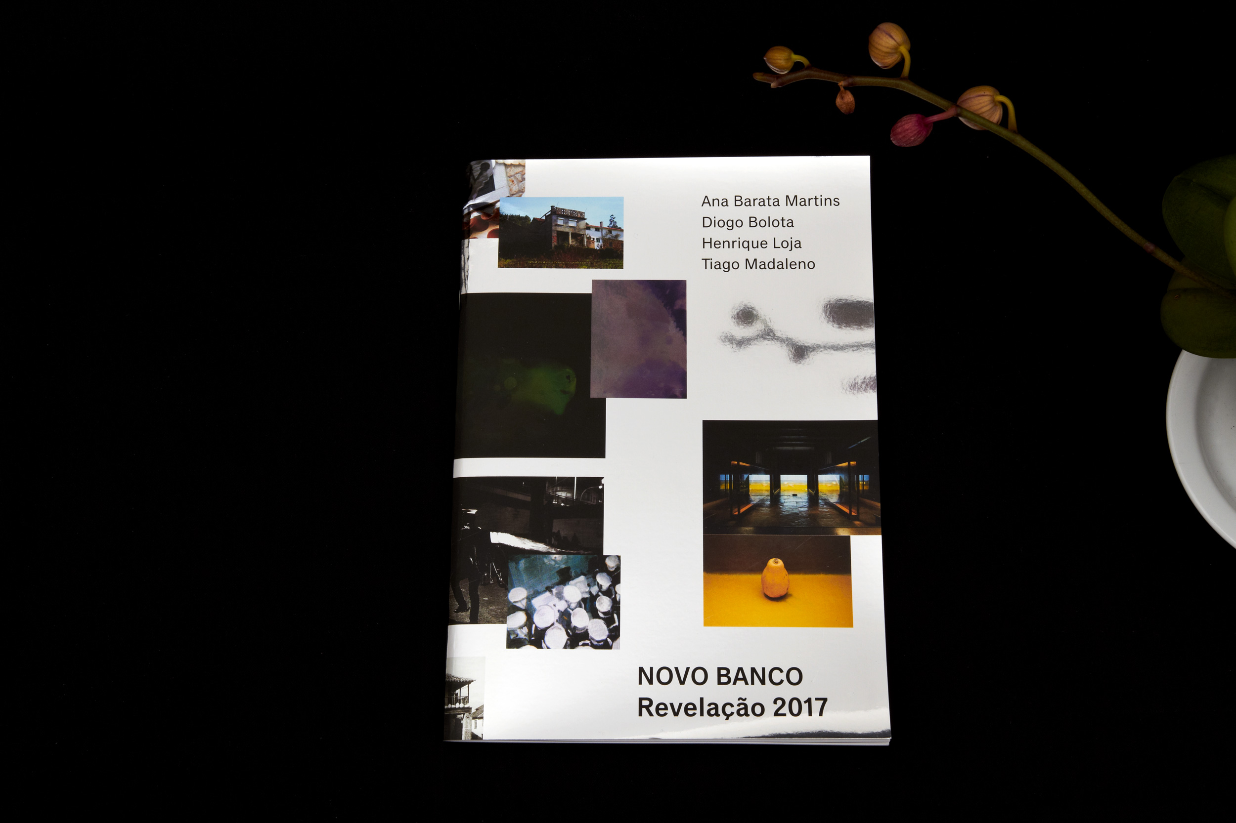
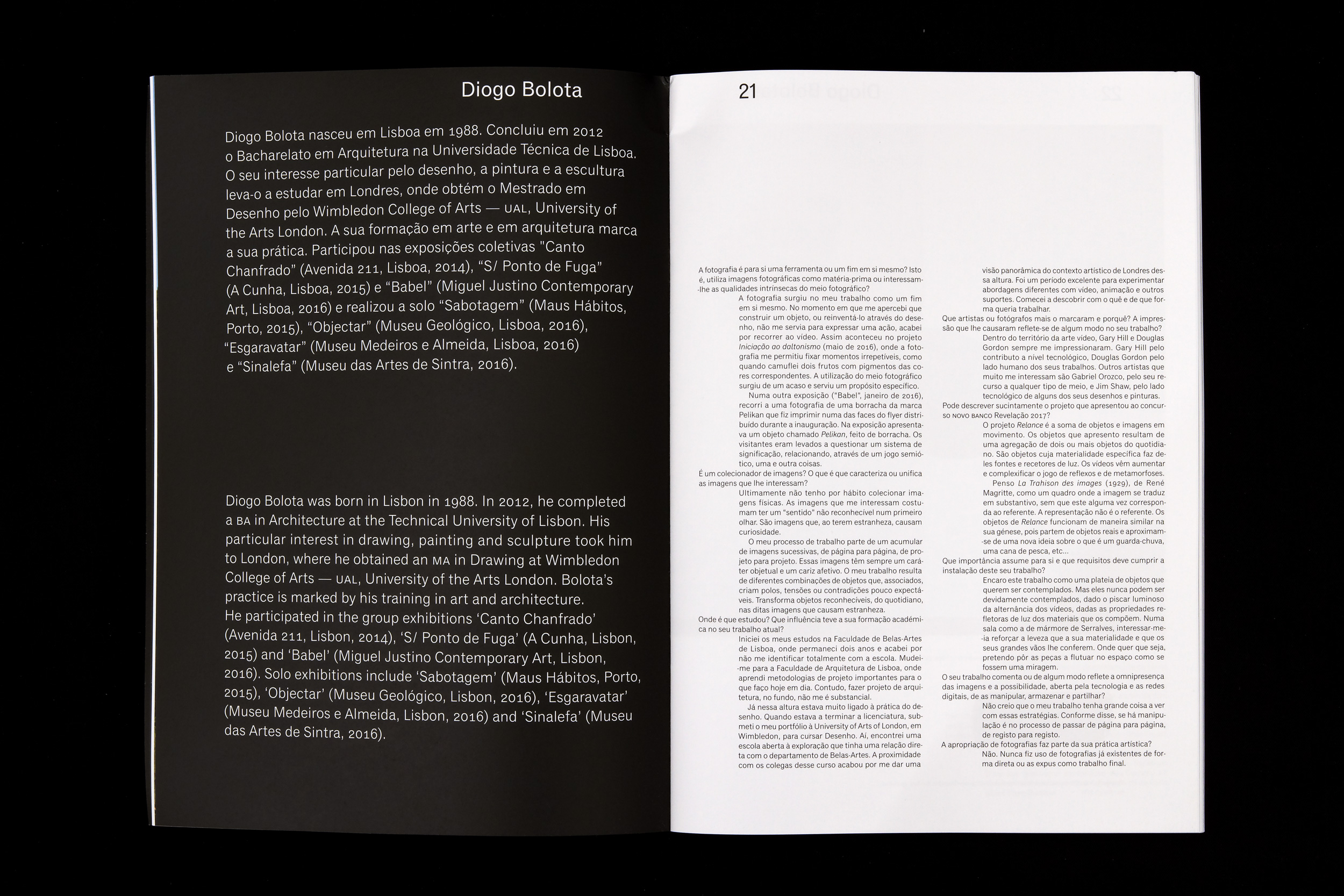
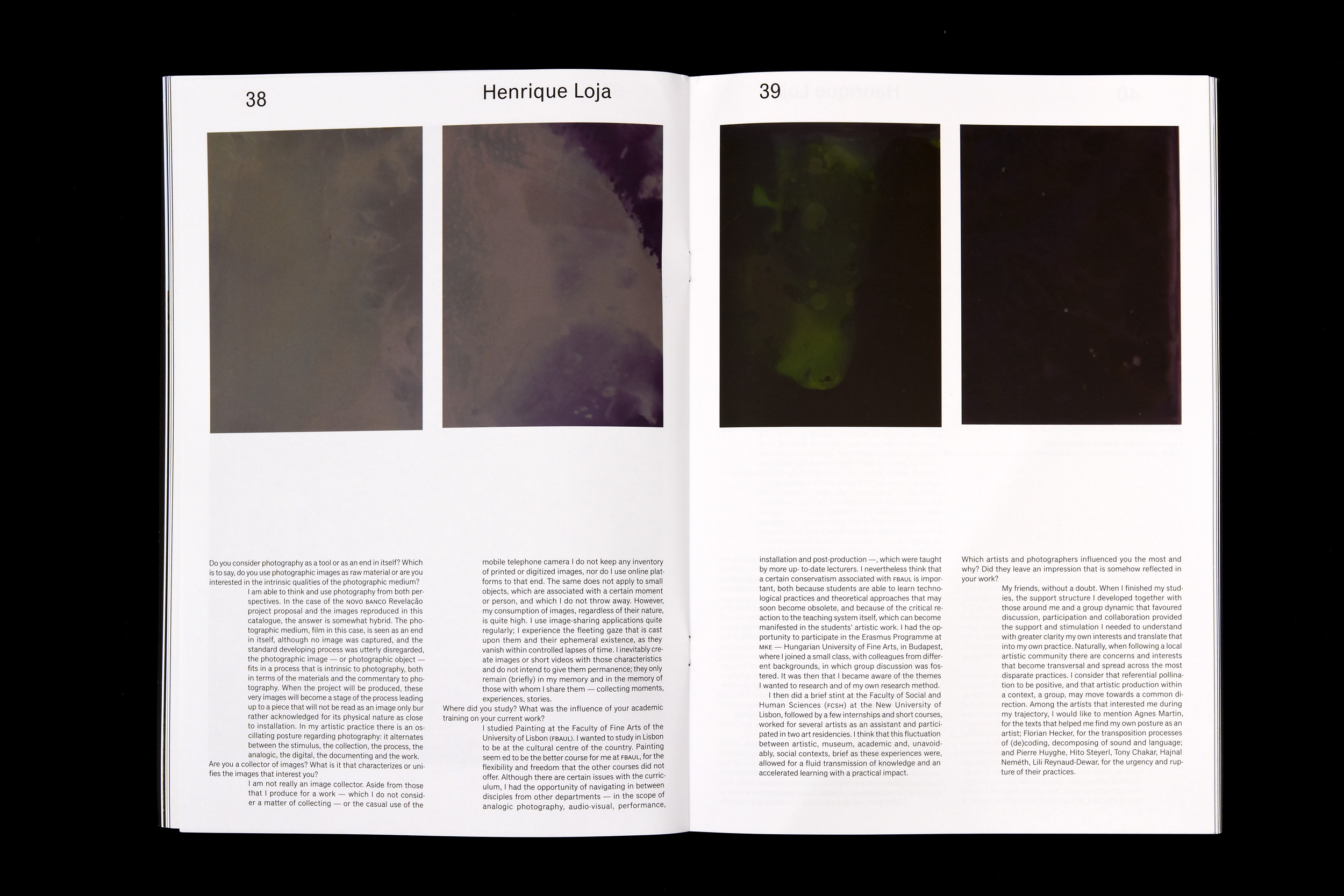
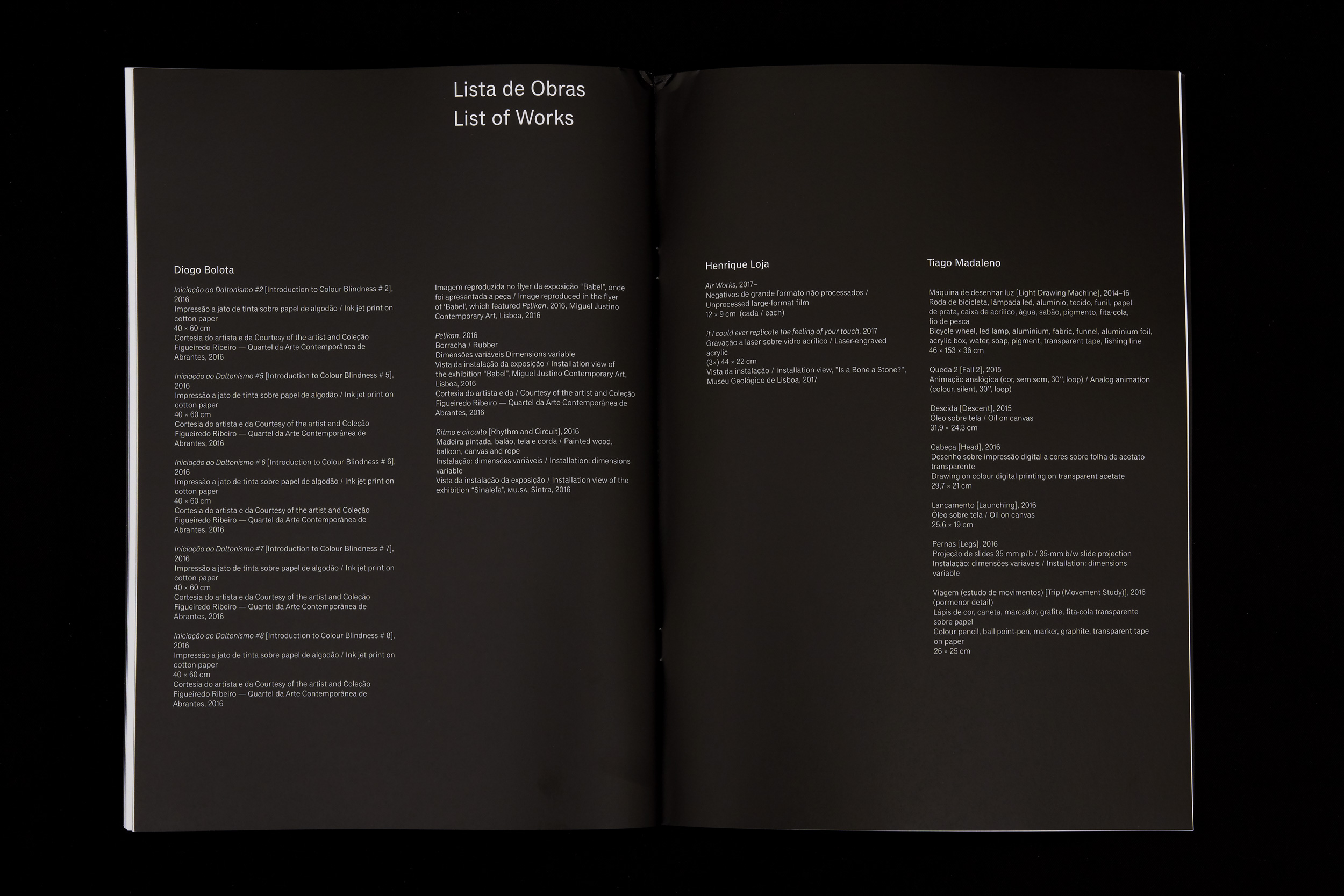
Leaves of Absence was the book published by Andreia Santana during her exhibition at Serralves Museum. Santana won the Novo Banco Revelação Award, a prize for young artists that work with photography. Tiago Carneiro and I designed the prize publication and Andreia asked us to design a small publication for there, that not only presented the work that was in the exhibition, but also part of the process that resulted in the exhibition.
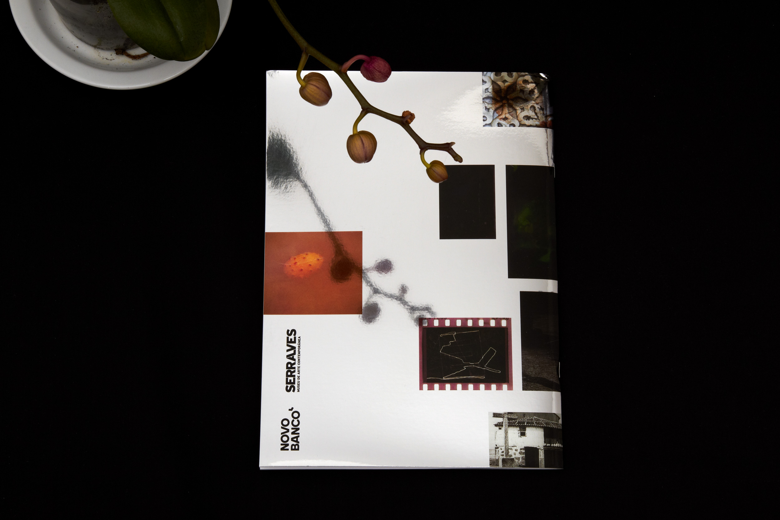
Novo Banco Revelação 2017
This catalogue was designed for the Novo Banco Revelação Award organised by Serralves Museum.
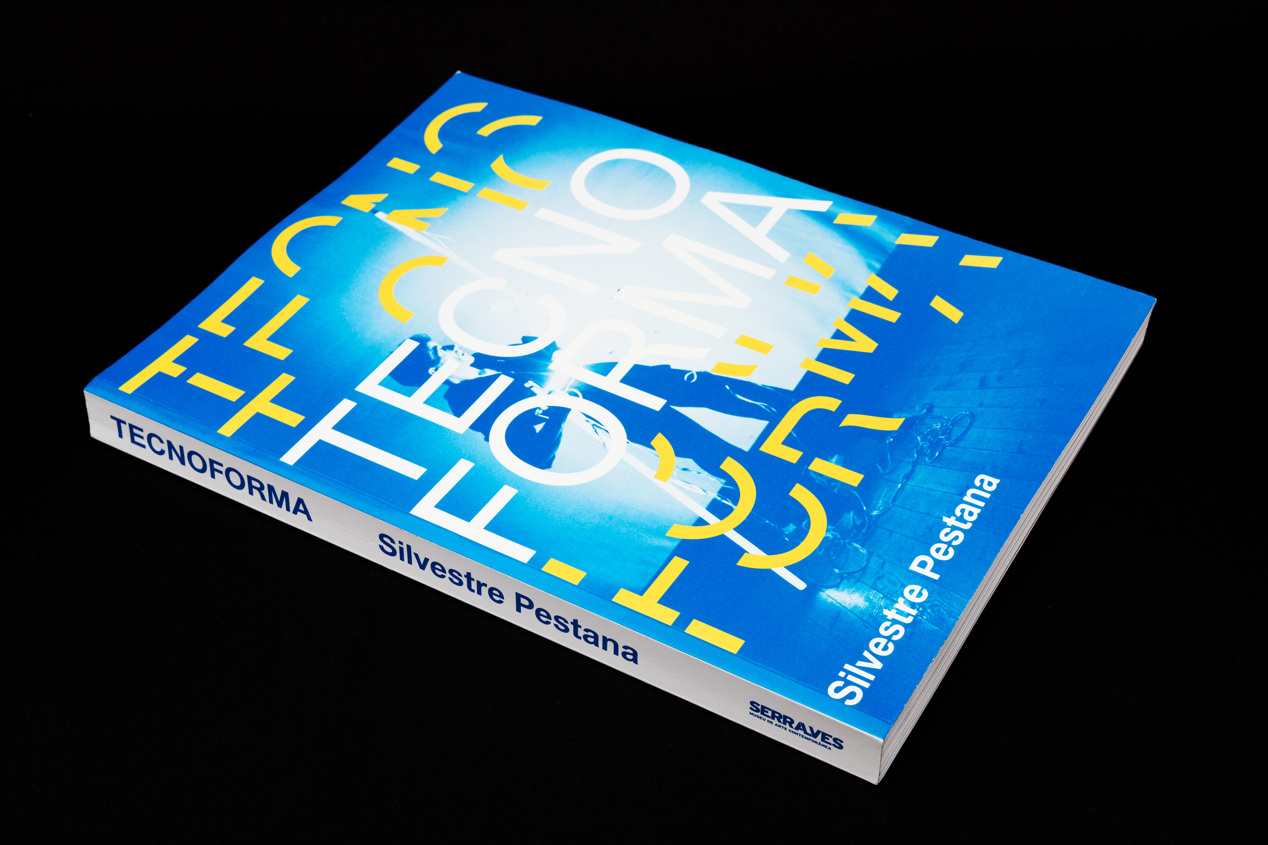
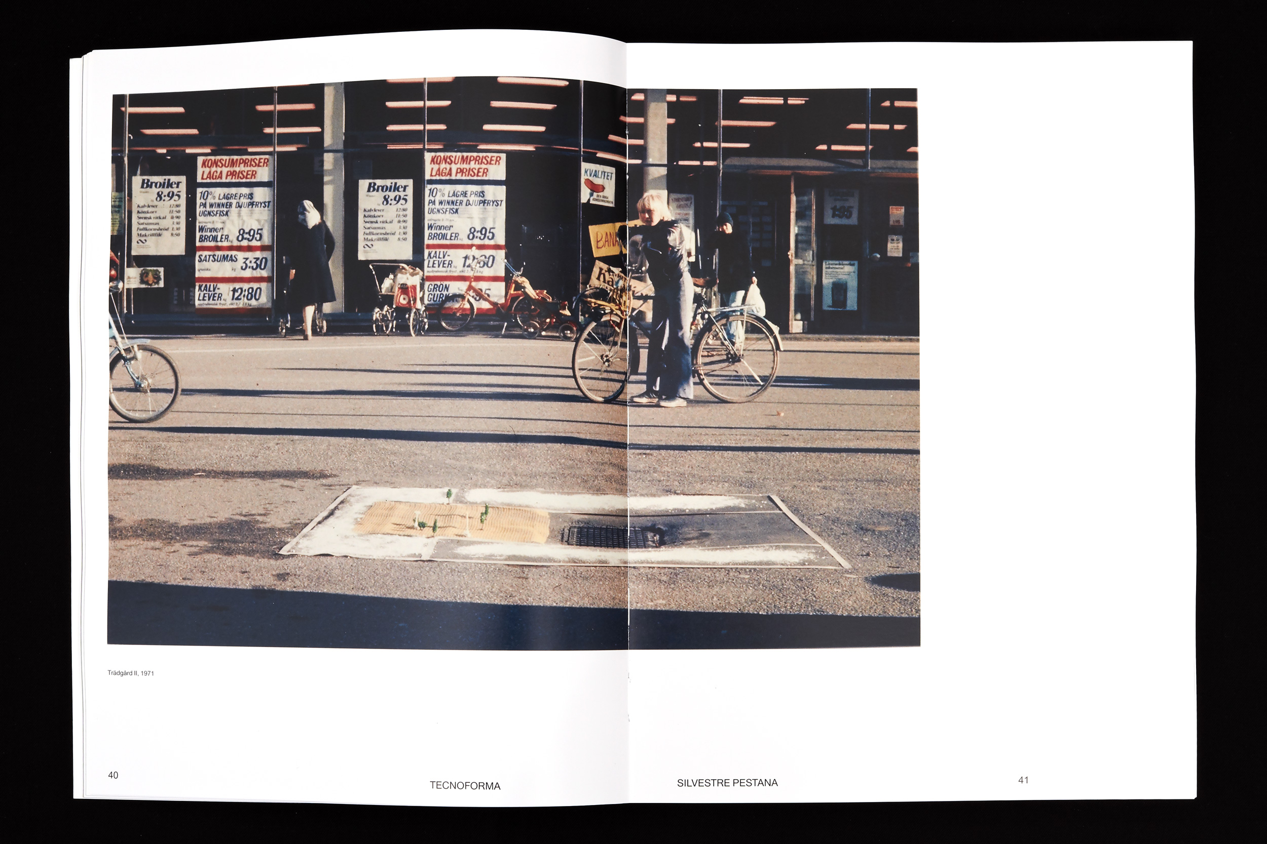
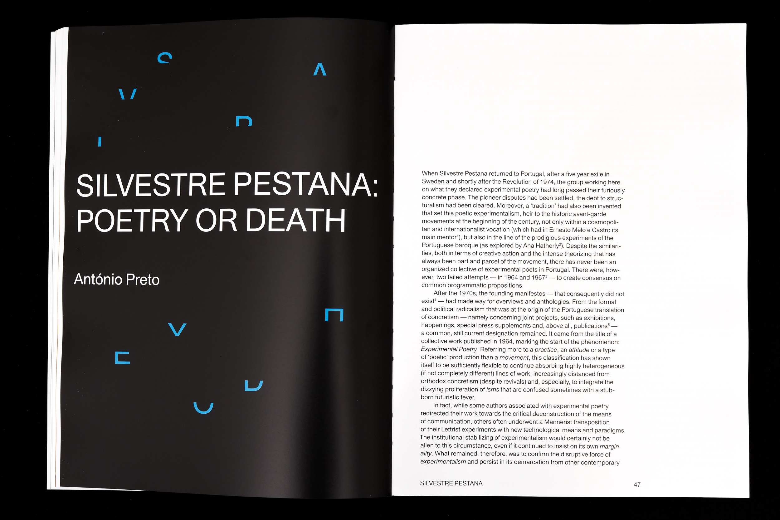
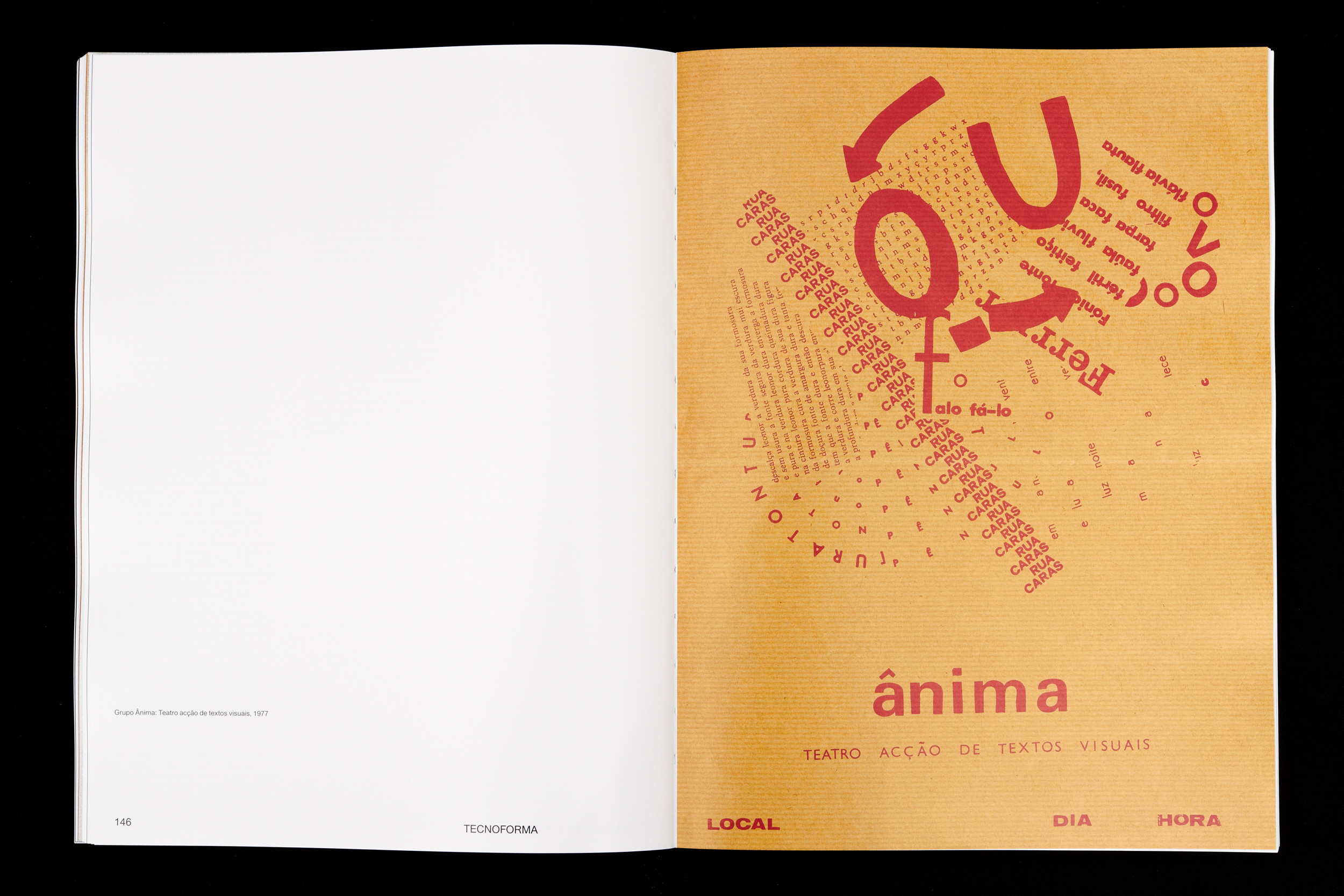
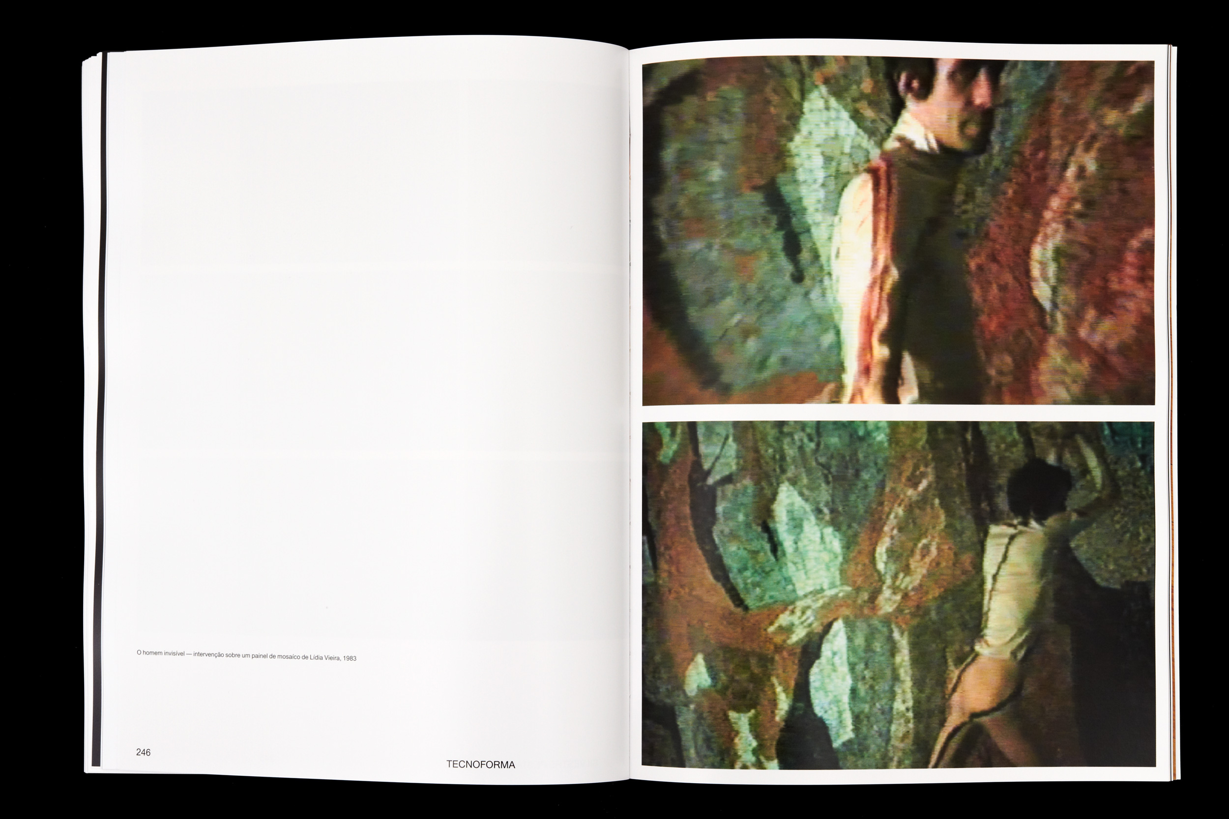
Tecnoforma
2016
240 × 320 mm
Client: Museum of Contemporary Art — Serralves
This catalogue was designed for the exhibition of Silvestre Pestana at Serralves Museum.
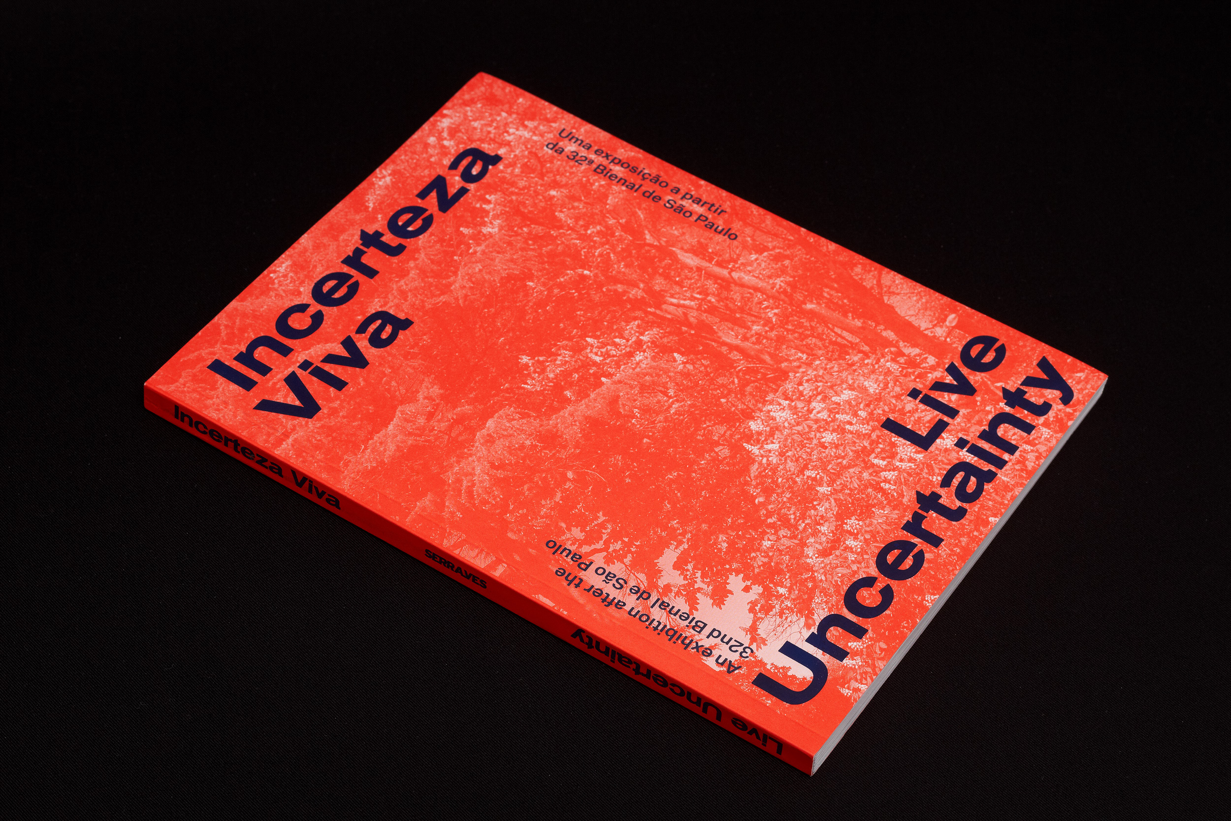
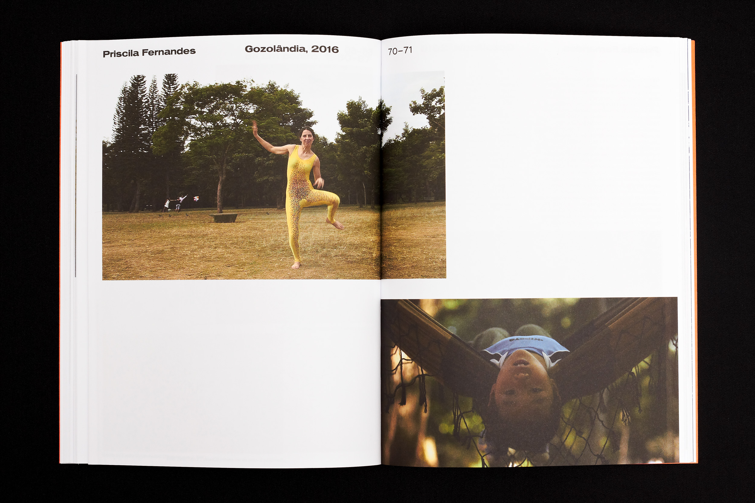
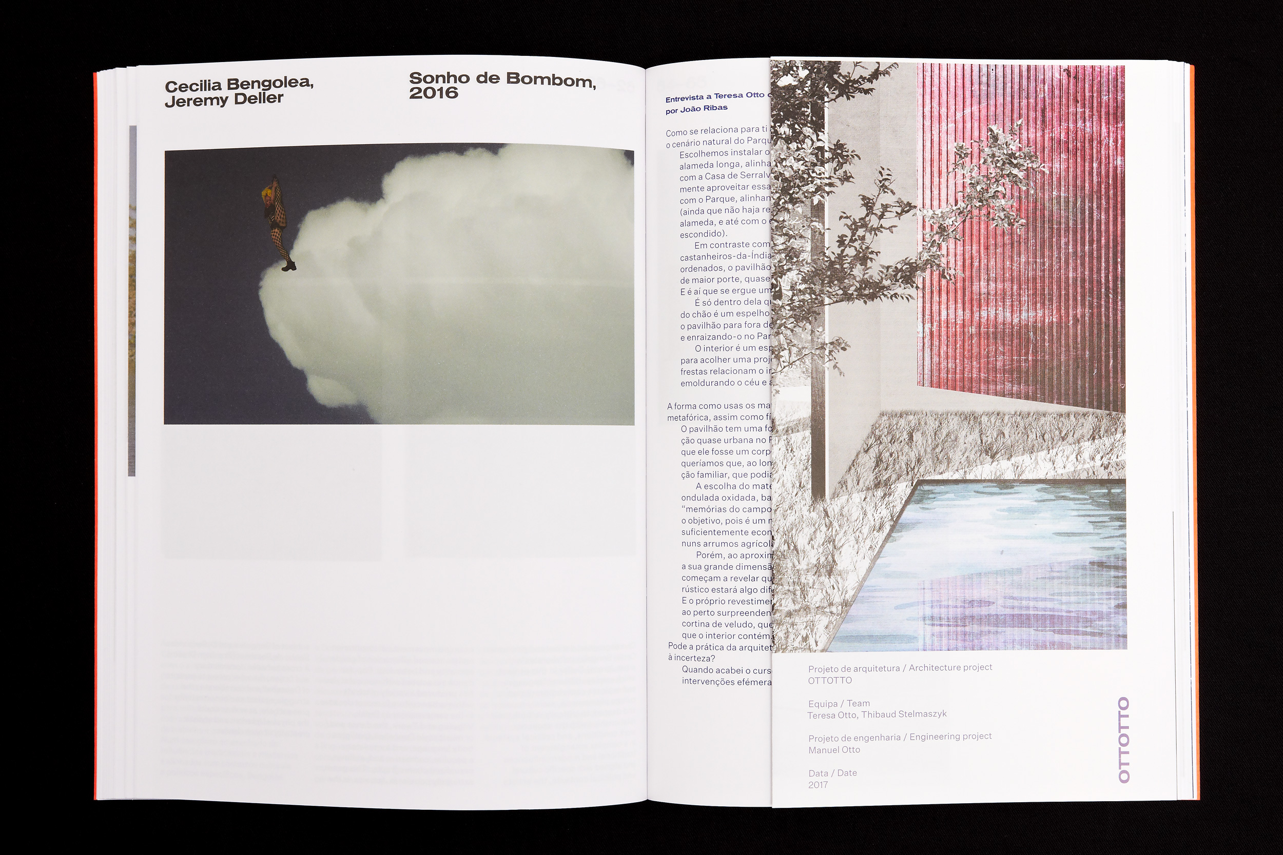
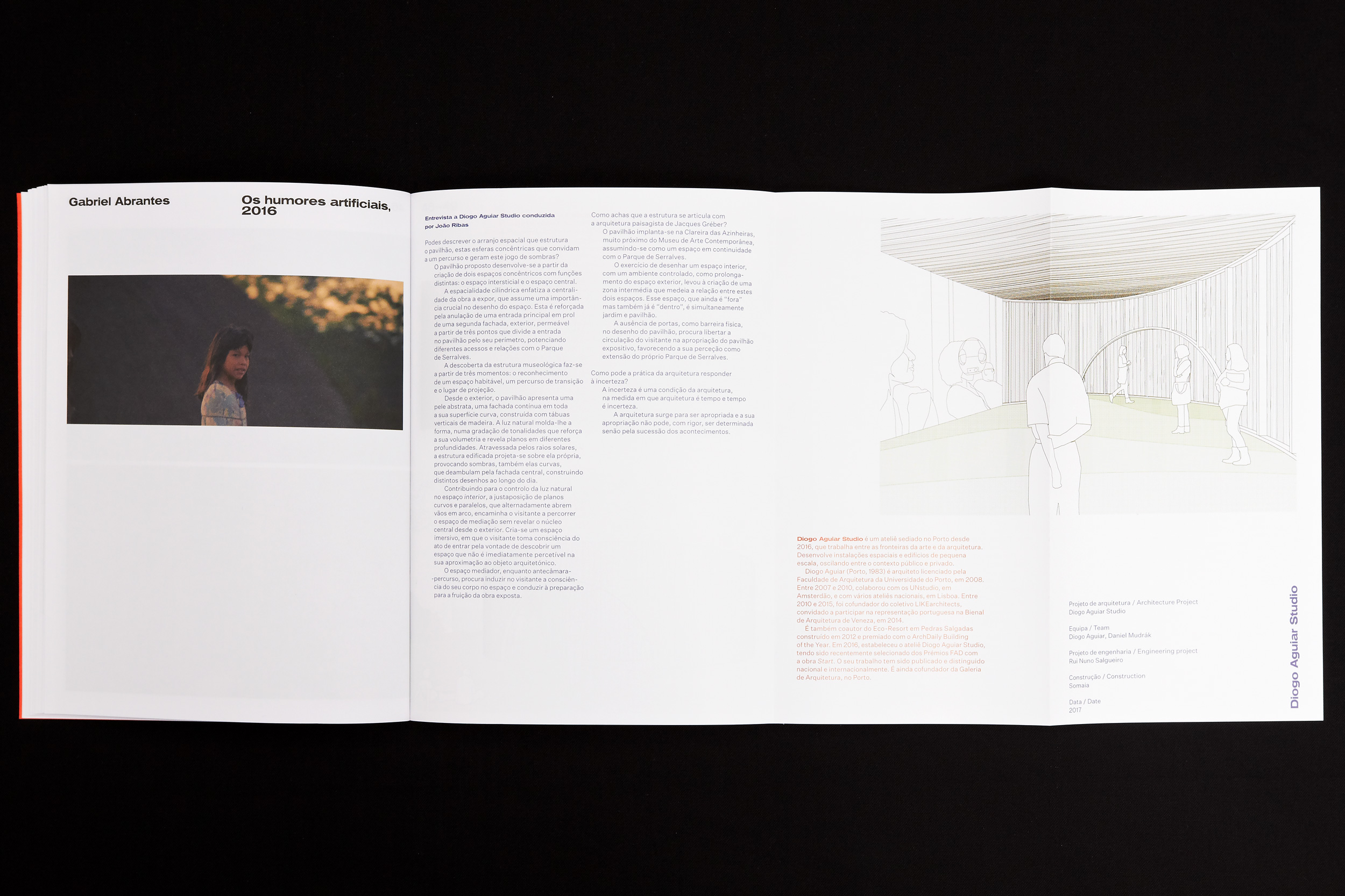
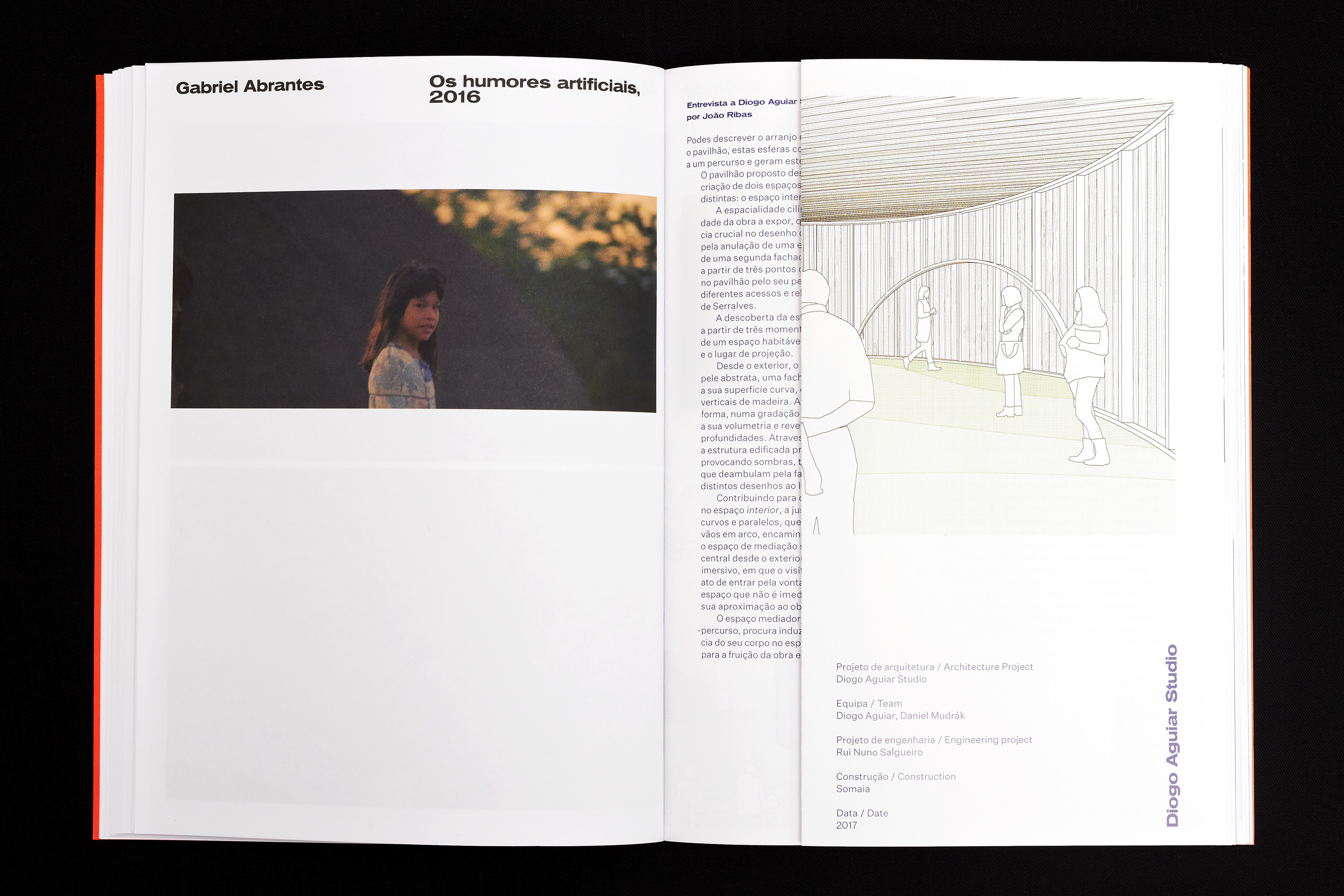
Incerteza Viva / Live Uncertainty
2017
170 × 230 mm
Client: Museum of Contemporary Art — Serralves
This exhibition was presented at the Museum and at the Museum's park. For the presentation at the park, it was commissioned 5 temporary pavilions.
For the catalogue, it was important to present it as a guide to the exhibition, establishing which pieces were installed at the park and at the museum and represent the temporary pavilions in the publication.
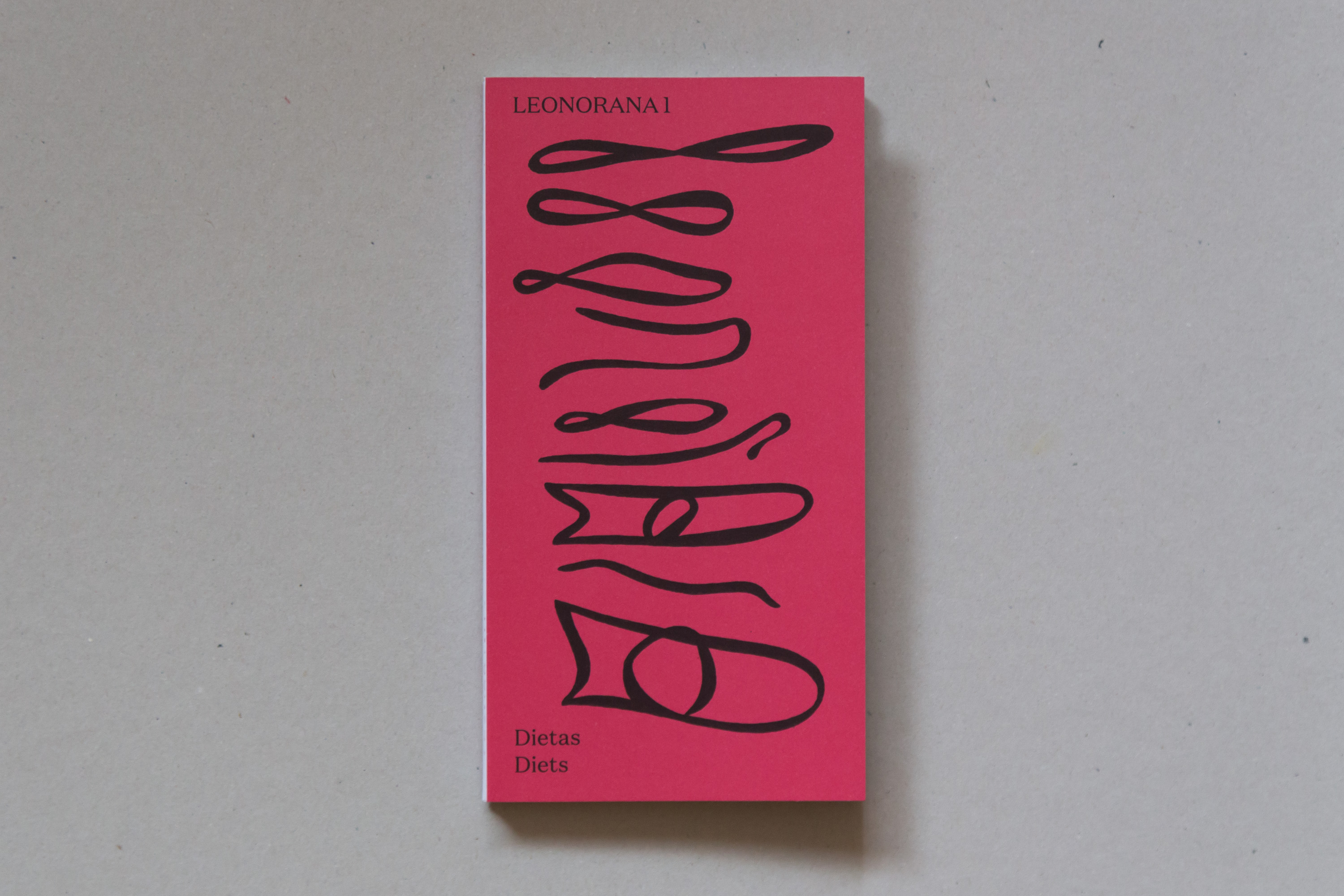
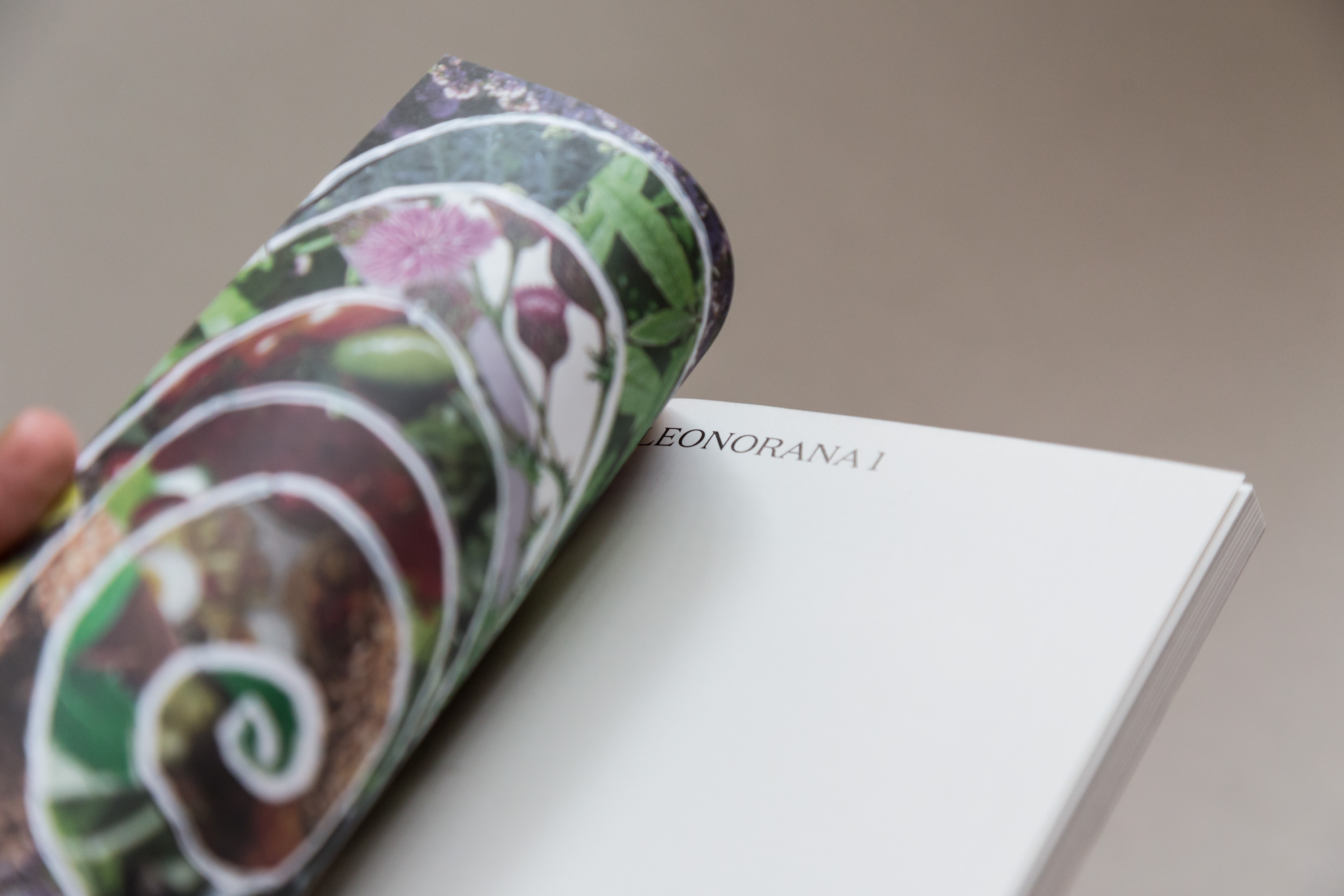
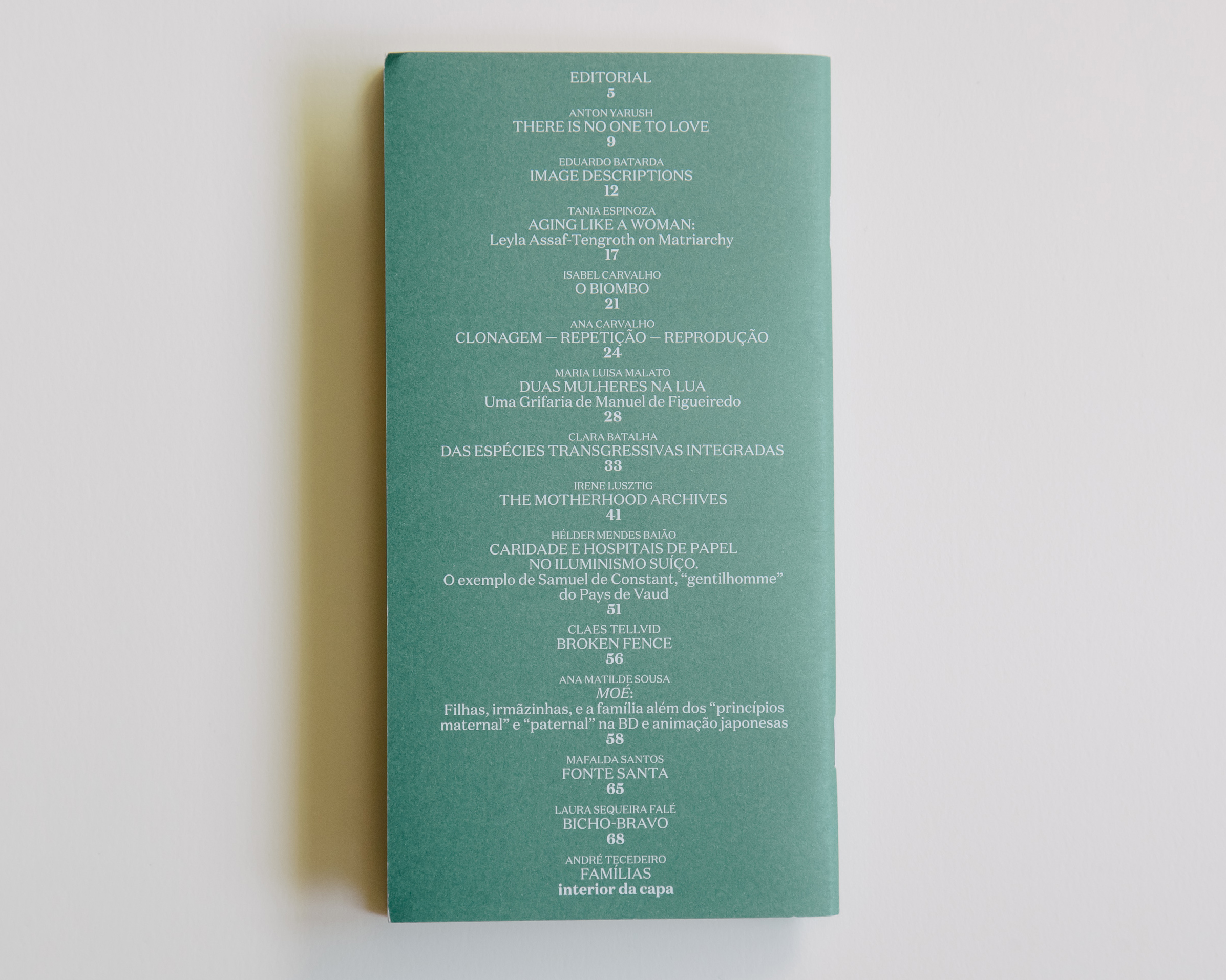
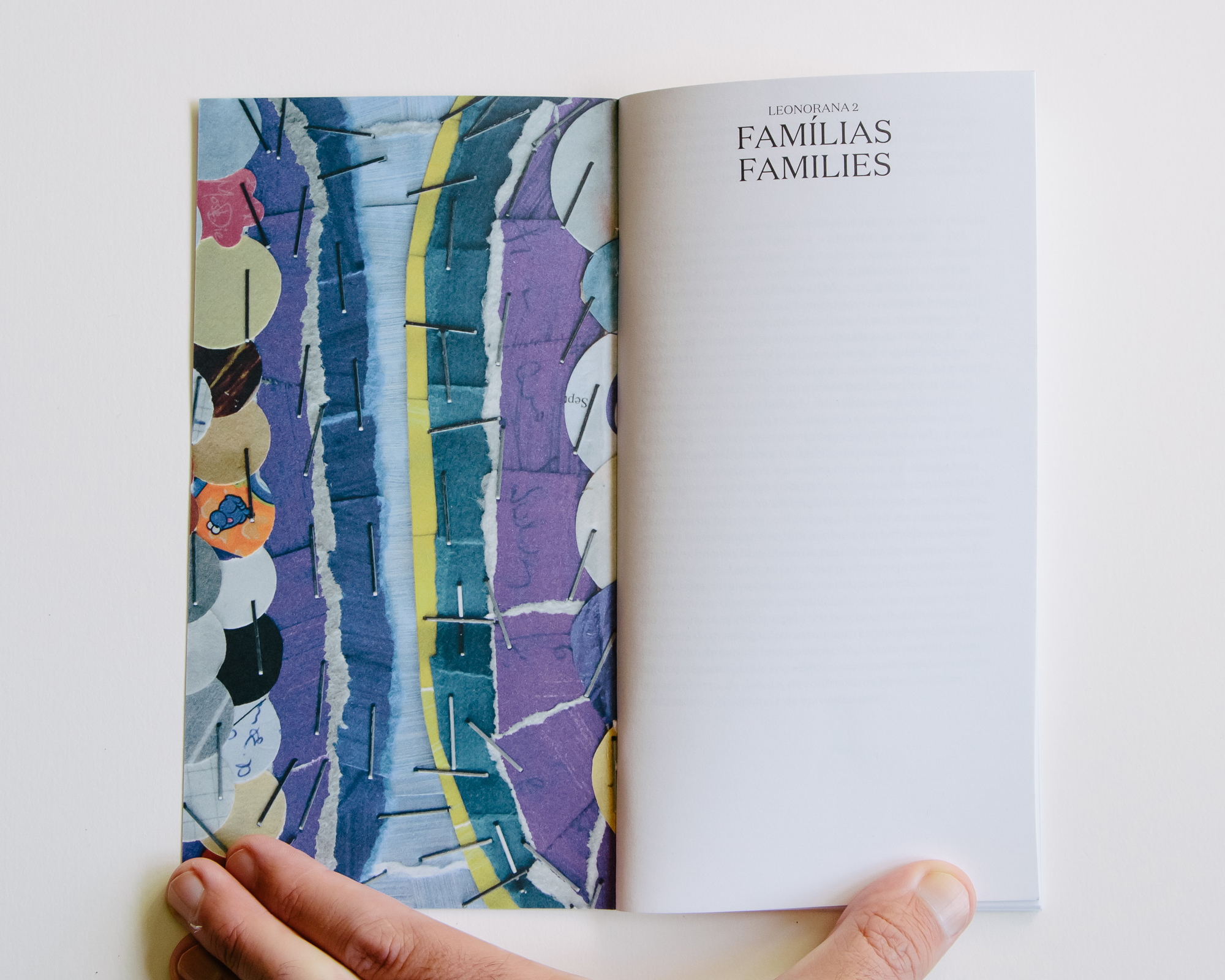
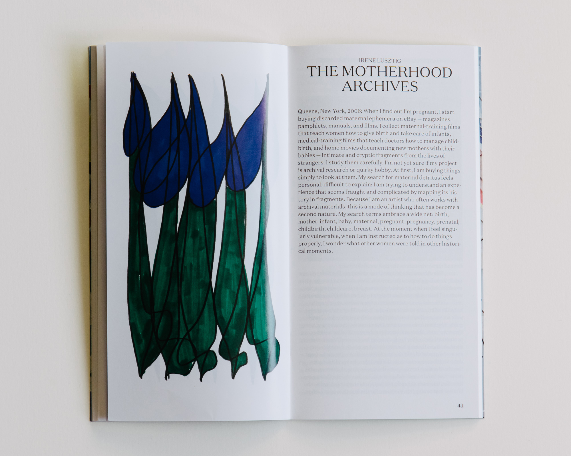
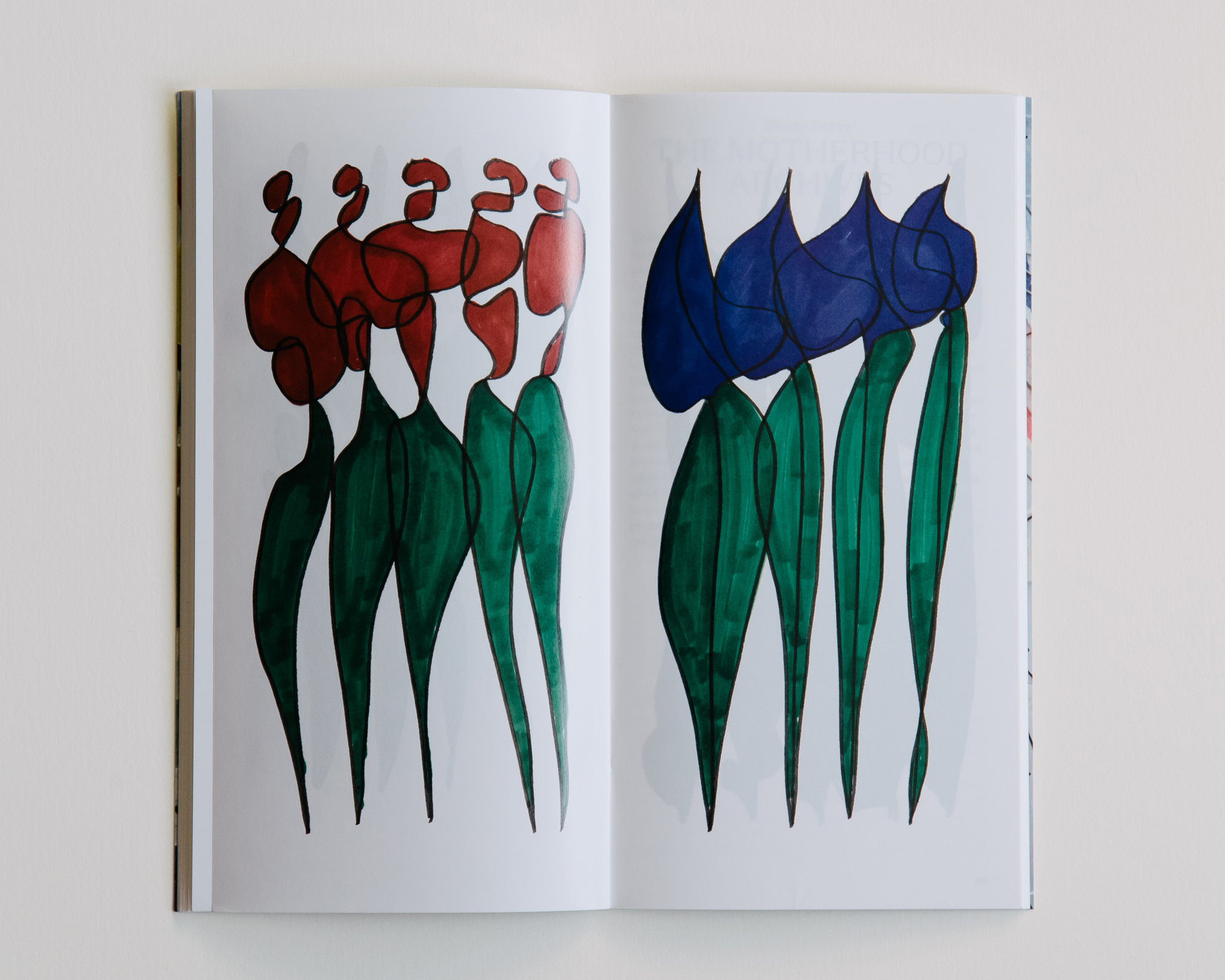
Leonorana
2018—2019
110 × 210 mm
Client: Isabel Carvalho
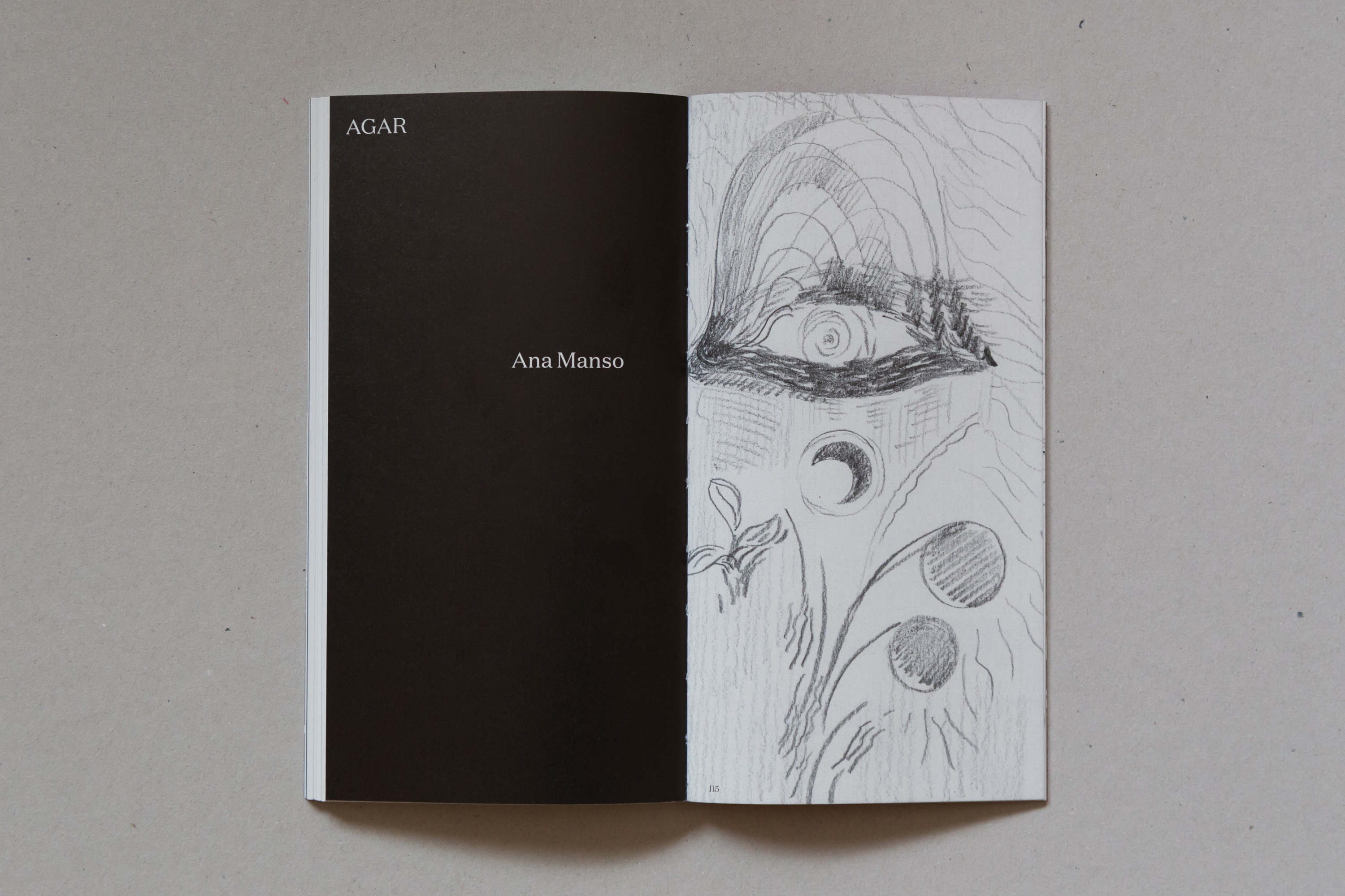
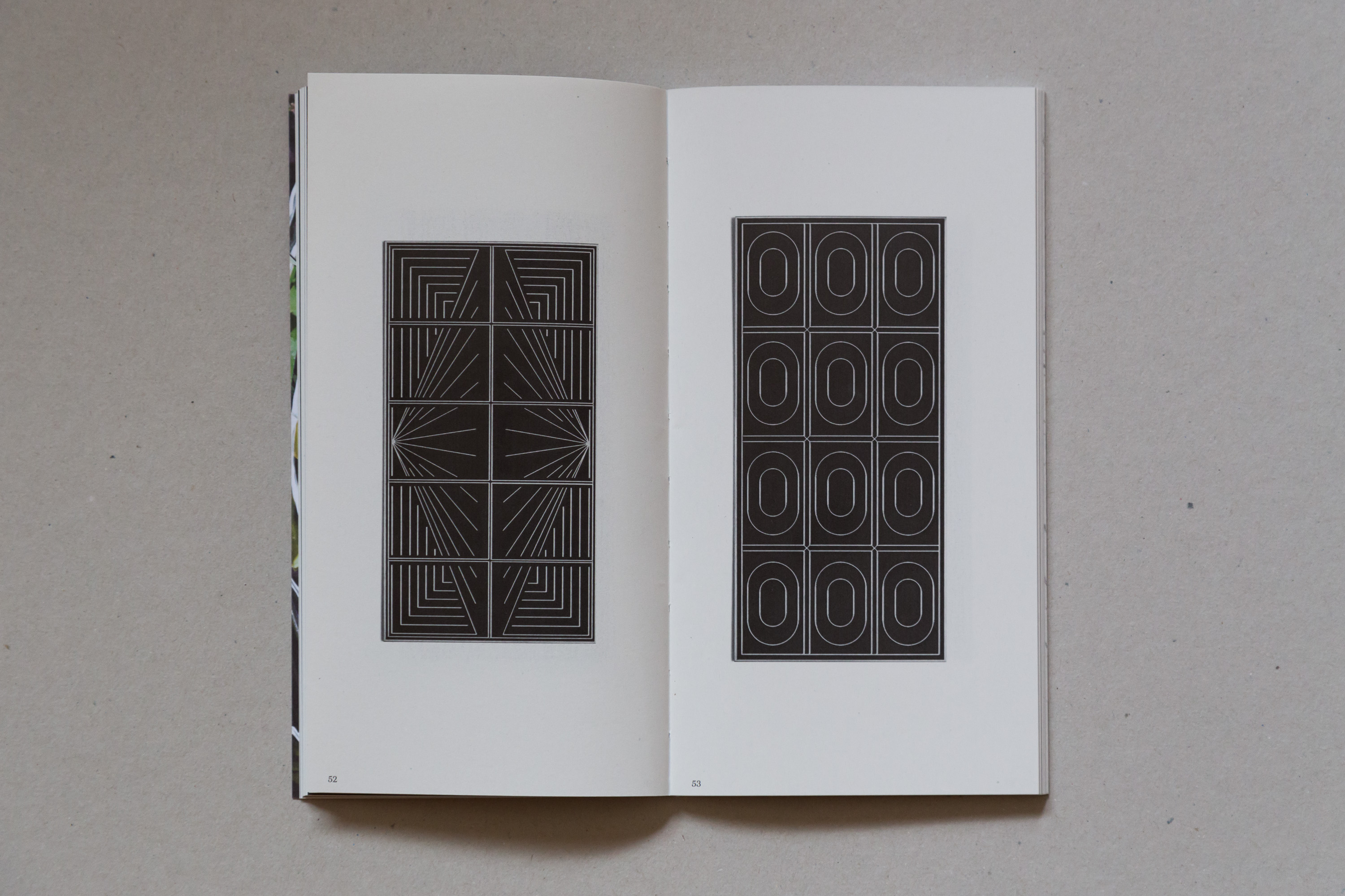
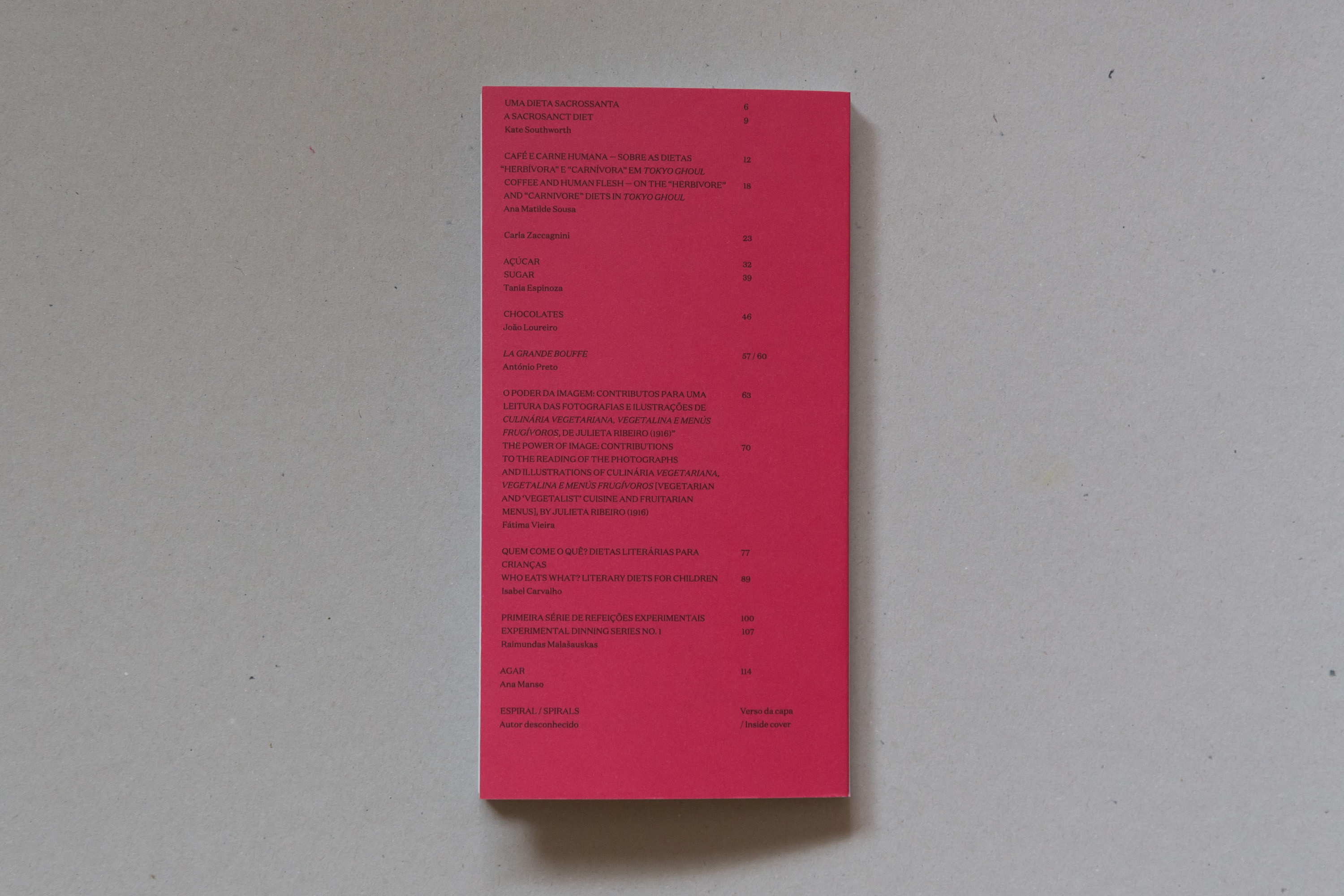
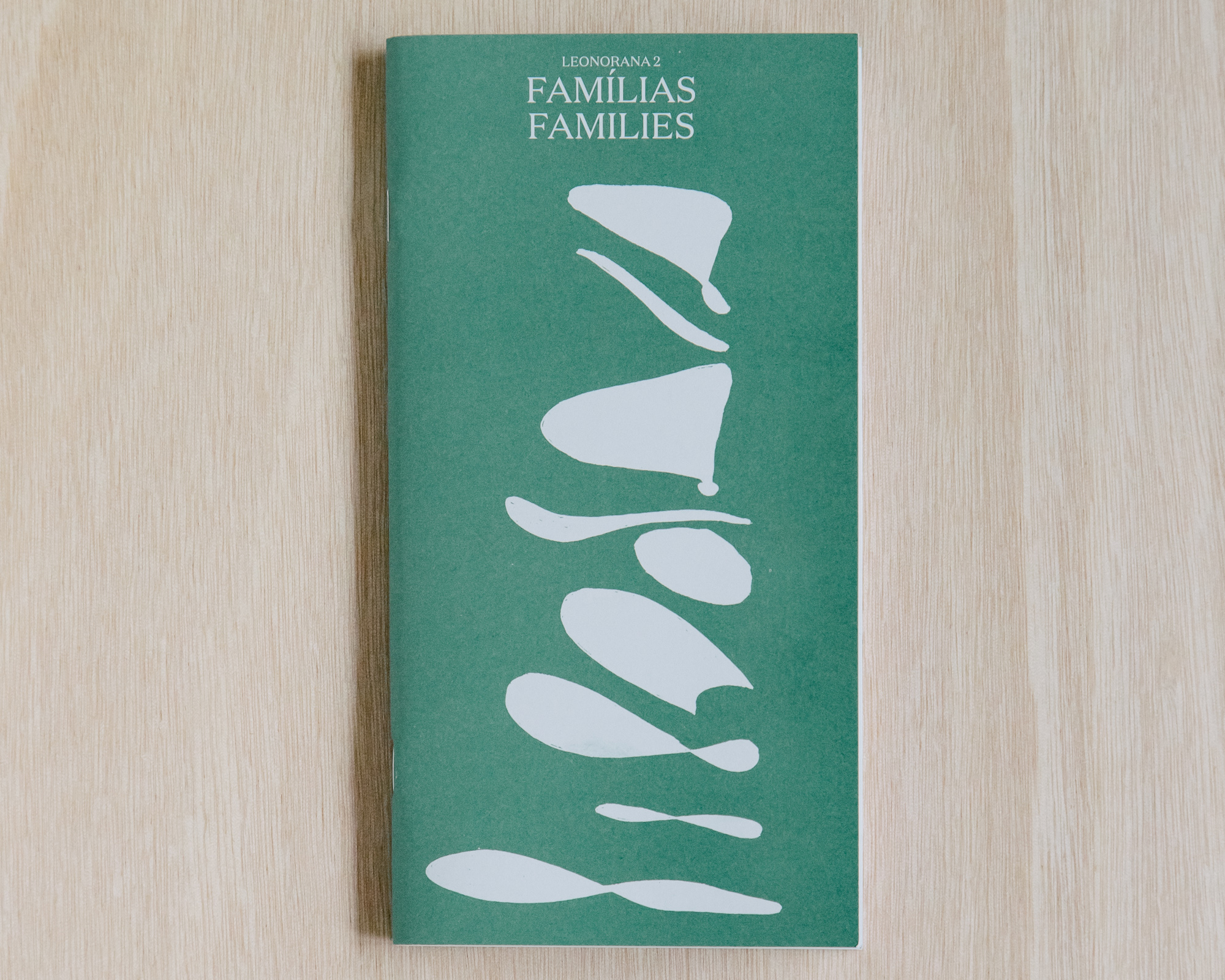
Leonorana is a magazine edited by Isabel Carvalho. Every number has a different theme; the first one of about Diets and the second one about Families
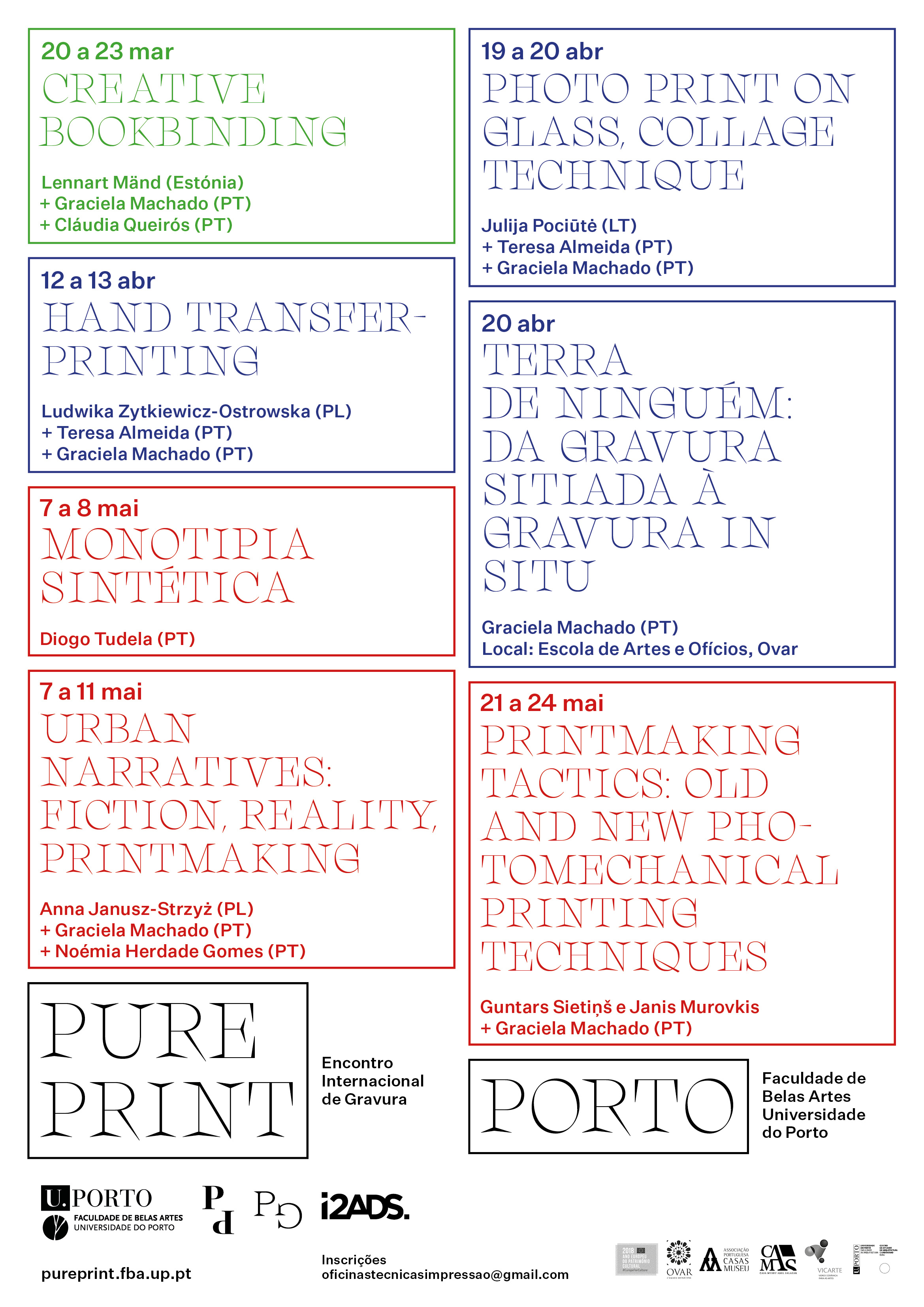
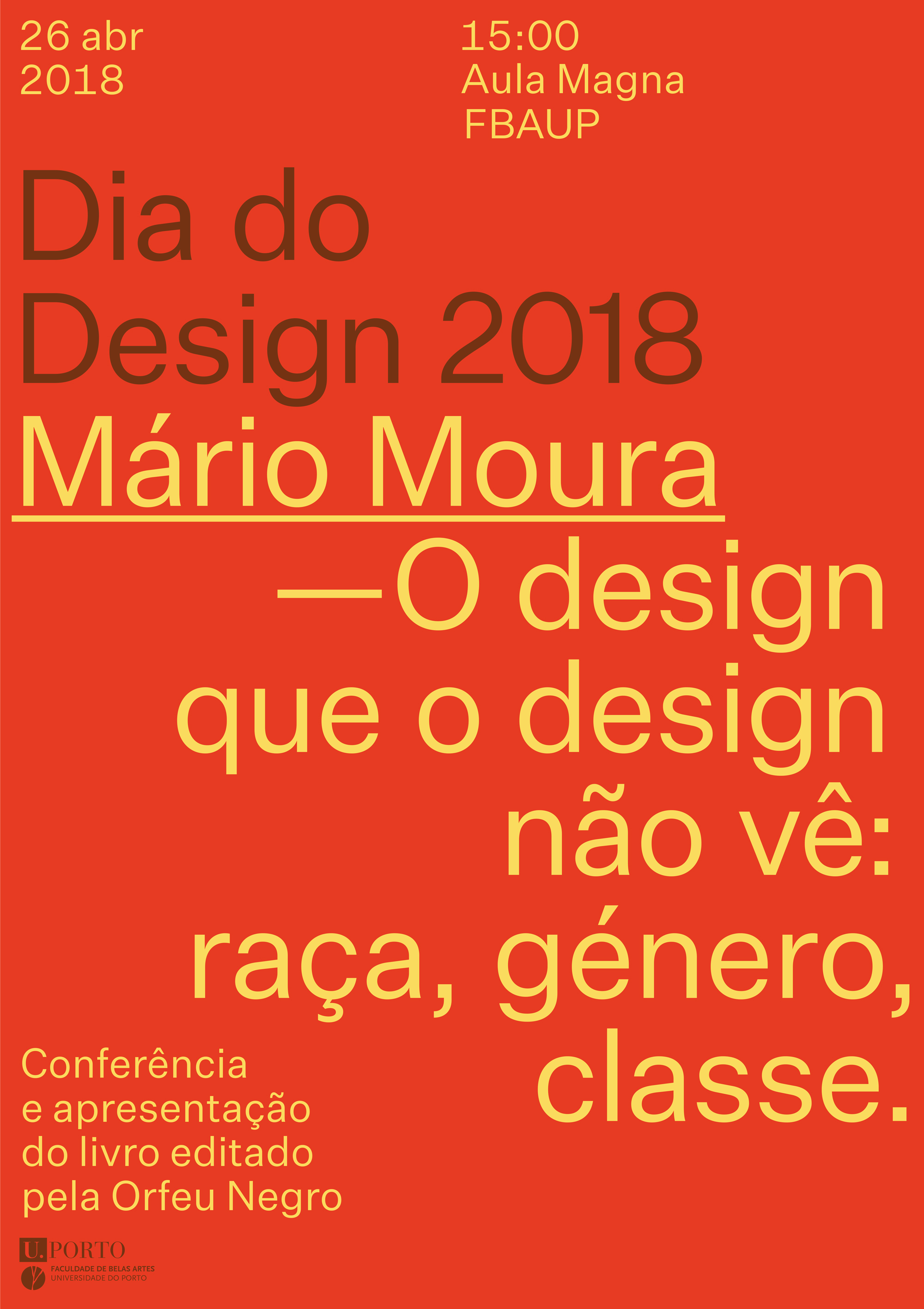
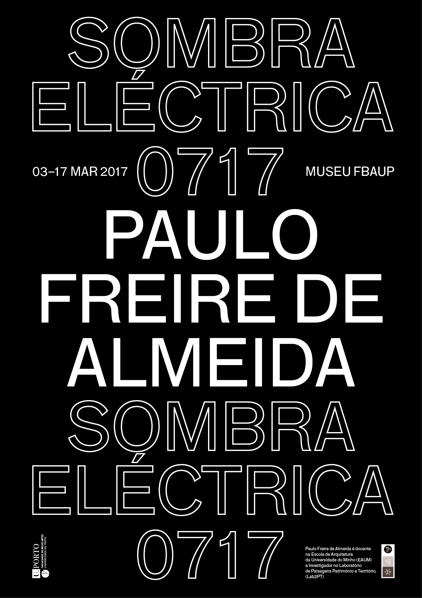
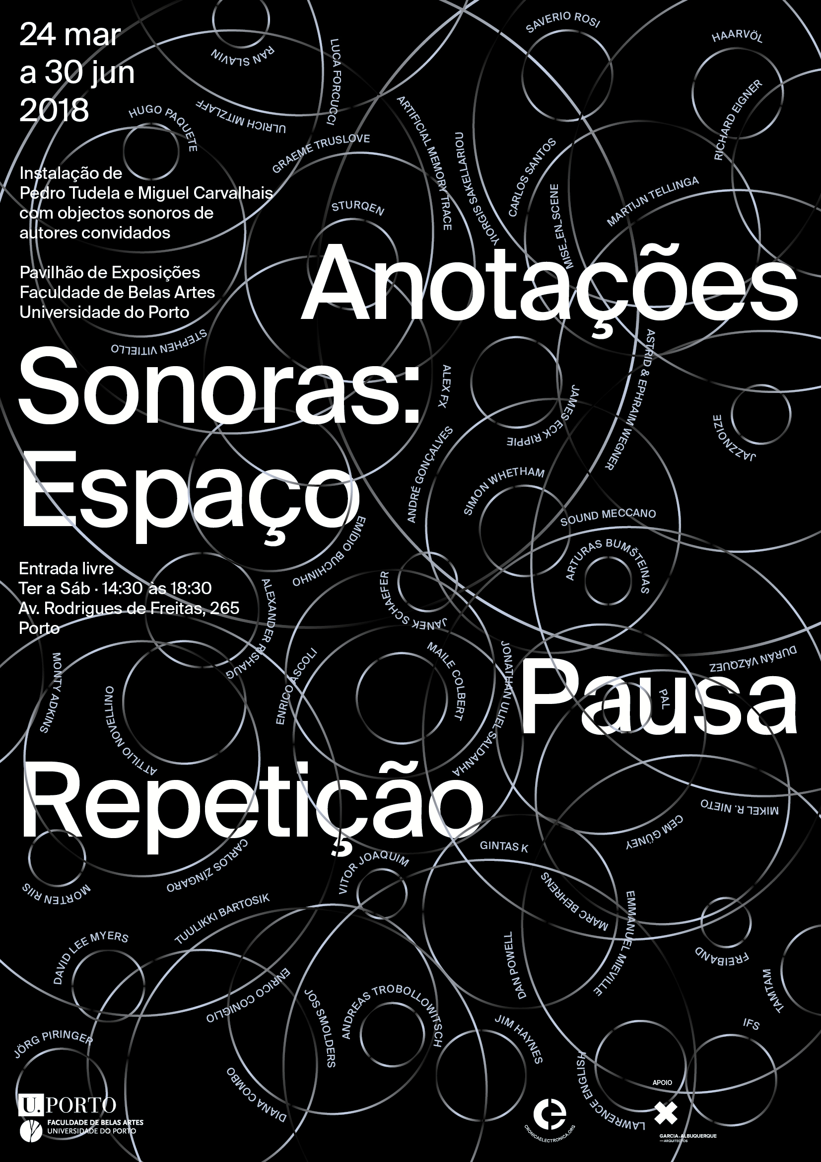
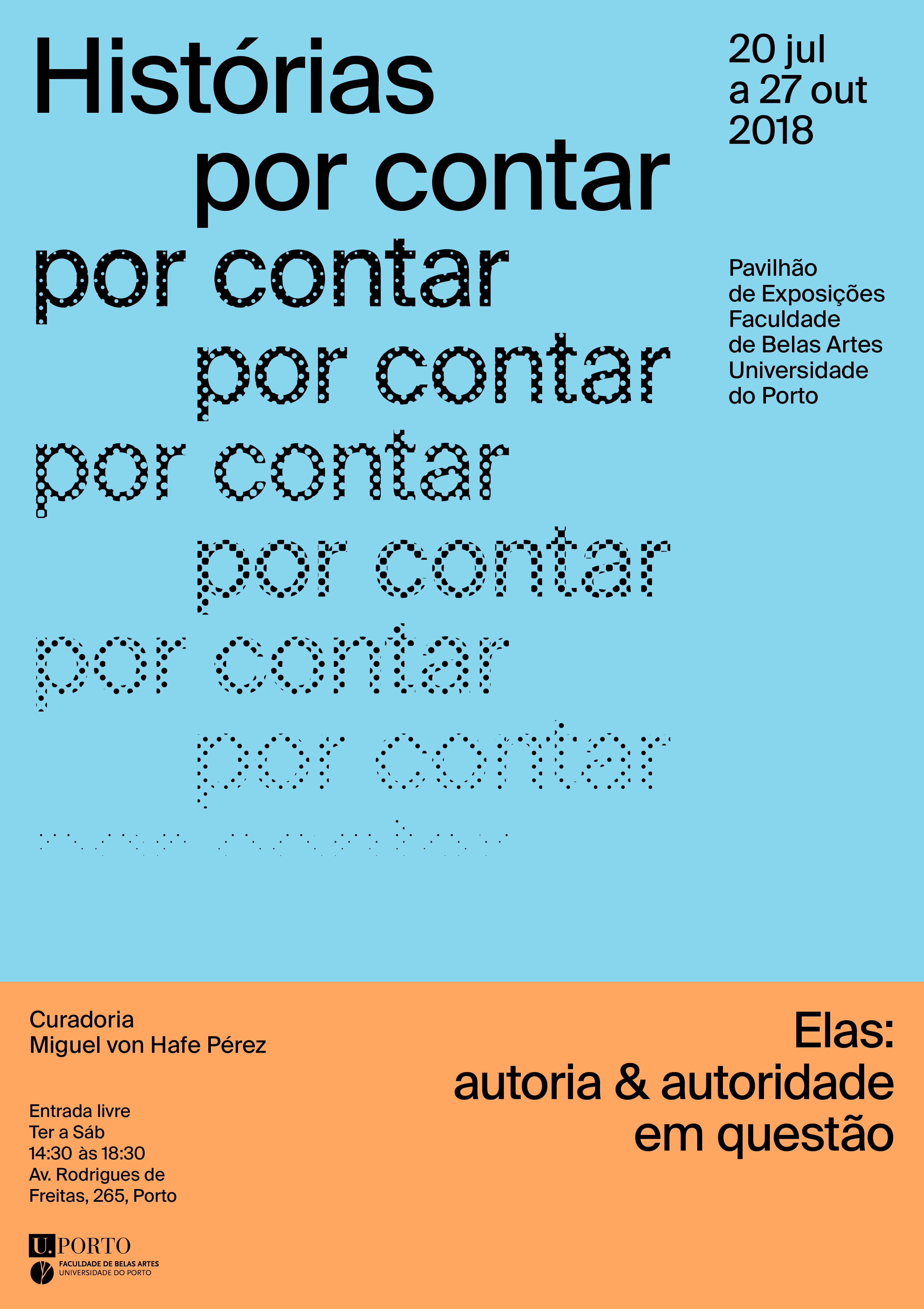
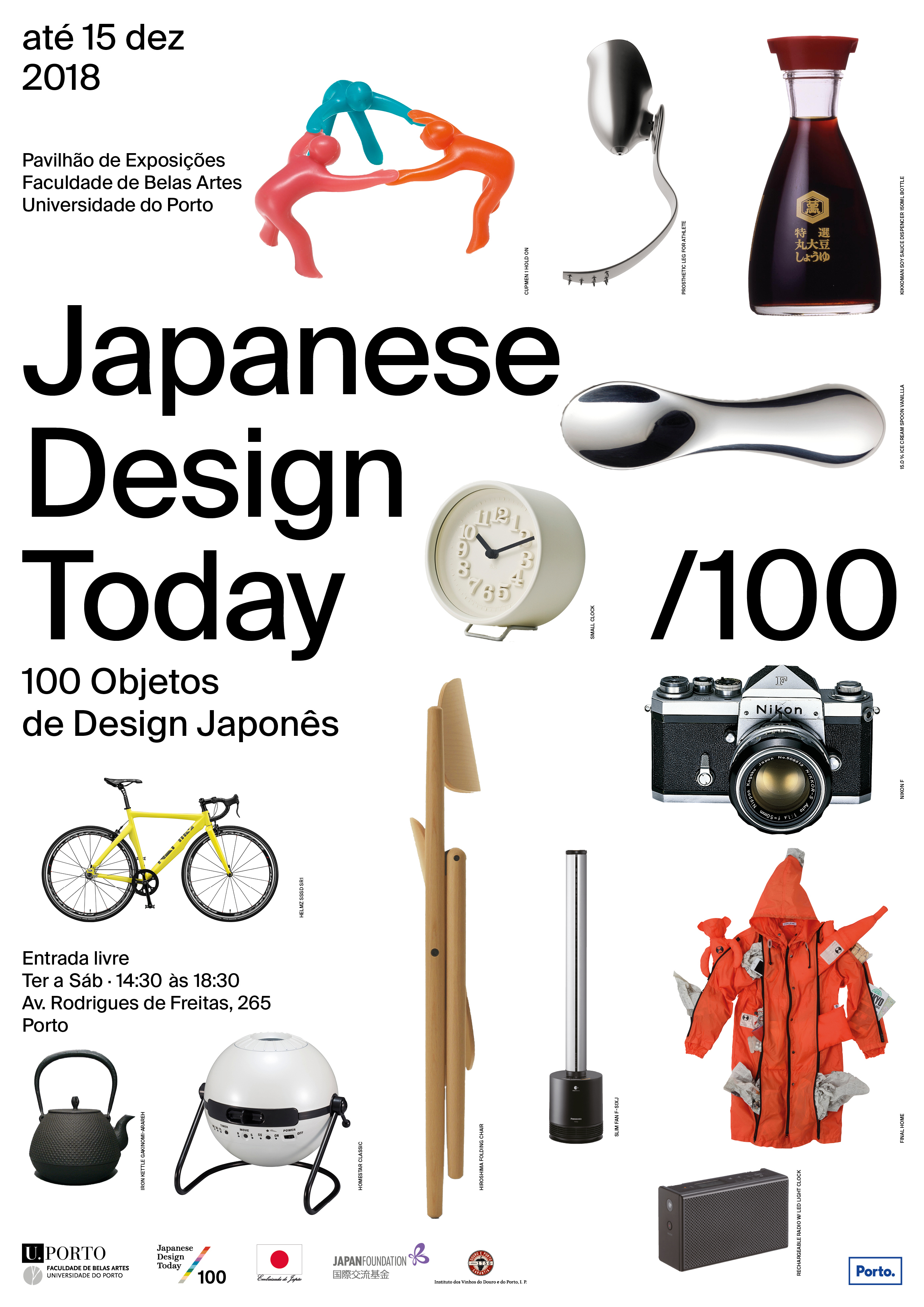
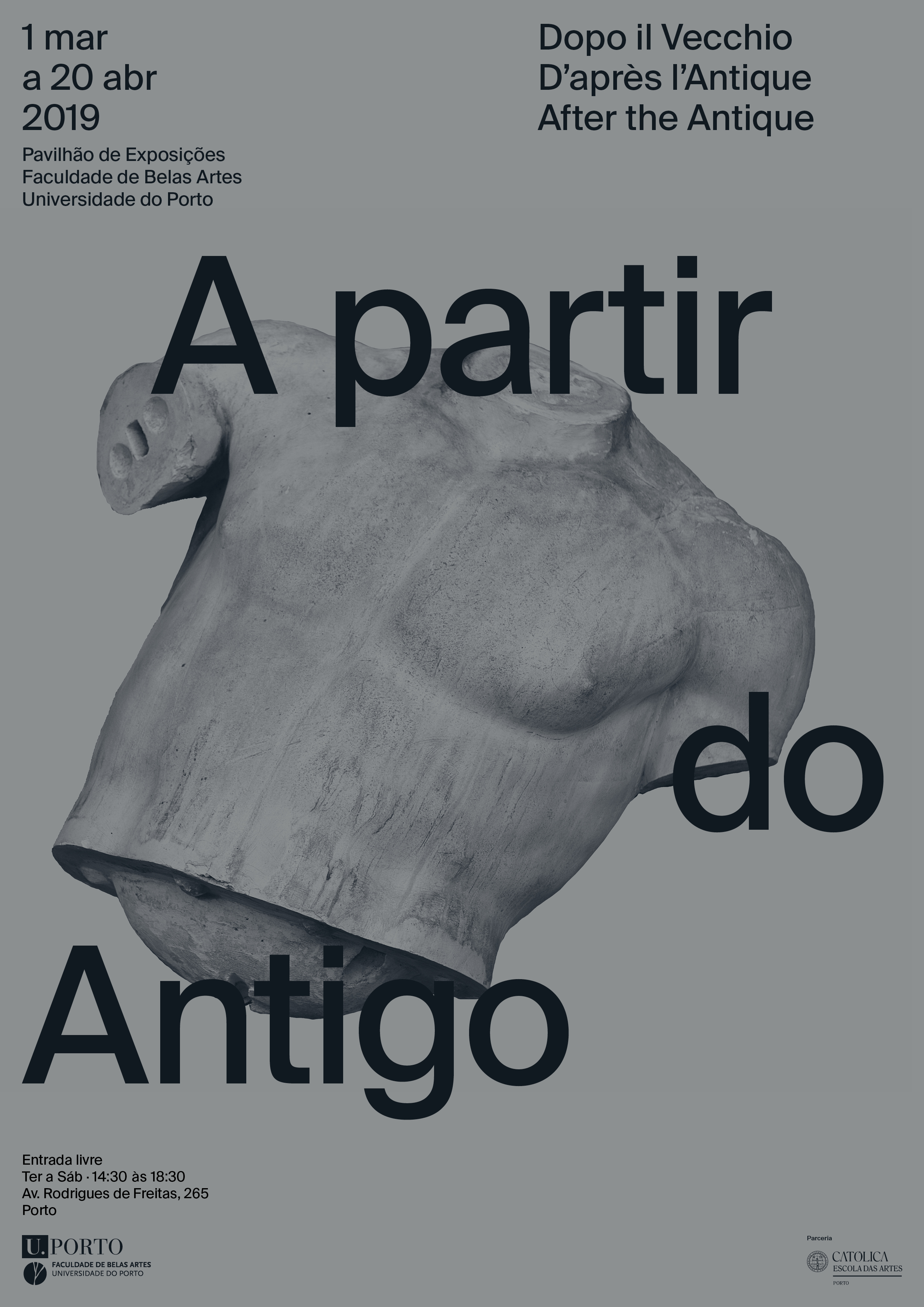
Posters for Pavilhão de Exposições
2017—2019
Client: Faculty of Fine Arts of University of Porto

do it
2017—2019
Client: Faculty of Fine Arts of University of Porto
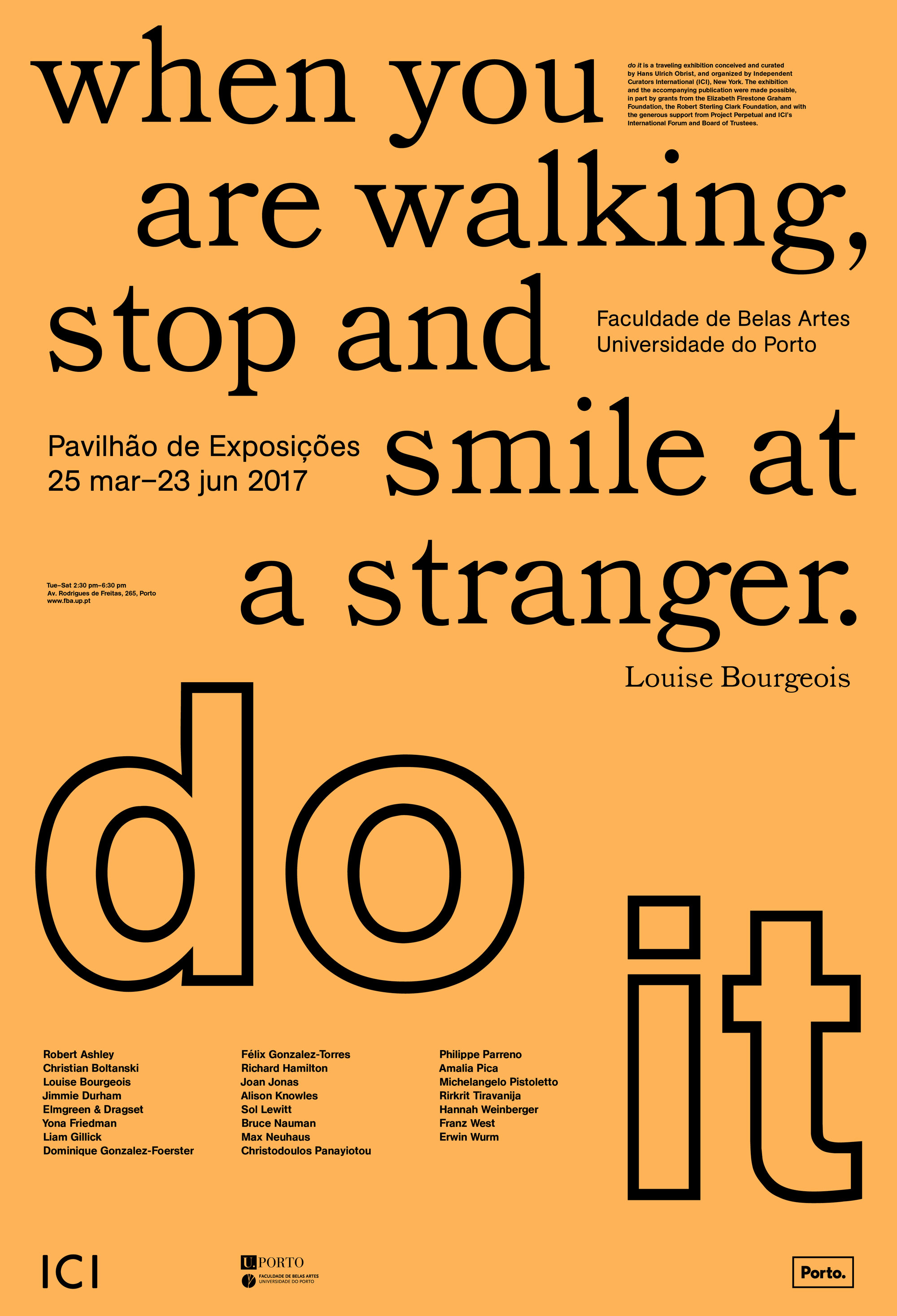
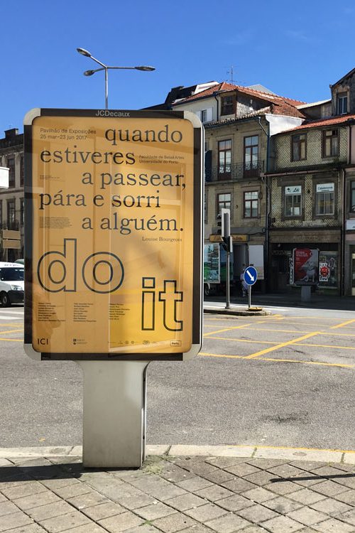
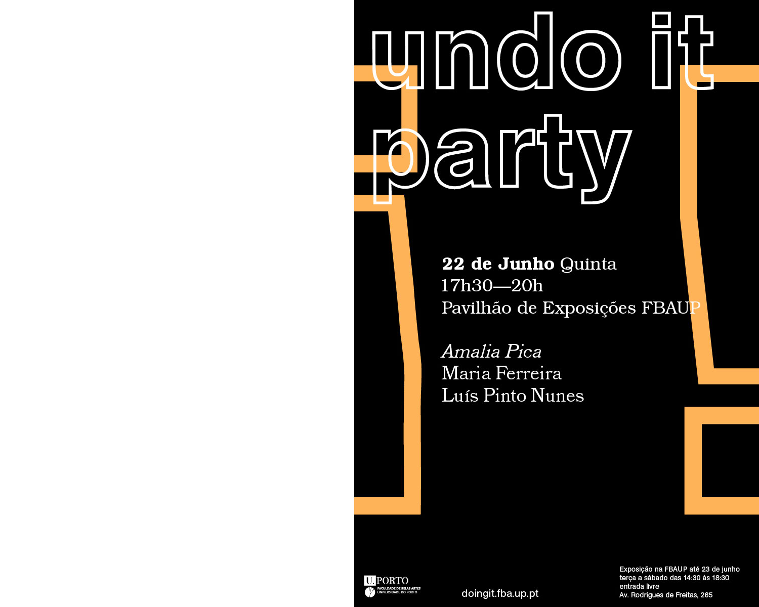
Do it is a project by Hans Ulrich Obrist. In 2017, the Faculty of Fine Arts hosted an interaction of the show. The exhibition presents works that are done locally, following instructions of the artists compiled by do it.
I was responsible to make the identity of the show, but I also had an instruction to follow: Louise Bourgeois — When you are walking, stop and smile at a stranger. As the posters would be on the street, I designed them with this instruction, in Portuguese and in English.
Design da Cultura / Cultura do Design
2016
W/ Luís Pinto Nunes
Client: Câmara Municipal do Porto
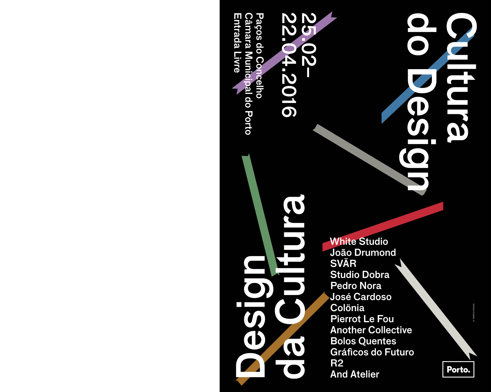
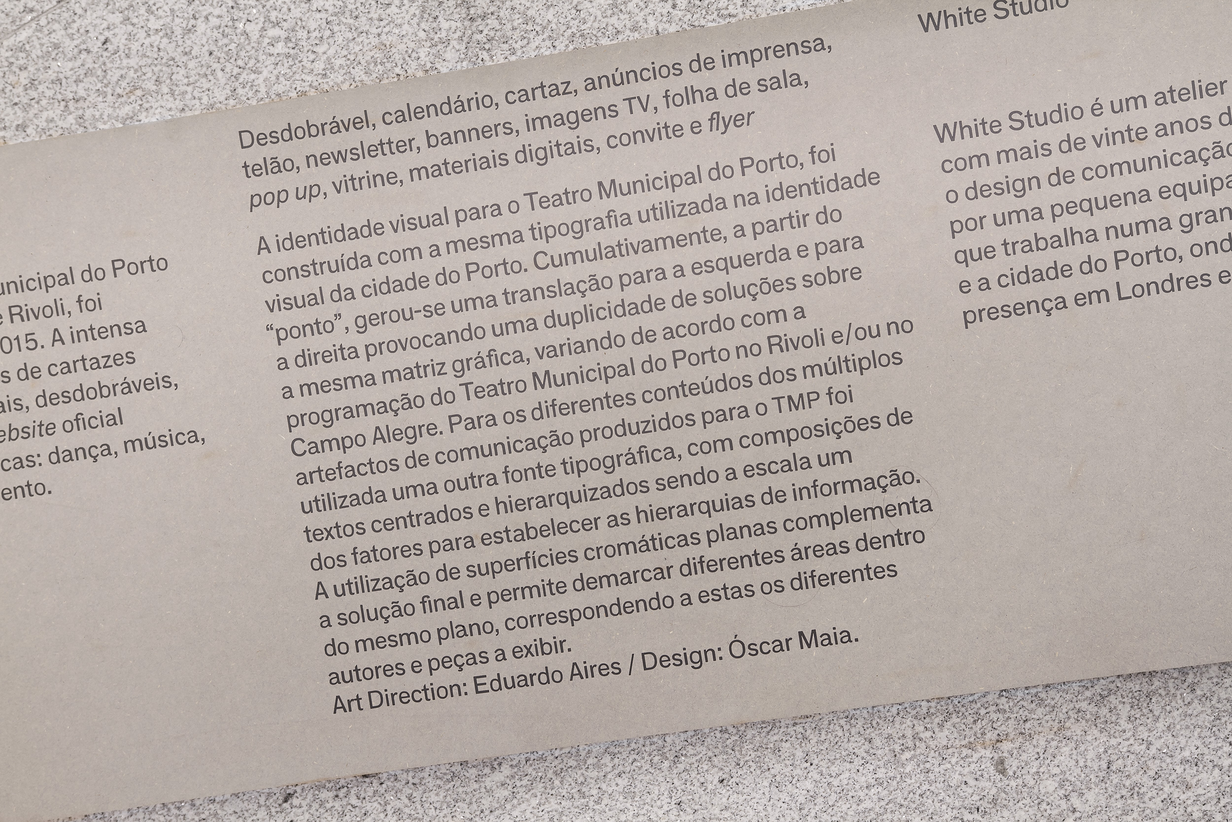
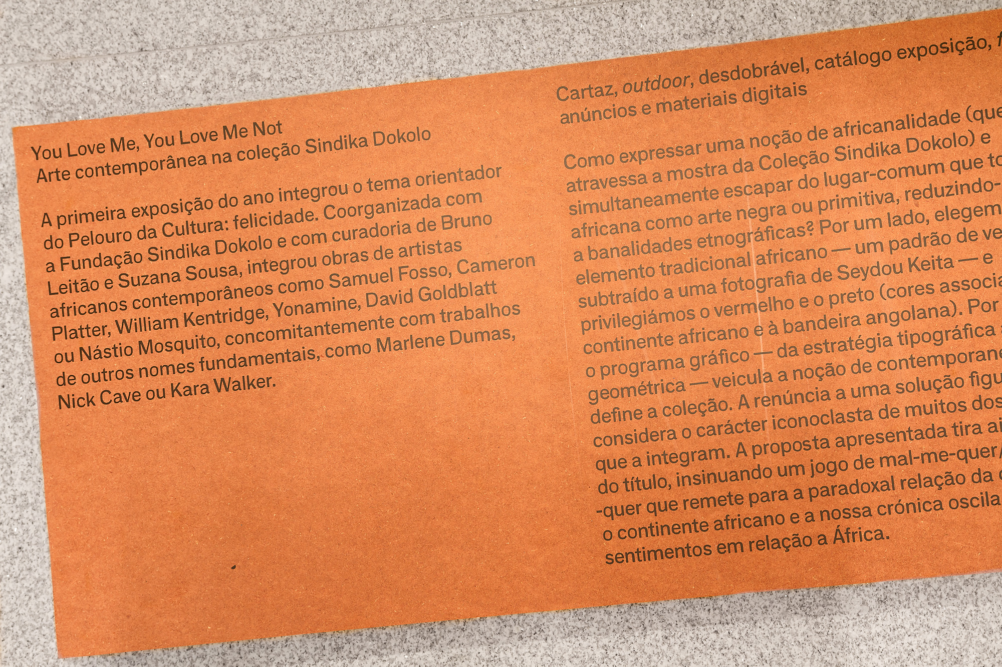
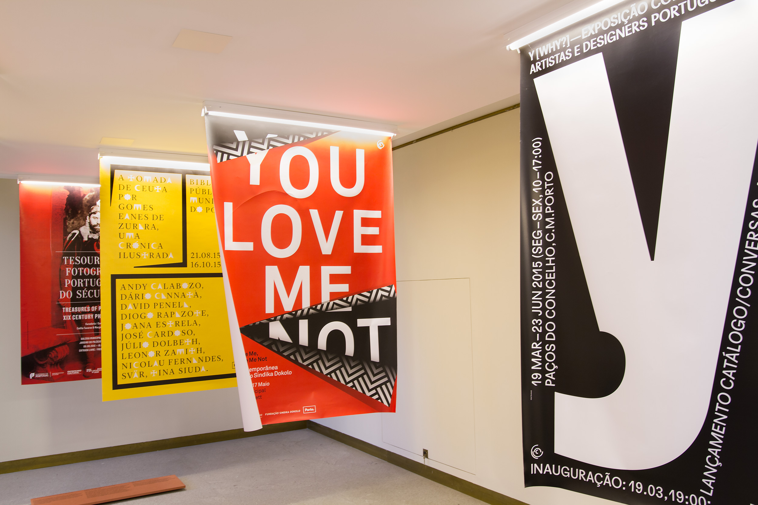
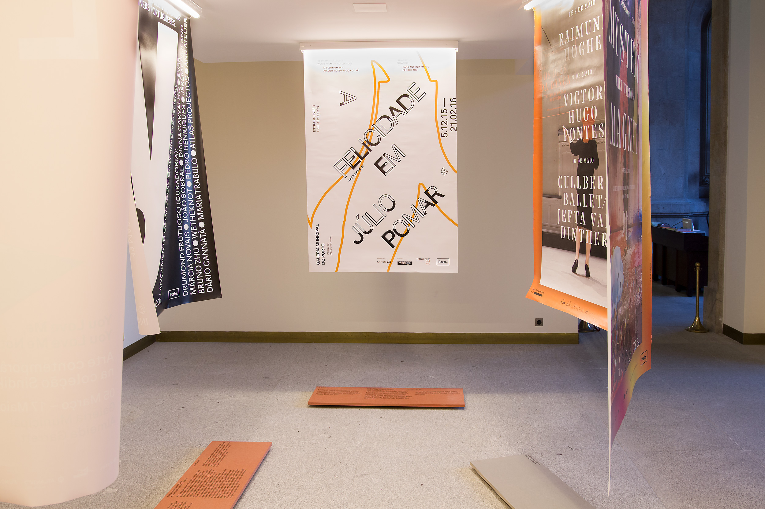
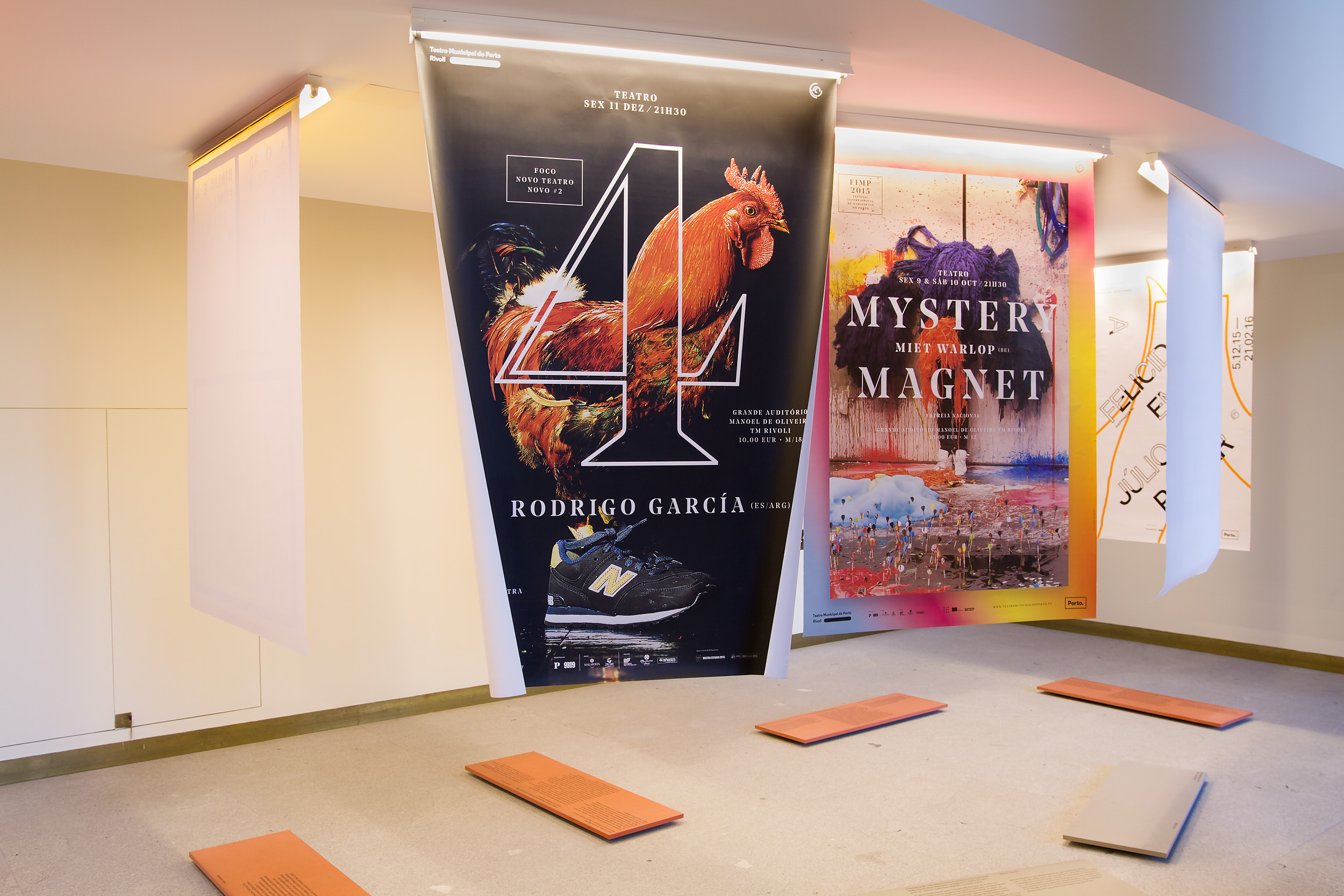
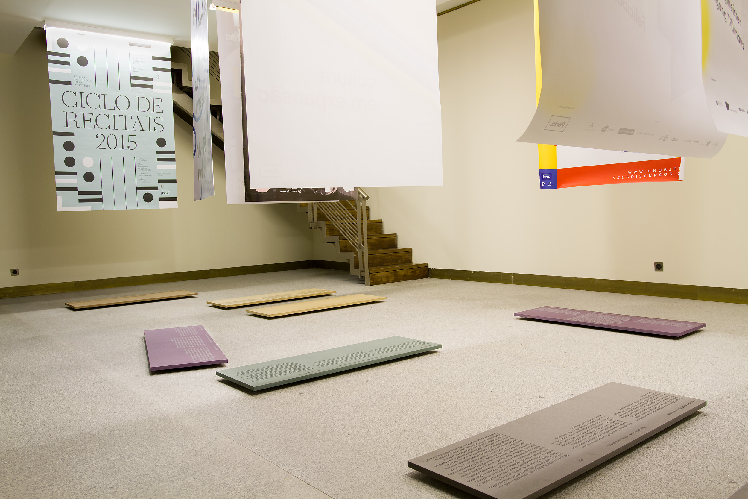
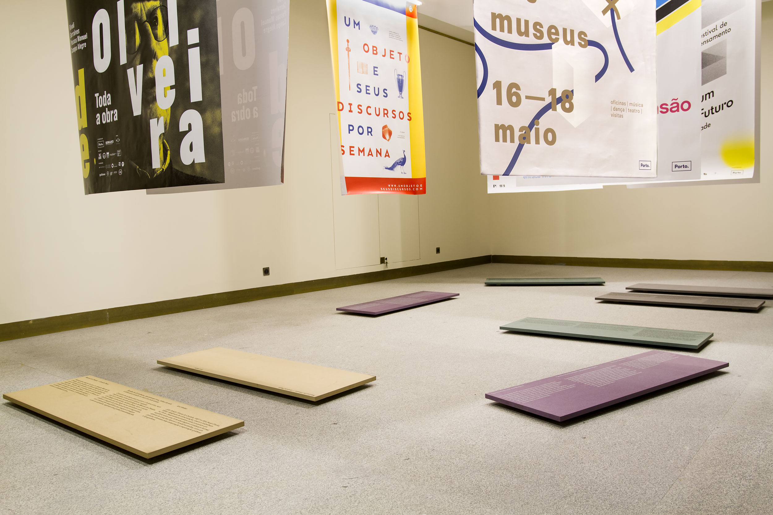
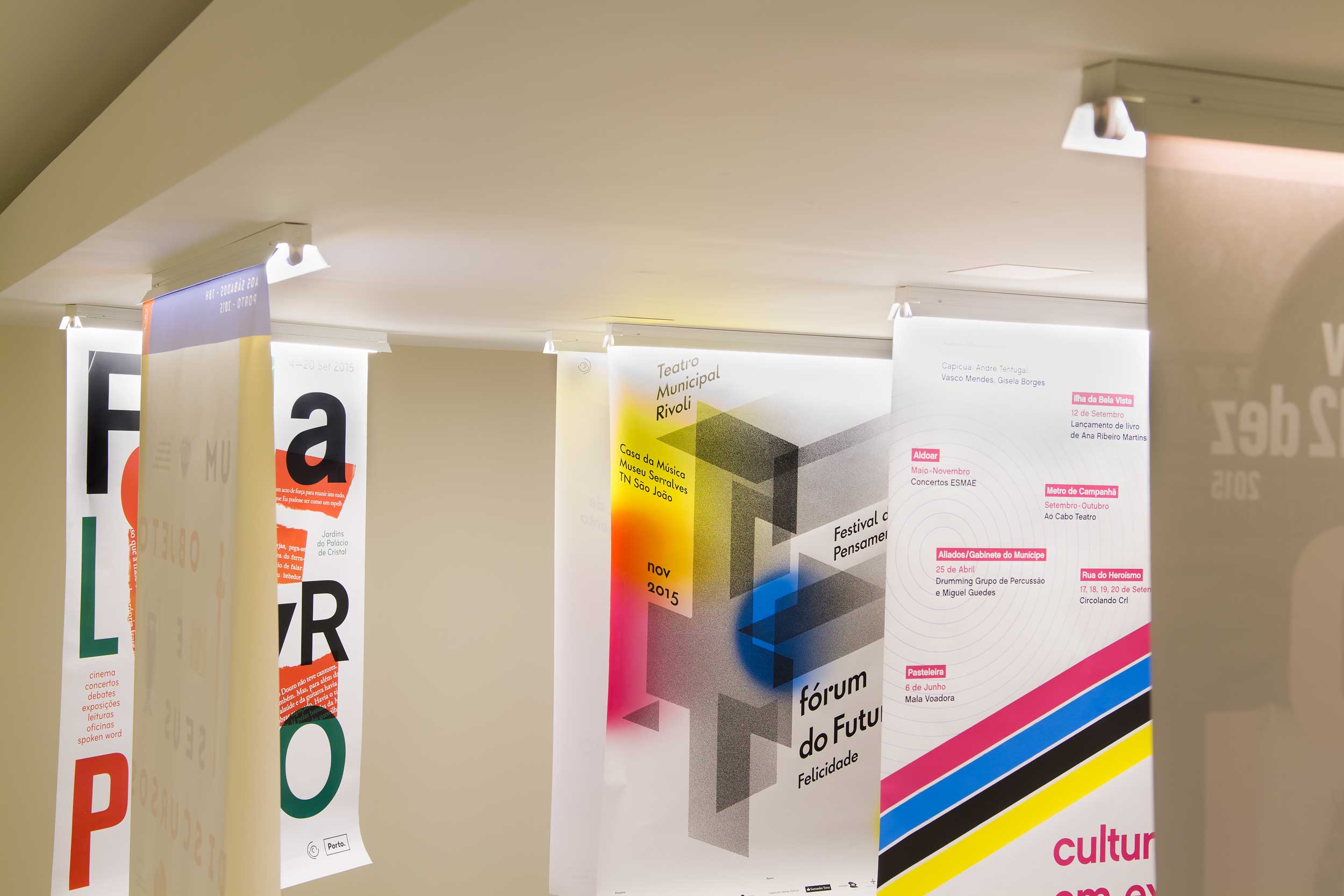
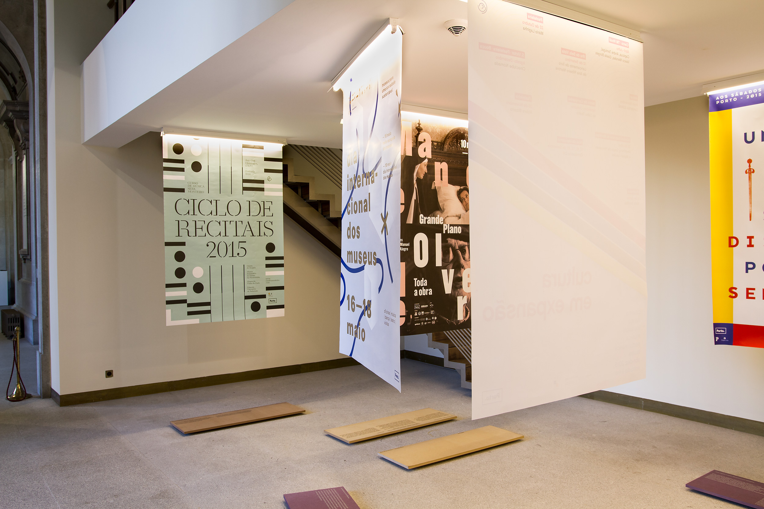
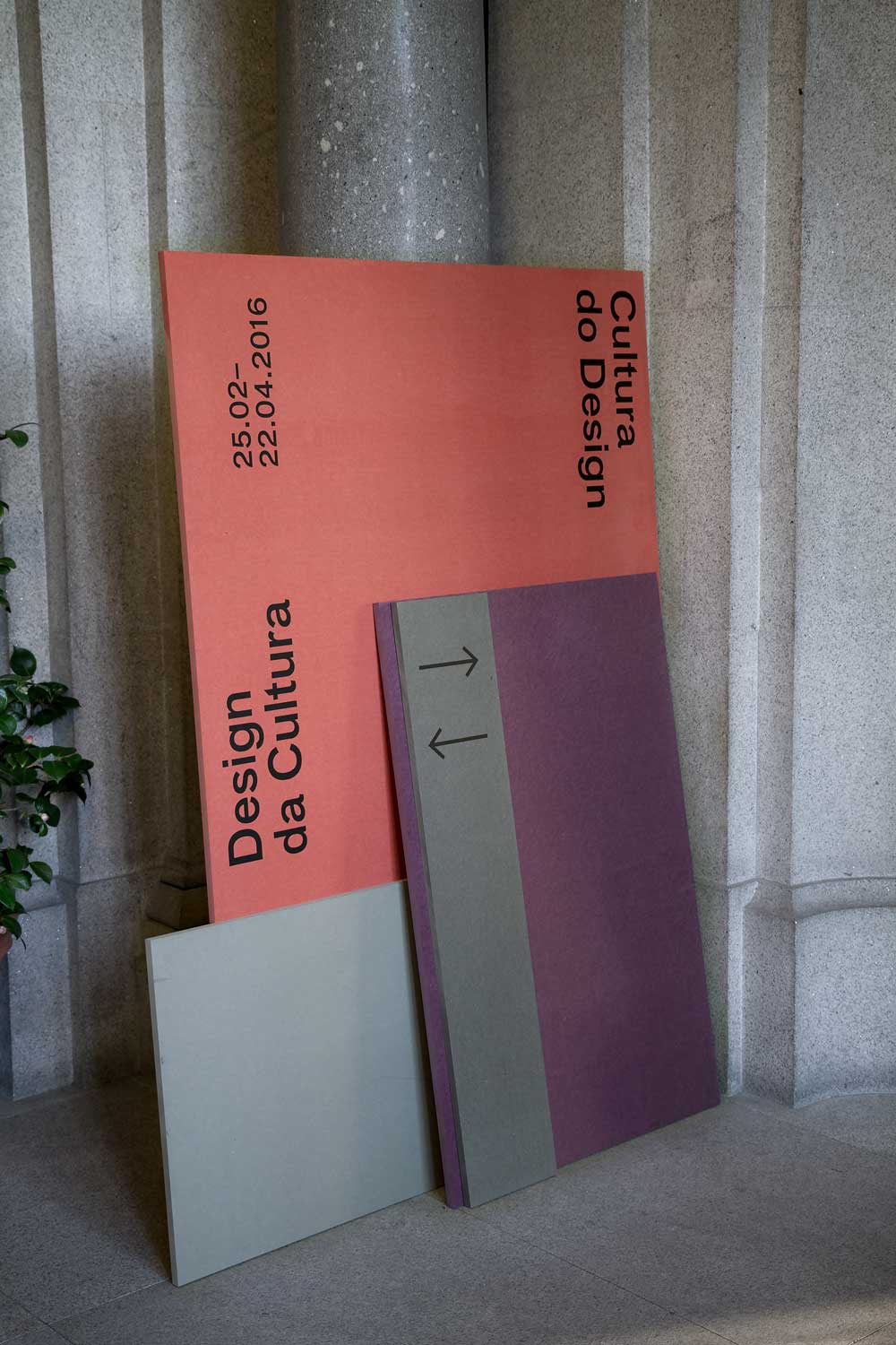
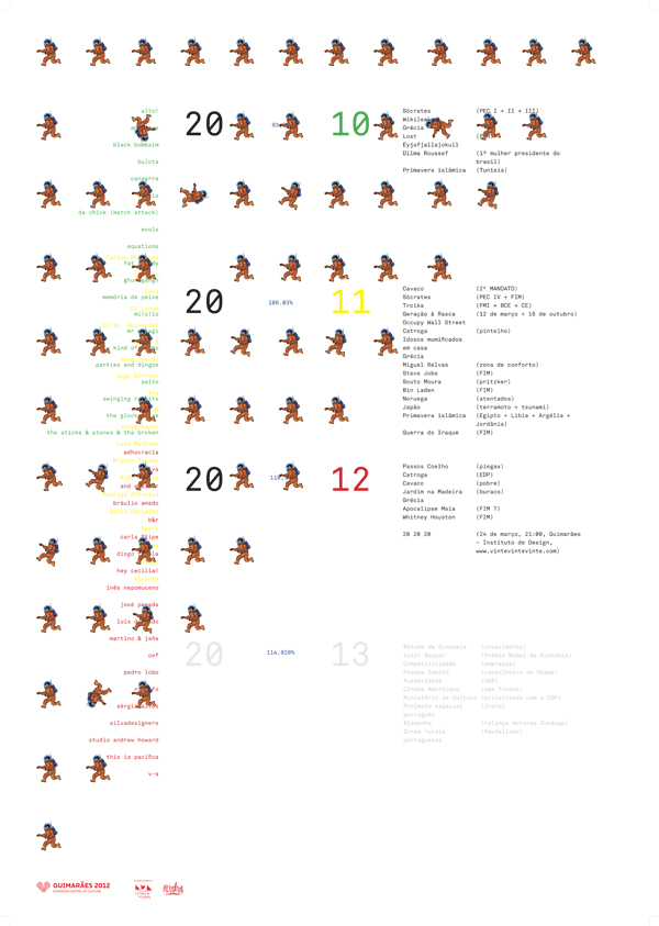
In 2016, Luís Pinto Nunes and I were invited to curate and design the exhibition that presented all graphic work commissioned by the Cultural Sector of Porto Municipality in 2015. The exhibition took place at the building of Porto Municipality.
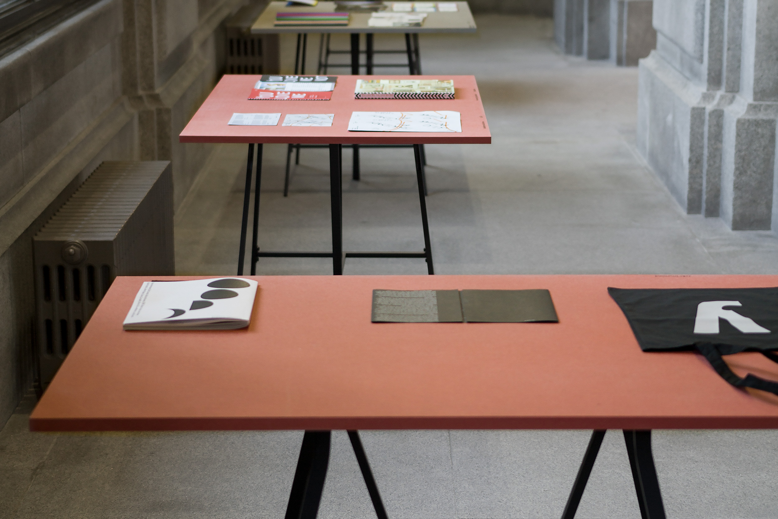
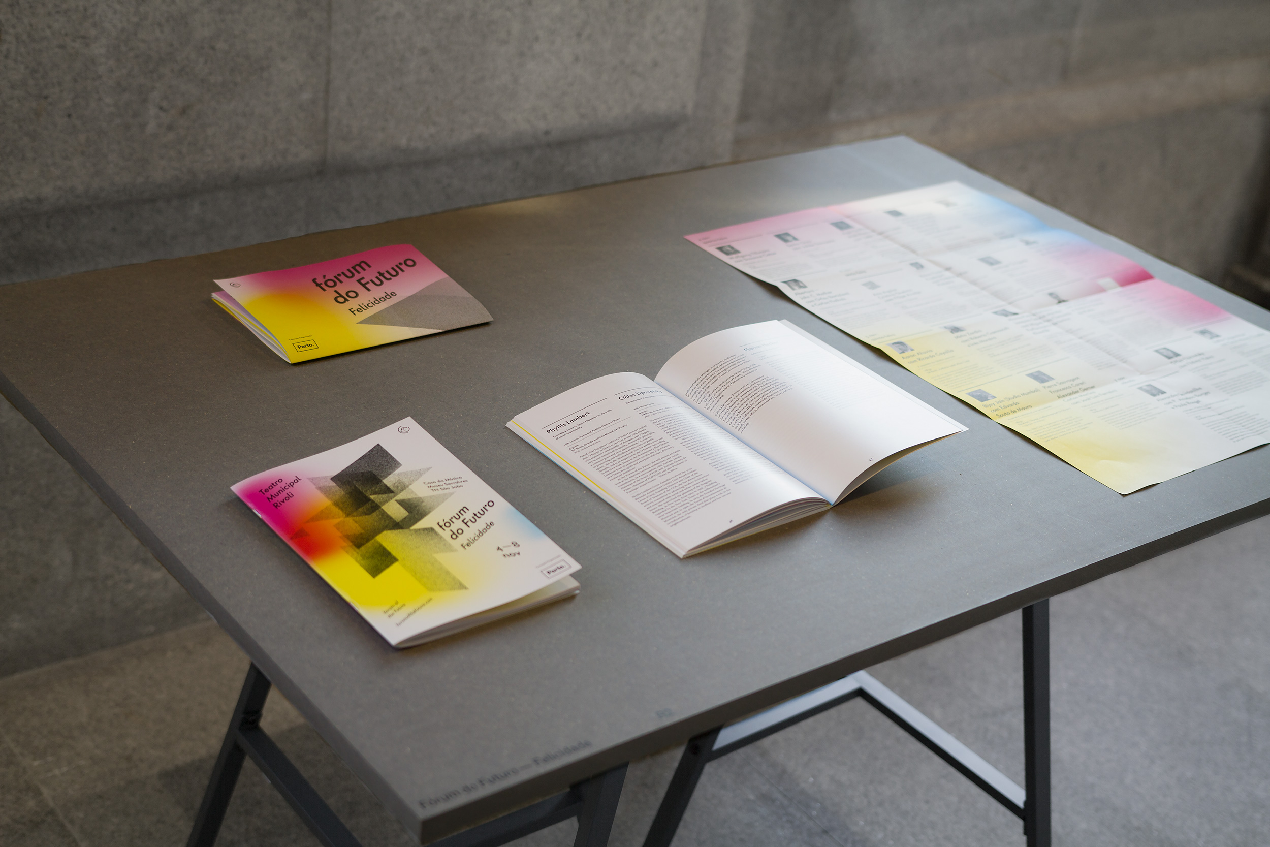
Most of the work present was printed matter — big format posters, leaflets and books. One of the main challenges was how to present the posters. We decided to hang them on a light structure and create a circuit, organising the posters by areas, based on a cloud scheme, placed on the bottom of each. This wood block presented the information about the project and the team that designed it.
The poster was based on the idea of circuit, and it represents each area on the exhibition.
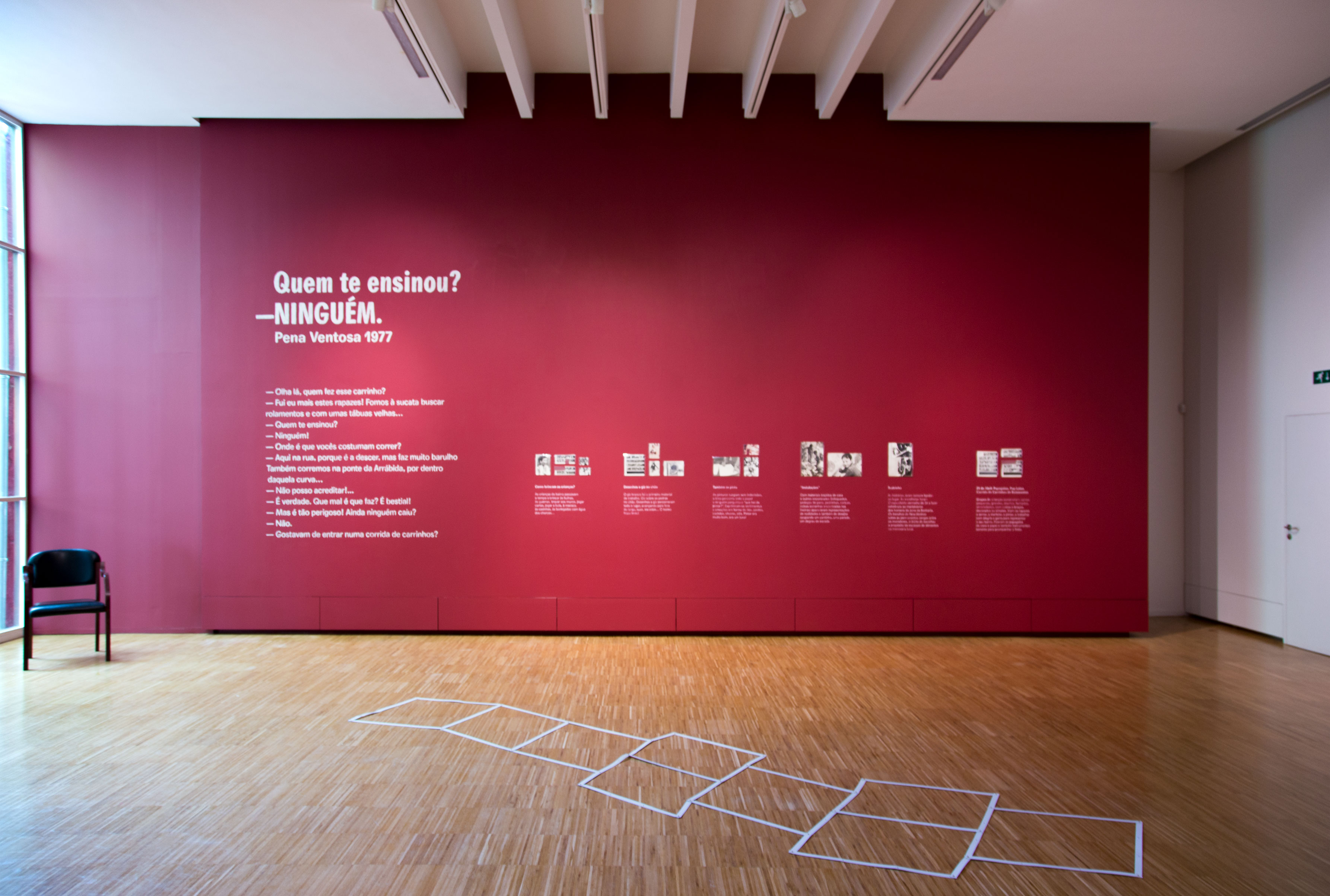
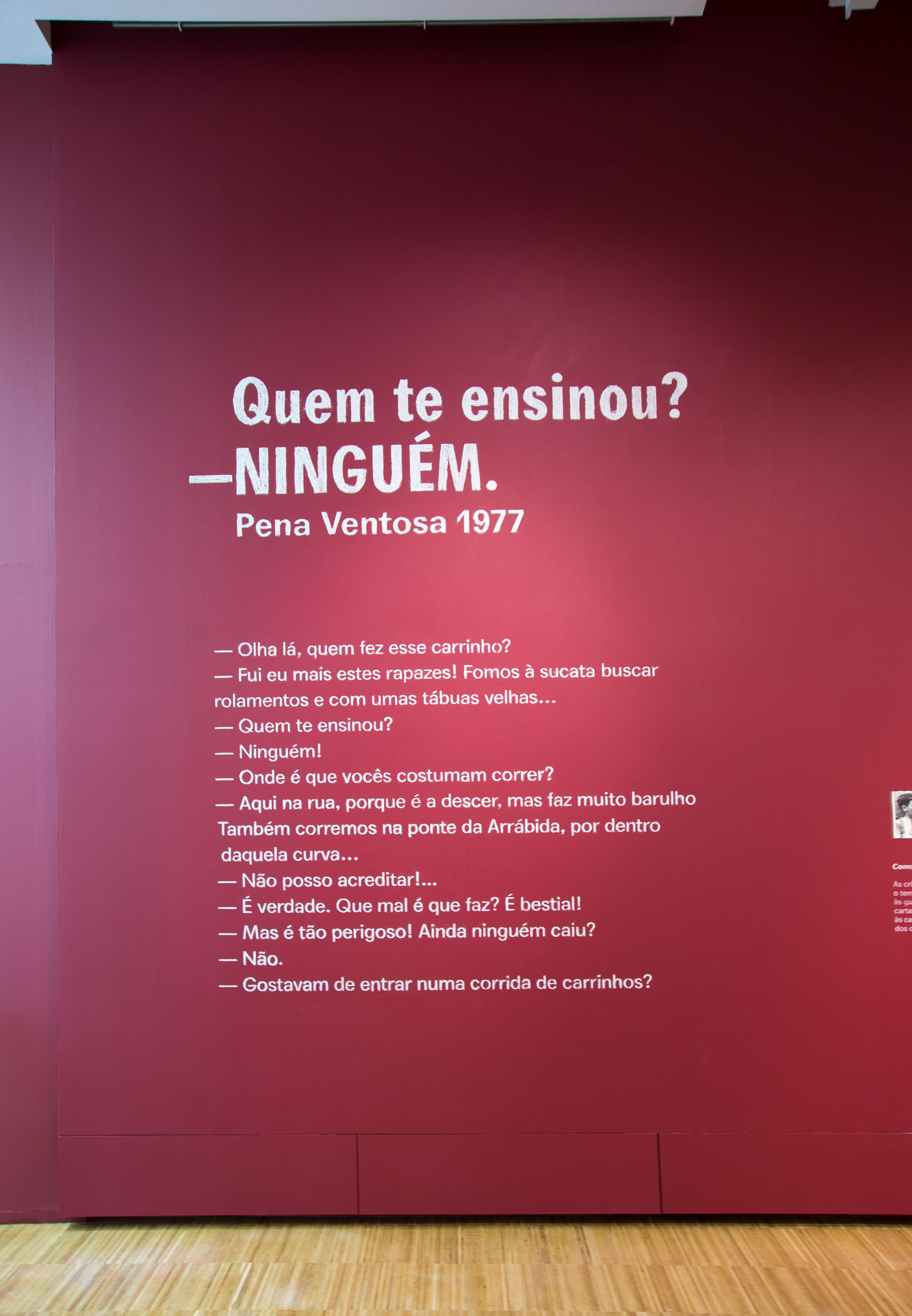
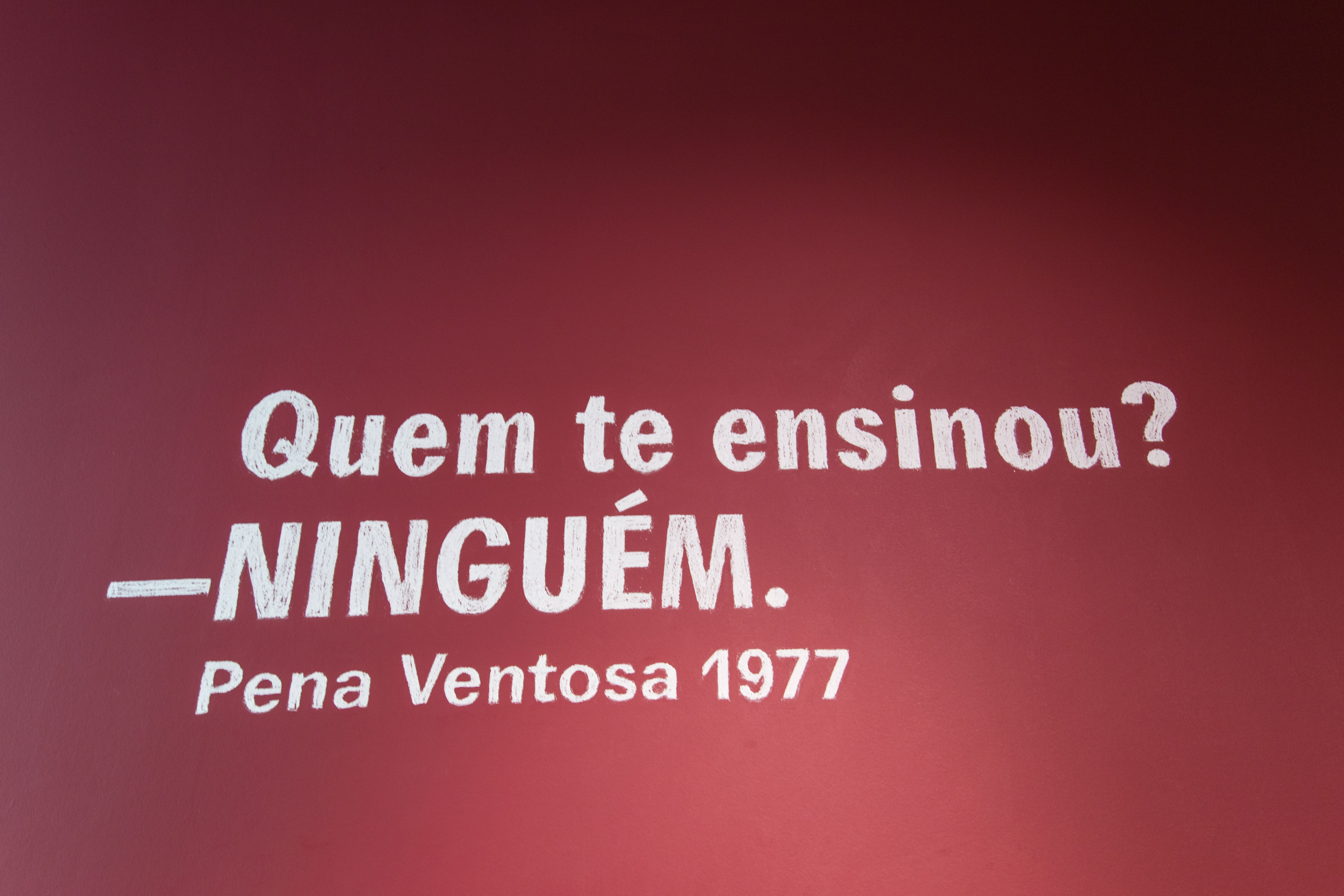
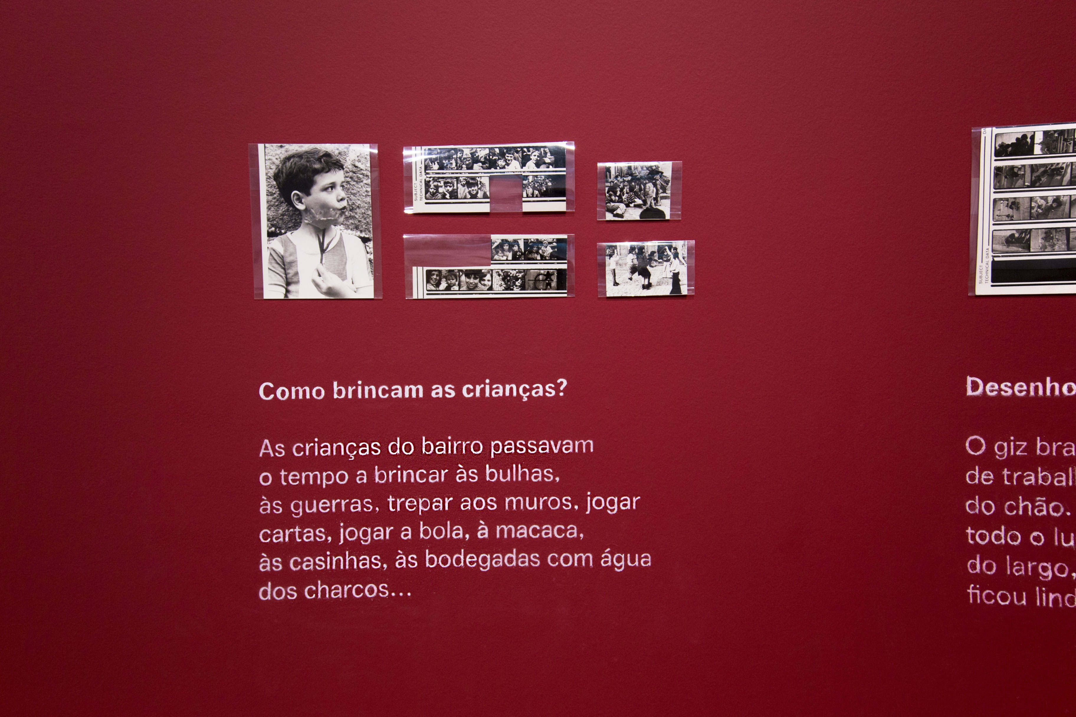
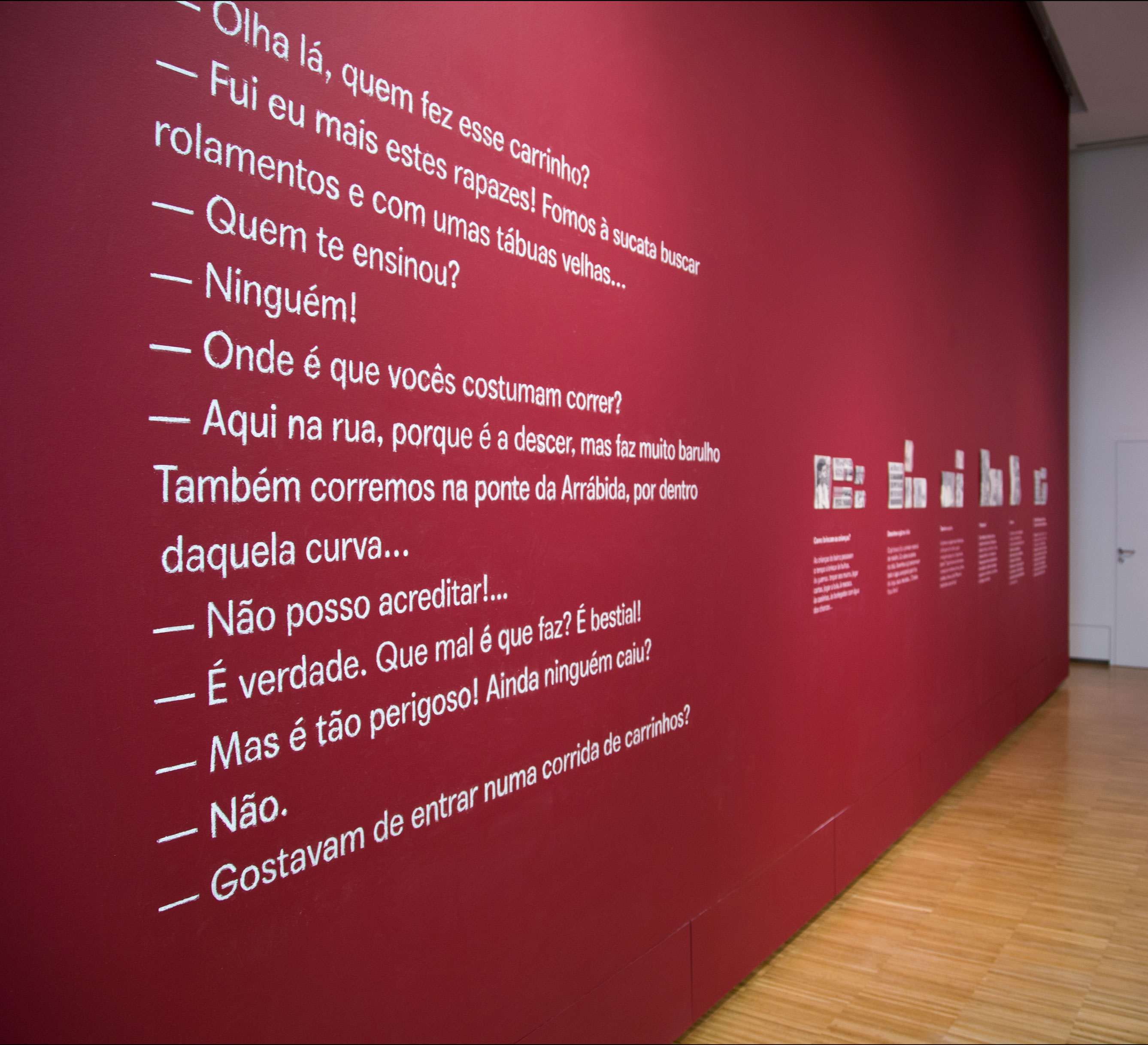
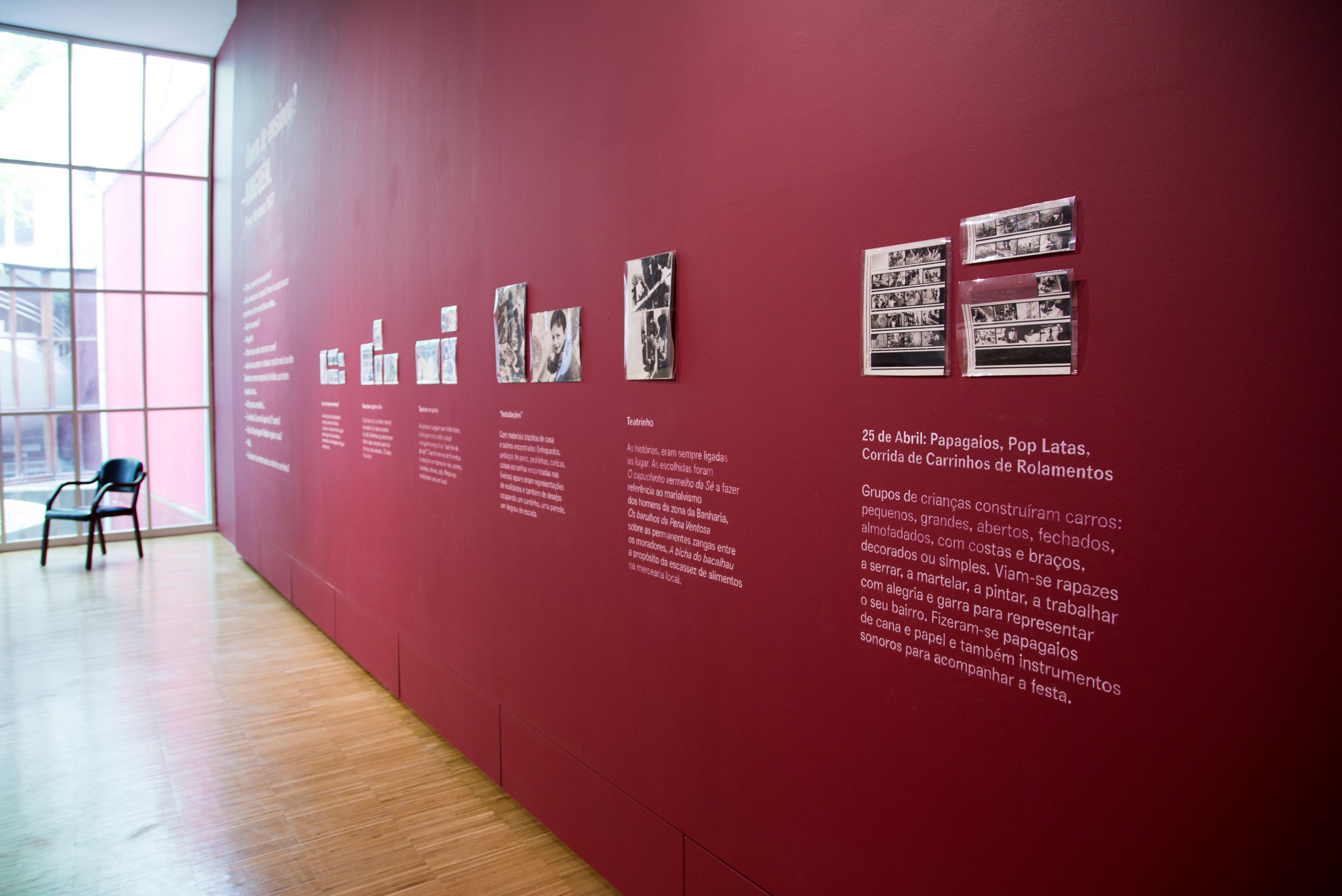
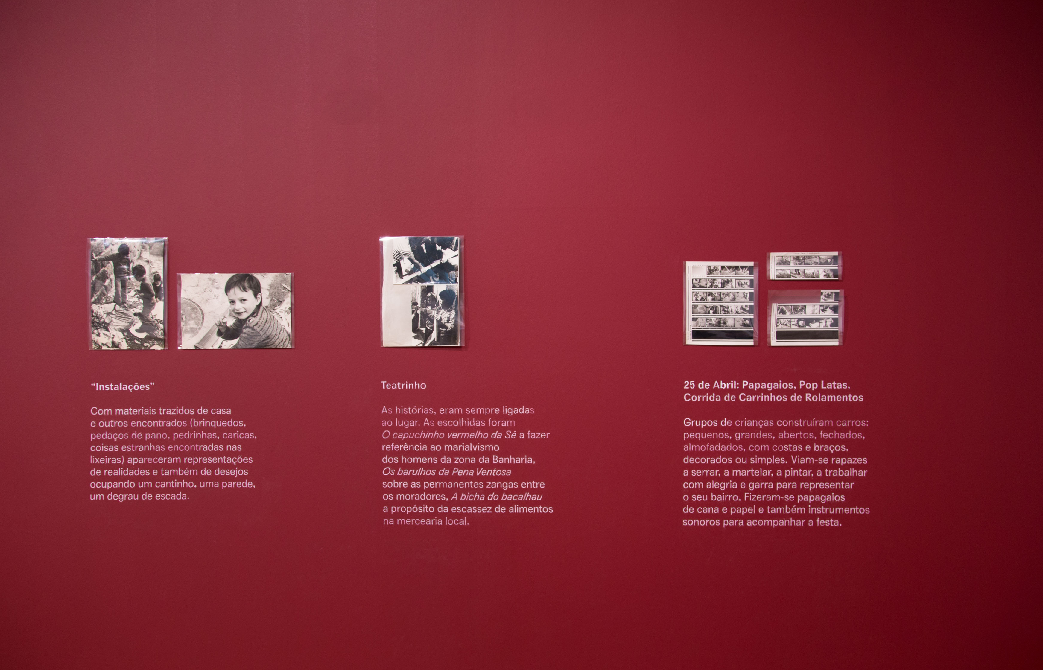
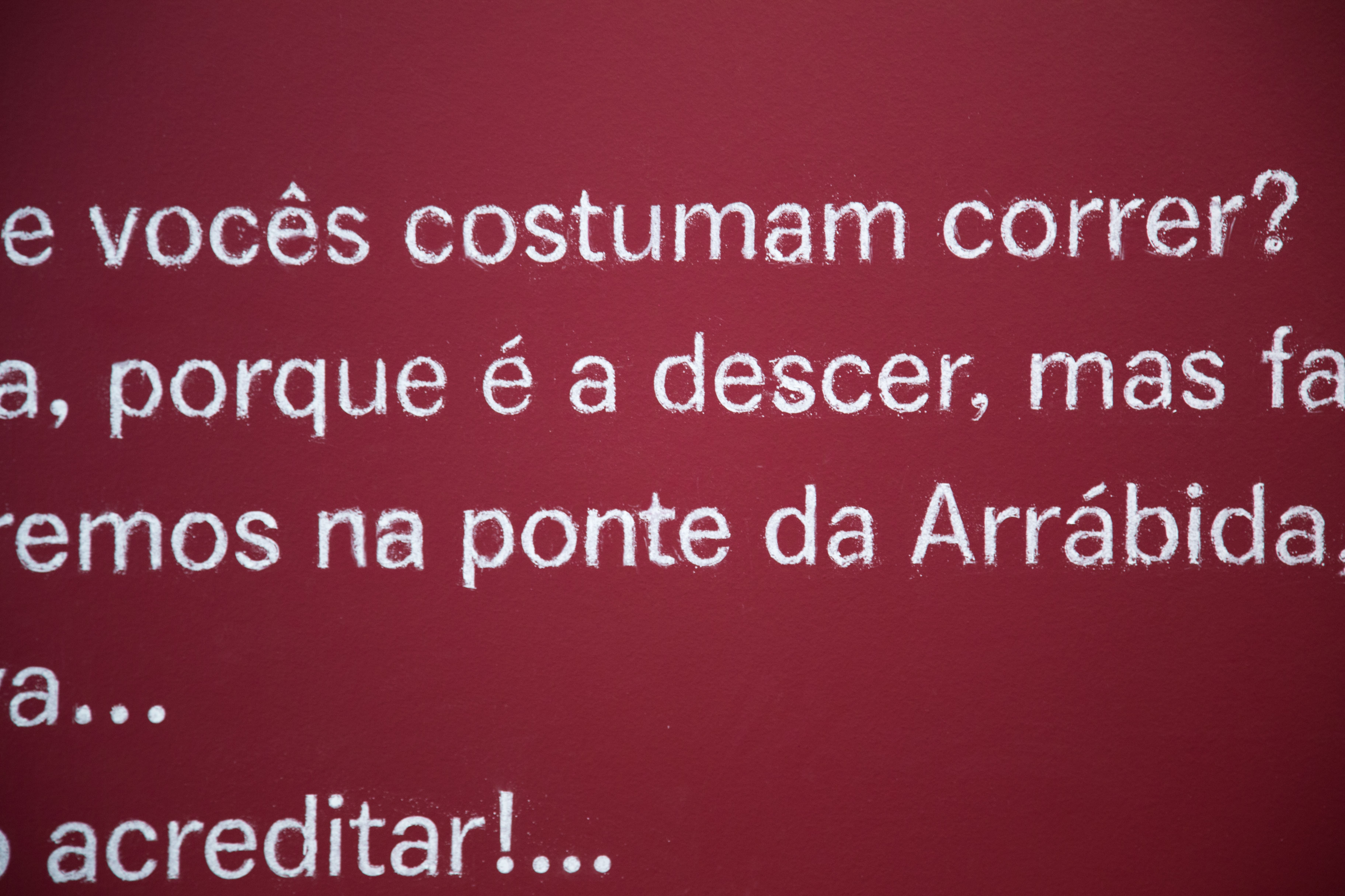
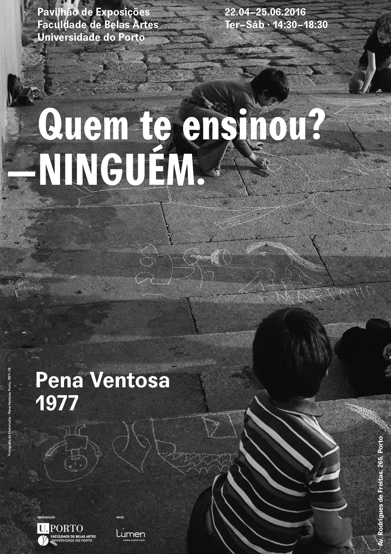
Quem te Ensinou? —Ninguém
2016
Client: Faculty of Fine Arts of University of Porto
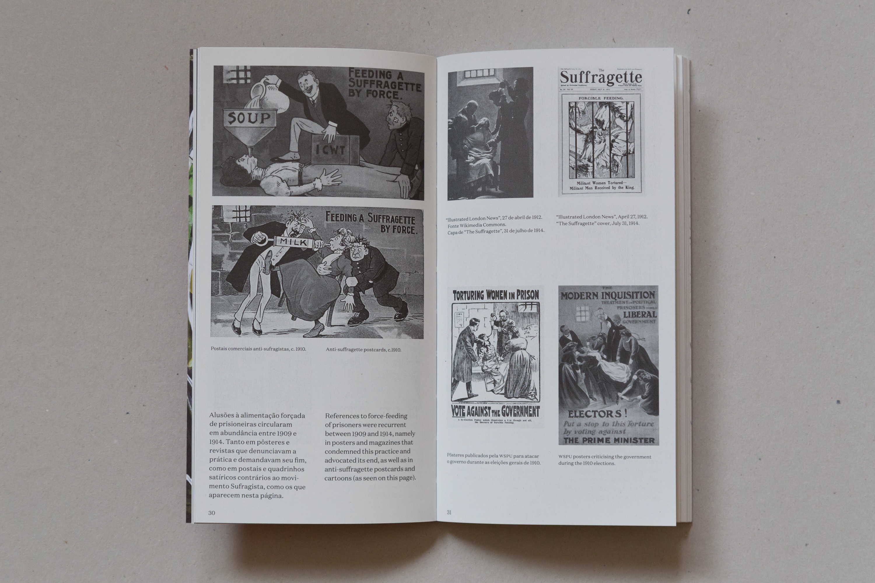
Exhibition design for Quem te ensinou? —Ninguém. This exhibition presented the process of Elvira Leite, that during the years after the 1974 revolution in Portugal, developed a social project with the kids of a very poor neighbourhood in Porto.
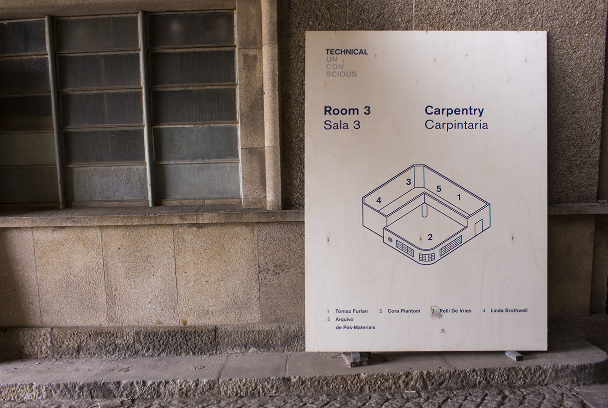
Technical Unconscious
2014
Assisted by Mariana Marques and Vincent Hehle
Client: Faculty of Fine Arts of University of Porto
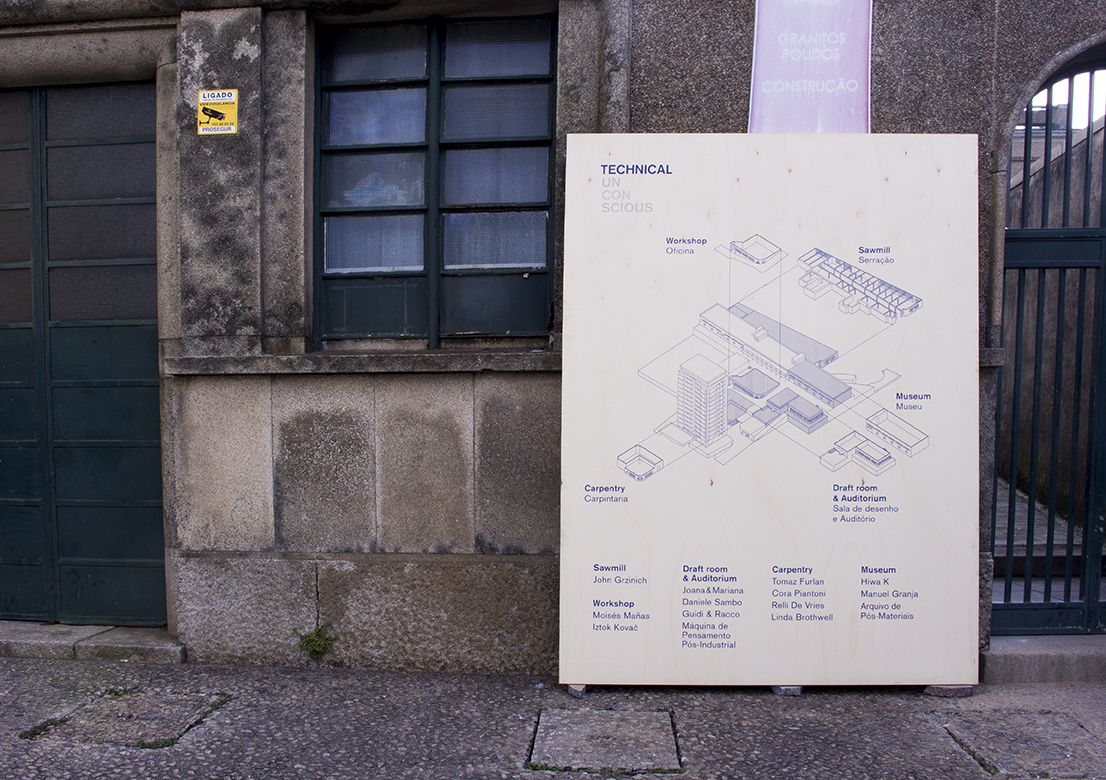
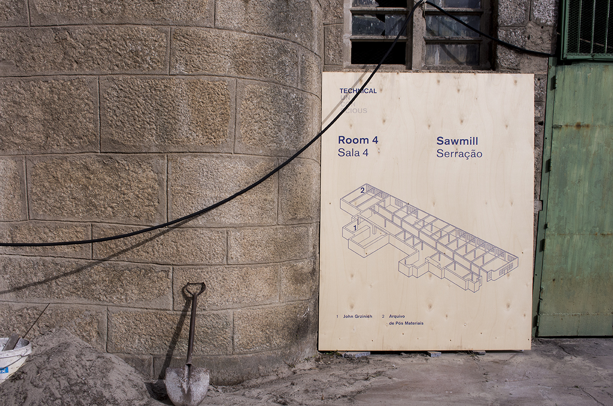
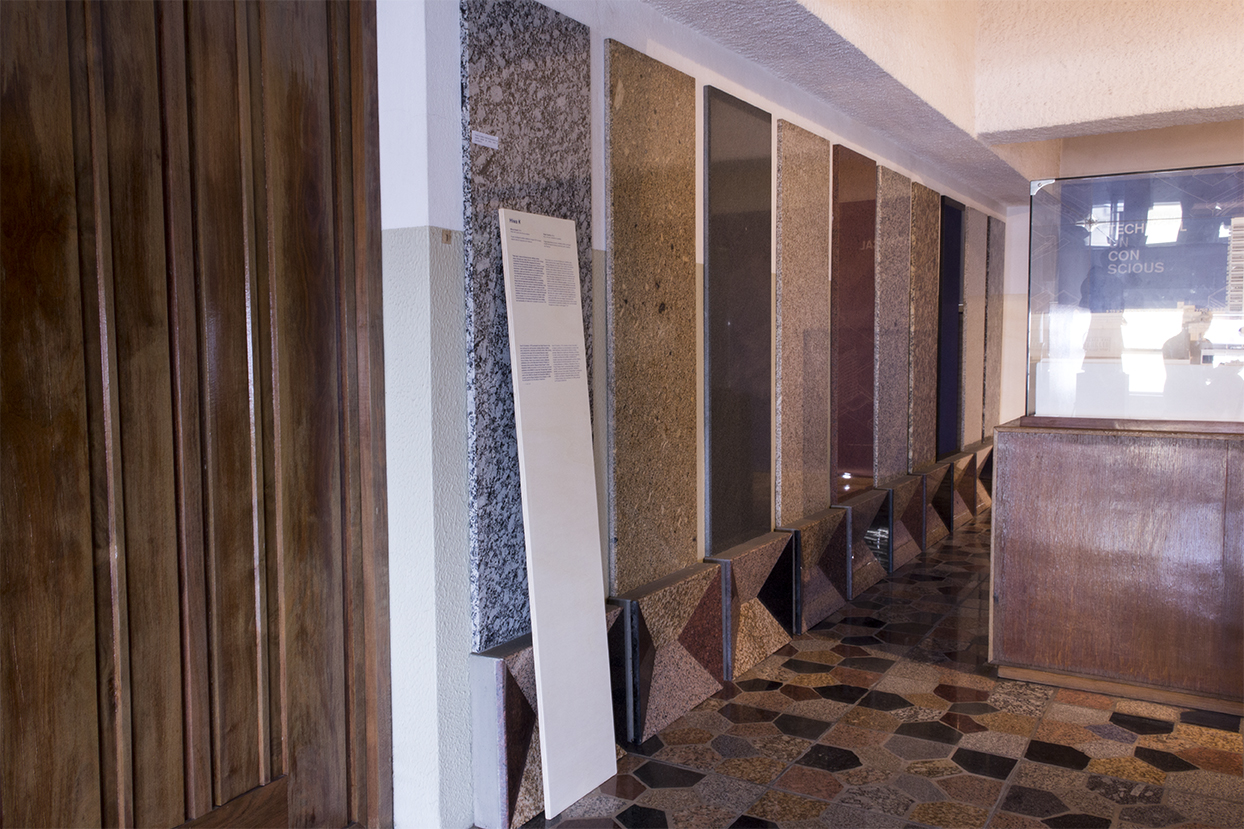
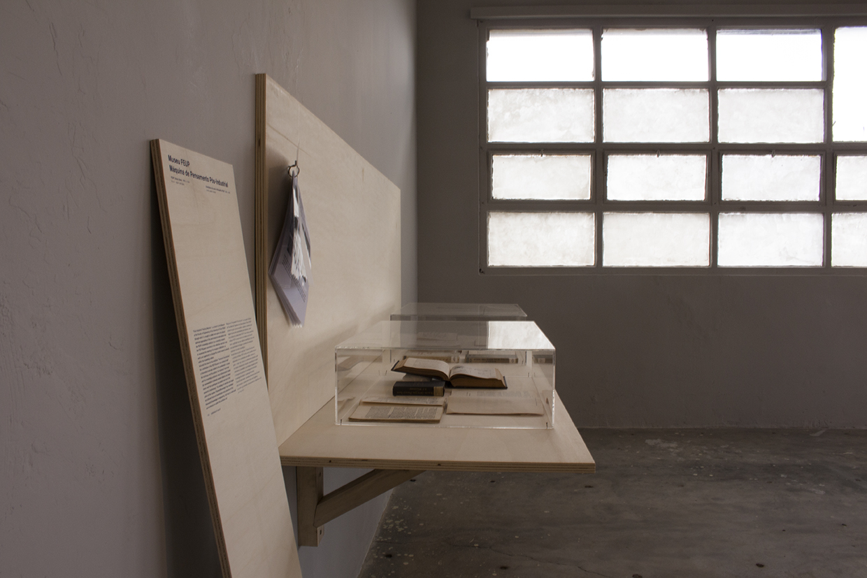
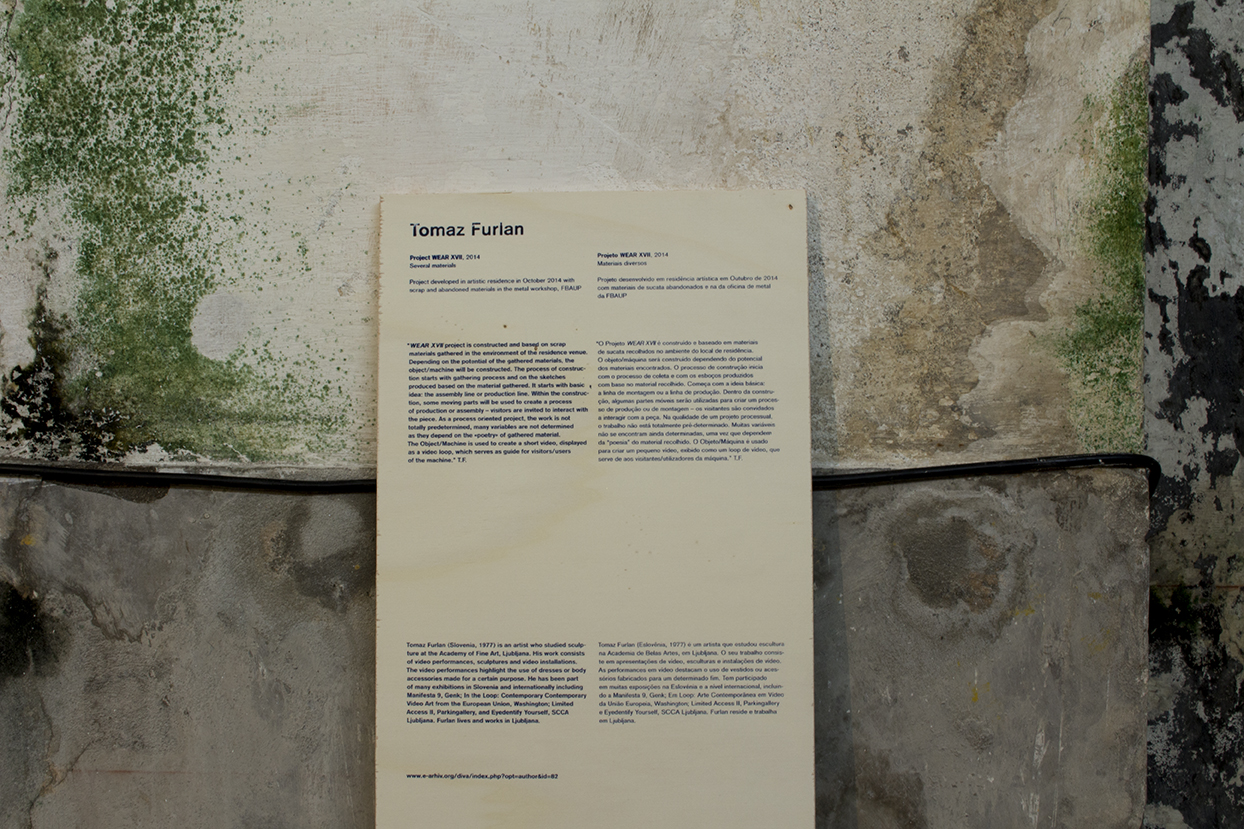
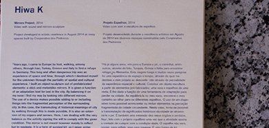
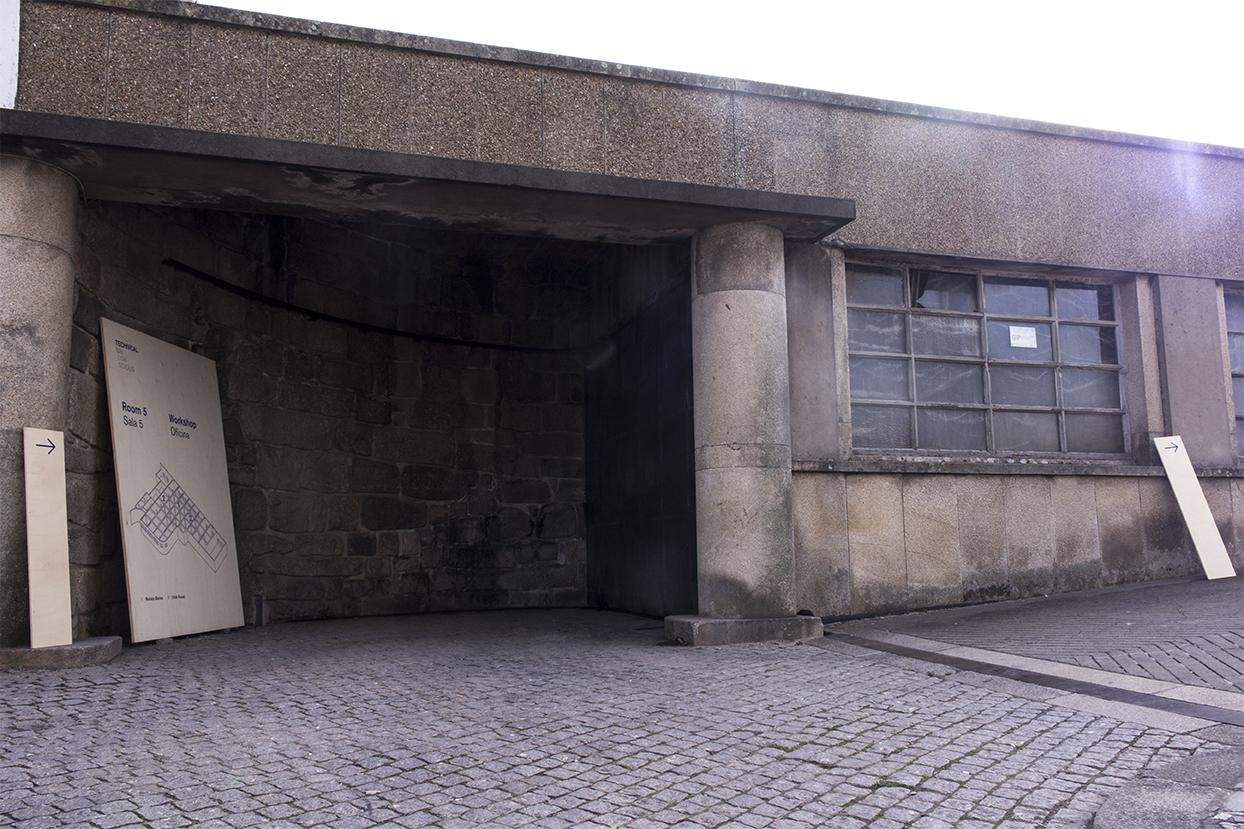
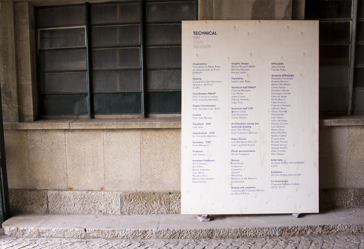
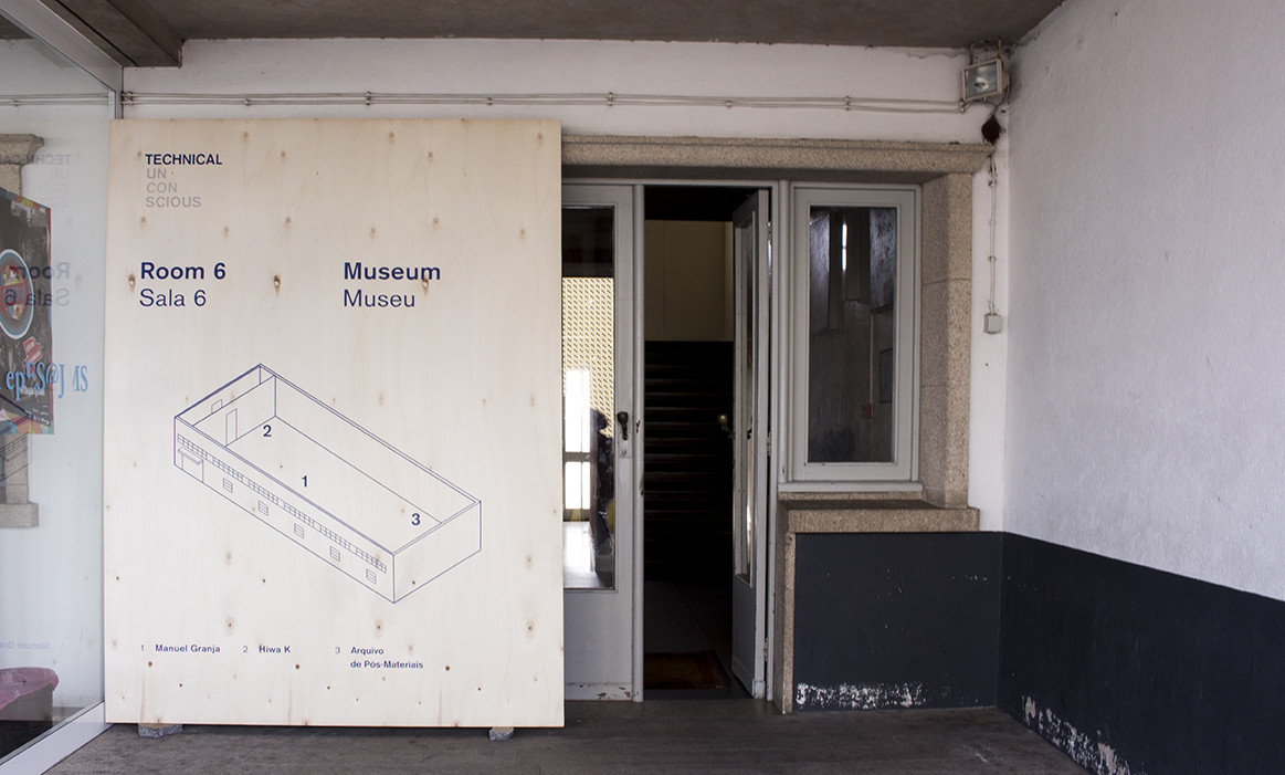
Technical Unconscious was an exhibition in the old complex of the Masons Cooperative in Porto.
As it was presented on every building of the complex, it was designed a map and it each building had it own.
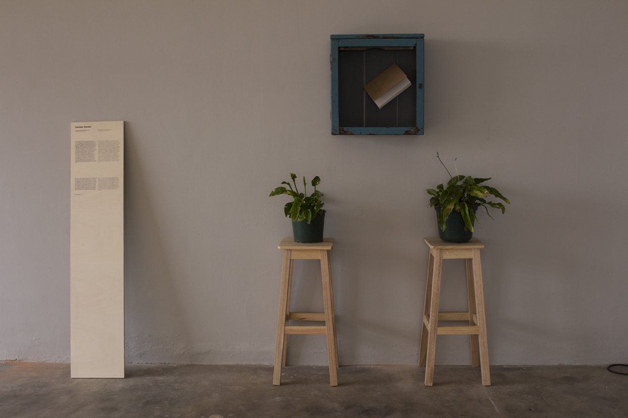
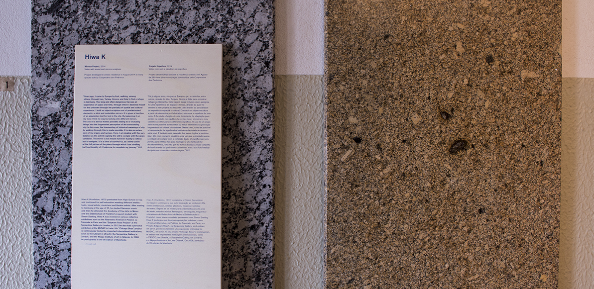
To create contrast between the stone in the buildings, we use big wooden boards.
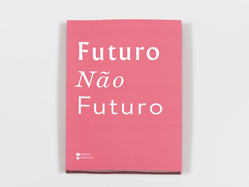
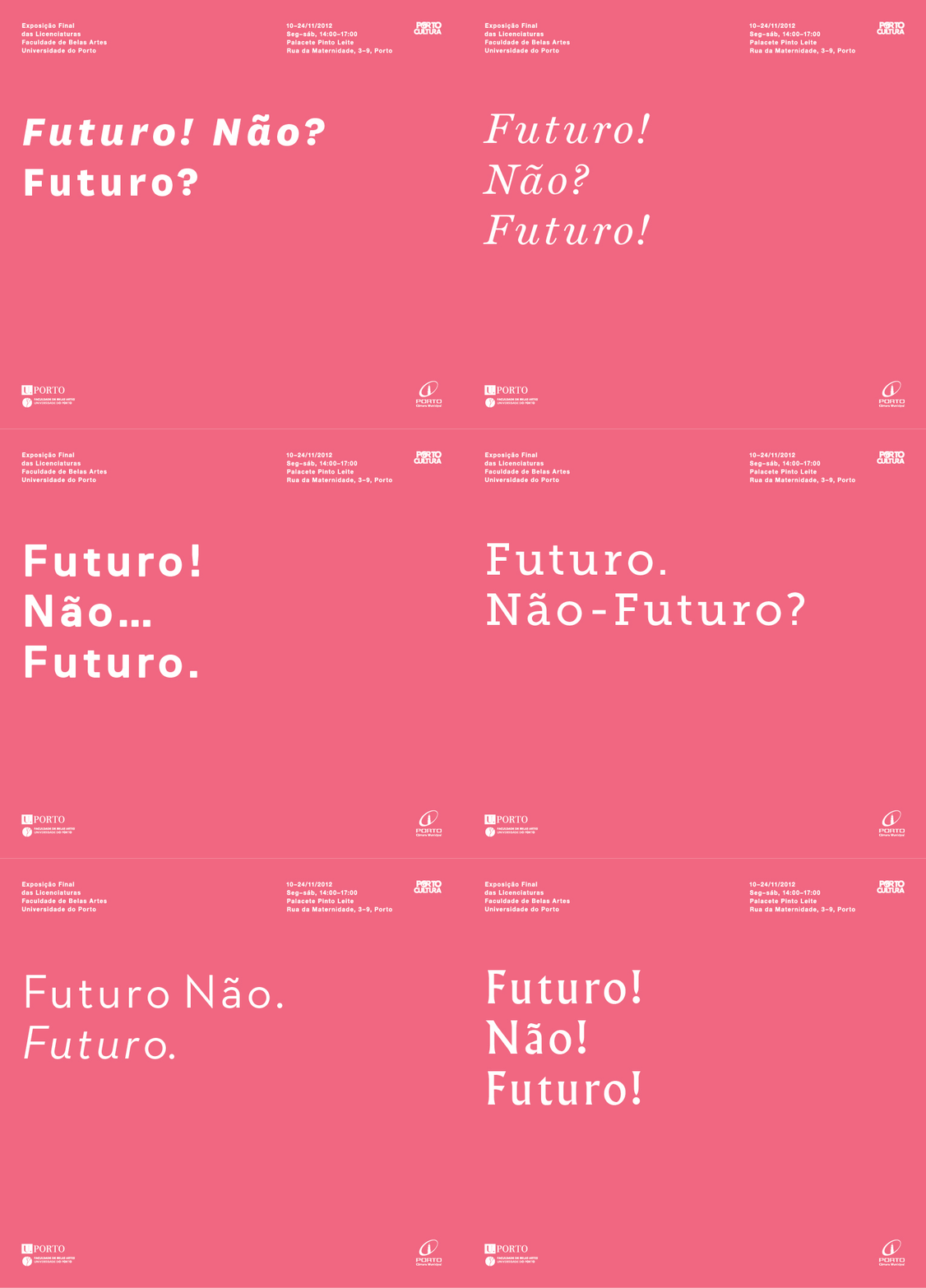
Futuro Não Futuro
2012
Client: Faculty of Fine Arts of University of Porto
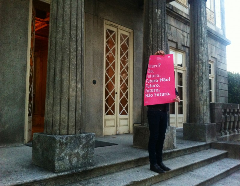
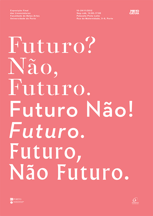
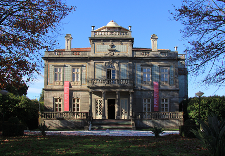
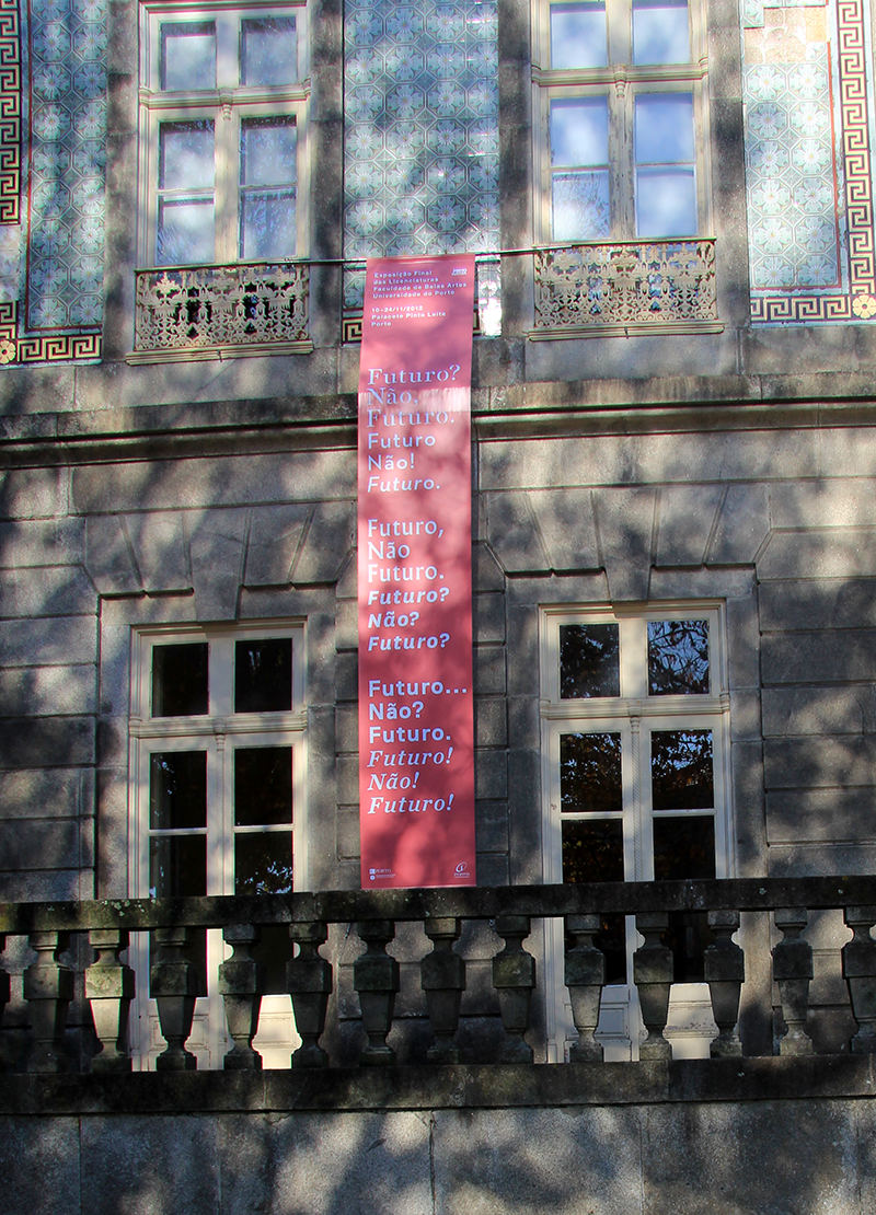
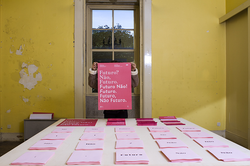
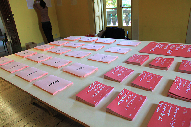
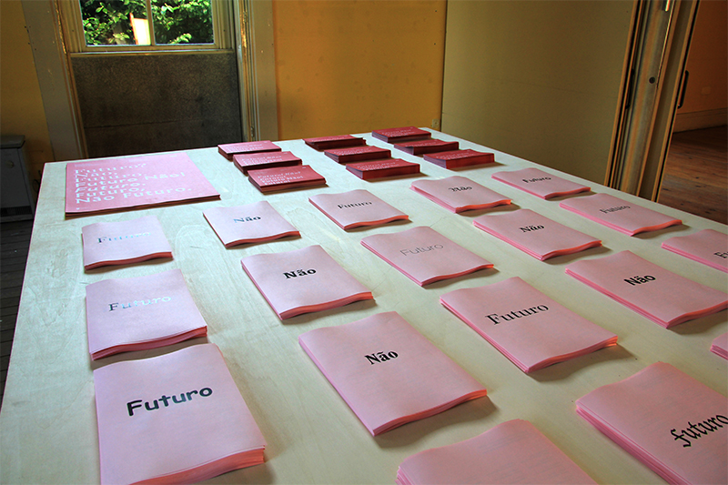
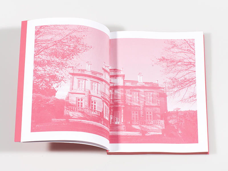
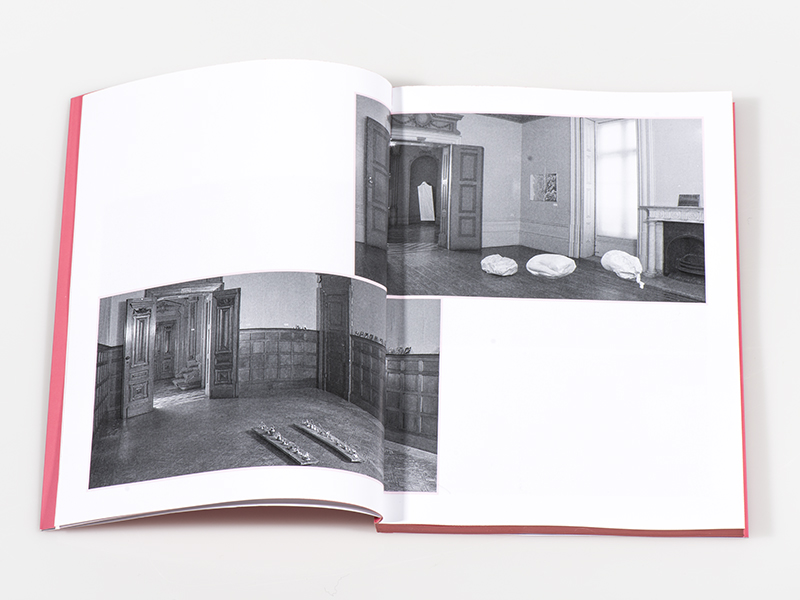
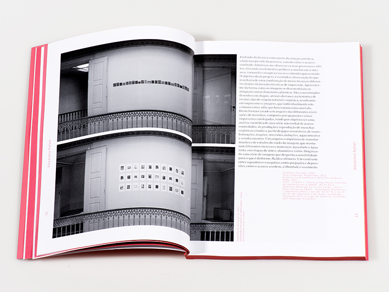
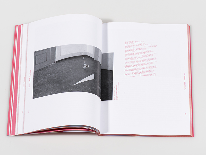
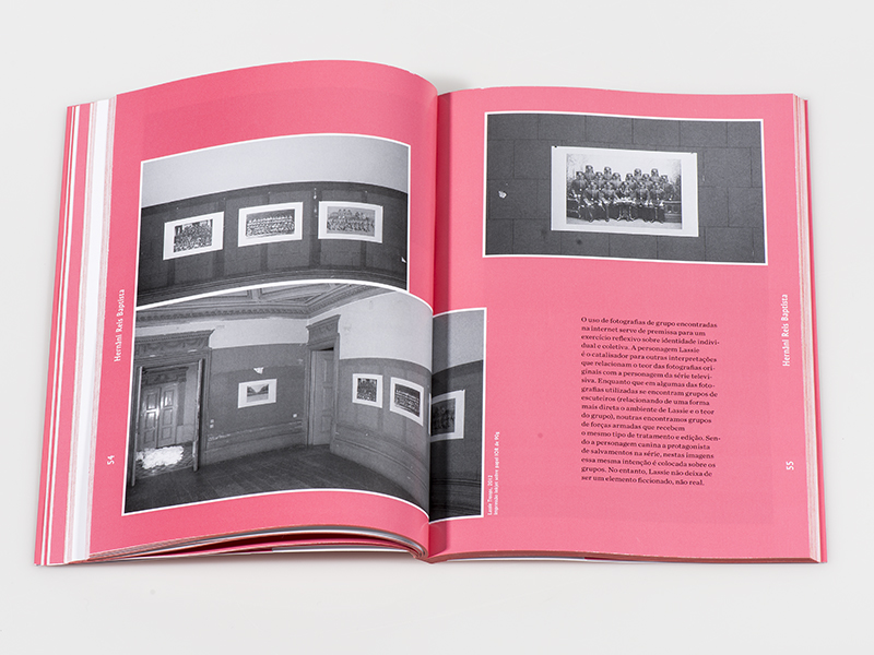
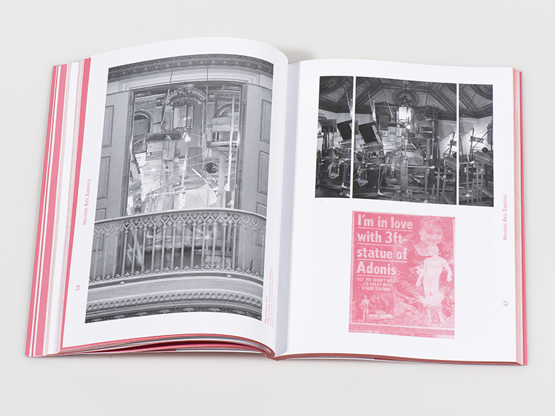
Futuro Não Futuro was the final show of the Faculty of Fine Arts of University of Porto at Palacete Pinto Leite, in Porto.
In 2013, Portugal was at the height of the economic crisis. Many young qualified people were moving out of the country in search of a better life, leaving behind unemployment and under payment.
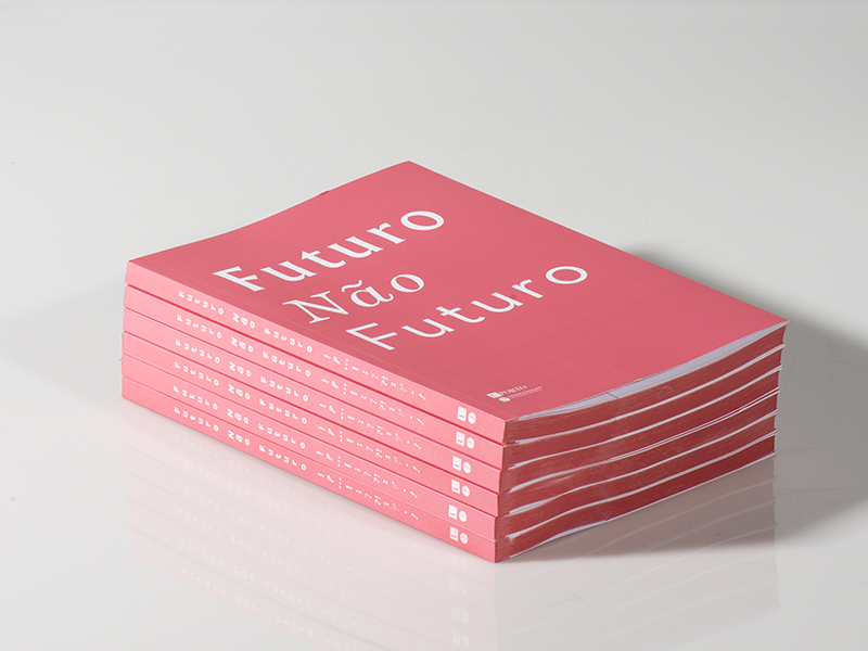
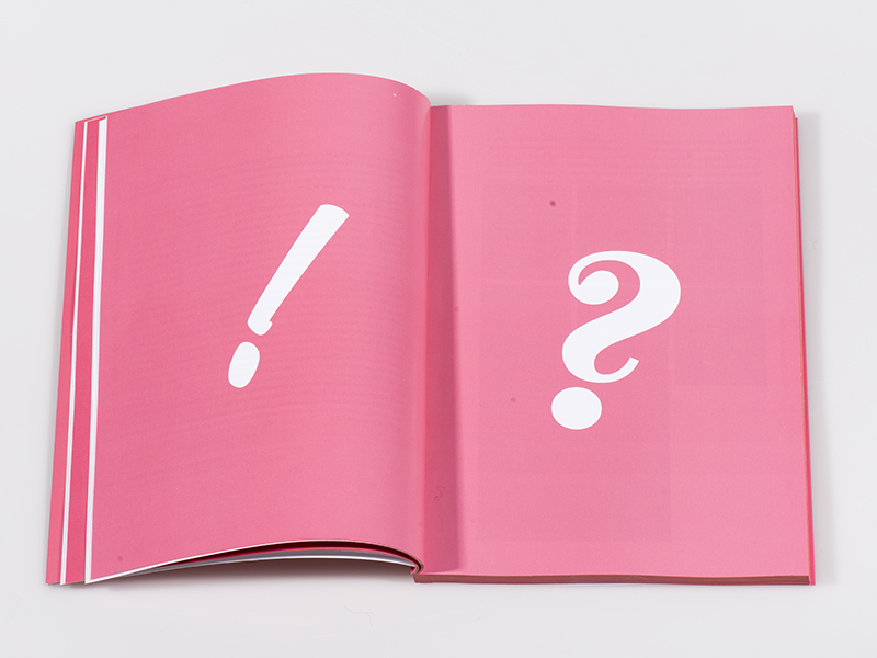
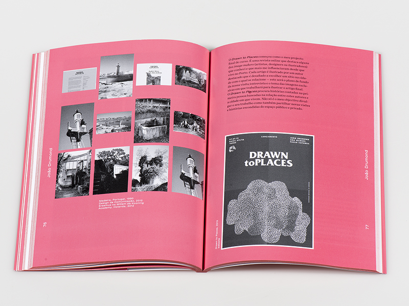
The identity of the show was based on that. Using a pink that would ironize this situation, while using different punctuation in order to create new meanings with the title — Future No Future.
The catalogue maintained this idea, this time as a pink block.
Trampolim
2013
Client: Faculty of Fine Arts of University of Porto
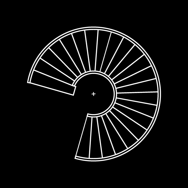
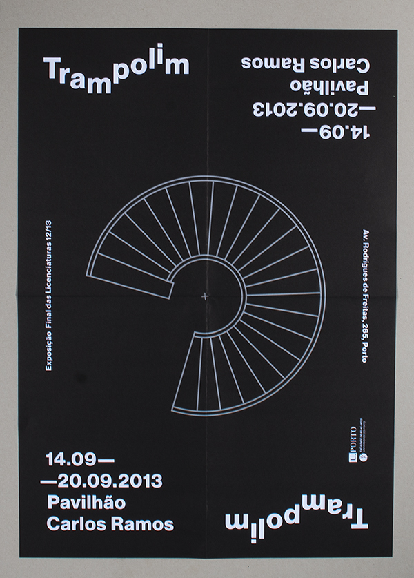
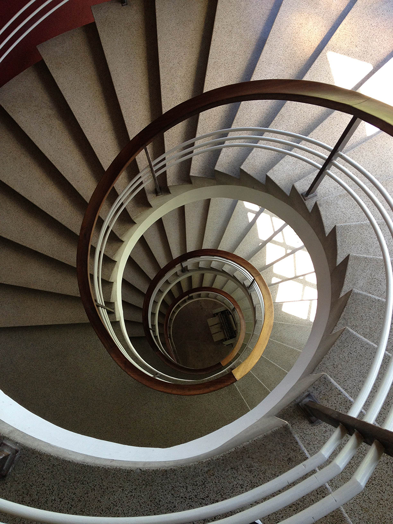
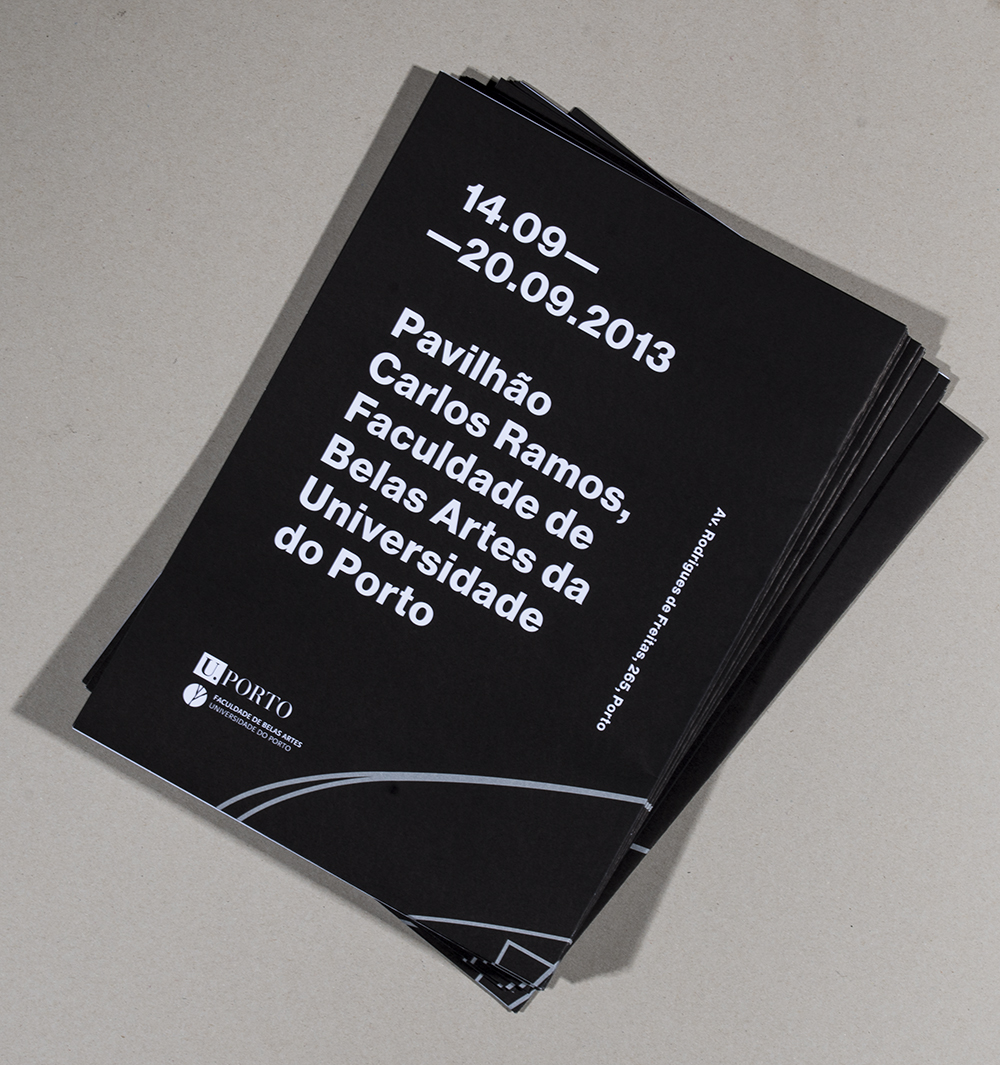
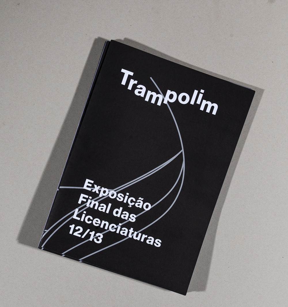
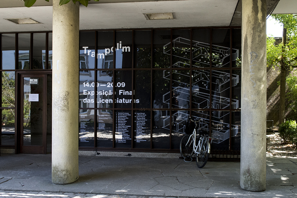
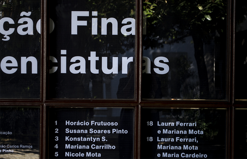
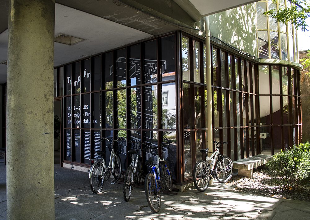
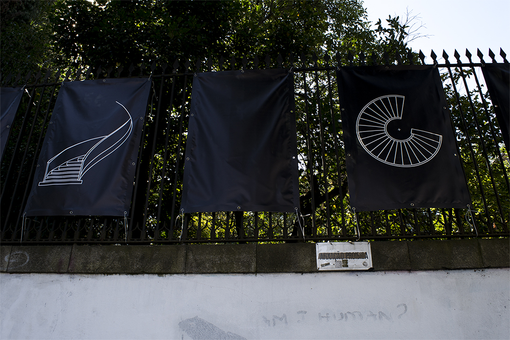
Trampolim was the 2013 final show at the Faculty of Fine Arts of University of Porto.
Using the spiral staircase of the building where it took place, that is was designed by Manuel Fernandes de Sá in the 50s, that resembles a trampoline, the identity was based on the building itself.

#FOMO
2014
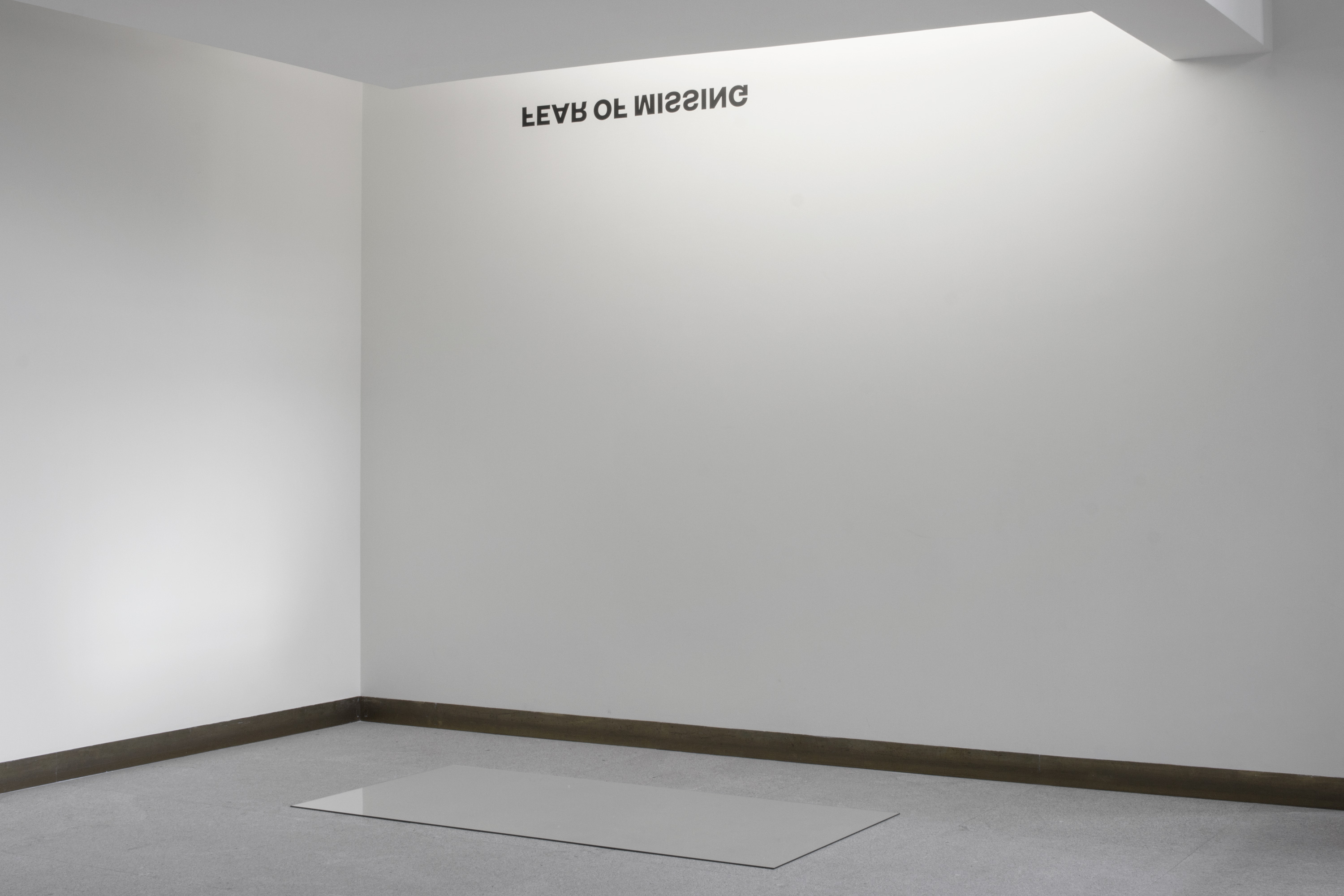
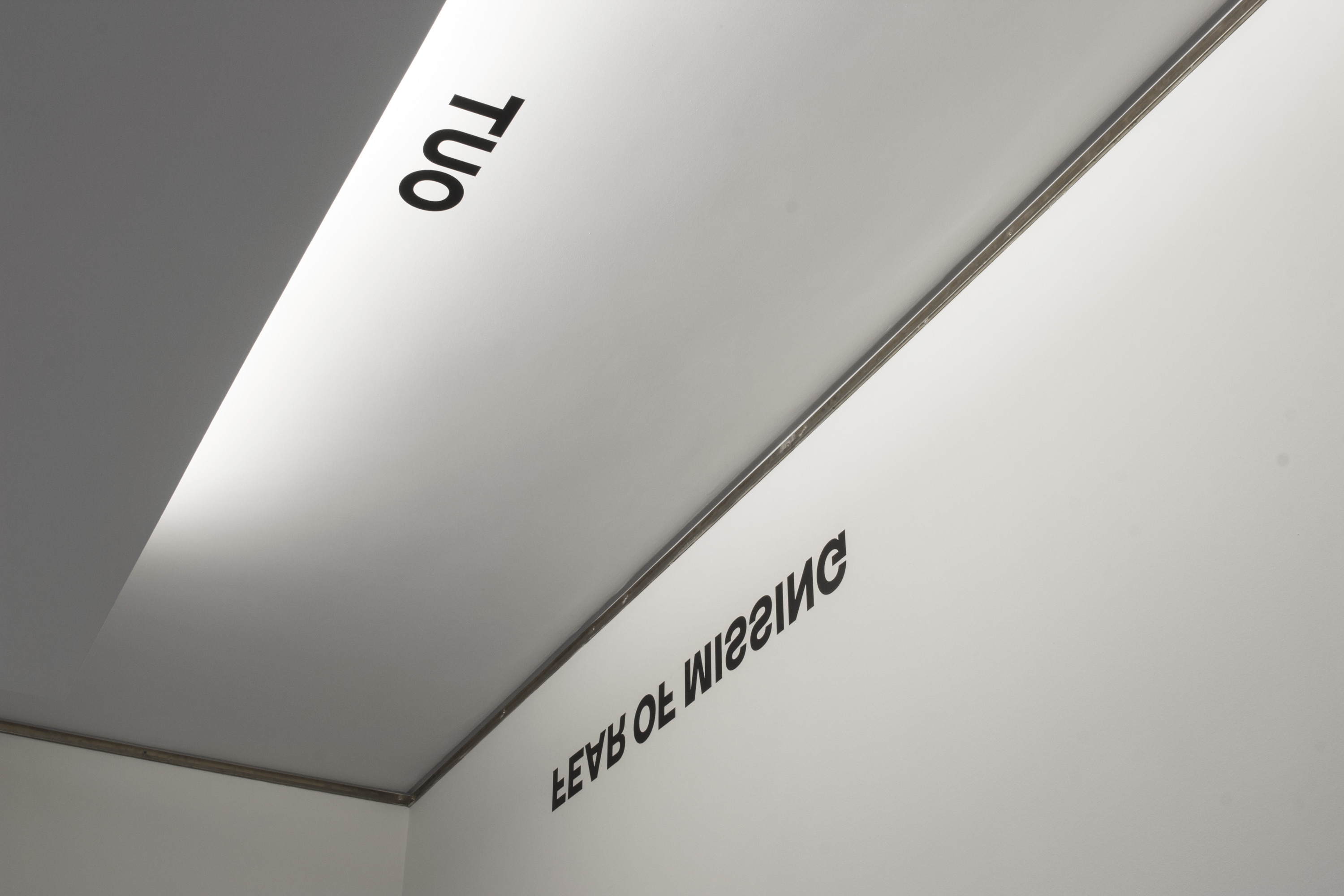
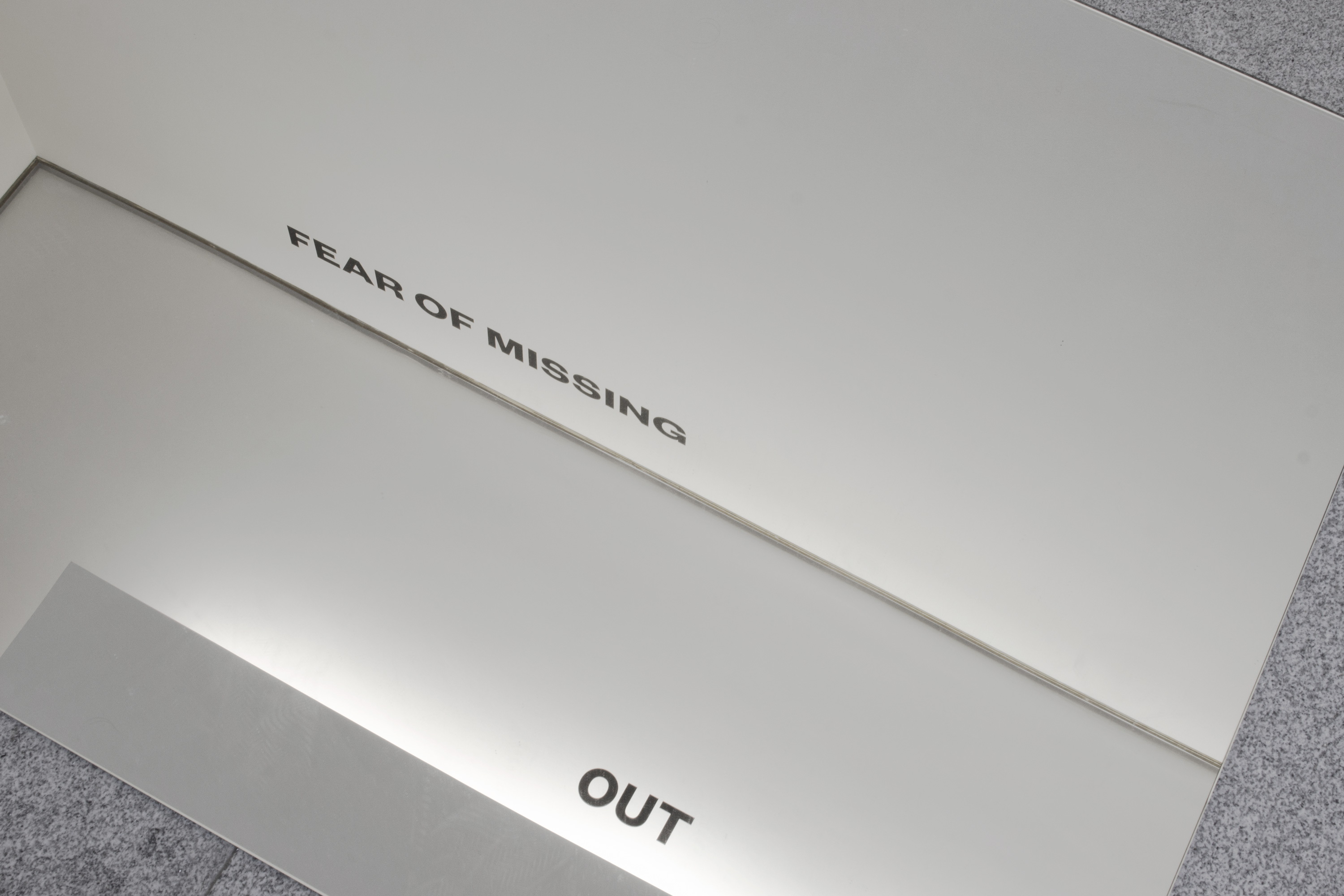
João Drumond and Horácio Frutuoso invited me to Y, a collective show with young artists and designers.
I proposed them to work with the idea of representation and its relationship with the social media.
#fomo pretend to question, in this pos-digital era, what is identity and how it is built, as a self reflexive exercise.
Selected Posters
